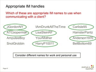
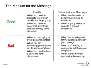
Downloaded 1,226 times

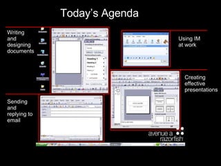
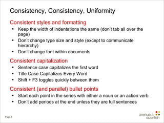
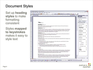
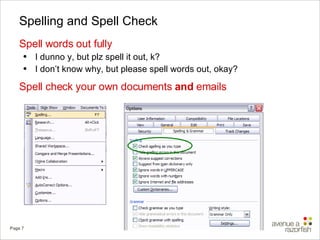
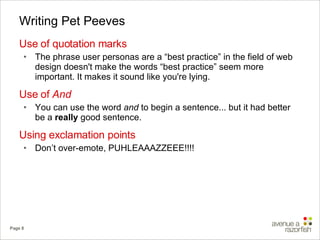
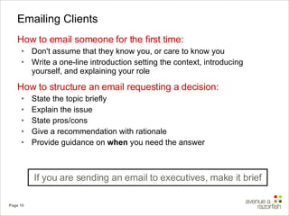
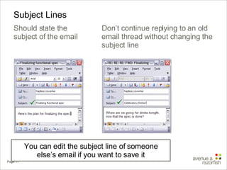
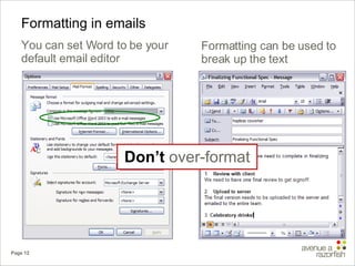
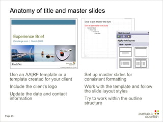
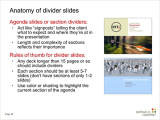
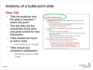
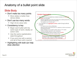
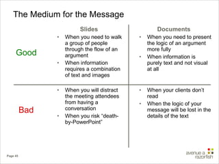


The document provides guidelines for effective communication in the workplace, focusing on writing emails, creating presentations, and using instant messaging appropriately. It emphasizes understanding the audience, maintaining consistent formatting, and being concise while delivering key points. Additionally, it offers specific tips on structuring emails and presentations to enhance clarity and engagement.

![Basic guide to writing an essay[1]](https://cdn.slidesharecdn.com/ss_thumbnails/basicguidetowritinganessay1-151215085422-thumbnail.jpg?width=640&height=640&fit=bounds)
![Basic guide to writing an essay[1]](https://cdn.slidesharecdn.com/ss_thumbnails/basicguidetowritinganessay1-101115203213-phpapp01-thumbnail.jpg?width=640&height=640&fit=bounds)
![Basic guide to writing an essay[1]](https://cdn.slidesharecdn.com/ss_thumbnails/basicguidetowritinganessay1-150610212749-lva1-app6891-thumbnail.jpg?width=640&height=640&fit=bounds)

![Basic guide to writing an essay[1]](https://cdn.slidesharecdn.com/ss_thumbnails/basicguidetowritinganessay1-110202082535-phpapp02-thumbnail.jpg?width=640&height=640&fit=bounds)

![Bus com05[1] 1](https://cdn.slidesharecdn.com/ss_thumbnails/buscom0511-110309033512-phpapp01-thumbnail.jpg?width=640&height=640&fit=bounds)


![Getting Started with Apache Spark: Big Data Made Simple [Free Meetup]](https://cdn.slidesharecdn.com/ss_thumbnails/apachesparkgettingstarted-260203175547-8361bcc3-thumbnail.jpg?width=640&height=640&fit=bounds)