

Recommended
More Related Content
Viewers also liked
Viewers also liked (20)
Similar to Do Your Power Point Presentations Stink?
Similar to Do Your Power Point Presentations Stink? (20)
Do Your Power Point Presentations Stink?
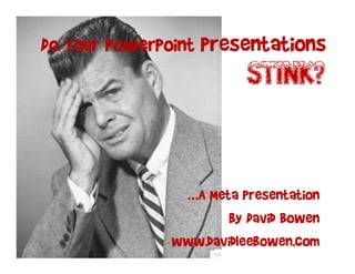
- 1. Do Your PowerPoint Presentations STINK? …A Meta Presentation by David Bowen www.davidleebowen.com
- 2. Scope • This Guide is for presentations to an Audience • It is NOT for Sharing detailed Information • It is NOT for Your Regular boring Meetings • Know Your Audience • Know Your Idea • Communicate • Close
- 3. Message • What’s your BIG Idea? • BTW Your Audience Wants To Know – W.I.I.F.M? • FYI, TMI is NOT A-OK • Tell Them What You are Going To Tell Them • Tell Them • Tell Them What You Told Them
- 4. Theme • Tie it all together • e.g. “OLd Timey Stuff” • Consistency is Key • Be Creative • Even Though: • You May be constrained by Corporate Guidelines • You may be timid standing above the croWd • a
- 5. Color Scheme • Select a Color Palette that “Goes Together” • e.g. B&W, Sepia Tone, Muted Reds • Get Ideas From Your Hardware Store (Think Paint)
- 6. Space • Use It! • No More Than 7 bullets • No More Than 7 words • Break These Rules Very Rarely • YOU are the Main Event
- 7. Space • The More Stuff On Your Slide… • The Less They Will Pay Attention to YOU! • Put up Your Slide • Give Them a Second • Speak To Your Slide • Hide Slide If Needed
- 8. Arrange • Use the Corners • Use The edges • Keep It Simple (Superstar) • Don’t be Afraid to Overlap • The Guy In The Back Can’t See!
- 9. Alignment • ALWAYS JUSTIFY! • Right –or- • Left • But NEVER Center! • Go Look at A Magazine or Pro Web Page… • Just Do It!
- 11. Fonts • Use a Unique Font • Make Sure it is Readable (LARGE) • Make Sure it Fits Your Theme • Don’t Use Too Many Fonts – 1 Font with a Max 2 Accent Fonts • 1000’s of Free or Low Cost Fonts Available
- 12. Pictures
- 13. Pictures • Worth a Thousand… • Prominent Is Good • Clip Art is Bad • Millions of Pro Pix
- 14. Message (Redundancy pt 2) • Tell Them! • Then Tell Them What You Told Them
- 15. Some Don'ts No Clipart No Audio Clips 200 80 150 60 100 40 Volume This is some very tiny text to show as an example of what not to do 50 20 High for a presentation to an audience. 0 0 If you use text that is too small, Low not only will your audience be 1/5/2002 1/6/2002 1/7/2002 1/8/2002 1/9/2002 confused, but they will also be Close irritated, frustrated, disengaged and apathetic. No “Eye-charts” No Tiny Text
- 16. BAD SLIDE! • This slide has too much clutter • The text is centered • There are too many font types • Is There a Color Scheme? • Clip Art…Yuk! • This script is very hard to read • Can that guy in the back see? 200 80 150 60 100 40 Volume 50 20 High 0 0 Low Close
- 17. Message (Redundancy pt 3) • Tell Them What You Told Them • Include a Call To Action! What was that presentation about?
- 18. Questions? • Paraphrase the Question • Eye Contact With Audience • Address The Questioner AND The Audience • Set Expectations – e.g. “Last Few Questions”
- 19. You Now Have The Power…Use It Wisely Go Get ‘Em! ‘Em! Em www.Davidleebowen.com linkedin.com/in/bowendavid linkedin.com/in/bowendavid
- 20. Back Up / Reference • If you can not live without your back up slides… • Add more detail here so that a reader who did not attend your presentation can piece it together • You will notice that this slide has far more words than just the seven or less that is recommended • Are you still reading this? If so, think of your audience and how bored they will be trying to read this low level of minutiae on your slides • My goodness, you really are a glutton for punishment aren’t you?
- 21. Back Up / Reference • How To Hide A Slide: –When in Presentation Mode in PowerPoint : • Press “W” for White Screen • Press “B” for Black Screen
- 22. Back Up / Reference FONTS • 1000’s of Free or Low Cost Fonts Available: – Be Sure to Read the Terms of Use – http://www.dafont.com/ – http://www.1001freefonts.com/ – …etc. etc.
- 23. Back Up / Reference Pictures • All Cost Ranges Available – including FREE • Read the Terms of Use • Some Resources: • Fotolia.com • istock.com • etc.
- 24. The choice is clear… linkedin.com/in/davidbowen www.davidleebowen.com