Digipak Design Appeals Through Images, Colors and Font
•Download as PPTX, PDF•
0 likes•202 views


Recommended
More Related Content
What's hot
What's hot (18)
Similar to Digipak Design Appeals Through Images, Colors and Font
Similar to Digipak Design Appeals Through Images, Colors and Font (20)
More from Jordan Booker
More from Jordan Booker (18)
Digipak Design Appeals Through Images, Colors and Font
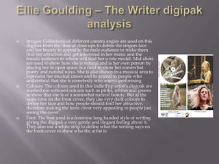
- 1. Images: Collections of different camera angles are used on this digipak from the likes of close ups to define the singers face and her beauty to appeal to the male audience to make them find her attractive and get interested in her music and the female audience to whom will find her a role model. Mid-shots are used to show how she is natural and is her own person by placing her in open space in a field to show her somewhat purity and natural ways. She is also shown in a musical area to represent her musical career and to appeal to people who understand that she is somebody who enjoys performing. Colours: The colours used in this Indie Pop artist’s digipak are washed out softened colours such as pinks, whites and greens to show that she is of a somewhat natural beauty. But at the same time on the front cover, they use very dark colours to define her face and how people should find her attractive, therefore making the front cover very appealing to people just seeing the cover. Font: The font used is a feminine long handed style of writing giving the digipak a very gentle and elegant feeling about it. They also use a white strip to define what the writing says on the front cover to show who the artist is.