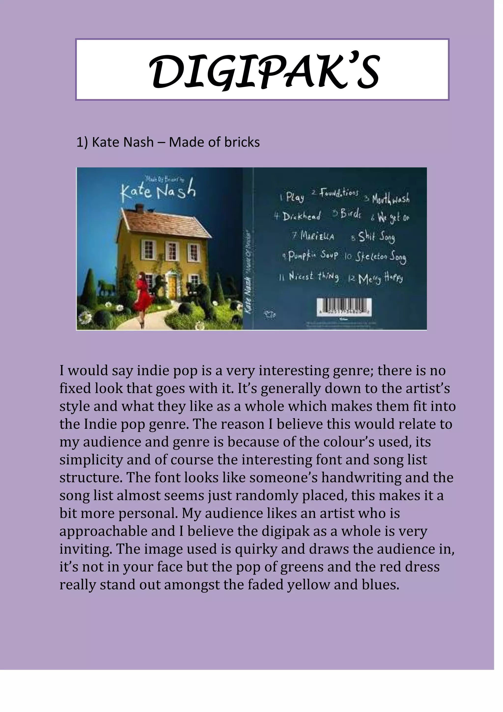
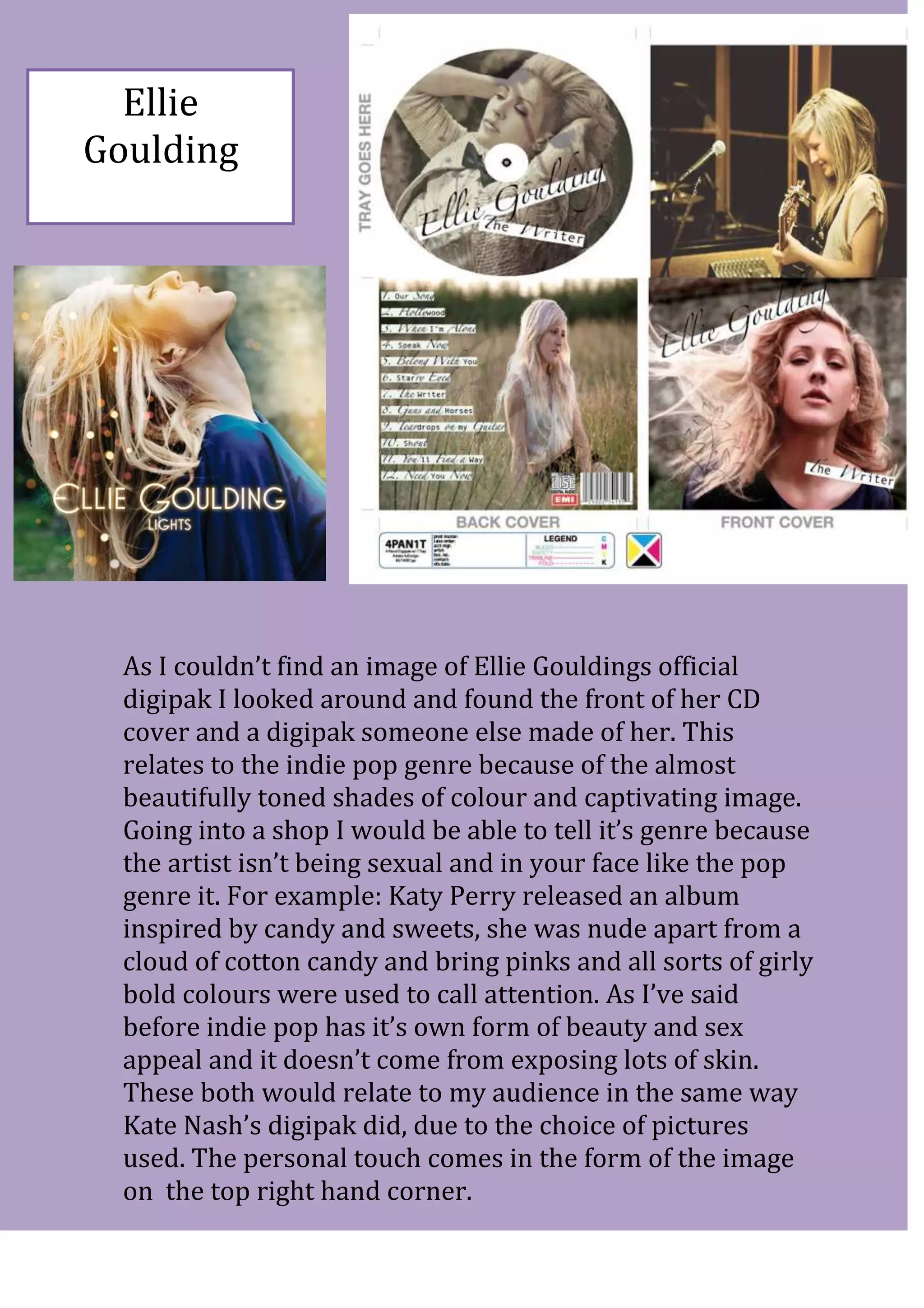
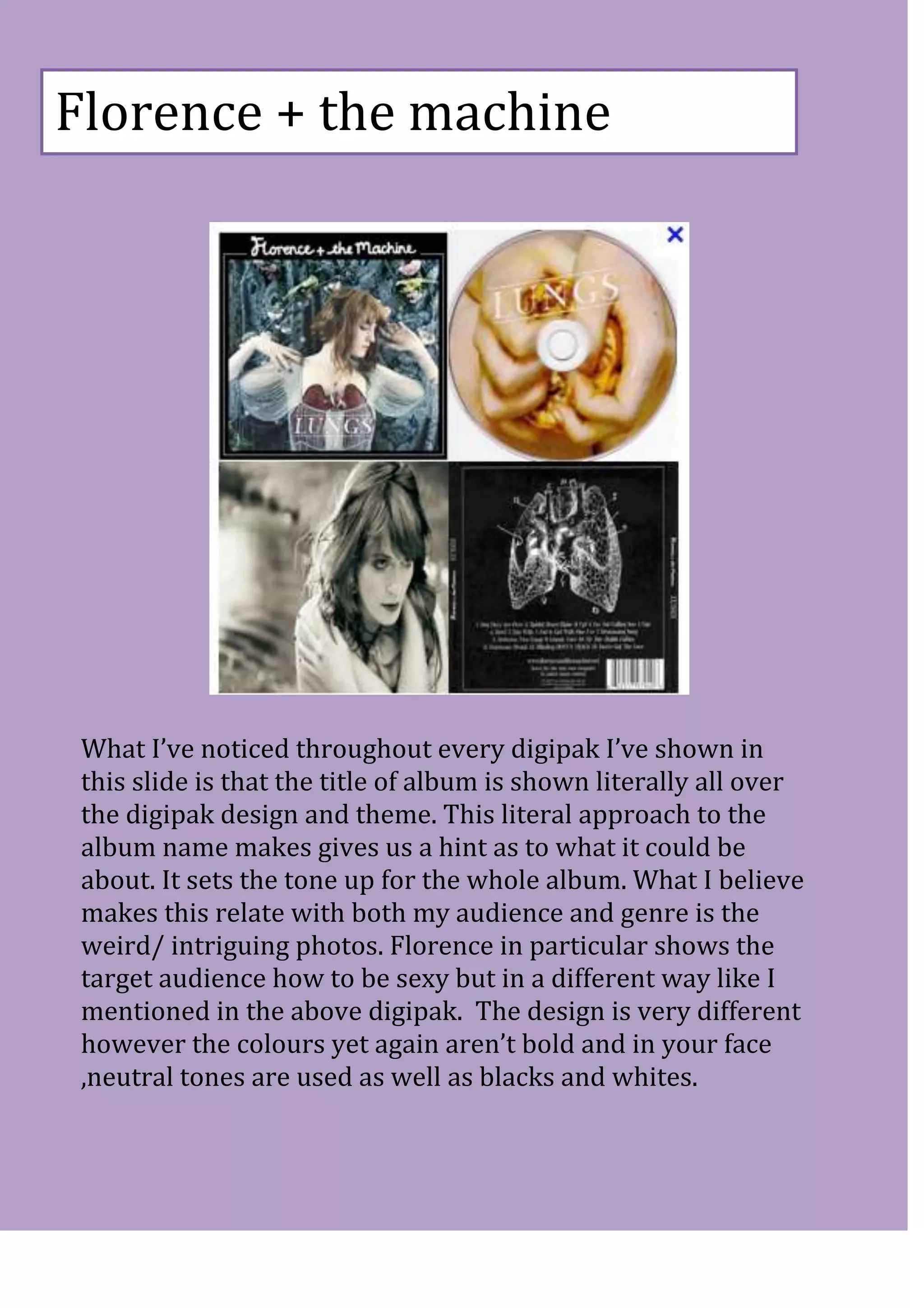
This document discusses and analyzes the digipak designs of three indie pop artists - Kate Nash, Ellie Goulding, and Florence + the Machine - in order to determine what design elements appeal to an indie pop audience. For each artist, the document examines the color palette, imagery, and overall aesthetic used in their digipak designs. Across all three designs, consistent elements identified include neutral and muted colors, artistic or quirky images of the artist, and incorporation of the album title into the visual design. These elements help identify the designs as indie pop and aim to attract that target audience through an unconventional and personal aesthetic approach.
1. DIGIPAK’S
1) Kate Nash – Made of bricks
I would say indie pop is a very interesting genre; there is no
fixed look that goes with it. It’s generally down to the artist’s
style and what they like as a whole which makes them fit into
the Indie pop genre. The reason I believe this would relate to
my audience and genre is because of the colour’s used, its
simplicity and of course the interesting font and song list
structure. The font looks like someone’s handwriting and the
song list almost seems just randomly placed, this makes it a
bit more personal. My audience likes an artist who is
approachable and I believe the digipak as a whole is very
inviting. The image used is quirky and draws the audience in,
it’s not in your face but the pop of greens and the red dress
really stand out amongst the faded yellow and blues.
2. Ellie
Goulding
As I couldn’t find an image of Ellie Gouldings official
digipak I looked around and found the front of her CD
cover and a digipak someone else made of her. This
relates to the indie pop genre because of the almost
beautifully toned shades of colour and captivating image.
Going into a shop I would be able to tell it’s genre because
the artist isn’t being sexual and in your face like the pop
genre it. For example: Katy Perry released an album
inspired by candy and sweets, she was nude apart from a
cloud of cotton candy and bring pinks and all sorts of girly
bold colours were used to call attention. As I’ve said
before indie pop has it’s own form of beauty and sex
appeal and it doesn’t come from exposing lots of skin.
These both would relate to my audience in the same way
Kate Nash’s digipak did, due to the choice of pictures
used. The personal touch comes in the form of the image
on the top right hand corner.
3. Florence + the machine
What I’ve noticed throughout every digipak I’ve shown in
this slide is that the title of album is shown literally all over
the digipak design and theme. This literal approach to the
album name makes gives us a hint as to what it could be
about. It sets the tone up for the whole album. What I believe
makes this relate with both my audience and genre is the
weird/ intriguing photos. Florence in particular shows the
target audience how to be sexy but in a different way like I
mentioned in the above digipak. The design is very different
however the colours yet again aren’t bold and in your face
,neutral tones are used as well as blacks and whites.