
Recommended
More Related Content
What's hot
What's hot (20)
Viewers also liked
Viewers also liked (20)
Similar to AS Media Studies - Preliminary Planning and Research
Similar to AS Media Studies - Preliminary Planning and Research (20)
Recently uploaded
Recently uploaded (20)
AS Media Studies - Preliminary Planning and Research
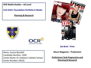
- 1. OCR Media Studies – AS Level Unit G321: Foundation Portfolio in Media Planning & Research Name: Jessica Blundell Candidate Number: 1020 Center Name: St. Andrew’s Catholic School Center Number: 64135 Set Brief - Print Music Magazine – Production Preliminary Task Progression and Planning & Research
- 2. Section 1) – Preliminary Task
- 3. Preliminary Task Progression– Evidence Front Cover Step-by-step
- 4. First, I added a gradient background from yellow to blue in order to suit the St Andrew's logo. I also added in a banner with the St Andrews logo on it so that if anyone's sees it they automatically know that it is the St Andrews school magazine. The banner has the shadow effect on it and also the stroke effect in white. I added the masthead in the font ‘Microsoft Tai Le’ and made the colour dark blue in order to match the school logo, I put a black stroke effect round it. I also put in the strapline ‘discover success’ which has connotations of doing well at school and how people at the school are doing and how students can follow their example.
- 5. Secondly, I added the main image of Catherine. I removed the background and made sure that no bits of the background are showing. This makes it look more professional and more focus is on Catherine, this means that people know that she is part of the main article.
- 6. Next I put in the barcode. I put a white square as the background with a thin black stroke effect. I put the actual barcode in next and then added the social media logos (Facebook and twitter) and put in the username which can be used for either social network to find the school magazine. I put in the price and I also added The Student masthead. I put in issue 1 and October 2015 to let people know that this is the first issue and what month this issue is. The fonts I used are very basic fonts as it is only the barcode and more attention should be going towards the cover lines and the main image.
- 7. Next I put in the puff promotion. I made it a yellow circle with a black stroke effect because it fits in with the colours of the school logo. I added win and put it just above the circle, I put a yellow stroke effect around it because it stands out more and it is the same colour as the background, making it blend in more. I also added a drop shadow so that it will stand out even more. I put the new iPhone in a smaller text in white with the black stroke effect, and I made the 6S a bigger font and a different colour so it attracts more attention. I put in the iPhone so that people can see what it looks like and it means that it will become more real to people, possibly persuading them to enter the competition. There is also a drop shadow on the iPhone so that it stands out against the text in the puff promotion, drawing more attention towards it.
- 8. The next thing I did was put in the main story and its cover line. I decided that I would make the cover lines and main article text yellow and white with a black stroke effect. This is because it will stand out more against everything else on the page and again, it goes with the school logo colours. ‘Catherine Worwood’ is in the biggest font in the main article section, this is because it means people will read that first, especially because it the only part (except for the cover line) that is white for the main story section, meaning it stands out more. The rest is in yellow and the exclusive is in capitals to draw attention. I made the sub-line text much smaller because I don’t want to reveal too much about the article, and if people see what the main story is about they probably wouldn’t need to read the sub-line in order to decide if they will buy the magazine.
- 9. The next thing I did was add all the cover lines in and put the sub-lines in too. I continued with the colour scheme of yellow and white in terms of the stories featured on the front cover. I decided to use some rhetorical questions because it prompts the reader to think of a response or to want to find out the answer is to that question. I tried to add cover lines which are specific to the sixth form as it is a sixth form magazine. I also put in articles that would benefit sixth form students or help them in some way (for example the learning style helps people to find out how they should be doing revision). I also added things that sixth form students can relate to such as the new a levels and the bowling trip that happened. I used the ruler tool to decide and measure the difference between the articles so I could try and make them as equal as possible. I put the stroke effect around all the text because it helps it to stand out more.
- 10. The next thing I did was adding a few images to make the front cover more interesting and to fill blank space. I put in coloured squares which represent the house colours near the bowling cover line as the bowling trip was house bowling (winning points from bowling to add to the house you are in at school). I also added the pabulummm logo as they prove the school food. It relates to the article as there was a new sixth form café with new food.
- 11. The final thing I did was adding the school website link. I put this is a small text at the top of the page so that it doesn't take up any space that could be used for articles, it is a subtle place to put it and does not get in the way, but it is still there so people have the option and knowledge of the school website. It is yellow and has the black stroke effect around it so that it matches the rest of the text on the page.
- 12. The front cover looks like this now that it is completed.
- 13. Preliminary Task Progression– Evidence Contents Page Step-by-step
- 14. The first thing I did when making my contents page was adding the gradient, background, The Student logo and This week…
- 15. Next, I put in the editorial. I put a picture of myself with a black stroke effect. I also included a drop capital, the editorial text, my signature and editor information. There is also information about the social media that the magazine has.
- 16. I put the stories in next, I put a sub-line in as well to give the reader some information about the article. They match the colours of the cover-lines on the front cover. I also added a yellow box as a background for the Features section.
- 17. Next I put in some pictures that relate to the articles to fill up some space. I also added the page number at the bottom and the school email. The student pat of the website is the same font and size as the masthead.
- 18. The final thing I did was adding the photos and the captions. I added a picture of Catherine helping another student as she is on the front cover, and another image of two other students in the school who are in a french classroom. I also added two navy lines to make the page look more interesting an neater. I also put in two ten pound note images to give an insight into what the reward is. I also changed my email to www.jblundell@thestudent.com
- 19. This is the completed version of my contents page.
- 20. Section 2) – Log Book
- 21. Music Magazine – Genre research Bauer Media Group is an example of a magazine publisher, Bauer Media Group is a large European-based media company with its headquarters in Germany. It manages more than 600 magazines, over 400 digital products and 50 radio and TV stations around the world. This company manages Q magazine. Source: https://en.wikipedia.org/wiki/Bauer_Media_Gr • Q magazine has a genre of pop/rock with a a few features about R&B and rap. • The Guardian said Q magazine was the best music magazine in the UK in 2006. (http://www.theguardian.com/media/2006/aug/17/pressandpublis hing.circulationfigures4) • Pop music is a genre of popular music that originated in its modern form in the Western world during the 1950s and 1960s, deriving from rock and roll. (https://en.wikipedia.org/wiki/Pop_music)
- 22. Established Magazine for my Research Masthead – big and bold so it stands out and draws attention of the readers or potential readers. Main headline – doesn't’t give away the story so the readers are left wondering what its about. Also creates a ‘personal relationship’ (Katz uses and gratifications) as some of the readers might be able to relate to the quote ‘I feel so alone’. However, this can also create ‘diversion’ (Katz uses and gratifications) because they are reading about her life and forgetting about any problems they’re facing in their life. The quote may also attract ‘caregivers’ (Maslow's Hierarchy of needs) as they will feel sorry for the star as she feels ‘so alone’ Cover story Incentive – Helps in trying to get people to buy the magazine, it stands out as it’s blue which draws attention. Barcode star appeal (Richard Dyer) Strapline (discover great music) – readers can find out good music to listen to and since the readership is for a wide audience it can appeal to any age. Florence from Florence and the machine – persuades people to buy it
- 23. Target Audience – Katz, Maslow, Hartley and/or socio-economic needs Q magazine covers a range of music from todays music and artists and older music and artists, this means that the target audience of Q magazine will most likely be people who are working. 71.8% of people who read it are in the ABC1 profile, meaning they are employed and have the money to spend on buying music magazines. It can appeal to both male and females. Source: http://www.bauermedia.co.uk/uploads/Q.pdf According to Katz’ uses and gratifications, the audience would be part of the ‘diversion’ section. This is because Q magazine has a readership of people who are working in professional jobs, school, college or university. This means they’re likely to become stressed at work/school and need a way of escaping that stress and forgetting about It for a while. Therefore, Q magazine would aim to provide stories and entertainment for its readers so that they can escape the stress of their everyday lives. According to Hartley's seven subjectivities the target audience is likely to be of both genders and of middle class. According to age, the readers are likely to be 15-34 years old and of any ethnicity. Maslow’s hierarchy of needs would suggest that the readers of Q are social climbers. This is because they are in professional jobs and are likely to care about their position in that job and the status they have in society. They could also be perceived as survivors because of their ABC1 profile. This is the same for the younger generation of readers, however, they will be concerned with their status among their peers. As most are in employment they are likely to want security and routine, this can be transferred to how they feel about other people like celebrities included in the magazine and how they want them to have security and routine and for everything to work out. However, for the younger generation of readers, they will want security and routine as they need to finish school, college or university and are likely to want the security that this will happen. From the research completed into this media product, I think the USP is the main headline. This is because it has Florence in big letters and above it is a quote saying ‘I feel so alone’ and at the bottom it says ‘woman on edge’ This has a lot of different interpretations over what she could be ‘on the edge’ for and why she feels ‘so alone’ so people finding a magazine may be drawn towards it to find out why this is on the main headline, especially if they are fans of this celebrity. This magazine company could use these kinds of headlines on other magazine covers to intrigue readers to/of the magazine because they do not know the full story behind the headlines and may want to find out more.
- 24. Publisher research Bauer media ‘We think popular’ Bauer media • Bauer Media is a European company that publishes many forms of media such as magazines, radio and TV. It manages more than 600 magazines, over 400 digital products making it a large company and therefore respected by many media forms. (https://en.wikipedia.org/wiki/Bauer_Media_Group) • Its slogan ‘we think popular’ implies how the company is forward thinking and has a lot of researchers, meaning it catches onto trends very quickly. Due to this people will want to read/watch/listen to the media Bauer produces as it will inform them on what is popular at the minute and what trends are present at that time. They interpret trends so that everyone can understand them which could be why they are so successful. Q magazine • Data shows that Q magazine is mostly read by 15-34 year olds. This shows that Q magazine is capable of attracting readers of a wide age range as they do a range of covers with different music artists from both the past and from the present. Data also shows that the magazine is read by more men than women and that most readers are from ABC1 groups. (Source: http://origin.mediauk.com/magazines/36219/q/readership-figures) • Q magazine can be purchased online as a monthly or yearly subscription, it can also be purchased in retail outlets such a WHSmith, Newsstand and many other shops and newsagents. Q magazine offers digital and physical copies of their magazine in their subscription deals and are brought out monthly
- 25. Target audience • The target audience of Q magazine appears to be people in their twenty’s to thirty’s. On the Q magazine media pack results show that 71.8% of the ABC1 profile read the magazine with the median range of 34. This means that people who read the magazine are employed and in some sort of skilled job. (source: https://www.bauermedia.co.uk/uploads/Q.pdf) • Other statistics also show that 83.8% of the readers are 15-44 years of age. This shows that Q has the ability to make the magazine appeal to a wide range of ages. Q does this by featuring currently popular artists like Adele and older artists like Paul McCartney. This means that there is always going to be someone from one age group who is interested in the artist on the front cover. • Q magazine statistics show that 71.8% are employed, showing that the majority of people who buy the magazine have an income and enough money left over to buy the magazine.
- 26. Conventions of a Music Magazine Billboard magazine Masthead – the bright colours draw attention and stand out. The colours suggest that the readership is young and modern. Incentive – persuades people to read the magazine. It is bright and does not match the colour scheme therefore making it more obvious. ‘star appeal’ (Richard Dyer) – this particular star appeal will attract teenagers and young adults which matches the readership, which follows the ‘age’ aspect of Hartley's seven subjectivities. Drakes ‘gender’ and ‘ethnicity’ will also draw readers who feel they can relate to him because they share characteristics or they want to find out more about him because of these characteristics. Cover stories – the cover stories act as a ‘diversion’ (Katz’ uses and gratifications) as the reader will read the cover stories and be diverted from anything they are currently facing in their life. Main headline – doesn’t give the story away but gives enough for it to sound interesting Barcode
- 27. The target audience for billboard magazine can be denoted as young adults and a range of ethnicities. This is because the music genre of this magazine is pop music which is mainly listened to by young adults and since the ethnicities of pop singers vary, so will the people who listen to them. Data from the billboard website itself states that 68% of readers are college graduates which support how the target audience is young adults. As readers get older there are less people reading billboard magazine as peoples music taste changes as people get older and perhaps don’t have the time to spend reading magazines due to work. According to Katz uses and gratifications the target audience will want to be ‘diverted’ from their every day lives. This is because the readers will be in school or work which they may find to be stressful so might want a way to escape it. They will also want to ‘personally identify’ with the celebrities included in the issues because they want to know that they're not alone in any situation, and knowing they're not might help them. According to Hartleys seven subjectivities the target audience will be in their late teens or early twenties, both male and female and of any ethnicity and class. Maslows hierarchy of needs presents the readers as explorers, this is because they are still young so they will be driven and influenced by social change. What is the USP of this magazine? From the research completed into this media product, I think the USP is the ‘celebrity appeal.’ This is because pop artists are widely known about and listened to by a range of age groups so when people see the magazine on the shelves and see their favorite singer they are likely to want to buy the magazine, especially if that singer is their role model. The front cover in the previous slide has Drake on the front cover, who has 25.5 million followers on twitter, meaning that some of those followers would want to buy a magazine with this particular celebrity on it, this goes for every magazine that billboard and any other magazine has published. The main headline with this celebrity appeal will draw peoples attention and will mean that some people will buy the magazine to read, especially a younger audience who this magazine aims towards. Source: http://advertising.billboard.com/magazin e
- 28. Publisher research Prometheus global media states ‘Billboard content is consumed by millions of people in more than 100 countries.’ This means that there are a lot of people that read this magazine which makes it a success, and the fact it says ‘millions of people’ connotes how a range of people read it and enjoy it. (source: http://www.prometheusgm.com/billboard) Its total readership is 48K with 68% being college graduates. This means that the majority of people who read it are young and with the music artists they have on their front covers means that that age group is likely to be their target audience. Source: http://advertising.billboard.com/magazine Billboard not only do magazines, they also do music charts and awards (billboard music awards, hot 100, ranking the top songs and albums regardless of genre. Magazines are produced weekly. Billboard music awards means that the magazine will have a raised profile, therefore making it read by more people if they watch the billboard music awards and if they pay attention to the ‘Hot 100’ music chart. Billboard magazines issues are mostly only available to purchase online or the option to subscribe to billboard is available online. They can be bought on the billboard website, iTunes and newsstand. Billboard is an American music magazine, with its first issue being released on November 1st 1894. Billboard magazine is owned by Prometheus global media .