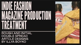
This document provides design treatments and initial concepts for a fashion magazine. It includes:
- Selection of a blue, yellow, and red color palette to represent rawness and genuineness.
- Hand-drawn assets created in Illustrator using the pen tool. Fonts selected are sans-serif for familiarity and readability.
- Text boxes adjusted in Illustrator to flow around pictures and text on pages. Photographs edited in Photoshop with a halftone effect.
- A decision to feature an article on organic tie-dye techniques after evaluating designs, as it allows for creative illustration and engages the target audience of young, environmentally-conscious fashion enthusiasts.
3. I have chosen two main topics that I want to write
about in the first issue of my magazine, whuch are fol-
lowing: “Interview with a young fashion designer” and
“Organic tie-dye”.
They were chosen by me due to them being interesting
to my target audience, and due to my magazine being
fashion-oriented.
10. 13 14
TAK
E
S
L
E
S
S
T
H
A
N
A
N
H
O
UR
INGRED-
IENTS:
STEP
1:
THREE
TEA-SPOONS
OF TURMERIC
TWO
BEET-
ROOTS
TWO
JARS
ONE T-
SHIRT
Unlike regular resist-dyeing tech-
niques, tie-dye is characterized by
the use of bright, saturated primary
colors and bold patterns. These pat-
terns, including the spiral, mandala,
and peace sign, and the use of multi-
ple bold colors, have become cli-
chŽd since the peak popularity of
tie-dye in the 1960s and 1970s.
STEP
2: Most tie-dyes are now
dyed with Procion MX
fiber reactive dyes, a
class of dyes effective
on cellulose fibers
such as cotton, hemp,
rayon, and linen. This
class of dyes reacts
with fibers at alkaline
(high) pH, forming a
wash-fast, permanent.
bond. Soda ash (sodi-
um carbonate) is the
most common one.
STEP
3: Discharge
agents are used
to bleach color
from the previ-
ously-dyed fab-
rics, and can be
used as a re-
verse tie-dye,
where applica-
tion of the agent
results in loss of
color rather than
its application.
Household
bleach (sodium
hypochlorite)
can be used to
discharge fiber
reactive dyes on
bleach-resistant
fibers such as
cotton or hemp
(but not on wool
or silk), though.
the results are
variable, as
some fiber reac-
tive dyes are
more resistant
to bleach than
others.
I have combined all
the created assets
in Adobe Illustrator
and in the next step
I will add pictures
and textures in
Adobe Photoshop.
11.
12. 15 16
GENERAL
INFO:
ORIGINA-
TES FROM
RUSSIA
MAKES
FOUR-
FIGURE
INCOME
OWNS
A BRAND
18 YR
OLD
TELL US A BIT
ABOUT YOURSELF
HOW DOES THE FUTURE
LOOK LIKE FOR YOU?
We try to have people accept the fact that
the work of the Maison Martin Margiela can
exist independently of what the designer
looks like-that our work is solely a proposi-
tion of wearing what it is we like to create, a
presentation of a way in which we see
things at a given moment. Martin Margiela
decided not to appear in the public eye for
that reason. He wants the light not to be on
him but on what really matters-the clothes,
the philosophy, the Maison, the team. And
now itÕ
s become the landmark of the
Maison. But what some consider a marketing strategy and
a sort of snobbism is more like a sacrifice: He could have
all eyes on him, and the glory and the fame. But instead he
decided to step away, to let the garments and the Maison
speak for him, for his love of what he does, and for the re-
spect he has for his team poage.What? Martin Margiela
looks like has, for us, little or nothing to do with this
translated and hyped by the press process.
Martin Margiela decided not to appear in the public eye
for that reason. He wants the light not to be on him but
on what really matters-the clothes, the philosophy, the
Maison, the team. And now itÕ
s become the landmark of
the Maison. But what some consider a marketing strat-
egy and a sort of snobbism is more like a sacrifice: He
could have all eyes on him, and the glory and the fame.
But instead he decided to step away, to let the gar-
ments and the Maison speak for him, for his love of
what he does, and for the respect he has for his team
poage.What? Martin Margiela looks like has, for us, little
or nothing to do with this translated and hyped by the
press process. We try to have people accept the fact
that the work of the Maison Martin Margiela can exist
independently of what the designer looks like-that our
workmatters-the clothes, the philosophy, the
Maison, the team.
I have combined
all the pre-made
assets and texts
for another dou-
ble-spread article
in the same style in
Adobe Illustrator
as well to see which
article will look
more appealing for
my target audience
after added pic-
tures and textures
in Photoshop.
13.
14. CONCLUSION
After completing my reference deck, I have chosen saturated blue, yellow and red as my
color palette because they are primary colors and represent rawness and genuineness of
the magazine I am creating. All the elements were created by myself using the Pen Tool
in Illustrator for the assets to look hand-done and genuine. Fonts I selected are timeless,
modern variations of the sans-serif Helvetica family to look familiar to my audience and be
easy-to-read. Text boxes that I created are not necessarily rectangular, because I added
different anchor points to adjust them to the flow of my magazine so that the text would
go around pictures and larger pieces of text, it is clearly shown on the page 15 of the
“Young designer interview”. Regarding pictures, I have chosen the most appropriate ones
for my articles of choice, then edited them in Photoshop and applied Halftone Color effect
to make it look more retro and hand-done, which my target audince really appreciates, ac-
cording to their social media profiles.
After looking at how my double page articles turned out, I needed to make a decision re-
garding which article I am going to make as m final one and I chose “ORGANIC TIE-DYE”
due to it having much more possibilities to creatively illustrate all the processes which take
place and it is more engaging with my young and crafty target audience, which, according
to the questionnaire, likes to customize their clothing and cares about the environment, so
no chemical dyes are going to be used.
P.S. - due to me being in constant research of different independent publications about
fashion, with each presentation, the overall style of my magazine was constantly changing
because of the new references every week. With the guidance of my teacher, I hace real-
ised, that it is time to settle down with one creative direction, so from here on now, the
guidelines outlined in this presentation regarding colors, structure and fonts are going to
be respected and all the work produced afterwards will be with the similar feel to ot.