3. STRUCTURE
Given the specifics of my article of choice,
which is a step-by-step guide to the process
of the natural tie-dye, there is not going to be
a conventional article per se, but rather step-
by-step instruction all over the double-spread.
The article will consist of: introduction, a list
of items needed to complete the craft and 5
steps in form of rather small, but detailed text
boxes, illustrated with my original pictures cho-
sen during the creation of a previous presenta-
tion. You wil be able to see the final article on
the next slide.
4. v
FINALARTICLE
INTRODUCTION INGREDIENTS STEP1 STEP2
Get in on the tie dye
trend while you’re at
home. Our junior edito-
rial Designer, Illya Boyko
, shares his tie dye rec-
ipe and pro tips. Please
note, we used beet and
turmeric because they
stain. Be careful of dye-
ing your clothes in a
bathtub or other easily
stained surfaces as they
will take on the color
of dye. We recommend
dyeing, rinsing, and dry-
ing your items outside,
in the grass on a sunny
day!
Three large beets;
Turmeric;
Water;
Knife;
Cooking Pot;
2 jars;
Sieve;
Any garment;
Zip lock bags;
Syringe;
Rubber bands.
Chop the beets into
square pieces. Place the
beets in a pot and cov-
er with enough water to
cover the beets. Bring
to a boil temperature
then reduce heat, sim-
mer up untill the beets
have turned a lighter
shade of red and are
easily pierced with a
fork. Once that is done,
bring four cups of water
to a boil and add four
tablespoons of turmer-
ic. Simmer for five min-
utes and then let cool
until it is room tempera-
ture.
Place a sieve on top of
a jar and pour the beet
slurry into the strain-
er. Press down on the
beets to extract as
much liquid as possible.
You could get rid of the
beet chunks afterwards,
or use them for another
purpose for the sustain-
ability purposes. Repeat
the same process with
the turmeric dye. Keep
in mind that the final re-
sult of this step has to
be two different jars
with two different dyes,
dont forget to separate
those!
5. FINALARTICLE
STEP3 STEP4 STEP5
Take your garment, (in our case it is a
long sleeve t-shirt) and go crazy with it!
Fold it, roll it and squeeze it, do whatev-
er your heart desires. Now don’t forget
to secure it by putting rubber bands all
over the piece, so it will keep the shape
during the dyeing. It is needed for cre-
ating unique patterns on your shirt due
to dye mixing with each other randomly
in those folded edges and rolled parts.
After that’s done, pull up your jars with
dyes in them and fill the syringes(no nee-
dles needed) with dye and try to cover
the entire garment with dye, leaving no
blank spaces to truly get the most satu-
rated effect possible. Dont forget to ro-
tate your shirt and make sure that dye is
truly covering every part of it.
After making sure that your
garment is fully covered in
dye al that left to do is to to
put it in a zip lock bag and
leave it outside overnight to
let the dye soak so it is not
going to wash out after the
first wash. Please, make sure
that if you have two or more
dyed garments you put them
in different bags so that the
dyes won’t mix and each gar-
ment will turn out exactly
how you imagined it to.
Here comes the final and
most satisfying part! Take
your piece out of a zip-lock
bag, rinse it off with cold wa-
ter, so the dye won’t stain
your body when you put it on,
cut the rubber bands and un-
fold the tee. All that is left to
do is to wait for the garment
to dry and take some pic-
tures of it to share with your
friends! We hope that you
found that guide useful and
enjoyed producing your own
custom pieces form 100% or-
ganic materials.
7. I have created a blank file in both
Adobe Illustrator and Photoshop in
CMYK, 300 dpi, so that it would be
legible for printing in future, as those
are industry standarts. Size was set
to 8.5 by 11 inches, as my research
showed it is the most common maga-
zine format.
Then I have created the colorscheme
squares, from which I will pick appro-
priate colors for different elements
of the front cover and outlined the
two main sans-serif fonts which I am
going to be using during the process
of creation of my final front cover. I
chose them because they are consid-
ered a classic and will be familiar to
my target audience and they pair well
together because of the contrast of
weights between them.
8. After that, I have put the final pic-
ture in Photoshop and created a grid
and bleed marks so all the content
would be layed out perfectly and ac-
cording to standarts.
Then, using the Replace Sky feature
I changed the original sky to a more
bright and sunny one, since I think it
would be more eye-catching to the
audience and matches the feel of the
magazine better.
9. I have noticed that there were some
people in the background, so i decid-
ed to get rid of them so they would
not complicate the background by
using the Content-Aware Fill fea-
ture.
I was feeling that the front cover
needed some whitespace to breathe
and become less busy, so i cropped
and scaled down the main image
therefore creating a little border
around the picture. I also put a mast-
head, that I created beforehand in
the top left corner, which is also con-
sidered an editorial design conven-
tion for front covers.
10. I also added number of the issue and
the date when it was published above
the masthead to inform my readers.
As a divider between them I added a
little yellow smiley face, as my mag-
azine is intended to have more of a
positive feel to it and I think that
attention to details is important in
such a field as editorial design is,
even if the reader will not necessarily
notice it.
Then I added the title of an article,
which research shows is the most
interesting to viewers and a quote
from the article itself to interest
them further to buy the issue. Every
first letter of the title is colored dif-
ferently form the rest of the text to
give the cover some color pop and I
am planning to use it as much as pos-
sible to make it an identifiable fea-
ture of the magazine. The brackets
are from a different, round font and
of different color to make it seem
more visually interesting.
11. After that, to make the text in the
plug more interesting, I used a Flag
Warp feature in Illustrator set to
11%, and also colored the number
blue because of the reasons stated
earlier.
Then, I took that warped text into
Photoshop and placed it inside a
shape, that I created using polygon
tool in phtoshop, set the polygon to
have 13 sides, set Star Ratio to 80
and rounded the corners for it to
be smooth and friendly to 33 pixels.
Then I simply added a 17 pixel outline
and put the warped text inside it,
and rotated it a tiny bit for it to have
some movement and direction.
12. Then I added the essential parts:
barcode and price tag. I put them
in the bottom left corner, since it is
where they usually are to be found in
other magazines.
On the previously blank space i the
top right corner you can now find
the also inside section, where poten-
tial buyers can find out more about
what else they are going to find in-
side the magzine, and will hopefully
get them to buy the isssue.
13. As a finishing step, I found some grain textures on the
internet, added them into my photoshop file and set
the blending mode of theirs to soft light, as it achieves
the best results from my experience. I added them to
make the magazine feel a bit more vintage and inde-
pendently-produced, since these are the desires of my
target audience.
14. The masthead is a hand-manipulated by me,
bold, display font. The original version of the
font is called “Eckmannpsych”. I chose it bea-
cuse it perfectly resonates with my taget au-
dience, who tend to be different from others
and extremely unique and original. It is set in a
saturated blue color, which will make it stand
out from other mastheads in the magazine ki-
osk, for example. It is bold, so it stands out well
from other elements. No shadows or bevels
were added to keep the magazine modern and
with down-to-earth, inclusive feel to it. It is
also set in a font that differs from every oth-
er on eon the cover, so it would be instantly
recognizable.
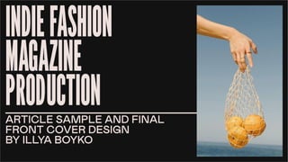
The main picture features a young fashion de-
signer photographed in a half-urban half-nat-
ural environment using natural lightng(sun),
so it communicates to the reader that fash-
ion belongs everywhere, no matter where you
are and that the magazine is genuine, honest,
bright and has a happy feel to it. The subject
himself will be appealing and relatable to my
target audience as he is young, interested in al-
ternative fashion and is dressed “trendy”. The
pose communicates that he is constantly in mo-
tion and will not stop in front of any troubles in
life, encouraging readers to do the same.
The plug is a feature of my magazine, that is
intentionally made bright and it stands out,
because it is intended ta catch audience’s at-
tention and make them instantly interested in
buying this issue. In this example, it says that
there is a guide to natural tie-dye inside, and
since the target audience likes to customize
their clothing, according to the questionnaire,
it will most likely interest them in purchasing
the magazine.
The main cover line is set in bright and inter-
esting color combination, stands out from the
image and is easilu readeble and also features
a quote from the promoted article to further
interest the audince in reading the interview. It
also correlates with the main image, so every-
thing is linked and stays coherent.
The language is quite neutral, so that it could
also attract the readers from outside of the
target audience.
The color scheme is rather limited, but that is
what will keep my magzine recognizable in a pile
of other print media products. All the colors
are saturated and are on the verge between
vintage(80s-90s) and modern, and that is ex-
actly what I was trying to achieve. The colors
pair well rogether because they are primary
and there is no way to miss using any combi-
nation of those. For the background I have
chosen plain white, so the company would not
waste money on the background colors print-
ing.
The barcode, price tag, issue number and date
are essential for any magazine, that is why they
are readable and easy to spot for the reader.