1. House Style –The house style consists of 3 colours which are red, black and white. The Guttenberg Design Principle – This double page spread does
These colours create an old style classic feel for the double page spread, with the red follow the design principle well because the image is on the left
on the American flag, it suggests power and passion and all this colours are used to hand side and naturally people will look there first, so they have
appeal to the target audience. The text in comparison with the images is really place the image in a good spot as it’s in the primary optical area,
insignificant, which shows that the designer focused massively in getting the then the audiences eyes will go to the right which is where the text
audience’s attention first and the image would be enough to appeal to the audience. is it so it makes it easy for the audience.
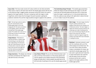
Text - The text type used are used to Main Image – The main image is the first
give off a representation of the thing the audience will look at, the
double page spread, as the main designers have done this by creating a use
image gives off, the same connotation of dominant contrast. The main image is a
as the typeface, which is the classic, singer from Florence and the machine, she
old style feel of the double page is wearing iconic style of clothing and as
spread. The smaller text is set out in a she is sat on the American flag this sets the
formal way of columns and the type theme of the article off. Also direct
of text used is formal. address to make the magazine target the
audience and make them more interested
Design Balance - The balance is in reading the article.
informal and there is a balance with
the text being on one side and the
main image being on the left hand Masthead - Dominant contrast is used
side, this is done because of the rule with the masthead, with use of the
of thirds which is that the audience white background and black text. The
look at the top left of the page first use of the colours black and white
and then look across downwards creates a connotation of a classic, old
naturally which is to the text. style feel for double page spread. The
text used is a girly text and it looks like
Design Symmetry – The design uses informal Use of Rule of Thirds–The use of rule of thirds has been used
it’s been hand wrote, this could link
symmetry and balances the image on one well, as the face of the women is in the primary optical area
with the type of music the artists
side with the text on the other. and this appeals to the audience because of the Guttenberg
produces and the text is used to
design principle which is where people naturedly look at the
appeal to the target audience of the
left hand side of anything (in this case the double page spread)
double page spread.