SlideShare a Scribd company logo
1 of 4
House Style                                                                                                                         Rule of Thirds
The contents page has a formal appearance                                                                                           The main or largest image on the page
due to the use of straight lines and text. The                                                                                      includes the use of rule of thirds. This is
use of font with a Times New Roman style for                                                                                        because the two subjects in the image can be
the word ‘Contents’ and clear straight text for                                                                                     clearly seen and recognised. If a grid was
other parts of the content also adds to the                                                                                         placed over the image the intersecting lines
formal appearance. This links to the masthead                                                                                       would all touch the artist in the middle making
which uses a formal ‘Q’ this links to attracting                                                                                    him the main focal point, however the extra
an older audience to the magazine. The red                                                                                          space around allows the second artist to be
links the content to the magazine Housestyle                                                                                        seen. The image appears to be at a
but it is also bright to attract attention to each                                                                                  professional standard do to the use of rule of
article. The green is not part of the usual                                                                                         thirds.
House style however it links to the plants and
grass used in the images.
                                                                                                                                    Imagery
                                                                                                                                    The bright colours fit in to the use of a white
                                                                                                                                    background and also make it prominent
Design Balance
                                                                                                                                    against the other darker images. This links to it
The page is not symmetrical however the page
                                                                                                                                    being the main feature in the magazine. The
is almost balanced because there are two images
                                                                                                                                    indication of warm weather by the lighting and
on each side. The difference is that the right
                                                                                                                                    clothing links to their genre of music which is
hand side uses smaller images to allow more
                                                                                                                                    more pop and light-hearted as opposed to rock
text. The regulars section does not contain any
                                                                                                                                    which would often use darker colours as in the
images at all and therefore less attention is
                                                                                                                                    image of the rolling stones. The use of black
drawn to this area. There is not a balance of
                                                                                                                                    and white also suggests they are an older band
colours in terms of the use of green. This may
                                                                                                                                    which again contrasts the image of Rizzle.
be because the more special features are linked
                                                                                                                                    Kicks
together.


Design Principal
The Page uses the Guttenberg design Principal. The evidence for this is that the image of Rizzle Kicks representing a major feature attracts the attention first due to it being
in the top left and people usually reading from the top left. The regulars section is in a weak area this is because they may be felt as less of an interest than the other
features, mainly for those who are reading the magazine for the first time and were attracted by the coverlines. The cover story is placed in a weaker fallow area due to the
front page already attracting the audience to the feature.

More Related Content

What's hot

Magazine contents pages analysis
Magazine contents pages analysisMagazine contents pages analysis
Magazine contents pages analysisHannahASmedia
 
Magazine cover analysis_worksheet rolling stone
Magazine cover analysis_worksheet rolling stoneMagazine cover analysis_worksheet rolling stone
Magazine cover analysis_worksheet rolling stonekruane95
 
Mix mag double page spread analysis
Mix mag double page spread analysisMix mag double page spread analysis
Mix mag double page spread analysiskruane95
 
Media Studies - Product Analysis
Media Studies - Product AnalysisMedia Studies - Product Analysis
Media Studies - Product AnalysisThomas Hesselberg
 
Analysing music magazines
Analysing music magazinesAnalysing music magazines
Analysing music magazineshobleycar
 
Cheryl Cole Anaylsis
Cheryl Cole AnaylsisCheryl Cole Anaylsis
Cheryl Cole AnaylsisJack Bocock
 
Double page spread
Double page spreadDouble page spread
Double page spreadHarryGoodwin
 
Final analysis
Final analysisFinal analysis
Final analysisluketanner
 
Lily allen double page spread
Lily allen double page spreadLily allen double page spread
Lily allen double page spreaddomhayes03
 
Contents Page Analysis
Contents Page AnalysisContents Page Analysis
Contents Page AnalysisBarney1995
 
Final analysis
Final analysisFinal analysis
Final analysisluketanner
 
Semiotic destruction of music magazine covers
Semiotic destruction of music magazine coversSemiotic destruction of music magazine covers
Semiotic destruction of music magazine coversShelby
 
Analysing contents pages
Analysing  contents pages Analysing  contents pages
Analysing contents pages asmediae12
 
Analysis of 3 music magazines
Analysis of 3 music magazinesAnalysis of 3 music magazines
Analysis of 3 music magazinesrayJMA
 
Double page spread analysis
Double page spread analysisDouble page spread analysis
Double page spread analysislydiaplatts
 
Magazine Cover Analysis
Magazine Cover AnalysisMagazine Cover Analysis
Magazine Cover Analysisemilygrimshaw
 
Double page spread analysis
Double page spread analysisDouble page spread analysis
Double page spread analysisLouis1995
 
Analysing articles dizzee mag ppt
Analysing articles dizzee mag pptAnalysing articles dizzee mag ppt
Analysing articles dizzee mag pptasmediac12
 

What's hot (20)

Magazine contents pages analysis
Magazine contents pages analysisMagazine contents pages analysis
Magazine contents pages analysis
 
Magazine cover analysis_worksheet rolling stone
Magazine cover analysis_worksheet rolling stoneMagazine cover analysis_worksheet rolling stone
Magazine cover analysis_worksheet rolling stone
 
Mix mag double page spread analysis
Mix mag double page spread analysisMix mag double page spread analysis
Mix mag double page spread analysis
 
Media Studies - Product Analysis
Media Studies - Product AnalysisMedia Studies - Product Analysis
Media Studies - Product Analysis
 
Dps upload to blog
Dps   upload to blogDps   upload to blog
Dps upload to blog
 
Analysing music magazines
Analysing music magazinesAnalysing music magazines
Analysing music magazines
 
Cheryl Cole Anaylsis
Cheryl Cole AnaylsisCheryl Cole Anaylsis
Cheryl Cole Anaylsis
 
Double page spread
Double page spreadDouble page spread
Double page spread
 
Final analysis
Final analysisFinal analysis
Final analysis
 
Lily allen double page spread
Lily allen double page spreadLily allen double page spread
Lily allen double page spread
 
Contents Page Analysis
Contents Page AnalysisContents Page Analysis
Contents Page Analysis
 
Final analysis
Final analysisFinal analysis
Final analysis
 
Semiotic destruction of music magazine covers
Semiotic destruction of music magazine coversSemiotic destruction of music magazine covers
Semiotic destruction of music magazine covers
 
Analysing contents pages
Analysing  contents pages Analysing  contents pages
Analysing contents pages
 
Analysis of 3 music magazines
Analysis of 3 music magazinesAnalysis of 3 music magazines
Analysis of 3 music magazines
 
Double page spread analysis
Double page spread analysisDouble page spread analysis
Double page spread analysis
 
Magazine Cover Analysis
Magazine Cover AnalysisMagazine Cover Analysis
Magazine Cover Analysis
 
Question 72
Question 72Question 72
Question 72
 
Double page spread analysis
Double page spread analysisDouble page spread analysis
Double page spread analysis
 
Analysing articles dizzee mag ppt
Analysing articles dizzee mag pptAnalysing articles dizzee mag ppt
Analysing articles dizzee mag ppt
 

Viewers also liked

Magazine cover analysis_worksheet nme
Magazine cover analysis_worksheet nmeMagazine cover analysis_worksheet nme
Magazine cover analysis_worksheet nmekruane95
 
Question 2 evaluation
Question 2 evaluationQuestion 2 evaluation
Question 2 evaluationkruane95
 
Magazine cover analysis_worksheet
Magazine cover analysis_worksheetMagazine cover analysis_worksheet
Magazine cover analysis_worksheetkruane95
 
Question 5 evaluation
Question 5 evaluationQuestion 5 evaluation
Question 5 evaluationkruane95
 
Contents page comparison
Contents page comparisonContents page comparison
Contents page comparisonkruane95
 
Image manipulation
Image manipulationImage manipulation
Image manipulationkruane95
 
Image contact sheet
Image contact sheetImage contact sheet
Image contact sheetkruane95
 
Music magazine research (questionaire)
Music magazine research (questionaire)Music magazine research (questionaire)
Music magazine research (questionaire)kruane95
 
Band image analysis
Band image analysisBand image analysis
Band image analysiskruane95
 
Music magazine market research
Music magazine market researchMusic magazine market research
Music magazine market researchkruane95
 

Viewers also liked (13)

Magazine cover analysis_worksheet nme
Magazine cover analysis_worksheet nmeMagazine cover analysis_worksheet nme
Magazine cover analysis_worksheet nme
 
Question 2 evaluation
Question 2 evaluationQuestion 2 evaluation
Question 2 evaluation
 
Magazine cover analysis_worksheet
Magazine cover analysis_worksheetMagazine cover analysis_worksheet
Magazine cover analysis_worksheet
 
Question 7
Question 7Question 7
Question 7
 
Question 5 evaluation
Question 5 evaluationQuestion 5 evaluation
Question 5 evaluation
 
Contents page comparison
Contents page comparisonContents page comparison
Contents page comparison
 
Question 5
Question 5Question 5
Question 5
 
Image manipulation
Image manipulationImage manipulation
Image manipulation
 
Image manipulation
Image manipulationImage manipulation
Image manipulation
 
Image contact sheet
Image contact sheetImage contact sheet
Image contact sheet
 
Music magazine research (questionaire)
Music magazine research (questionaire)Music magazine research (questionaire)
Music magazine research (questionaire)
 
Band image analysis
Band image analysisBand image analysis
Band image analysis
 
Music magazine market research
Music magazine market researchMusic magazine market research
Music magazine market research
 

Similar to Q contents page

Mix mag double page spread analysis
Mix mag double page spread analysisMix mag double page spread analysis
Mix mag double page spread analysiskruane95
 
Double page spread nm and lg
Double page spread   nm and lgDouble page spread   nm and lg
Double page spread nm and lgAlixKelly
 
Magazine contents analysis worksheet nme
Magazine contents analysis worksheet  nmeMagazine contents analysis worksheet  nme
Magazine contents analysis worksheet nmeadamtimms22
 
Mix mag double page spread analysis
Mix mag double page spread analysisMix mag double page spread analysis
Mix mag double page spread analysiskruane95
 
Mix mag double page spread analysis
Mix mag double page spread analysisMix mag double page spread analysis
Mix mag double page spread analysiskruane95
 
Nme contents page analysis
Nme contents page analysisNme contents page analysis
Nme contents page analysiscat663
 
Mix mag contents
Mix mag contentsMix mag contents
Mix mag contentsEddie Guy
 
Analysing Magazine Contents Pages
Analysing Magazine Contents PagesAnalysing Magazine Contents Pages
Analysing Magazine Contents PagesMattHartup
 
Double page spread analysis
Double page spread analysisDouble page spread analysis
Double page spread analysisbethwatson95
 
Conventions of a double page spread
Conventions of a double page spreadConventions of a double page spread
Conventions of a double page spreadLaura-G
 
Double page 1.docx 11
Double page 1.docx  11Double page 1.docx  11
Double page 1.docx 11shaunahughes
 
Magazine cover analysis_worksheet nme
Magazine cover analysis_worksheet nmeMagazine cover analysis_worksheet nme
Magazine cover analysis_worksheet nmekruane95
 
Evaluation question 1
Evaluation  question 1Evaluation  question 1
Evaluation question 1ChloeHicks
 
Music double spreads
Music double spreadsMusic double spreads
Music double spreadsDragonium
 
Evaluation of my media productfin
Evaluation of my media productfinEvaluation of my media productfin
Evaluation of my media productfinOS1793
 
Contents page analysis
Contents page analysisContents page analysis
Contents page analysissallymcmanus
 

Similar to Q contents page (20)

Mix mag double page spread analysis
Mix mag double page spread analysisMix mag double page spread analysis
Mix mag double page spread analysis
 
Double page spread nm and lg
Double page spread   nm and lgDouble page spread   nm and lg
Double page spread nm and lg
 
Magazine contents analysis worksheet nme
Magazine contents analysis worksheet  nmeMagazine contents analysis worksheet  nme
Magazine contents analysis worksheet nme
 
Mix mag double page spread analysis
Mix mag double page spread analysisMix mag double page spread analysis
Mix mag double page spread analysis
 
Mix mag double page spread analysis
Mix mag double page spread analysisMix mag double page spread analysis
Mix mag double page spread analysis
 
Nme contents page analysis
Nme contents page analysisNme contents page analysis
Nme contents page analysis
 
Mix mag contents
Mix mag contentsMix mag contents
Mix mag contents
 
Analysing Magazine Contents Pages
Analysing Magazine Contents PagesAnalysing Magazine Contents Pages
Analysing Magazine Contents Pages
 
Double page spread analysis
Double page spread analysisDouble page spread analysis
Double page spread analysis
 
Analysis of magazine covers
Analysis of magazine coversAnalysis of magazine covers
Analysis of magazine covers
 
Conventions of a double page spread
Conventions of a double page spreadConventions of a double page spread
Conventions of a double page spread
 
Double page 1.docx 11
Double page 1.docx  11Double page 1.docx  11
Double page 1.docx 11
 
Magazine cover analysis_worksheet nme
Magazine cover analysis_worksheet nmeMagazine cover analysis_worksheet nme
Magazine cover analysis_worksheet nme
 
Evaluation question 1
Evaluation  question 1Evaluation  question 1
Evaluation question 1
 
Music double spreads
Music double spreadsMusic double spreads
Music double spreads
 
Evaluation of my media productfin
Evaluation of my media productfinEvaluation of my media productfin
Evaluation of my media productfin
 
Task 3
Task 3Task 3
Task 3
 
3
33
3
 
Contents page analysis
Contents page analysisContents page analysis
Contents page analysis
 
Double page 1
Double page 1Double page 1
Double page 1
 

More from kruane95

A2 Advanced Portfolio Production Diary 2013-2014
A2 Advanced Portfolio Production Diary 2013-2014A2 Advanced Portfolio Production Diary 2013-2014
A2 Advanced Portfolio Production Diary 2013-2014kruane95
 
The Woman in Black Poster Analysis
The Woman in Black Poster AnalysisThe Woman in Black Poster Analysis
The Woman in Black Poster Analysiskruane95
 
Question 3
Question 3Question 3
Question 3kruane95
 
Evaluation Question 1
Evaluation Question 1Evaluation Question 1
Evaluation Question 1kruane95
 
Short film Focus Group
Short film Focus GroupShort film Focus Group
Short film Focus Groupkruane95
 
Short Film Questionnaire Analysis
Short Film Questionnaire AnalysisShort Film Questionnaire Analysis
Short Film Questionnaire Analysiskruane95
 
Written summary of ideas generation
Written summary of ideas generationWritten summary of ideas generation
Written summary of ideas generationkruane95
 
Story boards
Story boardsStory boards
Story boardskruane95
 
The masterpiece script
The masterpiece scriptThe masterpiece script
The masterpiece scriptkruane95
 
Film review analysis the kite runner
Film review analysis  the kite runnerFilm review analysis  the kite runner
Film review analysis the kite runnerkruane95
 
Film review analysis no strings attached & the rite
Film review analysis  no strings attached & the riteFilm review analysis  no strings attached & the rite
Film review analysis no strings attached & the ritekruane95
 
Film review analysis public enemies
Film review analysis  public enemiesFilm review analysis  public enemies
Film review analysis public enemieskruane95
 
The artist
The artistThe artist
The artistkruane95
 
Jack the giant slayer
Jack the giant slayerJack the giant slayer
Jack the giant slayerkruane95
 
The woman in black
The woman in blackThe woman in black
The woman in blackkruane95
 
Question 2 evaluation
Question 2 evaluationQuestion 2 evaluation
Question 2 evaluationkruane95
 

More from kruane95 (20)

A2 Advanced Portfolio Production Diary 2013-2014
A2 Advanced Portfolio Production Diary 2013-2014A2 Advanced Portfolio Production Diary 2013-2014
A2 Advanced Portfolio Production Diary 2013-2014
 
The Woman in Black Poster Analysis
The Woman in Black Poster AnalysisThe Woman in Black Poster Analysis
The Woman in Black Poster Analysis
 
Question 3
Question 3Question 3
Question 3
 
Evaluation Question 1
Evaluation Question 1Evaluation Question 1
Evaluation Question 1
 
Short film Focus Group
Short film Focus GroupShort film Focus Group
Short film Focus Group
 
Short Film Questionnaire Analysis
Short Film Questionnaire AnalysisShort Film Questionnaire Analysis
Short Film Questionnaire Analysis
 
Written summary of ideas generation
Written summary of ideas generationWritten summary of ideas generation
Written summary of ideas generation
 
Story boards
Story boardsStory boards
Story boards
 
The masterpiece script
The masterpiece scriptThe masterpiece script
The masterpiece script
 
Film review analysis the kite runner
Film review analysis  the kite runnerFilm review analysis  the kite runner
Film review analysis the kite runner
 
Film review analysis no strings attached & the rite
Film review analysis  no strings attached & the riteFilm review analysis  no strings attached & the rite
Film review analysis no strings attached & the rite
 
Film review analysis public enemies
Film review analysis  public enemiesFilm review analysis  public enemies
Film review analysis public enemies
 
The artist
The artistThe artist
The artist
 
Jack the giant slayer
Jack the giant slayerJack the giant slayer
Jack the giant slayer
 
The woman in black
The woman in blackThe woman in black
The woman in black
 
Question 2 evaluation
Question 2 evaluationQuestion 2 evaluation
Question 2 evaluation
 
Mix mag
Mix magMix mag
Mix mag
 
Mix mag
Mix magMix mag
Mix mag
 
Mix mag
Mix magMix mag
Mix mag
 
Mix mag
Mix magMix mag
Mix mag
 

Q contents page

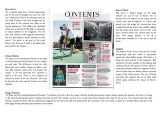
  • 1. House Style Rule of Thirds The contents page has a formal appearance The main or largest image on the page due to the use of straight lines and text. The includes the use of rule of thirds. This is use of font with a Times New Roman style for because the two subjects in the image can be the word ‘Contents’ and clear straight text for clearly seen and recognised. If a grid was other parts of the content also adds to the placed over the image the intersecting lines formal appearance. This links to the masthead would all touch the artist in the middle making which uses a formal ‘Q’ this links to attracting him the main focal point, however the extra an older audience to the magazine. The red space around allows the second artist to be links the content to the magazine Housestyle seen. The image appears to be at a but it is also bright to attract attention to each professional standard do to the use of rule of article. The green is not part of the usual thirds. House style however it links to the plants and grass used in the images. Imagery The bright colours fit in to the use of a white background and also make it prominent Design Balance against the other darker images. This links to it The page is not symmetrical however the page being the main feature in the magazine. The is almost balanced because there are two images indication of warm weather by the lighting and on each side. The difference is that the right clothing links to their genre of music which is hand side uses smaller images to allow more more pop and light-hearted as opposed to rock text. The regulars section does not contain any which would often use darker colours as in the images at all and therefore less attention is image of the rolling stones. The use of black drawn to this area. There is not a balance of and white also suggests they are an older band colours in terms of the use of green. This may which again contrasts the image of Rizzle. be because the more special features are linked Kicks together. Design Principal The Page uses the Guttenberg design Principal. The evidence for this is that the image of Rizzle Kicks representing a major feature attracts the attention first due to it being in the top left and people usually reading from the top left. The regulars section is in a weak area this is because they may be felt as less of an interest than the other features, mainly for those who are reading the magazine for the first time and were attracted by the coverlines. The cover story is placed in a weaker fallow area due to the front page already attracting the audience to the feature.
  • 2. House Style Rule of Thirds The contents page has a formal appearance The main or largest image on the page due to the use of straight lines and text. The includes the use of rule of thirds. This is use of font with a Times New Roman style for because the two subjects in the image can be the word ‘Contents’ and clear straight text for clearly seen and recognised. If a grid was other parts of the content also adds to the placed over the image the intersecting lines formal appearance. This links to the masthead would all touch the artist in the middle making which uses a formal ‘Q’ this links to attracting him the main focal point, however the extra an older audience to the magazine. The red space around allows the second artist to be links the content to the magazine Housestyle seen. The image appears to be at a but it is also bright to attract attention to each professional standard do to the use of rule of article. The green is not part of the usual thirds. House style however it links to the plants and grass used in the images. Imagery The bright colours fit in to the use of a white background and also make it prominent Design Balance against the other darker images. This links to it The page is not symmetrical however the page being the main feature in the magazine. The is almost balanced because there are two images indication of warm weather by the lighting and on each side. The difference is that the right clothing links to their genre of music which is hand side uses smaller images to allow more more pop and light-hearted as opposed to rock text. The regulars section does not contain any which would often use darker colours as in the images at all and therefore less attention is image of the rolling stones. The use of black drawn to this area. There is not a balance of and white also suggests they are an older band colours in terms of the use of green. This may which again contrasts the image of Rizzle. be because the more special features are linked Kicks together. Design Principal The Page uses the Guttenberg design Principal. The evidence for this is that the image of Rizzle Kicks representing a major feature attracts the attention first due to it being in the top left and people usually reading from the top left. The regulars section is in a weak area this is because they may be felt as less of an interest than the other features, mainly for those who are reading the magazine for the first time and were attracted by the coverlines. The cover story is placed in a weaker fallow area due to the front page already attracting the audience to the feature.
  • 3. House Style Rule of Thirds The contents page has a formal appearance The main or largest image on the page due to the use of straight lines and text. The includes the use of rule of thirds. This is use of font with a Times New Roman style for because the two subjects in the image can be the word ‘Contents’ and clear straight text for clearly seen and recognised. If a grid was other parts of the content also adds to the placed over the image the intersecting lines formal appearance. This links to the masthead would all touch the artist in the middle making which uses a formal ‘Q’ this links to attracting him the main focal point, however the extra an older audience to the magazine. The red space around allows the second artist to be links the content to the magazine Housestyle seen. The image appears to be at a but it is also bright to attract attention to each professional standard do to the use of rule of article. The green is not part of the usual thirds. House style however it links to the plants and grass used in the images. Imagery The bright colours fit in to the use of a white background and also make it prominent Design Balance against the other darker images. This links to it The page is not symmetrical however the page being the main feature in the magazine. The is almost balanced because there are two images indication of warm weather by the lighting and on each side. The difference is that the right clothing links to their genre of music which is hand side uses smaller images to allow more more pop and light-hearted as opposed to rock text. The regulars section does not contain any which would often use darker colours as in the images at all and therefore less attention is image of the rolling stones. The use of black drawn to this area. There is not a balance of and white also suggests they are an older band colours in terms of the use of green. This may which again contrasts the image of Rizzle. be because the more special features are linked Kicks together. Design Principal The Page uses the Guttenberg design Principal. The evidence for this is that the image of Rizzle Kicks representing a major feature attracts the attention first due to it being in the top left and people usually reading from the top left. The regulars section is in a weak area this is because they may be felt as less of an interest than the other features, mainly for those who are reading the magazine for the first time and were attracted by the coverlines. The cover story is placed in a weaker fallow area due to the front page already attracting the audience to the feature.
  • 4. House Style Rule of Thirds The contents page has a formal appearance The main or largest image on the page due to the use of straight lines and text. The includes the use of rule of thirds. This is use of font with a Times New Roman style for because the two subjects in the image can be the word ‘Contents’ and clear straight text for clearly seen and recognised. If a grid was other parts of the content also adds to the placed over the image the intersecting lines formal appearance. This links to the masthead would all touch the artist in the middle making which uses a formal ‘Q’ this links to attracting him the main focal point, however the extra an older audience to the magazine. The red space around allows the second artist to be links the content to the magazine Housestyle seen. The image appears to be at a but it is also bright to attract attention to each professional standard do to the use of rule of article. The green is not part of the usual thirds. House style however it links to the plants and grass used in the images. Imagery The bright colours fit in to the use of a white background and also make it prominent Design Balance against the other darker images. This links to it The page is not symmetrical however the page being the main feature in the magazine. The is almost balanced because there are two images indication of warm weather by the lighting and on each side. The difference is that the right clothing links to their genre of music which is hand side uses smaller images to allow more more pop and light-hearted as opposed to rock text. The regulars section does not contain any which would often use darker colours as in the images at all and therefore less attention is image of the rolling stones. The use of black drawn to this area. There is not a balance of and white also suggests they are an older band colours in terms of the use of green. This may which again contrasts the image of Rizzle. be because the more special features are linked Kicks together. Design Principal The Page uses the Guttenberg design Principal. The evidence for this is that the image of Rizzle Kicks representing a major feature attracts the attention first due to it being in the top left and people usually reading from the top left. The regulars section is in a weak area this is because they may be felt as less of an interest than the other features, mainly for those who are reading the magazine for the first time and were attracted by the coverlines. The cover story is placed in a weaker fallow area due to the front page already attracting the audience to the feature.