Tech Startup Growth Hacking 101 - Basics on Growth Marketing
Media 14
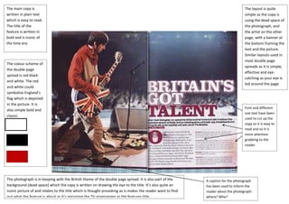
1. The main copy is The layout is quite
written in plain text simple as the copy is
which is easy to read. using the dead space of
The title of the the photograph, and
feature is written in the artist on the other
bold and is iconic of page, with a banner at
the time era. the bottom framing the
text and the picture.
Similar layouts used in
most double page
The colour scheme of
spreads as it Is simple,
the double page
effective and eye-
spread is red black
catching as your eye is
and white. The red
led around the page.
and white could
symbolise England’s
flag which is depicted
in the picture. It is
Font and different
also simple bold and
size text have been
classic.
used to cut up the
copy so it is easy to
read and so it is
more attention
grabbing to the
reader.
The photograph is in keeping with the British theme of the double page spread. It is also part of the A caption for the photograph
background (dead space) which the copy is written on drawing the eye to the title. It’s also quite an has been used to inform the
iconic picture of and relates to the title which is thought provoking as is makes the reader want to find reader about the photograph:
out what the feature is about as it’s mirroring the TV programme as the features title. where? Who?