Boost the utilization of your HCL environment by reevaluating use cases and f...
Double page spread analysis
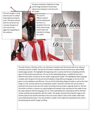
1. The grey masthead is faded but as large
as the image situated in the primary
optical area making it a main focus for
the reader.
The main image is a long
shot focused. It’s edited The use of a
clearly glamourizing the different style of
artist. The black contrast text formatting and
with the red of her hair the fact it’s a
connotes the genre of quotation from one
rock and roll and of the artists songs
aggression appealing to is both witty and
the audience. intended to intrigue
the reader.
The style of text is informal as this is an interview it complies with the format style of an informal
interview common to NME. The fact the first letter is bolded common to the house style of NME
double page spreads. This highlights the beginning and is a quirky text format complying with the
genre of informality and quirkiness. The use of the subheading being in a bolded format and a
different text makes it stand out to the reader intriguing the reader. The highlighted taboo language
complies with the genre of rock and roll and rebellion using offensive language as the aim of this
genre is to be rebellious and offensive. The use of the Guttenberg design principle is used as the main
image is in the primary optical area drawing the reader’s attention and then the actual article is
featured in the area of axis were the reader according to the principle is logically drawn to. The fact
the article is written in columns on a grey background making it clear and easy for the reader to see.
By using colloquial informal language such as in the subheading she’s attacking herself on the floor
creates synthetic personalization with the reader. The design symmetry focusing the image to the
primary optical area and the interview in the area of axis makes it clear to the reader rather than
overcomplicating the layout. The rule of thirds is visible in the image shot showing that the artist is
focused properly and the image is striking.
2. http://www.mydigitalpublication.com/publication/?i=97167
In contrast to NME RNB features there article in the primary optical area. It then focuses the image
in the area of axis, in compliance with the Gutenberg design principle.In contrast withNME RNB
magazine use a small left corner title showing the contents of the article new voices our favourite
involving the audience whilst being shown in the primary optical area. The masthead is bright in
colour and uses a hand writing style font creating informality. However in contrast to NME their
mastheads are always the artist’s name. More over the lighting of the photograph shows editing
clearly and makes the image stand out in the area of axis. The fashion style connotes the genre very
jazz chique and with the use of an object (the instrument) this demonstrates the musical aspect of
the new voice. In contrast to NME the main image Is not looking directly at the camera connoting
the Rhythm and Blues style of very introverted. Similarly to NME the interview technique is very
informal almost casual in style connoting again the relaxed style of the musical genre. The use of
casual rhetoric in the opening tag question “am I pronouncing it correctl ?” shows the casual nature
of the interview informal and relaxed. Although it is generally formal lexis there are some colloquial
lexis used such as “Why u Raggin?” creating synthetic personalization. Although differentially to
NME the interview conducted reads more as a two way conversation in contrast to the NME
interview which comes across as it’s addressing the audience. The design balanced in comparison to
NME ( who appear to comply more spatially with the Gutenberg design principle) RNB seem to
centralize the format. The symmetry of RNB magazine is even between the two pages centralized.
The rule of thirds complies clearly in this photograph as both the instrument and main focus (the
artist) are in the intersecting lines.
In conclusion both magazines present their layouts and texts in different formats with similar
formality styles with the acception of lexical choices.Therefore for my magazine I will be using the
image style of RNB magazine whilst using the informal colloquial language choices and layout of
NME.