SlideShare a Scribd company logo
1 of 1
Salford City College
Eccles Centre
AS Media Studies
Foundation Portfolio

 Masthead                                                Comment on how the design of the magazine cover attracts the target audience:                        Colour
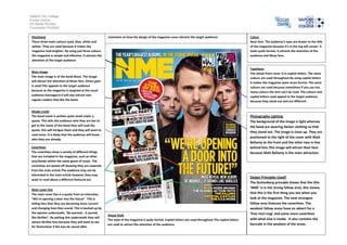
 There three main colours used, blue, white and                                                                                                               Neat font. The audience’s eyes are drawn to the title
 yellow. They are used because it makes the                                                                                                                   of the magazine because it's in the top left corner. It
 magazine look brighter. By using just three colours                                                                                                          looks quite formal. It attracts the attention of the
 the magazine is simple and effective. It attracts the                                                                                                        audience and Muse fans.
 attention of the target audience

                                                                                                                                                              Typefaces
 Main image                                                                                                                                                   The whole front cover is in capital letters. The same
 The main image is of the band Muse. The image                                                                                                                colours are used throughout.By using capital letters
 will attract the attention of Muse fans. Direct gaze                                                                                                         it makes the magazine seem more formal. The same
 is used.This appeals to the target audience                                                                                                                  colours are used because sometimes if you use too
 because as the magazine is targeted at the usual                                                                                                             many colours the text can't be read. The colours and
 audience (teenagers) it will also attract non-                                                                                                               capital letters used appeal to the target audience
 regular readers that like the band.                                                                                                                          because they stand out and are different.


 Model credit
 The band name is written quite small under a                                                                                                                 Photography Lighting
 quote. This tells the audience who they are but to                                                                                                           The background of the image is light whereas
 get to the name of the band they will read the                                                                                                               the band are wearing darker clothing so that
 quote, this will intrigue them and they will want to
                                                                                                                                                              they stand out. The image is close up. They are
 read more. It is likely that the audience will know
                                                                                                                                                              positioned to the right of the cover with Matt
 who they are already.
                                                                                                                                                              Bellamy at the front and the other two in line
 Coverlines                                                                                                                                                   behind him.This image will attract their fans
 The coverlines show a variety of different things                                                                                                            because Matt Bellamy is the main attraction.
 that are included in the magazine, such as other
 acts/bands within the same genre of music. The
 coverlines are boxed off showing they are separate
 from the main article.The audience may not be
 interested in the main article however they may
                                                                                                                                                              Design Principles Used?
 want to read about a different featured act.
                                                                                                                                                              The Guttenberg principle shows that the title
                                                                                                                                                              ‘NME’ is in the strong fallow area, this means
 Main cover line
 The main cover line is a quote from an interview,                                                                                                            that this is the first thing you see when you
 “We’re opening a door into the future”. This is                                                                                                              look at the magazine. The next strongest
 telling fans that they are becoming more current                                                                                                             fallow area features the coverlines. The
 and changing how they sound. This is backed up by                                                                                                            weakest fallow areas have an advert for a
 the opinion underneath, “Be warned… it sounds                                                                                                                ‘free mini mag’ and some more coverlines
                                                         House Style
 like Skrillex”. By putting this underneath they will                                                                                                         with what else is inside. It also contains the
                                                         The style of the magazine is quite formal. Capital letters are used throughout.The capital letters
 attract Skrillex fans because they will want to see
                                                         are used to attract the attention of the audience.                                                   barcode in the weakest of the areas.
 for themselves if the two do sound alike.

More Related Content

What's hot

Semiotic destruction of music magazine covers
Semiotic destruction of music magazine coversSemiotic destruction of music magazine covers
Semiotic destruction of music magazine coversShelby
 
Evaluation question one
Evaluation question oneEvaluation question one
Evaluation question onemynameisjarrod
 
Magazine contents page2
Magazine contents page2Magazine contents page2
Magazine contents page2UmaiyaKhawaja
 
Magazine cover research
Magazine cover research Magazine cover research
Magazine cover research Janet Lunkusé
 
Production log for my front cover
Production log for my  front cover Production log for my  front cover
Production log for my front cover twinklez
 
Magazine cover analysis Q Magazine
Magazine cover analysis Q MagazineMagazine cover analysis Q Magazine
Magazine cover analysis Q Magazinegemma-louise
 
Evaluation of my media product
Evaluation of my media productEvaluation of my media product
Evaluation of my media productsophieemarinaa
 
Codes of a music front cover
Codes of a music front coverCodes of a music front cover
Codes of a music front coverrhiannonbescoby
 
Evaluation of my media product
Evaluation of my media productEvaluation of my media product
Evaluation of my media productsophieemarinaa
 
Analysing contents pages prep for blog ppt
Analysing  contents pages prep for blog pptAnalysing  contents pages prep for blog ppt
Analysing contents pages prep for blog pptasmediag12
 
Market Research: Articles
Market Research: ArticlesMarket Research: Articles
Market Research: Articlesdannihoe
 
Conventions of a double page spread
Conventions of a double page spreadConventions of a double page spread
Conventions of a double page spreadLaura-G
 
Analysing Magazines
Analysing MagazinesAnalysing Magazines
Analysing MagazinesRay Anjum
 
Carve front cover, 16 1-12
Carve front cover, 16 1-12Carve front cover, 16 1-12
Carve front cover, 16 1-12rbeavis
 
Nme contents page analysis
Nme contents page analysisNme contents page analysis
Nme contents page analysiscat663
 
Media magazine - conventions
Media magazine - conventionsMedia magazine - conventions
Media magazine - conventionsMatt Halmshaw
 

What's hot (20)

Semiotic destruction of music magazine covers
Semiotic destruction of music magazine coversSemiotic destruction of music magazine covers
Semiotic destruction of music magazine covers
 
BRNC Evaluation
BRNC EvaluationBRNC Evaluation
BRNC Evaluation
 
Evaluation question one
Evaluation question oneEvaluation question one
Evaluation question one
 
Magazine contents page2
Magazine contents page2Magazine contents page2
Magazine contents page2
 
Magazine cover research
Magazine cover research Magazine cover research
Magazine cover research
 
Production log for my front cover
Production log for my  front cover Production log for my  front cover
Production log for my front cover
 
Magazine cover analysis Q Magazine
Magazine cover analysis Q MagazineMagazine cover analysis Q Magazine
Magazine cover analysis Q Magazine
 
Magazine anaysis2
Magazine anaysis2Magazine anaysis2
Magazine anaysis2
 
Evaluation of my media product
Evaluation of my media productEvaluation of my media product
Evaluation of my media product
 
Codes of a music front cover
Codes of a music front coverCodes of a music front cover
Codes of a music front cover
 
Vibe magazine
Vibe magazineVibe magazine
Vibe magazine
 
Evaluation of my media product
Evaluation of my media productEvaluation of my media product
Evaluation of my media product
 
Analysing contents pages prep for blog ppt
Analysing  contents pages prep for blog pptAnalysing  contents pages prep for blog ppt
Analysing contents pages prep for blog ppt
 
Market Research: Articles
Market Research: ArticlesMarket Research: Articles
Market Research: Articles
 
Conventions of a double page spread
Conventions of a double page spreadConventions of a double page spread
Conventions of a double page spread
 
LAJ Evaluation
LAJ EvaluationLAJ Evaluation
LAJ Evaluation
 
Analysing Magazines
Analysing MagazinesAnalysing Magazines
Analysing Magazines
 
Carve front cover, 16 1-12
Carve front cover, 16 1-12Carve front cover, 16 1-12
Carve front cover, 16 1-12
 
Nme contents page analysis
Nme contents page analysisNme contents page analysis
Nme contents page analysis
 
Media magazine - conventions
Media magazine - conventionsMedia magazine - conventions
Media magazine - conventions
 

Similar to Magazine cover analysis NME magazine

Magazine cover analysis_worksheet nme
Magazine cover analysis_worksheet nmeMagazine cover analysis_worksheet nme
Magazine cover analysis_worksheet nmekruane95
 
Magazine cover analysis_worksheet nme
Magazine cover analysis_worksheet nmeMagazine cover analysis_worksheet nme
Magazine cover analysis_worksheet nmekruane95
 
Media final evaluation
Media final evaluationMedia final evaluation
Media final evaluationFardowsa
 
Magazine cover analysis_worksheet rolling stone
Magazine cover analysis_worksheet rolling stoneMagazine cover analysis_worksheet rolling stone
Magazine cover analysis_worksheet rolling stonekruane95
 
Textual Analysis 1
Textual Analysis 1Textual Analysis 1
Textual Analysis 1mnoficzer
 
Magazine cover analysis q magazine
Magazine cover analysis  q magazineMagazine cover analysis  q magazine
Magazine cover analysis q magazineadamtimms22
 
Front Cover Research
Front Cover ResearchFront Cover Research
Front Cover Researchjessheap
 
Music Magazine Analysis
Music Magazine AnalysisMusic Magazine Analysis
Music Magazine Analysiskatiebutler1
 
Deconstruction of two music magazines
Deconstruction of two music magazinesDeconstruction of two music magazines
Deconstruction of two music magazinesozgealtinok
 
Evaluation
EvaluationEvaluation
Evaluationbenhope
 
Magazine Front Cover Analysis
Magazine Front Cover AnalysisMagazine Front Cover Analysis
Magazine Front Cover AnalysisLouis1995
 
Music magazine conventions
Music magazine conventionsMusic magazine conventions
Music magazine conventionsbhussain07
 
Magazine cover analysis_worksheet
Magazine cover analysis_worksheetMagazine cover analysis_worksheet
Magazine cover analysis_worksheetkruane95
 
Case studies and comparable products
Case studies and comparable productsCase studies and comparable products
Case studies and comparable productsameliaskill9
 
Evaluation question 1
Evaluation  question 1Evaluation  question 1
Evaluation question 1ChloeHicks
 

Similar to Magazine cover analysis NME magazine (20)

Magazine cover analysis_worksheet nme
Magazine cover analysis_worksheet nmeMagazine cover analysis_worksheet nme
Magazine cover analysis_worksheet nme
 
Magazine cover analysis_worksheet nme
Magazine cover analysis_worksheet nmeMagazine cover analysis_worksheet nme
Magazine cover analysis_worksheet nme
 
Magazine comparision
Magazine comparisionMagazine comparision
Magazine comparision
 
Media final evaluation
Media final evaluationMedia final evaluation
Media final evaluation
 
Magazine cover analysis_worksheet rolling stone
Magazine cover analysis_worksheet rolling stoneMagazine cover analysis_worksheet rolling stone
Magazine cover analysis_worksheet rolling stone
 
Textual Analysis 1
Textual Analysis 1Textual Analysis 1
Textual Analysis 1
 
Magazine cover analysis q magazine
Magazine cover analysis  q magazineMagazine cover analysis  q magazine
Magazine cover analysis q magazine
 
Front Cover Research
Front Cover ResearchFront Cover Research
Front Cover Research
 
Music Magazine Analysis
Music Magazine AnalysisMusic Magazine Analysis
Music Magazine Analysis
 
Magazine Analysis
Magazine AnalysisMagazine Analysis
Magazine Analysis
 
Deconstruction of two music magazines
Deconstruction of two music magazinesDeconstruction of two music magazines
Deconstruction of two music magazines
 
Evaluation Q5
Evaluation Q5Evaluation Q5
Evaluation Q5
 
Evaluation
EvaluationEvaluation
Evaluation
 
Magazine Front Cover Analysis
Magazine Front Cover AnalysisMagazine Front Cover Analysis
Magazine Front Cover Analysis
 
Media mags
Media magsMedia mags
Media mags
 
Music magazine conventions
Music magazine conventionsMusic magazine conventions
Music magazine conventions
 
Magazine cover analysis_worksheet
Magazine cover analysis_worksheetMagazine cover analysis_worksheet
Magazine cover analysis_worksheet
 
Case studies and comparable products
Case studies and comparable productsCase studies and comparable products
Case studies and comparable products
 
Evaluation question 1
Evaluation  question 1Evaluation  question 1
Evaluation question 1
 
Cover magazine
Cover magazineCover magazine
Cover magazine
 

More from gemma-louise

A2 advanced portfolio production diary template 2013 to 2014
A2 advanced portfolio production diary template 2013 to 2014A2 advanced portfolio production diary template 2013 to 2014
A2 advanced portfolio production diary template 2013 to 2014gemma-louise
 
What have you learned from your audience feedback
What have you learned from your audience feedbackWhat have you learned from your audience feedback
What have you learned from your audience feedbackgemma-louise
 
What have you learned from your audience feedback
What have you learned from your audience feedbackWhat have you learned from your audience feedback
What have you learned from your audience feedbackgemma-louise
 
Market research analysis
Market research analysisMarket research analysis
Market research analysisgemma-louise
 
"The Masterpiece" Script
"The Masterpiece" Script"The Masterpiece" Script
"The Masterpiece" Scriptgemma-louise
 
Written Summary of Ideas Generation
Written Summary of Ideas GenerationWritten Summary of Ideas Generation
Written Summary of Ideas Generationgemma-louise
 
Ancillary task film review analysis - lord of the rings the two towers
Ancillary task film review analysis - lord of the rings the two towersAncillary task film review analysis - lord of the rings the two towers
Ancillary task film review analysis - lord of the rings the two towersgemma-louise
 
Ancillary task film review analysis - Serenity
Ancillary task film review analysis - SerenityAncillary task film review analysis - Serenity
Ancillary task film review analysis - Serenitygemma-louise
 
Ancillary task film review analysis - Pirates Of The Caribbean
Ancillary task film review analysis - Pirates Of The CaribbeanAncillary task film review analysis - Pirates Of The Caribbean
Ancillary task film review analysis - Pirates Of The Caribbeangemma-louise
 

More from gemma-louise (20)

A2 advanced portfolio production diary template 2013 to 2014
A2 advanced portfolio production diary template 2013 to 2014A2 advanced portfolio production diary template 2013 to 2014
A2 advanced portfolio production diary template 2013 to 2014
 
What have you learned from your audience feedback
What have you learned from your audience feedbackWhat have you learned from your audience feedback
What have you learned from your audience feedback
 
What have you learned from your audience feedback
What have you learned from your audience feedbackWhat have you learned from your audience feedback
What have you learned from your audience feedback
 
Question 4
Question 4Question 4
Question 4
 
Focus group
Focus groupFocus group
Focus group
 
Market research analysis
Market research analysisMarket research analysis
Market research analysis
 
"The Masterpiece" Script
"The Masterpiece" Script"The Masterpiece" Script
"The Masterpiece" Script
 
Storyboard
StoryboardStoryboard
Storyboard
 
Media
MediaMedia
Media
 
Media dd0
Media dd0Media dd0
Media dd0
 
Media dd2
Media dd2Media dd2
Media dd2
 
Media dd4
Media dd4Media dd4
Media dd4
 
Media dd8
Media dd8Media dd8
Media dd8
 
Media dda
Media ddaMedia dda
Media dda
 
Media ddc
Media ddcMedia ddc
Media ddc
 
Media dd6
Media dd6Media dd6
Media dd6
 
Written Summary of Ideas Generation
Written Summary of Ideas GenerationWritten Summary of Ideas Generation
Written Summary of Ideas Generation
 
Ancillary task film review analysis - lord of the rings the two towers
Ancillary task film review analysis - lord of the rings the two towersAncillary task film review analysis - lord of the rings the two towers
Ancillary task film review analysis - lord of the rings the two towers
 
Ancillary task film review analysis - Serenity
Ancillary task film review analysis - SerenityAncillary task film review analysis - Serenity
Ancillary task film review analysis - Serenity
 
Ancillary task film review analysis - Pirates Of The Caribbean
Ancillary task film review analysis - Pirates Of The CaribbeanAncillary task film review analysis - Pirates Of The Caribbean
Ancillary task film review analysis - Pirates Of The Caribbean
 

Magazine cover analysis NME magazine

  • 1. Salford City College Eccles Centre AS Media Studies Foundation Portfolio Masthead Comment on how the design of the magazine cover attracts the target audience: Colour There three main colours used, blue, white and Neat font. The audience’s eyes are drawn to the title yellow. They are used because it makes the of the magazine because it's in the top left corner. It magazine look brighter. By using just three colours looks quite formal. It attracts the attention of the the magazine is simple and effective. It attracts the audience and Muse fans. attention of the target audience Typefaces Main image The whole front cover is in capital letters. The same The main image is of the band Muse. The image colours are used throughout.By using capital letters will attract the attention of Muse fans. Direct gaze it makes the magazine seem more formal. The same is used.This appeals to the target audience colours are used because sometimes if you use too because as the magazine is targeted at the usual many colours the text can't be read. The colours and audience (teenagers) it will also attract non- capital letters used appeal to the target audience regular readers that like the band. because they stand out and are different. Model credit The band name is written quite small under a Photography Lighting quote. This tells the audience who they are but to The background of the image is light whereas get to the name of the band they will read the the band are wearing darker clothing so that quote, this will intrigue them and they will want to they stand out. The image is close up. They are read more. It is likely that the audience will know positioned to the right of the cover with Matt who they are already. Bellamy at the front and the other two in line Coverlines behind him.This image will attract their fans The coverlines show a variety of different things because Matt Bellamy is the main attraction. that are included in the magazine, such as other acts/bands within the same genre of music. The coverlines are boxed off showing they are separate from the main article.The audience may not be interested in the main article however they may Design Principles Used? want to read about a different featured act. The Guttenberg principle shows that the title ‘NME’ is in the strong fallow area, this means Main cover line The main cover line is a quote from an interview, that this is the first thing you see when you “We’re opening a door into the future”. This is look at the magazine. The next strongest telling fans that they are becoming more current fallow area features the coverlines. The and changing how they sound. This is backed up by weakest fallow areas have an advert for a the opinion underneath, “Be warned… it sounds ‘free mini mag’ and some more coverlines House Style like Skrillex”. By putting this underneath they will with what else is inside. It also contains the The style of the magazine is quite formal. Capital letters are used throughout.The capital letters attract Skrillex fans because they will want to see are used to attract the attention of the audience. barcode in the weakest of the areas. for themselves if the two do sound alike.