
Recommended
More Related Content
What's hot
What's hot (20)
Viewers also liked
Viewers also liked (11)
Similar to Magazine anaysis3
Similar to Magazine anaysis3 (20)
More from HarryGoodwin
More from HarryGoodwin (15)
Magazine anaysis3
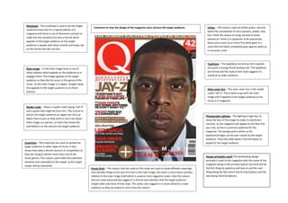
- 1. Masthead – The masthead is used to let the target Comment on how the design of the magazine cover attracts the target audience: Colour – The colours used are white, green, red and audience know that it’s a special edition of a black.The connotation of red is passion, power, love magazine and there is use of dominant contrast to but I think the reason of using red was to show make the text standout the text is formal which passion as I think it is important to be passionate appeals to the target audience as the target about your music as an artist.The white gives it a audience is people who dress smartly and enjoy rap clean feel and black completely goes against white as so the formal text will suit this. it connotes crime Typefaces – The typefaces are almost all in capitals Main image – In the main image there is use of and quite a strong formal looking text. The typefaces direct address which appeals to the audience as it are formal and the mature font style suggests it’s engages them. The image appeals to the target aimed at an older audience. audience as they like his music or the genre of the music. As the main image is a rapper, straight away this appeals to the target audience as its there Main cover line – The main cover line is the model interest. credit “JAY-Z” This is done to go with the main image and it appeals to the target audience as his music is in magazine Model credit – There is model credit saying “JAY-Z” and a quote that might be from him. This is done to attract the target audience as rapper are not just Photography Lighting – The lighting is high key, to about there music as they tend to care a lot about show the face of the image to make it a dominant there image as a person, so there fans know this contrast, so the magazine will appeal to the fans that and follow it so this attracts the target audience. jay-z has, as this is a primary audience for the magazine. The background is white so the typefaces/images can be seen clearly by the target audience. They have been given a formal layout to Coverlines – The coverlines are used to spread the appeal to the target audience target audience to other types of music, it also shows they have a decent amount of competition as they are trying to attract more than one of the Design principles used? The Guttenberg design music genres. The colours used make the coverlines principle is used in this magazine with the name of the standout and noticeable to the viewer as the target magazine being in the primary optical zone and will be viewer will be interested House Style – The colours that are used on this cover are used to show different meanings the first thing he audience will look at and the next and connote things to the star of it that is the main image; the cover is more direct and less thing being the face which has formal balance and the relative to the main image itself which is usual to most magazine covers. Also the colours text being informal balance. that are used automatically suggest it is formal and indicates that the target audience maybe older and more of that style. The colour also suggests it is more aimed at a male audience as they are linked to men more the colours.