1. CONTENTS PAGE ANALYSIS
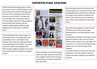
Thiskerrang! Contents page layout is clearly
and cleverly laid out so that the photos of the
artists take up the majority of the page with
the cover stories and page numbers below
and next to each of them. This makes the
contents page more interesting to look at.
The other pages within the contents page are
located at the right had side, with the
subtitles categorising the different pages
highlighted and made bold in a different
colour.
Anintroduction paragraph is used in the top
left hand corner of the contents page,
welcoming them and informing them about
the issue.
Kerrang! Also include their subscription to the
page at the bottom right corner to try and
influence their audience into subscribing. This
is useful as it is one of the first things that the
audience see as it I the first page of the
magazine.
It is placed inside of a red box and is the only
thing that is in red; this makes it stand out
amongst the page, bringing in the audience’s
attention.
All of the important parts of the text in the
contents page are in a yellow font colour and
are highlighted with a black banner behind it.
This brings in the audience’s attention and
informs them that these are the important
parts of the contents page that they should
notice.
The title/heading of the contents page is at
the top right corner of the page with a pull
quote below it from a well-known band
member, which makes the page that little bit
more interesting and informative. The colour
of the title matches the headings of the
different page categories making it easier and
more organised for the audience to navigate
around.
The use of photos on the contents page
inform the reader about what bands are
in the magazine without them having to
read anything; it visually provides them
with information.
2. CONTENTS PAGE ANALYSIS
This Q magazine contents page has the logo in
the top right corner of the page and this is
shown as it is included in the image of an
existing issue of Q magazine. Their
logo/masthead can also be found at the
bottom right corner of the page too.
The colours used in the contents page are
red, black and white. The red is iconic to the
magazine as it represents their house style;
their masthead of Q is always in white with a
red background. Red is a bold and strong
colour which stands out to the audience. All
of the colours used together look professional
and makes a clean and neat contents layout
and design.
The layout of the magazine is simple
and clear to understand and locate
pages; it’s not too full with different
colours and images. The images have
been used in a suitable way as
anchorage to the different pages and
stories that can be found within the
magazine.
The use of the bold lines which
separate each of the pages are useful
and make it clear to navigate whilst still
keep it stylish.
There is a review that can be found at
the bottom of the page; this makes the
contents page more interesting and
provides more information to the
audience already on the first page.The bold black and red colours contrast
against the white background making the
whole contents page design as a whole bold
and stand out to the audience.
3. CONTENTS PAGE ANALYSIS
This Kerrang! Contents page is cleverly laid
out in a creative and interesting way. The
main band and article of the magazine image
is placed in the centre of the page and is big
and spread out filling up most of the space. I
like how everything is placed in a slanted way
making it different from other contents
pages.
Kerrang! Regularly uses the colours red,
white, black and yellow. This can be seen
throughout this contents page layout as all of
the colours are used on this page.
The masthead of Kerrang! Is used on the
contents page at the top as a heading. The
font style and typography is used for this,
keeping the house style and image of the
magazine; this makes it noticeable and
recognisable to the audience.
The masthead of Kerrang! Is used
on the contents page at the top as
a heading. The font style and
typography is used for this,
keeping the house style and image
of the magazine; this makes it
noticeable and recognisable to the
audience.
The headings of all of the different
page categories are highlighted
with a black background which
contrasts with the bright yellow
text. This is effective as it draws in
the audience’s attention.
There are previews of some of the
pages which are used as images
on the contents page near the
main image of the band. This gives
the audience an idea of the
contents inside of the magazine.
4. CONTENTS PAGE ANALYSIS
This contents page from Rocksound is
effective and creative. The layout of the
photos is effective as they draw the
audience in visually. These also suggest
what the bigger and main articles are
within the magazine. The big page
numbers that are layered on top of the
images make it easy to find these articles.
Red if the most frequent colour used in the
contents design; this links with the colour
of the logo of the magazine, which can be
found in the top left hand corner of the
page. Red is used for the important
sections in the page, like the edit comment
found at the right hand side, and of the
headings categorising the different pages.
Three columns are used to separate
and display the pages. This is a
convention used in most magazines,
although for the other magazines that I
have researched they have only been
one column.
A quote from a popular band member
is used in the top right of the page.
This makes the page more interesting
to the audience and draws them in to
go and read the article. It informs the
audience straight away of the bands
included within the magazine.
The editors quote shows that the people
working for the magazine are connecting
with the audience through the text and
making interaction. They give feedback and
opinions about the magazine, informing
the audience from a different point of
view.
The images used in the contents page
all have different camera shots; this
gives the audience various different
images to look at. Some are shot in the
studio and the others are shot at a live
gig which suggests to the audiences
the different types of articles there
are.