2. Target audience
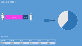
The target audience for dynamic is quite wide, however
the main age ranges are 16-25 and 26-35. Dynamic is
more female-leaning. The target audience’s
psychographics include: socialising with friends
(shopping, dining), listening to and keeping up with chart
music, watching and doing hair and makeup tutorials.
This magazine will appeal to the target audience as there
will be interviews with current chart toppers that attract
the target audience. I will use mostly Sans Serif fonts as
my magazine is pop but with a more mature outlook.
3. Things associated with modern pop music
The genre of my magazine is modern pop music. The target audience of this genre stereotypically wear fashionable
clothes and are quite girly. Stereotypically, the female target audience like shopping, makeup and hairstyling. The
male audience stereotypically also have a fashionable haircut and clothes.
4. Content of my magazine
Inside of my magazine, there will be interviews and articles of
current artists in the industry. This will appeal to my target audience
as they are interested in getting to know the artists and about their
everyday life, so they can relate to them. There will be a main
double page spread about a new and upcoming artist. This will also
appeal to my target audience as they like to be up to date with new
music and gossip about them.
These are two examples of my front cover layout design. The most
interesting and important articles will be displayed on the left third
of the magazine. This attracts the audience as it is easy on the eye,
making it accessible and easy to read.
5. Mode of address/house style
In my magazine, I will use the same font for the masthead. This will create a
brand identity for my magazine. This is conventional as all magazines have a
brand identity, so the audience instantly recognise the magazine. I will be
using similar colours and fonts throughout the magazine, this also creates a
brand identity for my magazine.
Throughout my magazine, I will use similar facial expressions, like straight
faces to connote maturity because if the artists were smiling more, then this
portrays a younger image of the artist. This will not appeal to the older target
audience as they will not take the artist or the magazine as seriously.