1. Codes and Conventions of Pop Magazines
Codes and conventions are a system of signs which can be decoded to create a meaning,
and it is what you expect to see in a specific genre. For example, in a pop magazine you
expect to see bright and girly colours.
One of the conventions for a pop magazine is for the main image to
dominate the front cover. This is to attract the audience’s attention
and to be able to persuade them to read the magazine. This is a way of
luring the target audience in and convincing them to make a purchase
of the magazine. In a pop magazine, cover mount is used to sell more
copies of the magazine. Cover mount is an item/s that are attached to
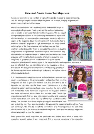
the front cover of a magazine as a gift. For example, the image on the
right is a Top of the Pops magazine and has free mascara, four
eyeliners and a style guide. This is to persuade the audience to buy the
magazine and also gives them an additional prize. This is another way
of convincing the target audience to make a purchase as they are being
provided with free gifts. Posters are also often given away in a pop
magazine, to give the audience another reason to purchase the
magazine, other than articles and gossip. If the poster includes an image of an artist that a
pop fan is fond of, they are more likely to buy the magazine as it is a
free poster. It is also given the impression that the young girls should
be decorating their rooms and making it look pretty and stylish, instead
of being out and about.
It is common music magazines to use beautiful women on their front
covers to sell copies as this attracts readers and catches their eye. Pop
magazines do this to persuade readers that they are able to be as
beautiful as the artist on the front cover. Furthermore, it is also
attracting readers as they may have a role model as the cover which
will immediately make them want to purchase the magazine and find
out more information about them. For instance, take Cheryl Cole,
many teenage girls find her as a role model, beautiful and successful
which makes them look up to her. Top of the Pops use the beautiful
Cheryl Cole on their front cover to give young girls the idea that they
can be just like her. They also give readers this view as the magazinehas the sell line “you
can be Cheryl”. This links to one of the conventions of a Pop magazine as the sells lines
should have a link to the featured artist of the magazine. This is another way pop magazines
attract young girls to read the magazine.
Both general and music magazines are passionate and serious about what is inside their
magazine, as each feature is very important. This is because everything in the magazine
2. must attract the audience and maintain them from purchasing and reading the magazine.
Moreover, it is important to be certain that the reader does not get bored uninterested in
their magazine, but entertained and inspired. If the target audience find a pop magazine
boring, this will immediately stop them from making a repeatpurchase of the magazine in
the future. Magazines have the ability to become like to friend to their readers, as it allows
them to escape from reality and enter an enjoyable and soothing world. This is creating a
bond between the magazine and reader which has a result of the reader continuously
buying the magazine.
In each music magazine, colours are used to reflect and celebrate the
musical tastes and cultural identity of the reader. Pop
magazinescontinuously use a variety of young youthful colours as this
matches their personality. For instance, the magazine on the right uses
a lot of pink used in the layout and text. It also has a good use of purple
which both comeacross as girly and feminine colours. This links to the
target audience as they are girly girls, who like to wear stylish clothes
and wear make-up. As the main sell line “The Wanted” is outlined in
yellow, this will draw in the attention of the reader, especially for fans
who love the boy band. “The Wanted” is in bold and pink which attracts
the audience.Furthermore, the colours that are used in popmagazine
give the impression of innocence which links well with young female
readers. It gives the remembrance of an upbeat and fun personality.As
a genre, it is a convention for Pop to have bright colours as it
represents a positive vibe and fun. This convention must be met
through magazines, as well as music videos. The male artists presented on the front of the
magazine will aim for girls to learn about the boys in order to be able to date them. Unlike
Kerrang magazines, they use dull and dark colours which immediately make use think off
aggression and masculinity.
Another convention of pop magazines is the clothing of artists on the front cover, as they
wear modern, fashionable clothing. This is to stereotype the clothes teenagers wear and
attract the readers with what artists are wearing. The artists are always smiling and
enthusiastic as this connotes they are happy and enjoying life. This also links to the
personalities of the artists as they are bubbly, fun and happy, just like the target audience.
Pop bands and artists Pop also wear bright colours and are always looking playful and happy
to create a positive image, instead of an image of sex, violence and creating a sense of nonoffense towards people. Hair and makeup are a major role in pop as they give the effect of
beauty and intelligence. Young teenage girls like to wear make-up, dress up and style their
hair, which links to the way pop artists are represented.
There are a number of different codes and conventions used generally across magazines as
a whole. For instance, the use of a mast head is the title of the magazine. This is usually bold
and bright to attract the target audience’s eye. The masthead becomes recognisable and
seen as a brand. This makes the target audience recognise the magazine anywhere they go.
3. Another general codes and conventions of magazines is the main image. This image is
dominant; usually takes up the whole front cover page and will have an image of a popular
idol represented within the particular genre. This increases the interest of readers and is
more appealing to the audience. The main image is dominant
Inspiration
A Pop magazine that exceedingly inspires me is ‘Top of the Pops’.
The image shown on the right is a front cover that inspires and
encourages me to extend the level of success I would like to achieve
in my coursework. There are a number of features I like in this front
cover that give me ideas for my music magazine and makes me
aware of how to set out my front cover. For example, the use of the
colour pink attract the target audience and gives the immediate
attention towards teenage girls. The long shot image of the girls
inspire me with their body language and facial expressions as it links
within the sell line and their personalities. They are making it
obvious they have a secret to tell which is effective as it is luring the
target audience in and convincing them to read the magazine. The
front cover stands out as they are all beautiful, well-known and
stylish women, which attracts young girls to think they can also be
as beautiful as them.
I also like the way the font is used as it is in bold and captures the audience’s eye
immediately, which is also another way to lure in the audience. It is in bright pink and white
which shows the target audience are young, innocent, girly girls. I would like to use this
when making my magazine as it is appropriate and attractive.