
Recommended
More Related Content
What's hot
What's hot (20)
Viewers also liked
Viewers also liked (15)
Similar to Mature Pop Magazine Contents Page Design Analysis
Similar to Mature Pop Magazine Contents Page Design Analysis (20)
More from GemmaSpencerMedia
More from GemmaSpencerMedia (11)
Recently uploaded
Recently uploaded (20)
Mature Pop Magazine Contents Page Design Analysis
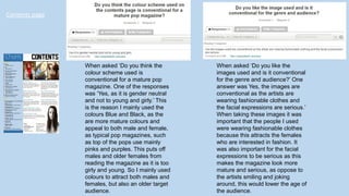
- 1. Contents page When asked ‘Do you think the colour scheme used is conventional for a mature pop magazine. One of the responses was ‘Yes, as it is gender neutral and not to young and girly.’ This is the reason I mainly used the colours Blue and Black, as the are more mature colours and appeal to both male and female, as typical pop magazines, such as top of the pops use mainly pinks and purples. This puts off males and older females from reading the magazine as it is too girly and young. So I mainly used colours to attract both males and females, but also an older target audience. When asked ‘Do you like the images used and is it conventional for the genre and audience?’ One answer was Yes, the images are conventional as the artists are wearing fashionable clothes and the facial expressions are serious.’ When taking these images it was important that the people I used were wearing fashionable clothes because this attracts the females who are interested in fashion. It was also important for the facial expressions to be serious as this makes the magazine look more mature and serious, as oppose to the artists smiling and joking around, this would lower the age of the audience.
- 2. When asked ‘ Do you think the layout is conventional?’ One of the responses was ‘Yes, it is similar to Billboard magazine which is conventional for the target audience.’ I used a similar layout to Billboard magazine as I was targeting the same audience as them. I researched Billboard magazine a lot and found that the layout of the magazine was very popular with the older target audience as well as the younger audience, therefore it made sense to base my layout on that of Billboard. When asked ‘What improvements would you make to the contents page?’ One of the answers was to ‘Put a frame around the image at the bottom to make it standout like the other photos.’ I made this improvement when I redid my contents page as I agreed that the images at the top stood out much more than the image at the bottom, so I added a frame to it.