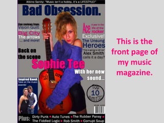
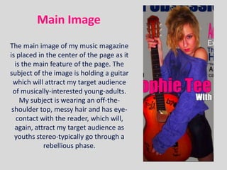
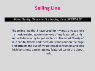
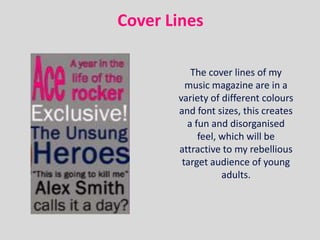
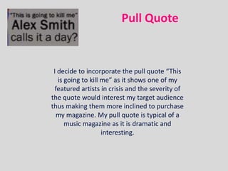
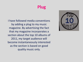
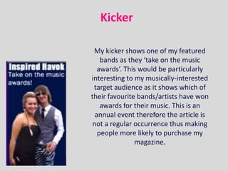
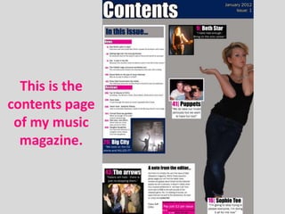
4. Main Image
The main image of my music magazine
is placed in the center of the page as it
is the main feature of the page. The
subject of the image is holding a guitar
which will attract my target audience
of musically-interested young-adults.
My subject is wearing an off-the-
shoulder top, messy hair and has eye-
contact with the reader, which will,
again, attract my target audience as
youths stereo-typically go through a
rebellious phase.
5. Selling Line
The selling line that I have used for my music magazine is
a music-related quote from one of my featured bands
and will draw in my target audience. The word “lifestyle”
is in capital letters and therefore stands out on the page
and attracts the eye of my potential consumers and also
highlights how passionate my featured bands are about
music.
6. Lead Article
My lead article ties-in with my main image
as it shows text-image cohesion and both
are large and centered on the page, this
will immediately attract my potential
buyers as it provides a decent amount of
information about the lead article of the
magazine.
7. Cover Lines
The cover lines of my
music magazine are in a
variety of different colours
and font sizes, this creates
a fun and disorganised
feel, which will be
attractive to my rebellious
target audience of young
adults.
8. The Left Third
The left third of my front cover contains
a lot of information about the magazine
and it’s contents. I feel that my left third
develops usual magazine conventions as
it includes an image as well as text. This
is not a common factor of the left third
yet I feel that it works well here as it
attracts a potential buyers gaze via
colour and shape.
9. House
Style
For the house style of my magazine, as well as using the more
plain colours of black, gray and white, I decided to use navy blue
and bright pink. This is not a usual convention of music magazines
as they tend to use colours that are not gender-specific as not to
favour a particular gender. I have chosen these colours as they
appeal directly to both males and females rather than not
directing a gender at all.
10. Price and Barcode
I have followed the usual music
magazine convention by placing my
price and barcode at the bottom
right corner of the front cover. This
is done as it is most likely to be the
last place on the page that a
potential buyer will look at.
11. Masthead
The masthead of my music magazine is centrally placed at the top of the
page as it is the first thing that I want my target audience to buy. The name
‘Bad Obsession’ would be attractive to my target audience as it has
negative connotations, which teenagers/ young adults are stereotypically
linked with; the word ‘Obsession’ suggests that my music magazine is so
good that it is capable of becoming an obsession and I think that this
would intrigue a potential buyer. My main image overlaps and covers part
of my masthead and, much like popular music magazines such as the
Rolling Stone, this shows that the magazine is so well known that when the
full masthead is not shown, the target audience still knows which magazine
it is.
12. Pull Quote
I decide to incorporate the pull quote “This
is going to kill me” as it shows one of my
featured artists in crisis and the severity of
the quote would interest my target audience
thus making them more inclined to purchase
my magazine. My pull quote is typical of a
music magazine as it is dramatic and
interesting.
13. Plug
I have followed media conventions
by adding a plug to my music
magazine. By advertising the fact
that my magazine incorporates a
section about the top 10 albums of
2011, my target audience will
become instantaneously interested
as the section is based on good
quality music only.
14. Kicker
My kicker shows one of my featured
bands as they ‘take on the music
awards’. This would be particularly
interesting to my musically-interested
target audience as it shows which of
their favourite bands/artists have won
awards for their music. This is an
annual event therefore the article is
not a regular occurrence thus making
people more likely to purchase my
magazine.