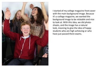
1. I started of my college magazine front cover
with the main background image. Because
it’s a college magazine, we wanted the
background image to be relatable and nice
to look at. With this idea, we did photo-
shoots, and the image has a natural
look, meaning to give the idea of happy
students who are high achieving or who
have just passed there exams.
2. I then moved on to placing the masthead, which I
Got from dafont.com. The masthead is a clear black,
In bold writing to help it stand out. The masthead I
Think gives of a modern look, which links with the
Name of the magazine CCN. The drop shadow behind
The masthead also helps make it stand out by giving
It a 3D effect.
3. I then added cover stories to the front of
the Magazine to help draw attention to
the magazine. I decided to use white, to
help them stand out But also this means
they would contrast from The masthead
and main background image. The cover
lines are short, so they don’t detract
From the main background image but
helps Student create an interest in the
magazine And make them want to buy it.
4. Because I didn’t have much going on
at the bottom of the magazine I
decided to create something that
would draw more attention to the
magazine, such as a freebee, or
vouchers off something. I started with
a long white bar with a drop shadow
to help it stand out, and this meant
that any font I put on top would stand
out and become more obvious than
the rest of the cover lines on the
magazine.
5. With this, I then added on top a bold
black font to contrast with the
white, and because
teenagers/students are interesting in
music and free stuff, I decided to use
the cover line in bold of ‘WIN
TICKETS’. I used a font which is similar
to the masthead but also had a
different and relatable design
element to it, because the bottom
lines which are cut out of the from
remind me of music volume when
played on a stereo.
6. With my front cover filled up, I decided to
Add in a bar code to make it look authentic,
And also the colour scheme is similar
throughout the front cover.
Although the front cover is simple and uses
a simple black on white colour scheme away
from the background image, I think its very
Effective in its purpose of drawing in
peoples attention (mainly students) with
cover lines and things which interest them.