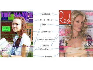
2. For my main image I used a Medium shot (face and chest only)
which is similar to the Red cover however Red shows less body
than my main image. I used a continuous colour scheme of
purple and green (which are the college colours). Just like Red as
they used a continuous colour scheme of pink, white and red.
Just like Red I kept my cover lines away from my main images
face. I did this as I do not want to distract the focus away from
my main image, I assume this is the same reason Red also did
this. I followed the codes and conventions of a magazine my
making the Masthead the biggest font so it is recognisable as
the title for the magazine. I added a flash to my magazine.
However, Red did not this shows that I have used the codes and
conventions but I have developed it to make it my own. My flash
covers an empty space making it look better and fuller. Red uses
a variety of fonts and font sizes and although I did this to an
extent, I didn't do it as much as Red. This means I should have
done this as it would have followed the codes and conventions
better. My cover doesn’t follow the Rule of thirds as much as I
would like it to be. However, the cover for Red follows it exactly
keeping the coverlines on the left and right and having the
masthead in the top left corner of the page.