
Recommended
More Related Content
What's hot
What's hot (20)
Similar to Front
Similar to Front (20)
More from Emel1234
More from Emel1234 (20)
Recently uploaded
Recently uploaded (20)
Front
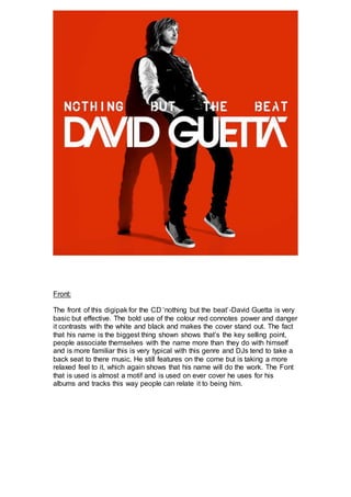
- 1. Front: The front of this digipak for the CD ‘nothing but the beat’-David Guetta is very basic but effective. The bold use of the colour red connotes power and danger it contrasts with the white and black and makes the cover stand out. The fact that his name is the biggest thing shown shows that’s the key selling point, people associate themselves with the name more than they do with himself and is more familiar this is very typical with this genre and DJs tend to take a back seat to there music. He still features on the come but is taking a more relaxed feel to it, which again shows that his name will do the work. The Font that is used is almost a motif and is used on ever cover he uses for his albums and tracks this way people can relate it to being him.
- 2. Back: The back cover of the digipak also uses the same colour red. The different use of font separates the front from the back and also separates the two different CD’s that is inside. The black text box at the bottom contains all the information about institutions this is only small because its almost like they know its not needed because him alone is going to get the Cd’s sold on his own as e is so well known and has a very large fan base world wide.