
Recommended
More Related Content
What's hot
What's hot (19)
Similar to Question 2 evaluation pdf
Similar to Question 2 evaluation pdf (20)
Recently uploaded
Recently uploaded (20)
Question 2 evaluation pdf
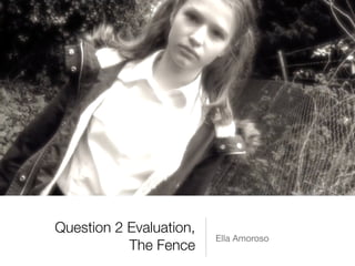
- 1. Question 2 Evaluation, The Fence Ella Amoroso
- 2. How effective is the combination of your short film, magazine article and film poster?
- 3. In regards to the short film itself, when I gathered my audience feedback I found out that the short film would and would not attract an audience. Some of the audience members who gave feedback on if they would see the short film or recommend it to others, they stated that they would because there is a mystery element to the story. The biggest question they had in their minds was ‘was the whole story a dream and none of it ever happened?’ or ‘did it really happen now in her sleep she has flashbacks of the real event that happened?’. This was something neither the director or I had even thought of so this was interesting as I think it contributed to if others would see the short film. This is a huge positive but also a slight negative to the short film itself and how effective it is. It left questions for viewers but it also meant that the audience was confused. A conventional thriller leaves the audience with questions so this shows we have also followed a thriller film convention. Short Film
- 4. With my film poster, I think that this would be effective in regards to the audience numbers and reaction. The film poster I created is slightly unconventional. For example, the protagonist is supposed to be the main face of the poster, and unfortunately we were not able to take photos of Chloe on the day, so instead I chose to put Violet as my protagonist on the poster. Also, Chloe’s face is not in the centre, I have put an effect on it so it is slightly in the background. The colours I used in the poster I thought fitted with the storyline. Obviously the girl is called Violet, and the disease the vicar has is known as ‘Vampire Syndrome’, so this made sense to me to use dark colours on the poster. This is the reasoning as to why I used the dark purple/blue as the colour with the shadow effect around the edges. I asked members of my class which I didn’t film, and they said that they liked my poster and they found it effective. They thought that the tag line font was slightly too large and the girls face should of been the main photo on the poster instead of in the background blended into the other image. This is something that I will go back to change, however I do think that the poster and images are effective and I am happy with them. I have listened to the feedback and think it is good feedback, and this will also help to make my poster more effective to getting audience members attention. Film Poster
- 5. Magazine Article When I began my magazine article, I wanted to keep the article, clean and simple, which would therefore be effective on the audience. I think that the wording too of my magazine article had made it effective on the audience. I think that because of the actual article which I have written, I have made this appeal to audience members. I’ve used very encouraging and persuasive vocabulary which is something that the film industry use often to appeal to an audience. This is a unique point which I think links well to my film poster.
- 6. My film poster essentially is a very simple design, and this is something I know appeals to an audience. They want something clean, simple and effective. All of these factors will get the audiences attention if they see it on a public advert. If the members of the public have to stand and look at the poster for too long because the poster is so busy, this will not appeal to an audience as they may not bother to read or look at it. The magazine article is the same; it’s not too busy that the audience will lose track of the information, but not boring so that they skip over the page. This is a factor which is very important in the industry when advertising a film, but also something that works well with the short film I worked on. This is also a reason why I think my magazine article mainly but film poster too would work well in the real world when advertising my short thriller film - The Fence.