
Recommended
More Related Content
What's hot
What's hot (14)
Viewers also liked
Similar to Task Two - Detailed Analysis of Music Magazine
Similar to Task Two - Detailed Analysis of Music Magazine (20)
Recently uploaded
Recently uploaded (20)
Task Two - Detailed Analysis of Music Magazine
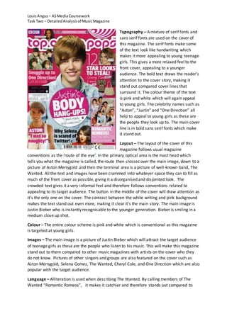
- 1. Louis Angus – AS Media Coursework Task Two – Detailed Analysis of Music Magazine Typography – A mixture of serif fonts and sans serif fonts are used on the cover of this magazine. The serif fonts make some of the text look like handwriting which makes it more appealing to young teenage girls. This gives a more relaxed feel to the front cover, appealing to a younger audience. The bold text draws the reader’s attention to the cover story, making it stand out compared cover lines that surround it. The colour theme of the text is pink and white which will again appeal to young girls. The celebrity names such as “Aston”, “Justin” and “One Direction” all help to appeal to young girls as these are the people they look up to. The main cover line is in bold sans serif fonts which make it stand out. Layout – The layout of the cover of this magazine follows usual magazine conventions as the ‘route of the eye’. In the primary optical area is the mast head which tells you what the magazine is called, the route then crosses over the main image, down to a picture of Aston Merrygold and then the terminal area is a picture of well-known band, The Wanted. All the text and images have been crammed into whatever space they can to fill as much of the front cover as possible, giving it a disorganised and disjointed look. The crowded text gives it a very informal feel and therefore follows conventions related to appealing to its target audience. The button in the middle of the cover will draw attention as it’s the only one on the cover. The contrast between the white writing and pink background makes the text stand out even more, making it clear it’s the main story. The main image is Justin Bieber who is instantly recognisable to the younger generation. Bieber is smiling in a medium close up shot. Colour – The entire colour scheme is pink and white which is conventional as this magazine is targeted at young girls. Images – The main image is a picture of Justin Bieber which will attract the target audience of teenage girls as these are the people who listen to his music. This will make this magazine stand out to them compared to other music magazines with artists on the cover who they do not know. Pictures of other singers and groups are also featured on the cover such as Aston Merrygold, Selena Gomez, The Wanted, Cheryl Cole, and One Direction which are also popular with the target audience. Language – Alliteration is used when describing The Wanted. By calling members of The Wanted “Romantic Romeos”, it makes it catchier and therefore stands out compared to
- 2. Louis Angus – AS Media Coursework Task Two – Detailed Analysis of Music Magazine other cover lines on the front cover. The language used on the cover is very informal using words such as “snuggle” and “naughty” which make it more appealing to a younger audience. Conventions - Typography – Sans serif fonts are used on this spread which give it a contemporary feel, making it appeal to young girls. The large fonts used make it easier to distinguish that it’s the cover line. The pink text makes the page more appealing as well as fitting in with the continuous colour scheme of pink, white and black. By putting the cover line in speech marks it lets you know that it’s from the article. The serif font that is used is letting you know a bit more of what the article is about. By highlighting some of the text in the article it makes it stand out, suggesting that they are key pieces of information that the reader will find most interesting. Layout – This double page spread is split into two, with all the text on the left and an image of Cher Lloyd on the right. The text is organised which gives the spread a more mature and look, which is conventional due to the article being an interview. The route of the eye starts with the primary optical area where the headline is, then it moves across o an image of Cher Lloyd, back onto the left hand side and across a smaller image of the artist, hen back finishing at the terminal area where the majority of the text is. The image is alone on the right hand side which makes it look more ordered and not cluttered, making it seem a lighter read.
- 3. Louis Angus – AS Media Coursework Task Two – Detailed Analysis of Music Magazine Colour – The colours used in this magazine follow the scheme that is carried through the magazine. Yellow, pink and white are the main colours used which connote positivity, while appealing to a younger audience. The pink is also a more feminine colour which follows conventions as it’s a magazine aimed at young teenage girls. The blue top that Cher Lloyd is wearing also stands out as it does not follow the colour scheme. Images – The main image on this spread is a picture of singer Cher Lloyd bending over, posing with an old-style camera. She is dressed in clothes that young teenage girls would wear, again appealing to the target audience. She is promoting positivity as she is pulling a funny face. The smaller image on the left page which is surrounded by text shows Cher Lloyd being photographed by what seem like her fans, which is suggesting that she has a celebrity status and is very popular with young girls, which is the target audience for this magazine. Language – The language that is used is very basic which makes it easy for the younger audience to read and also more appropriate for a younger audience. Typography – The masthead of the contents page is bright pink with white writing which automatically pulls you to this primary optical area. The serif font used gives it a more informal