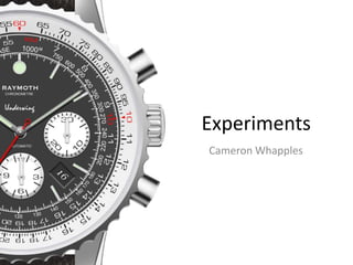
SlideShare a Scribd company logo
1 of 35
Experiments
Your Name
Experiments
Cameron Whapples
Experiment
Experiment:
An experiment with a logo and brand name that will help to
create the company for the final product. This is something
that has to be simple in design but memorable and
recognisable.
Initial sketch of the brand logo.
Process
The name ‘Raymoth’ was one that came to me at random. I liked the combination of the two words and so I decided to base the
logo from these images. I started by finding an image of a moth, choosing one that showed it spreading its wings. I particularly
liked the difference in the two wings and even the sides of the body. I left it the way it was.
I used the Magic Wand Tool to surround the image and delete the background. I used the Refine Edge option to smooth out any
rough edges. I left the antennae despite them being barely visible from a distance. Something to note is that I should have
increased their width.
Happy with the moth, I moved onto the rays. I had pictured them appearing from the sky and sweeping past the moth. I started to
create the image by using the Shape Tool and editing rectangles. This did not work very well as I needed the rays to get bigger as
the moved further down the page. I tried to draw them with the Polygonal Lass Tool and fill them but this did not work either as
they all varied in shape and size.
I found an image of the ‘Rising Sun’ flag on the internet. I copied this onto the document and began to work on this. I soon
realised that this was perfect as all the rays radiated from one spot which was what I needed. I removed most of the rays until the
bottom right corner was left. I added a circle to replace the existing sun. This was much smaller and so created a border between
itself and the rays.
Unintentionally either wing of the moth being the marker for where the rays should end. This looked good and so I decided to
surround the image with a rectangular selection. Everything outside of this was deleted and gave the image a neater appearance.
The definition of the moth was not clear what with the rays shining right through so I decided to create a border around the moth.
This worked very well as it made the moth image clearer as well retaining the shape of the rays. Around the antennae it did not
work so well as they were so thing they could not be seen as clearly the rays just ended abruptly for no clear explanation in that
area.
Next I created a small window for the brand name to sit in. This was situated below the logo. I added the name and chose the font
‘Copperplate Gothic Bold’. This was a preferred font of mine and the old fashion text worked into the heritage of brand
companies. I positioned this nearer the top of the window so that I could add a tagline underneath.
Process
Before I did this I created a line using the Shape Tool. I shortened it and positioned it underneath the brand name. I stretched
between the halfway point of the ‘A’ and the ‘T’. I felt that if it was longer it may have detracted from the rest of the text.
Underneath this I wrote in the regular version of Copperplate the tagline. As this was only an experiment I wrote ‘Since yesterday’
as many watch brands show prowess in the hundreds of years their companies have been alive.
This experiment worked very well in terms of producing a brand from nothing but a couple of sourced images. The idea to make
the image entirely black and white was one founded from my research as many brands use this to their advantage. The lack of
colour means that they can be used on any sort of advert no matter the tone. It is neutral.
One thing that I noted after I had produced it was that the logo was a literal representation of the brand name. This made it look a
little unprofessional and something that would not likely be seen as the logo for a high-end luxury watch brand.
Experiment
Experiment:
An experiment with a different brand name and logo that
represents the brand without being too literal, a flaw of the
previous design.
Initial sketch of the brand logo.
Process
Taking inspiration from the Breitling logo, which features a set of wings and an anchor, I wanted an image that would tie in with
the primary function of the brand. It would relate to the sort of products that would be sold. I decided to relate the logo to the
diving and flying aspects and set about finding images that would represent this. As my sketches show the plan was to be a diving
helmet resting upon a set of bird-like claws.
First I sourced an image of an old diving helmet. I took this into Photoshop to transform it into my logo. I used the Selection Tool
to draw a rough silhouette around the image. My original plan was to then shade this entirely black and leave the formerly gold
parts white. After creating the silhouette I then selected the gold parts on the original image to then create the white areas. While
doing this I realised how much better the image looked with only these highlights. As the gold covered all the distinguishable
features I decided to leave it as it was because the image was recognisable without the silhouette.
Normally I would have also used the Refine Edge tool to smooth the edges but I particularly enjoyed the rugged look, as though
the helmet had been rusting in a wreck for several years. I was pleased with the design and did not think that the claws that I had
planned to add would increase the design. I left them out.
I then moved to the brand name. This was a randomly chosen German word, as German is language spoken in Switzerland. I
chose a different font in order to see if the results were better. I also chose a different family of font for the slogan. I placed this
above the brand name this time to see the effect.
To finish the logo I decided to add two corners of a rectangle to border the brand name. This was done placing a box around the
text and removing the excess accordingly.
Overall the logo and brand is something that is pleasant to look at but not something that I would use for my final brand. I find the
logo very artistic and fits perfectly between simplistic and memorable but what with the generic brand name layout I think the
overall effect is not enough.
Experiment
Experiment:
An experiment with the simplicity of logos, aiming to be just
as or more memorable through the basic design of the brand
name and logo.
Initial sketch of the brand logo.
Process
With my first attempt being too literal and my second being too generic I decided to rethink my ideas. I also wanted to make the
simplest thing I could think of. Learning from the first image I decided to make the logo much simpler as this would translate
better to the advertisements and even the products themselves.
To start with I chose the image of the dolphin jumping out of the water. I needed an image that was clear and did not have water
obstructing the dolphin’s outline. I pasted it into the Photoshop document and used the Magic Wand Tool to highlight the edges. I
then filled the space with the Brush Tool coloured black. While the area was still highlighted I used the Refine Edge Tool to smooth
out any uneven surfaces. I did not leave any of the detail as I just wanted the silhouette of the animal.
I then altered the angle at which the dolphin was jumping at. Now it stood taller and looked much more elegant which would be
representative of the brand and its products.
I added the brand name which did not directly relate to the name but was still relevant. I chose the name ‘Barrier’ relating to the
Great Barrier Reef. This may have been relevant but less so than the logo for ‘Raymoth’. I chose an elegant font for the brand
name, similar to Copperplate Gothic but not as bold. I also altered the spacing between the characters so that the word became
the same width as the logo. Underneath this I added the slogan which was in a more spidery font. I liked the look of this as it
made it appear handwritten and gave it a more personal touch.
The result of this logo is a little basic, despite my thoughts on brand logos. Looking at this logo it gives the wrong impression of
the brand. This would not look out of place on a perfume bottle or a bar of soap, which is not good when creating a logo for a
luxury watch brand.
Experiment
Experiment:
An experiment with the complexity of logo design which is
the opposite of the previous. An attempt to reverse the
failure of the logo prior.
Process
As the previous two logos had been very simplistic I decided to make a new one that was a little more complex. My thoughts on
the matter were that the simpler the logo the better it was at being remembered but I went against this judgment in order to see
the result. I decided to focus the logo around an image of the Earth, a subtle nod to the international recognition of the brand.
I started with the Earth. I found an image online and pasted it into Photoshop where I then transformed it into a black and white
outline. I did this by using the Quick Selection Tool to draw around the continents on the globe. I filled them with the Brush Tool
using the colour wheel to make them black. I left the sea white. To create the the outlining circle around the edge I used the
Shape Tool to create an ellipse. By altering the settings I was able to fit around the shapes of the land masses. This neatly defined
the globe from the white background.
I decided next to include a set of wings in the design. I took inspiration from Breitling with this element, as their logo features an
anchor and wings which relates to the different capabilities of their watches. I wanted to represent my brand’s aviation ties so I
set about finding an image online. I repeated a similar process that I used for the globe. This was much trickier due to the detail in
the feathers. I used the Refine Edge options to smooth out any rough edges. While the image was still selected I once again used
the brush, but this time chose white instead of black to colour the area with. I then used the Blending Options on the layer to
create a Stroke around the wings. I altered the default settings so instead of the line appearing on the outside of the image they
appeared on the inside. This meant that the definition around the edges of the wing tips was not affected. Had I performed it on
the outside the stroke lines may have collided and given the logo a much more cartoonish look.
I wanted to add a texture on the inside of the wings which would give them a much more interesting and complex look. I chose a
giraffe-like pattern as it seemed the most intriguing. To start adding the texture I first selected the layer containing the wings and
rasterized it. This meant that I could no longer alter the stroke around the inside, but it also meant that editing it was going to be
much simpler as it no longer had any properties, it was ‘flat’. I then used the Magic Wand to select the white areas on the inside
and I erased them. I moved the layer with the pattern on it so that it showed through the edges of the wing I had now created. I
positioned them so that the texture filled to the edges. Once it was in the correct place I then moved back to the wing layer. I
selected the Blending Options again and just as before added a stroke. This time, however, I made it white so that it encroached
Process
onto the giraffe pattern. This looked much better than leaving it spread to the edges and despite the small gap kept the logo
looking light.
I then moved to the name, ‘Circumference’. I was thinking along the lines of circumnavigation and aviation, it also corresponded
with the image of the Earth. Beneath this I displayed the date that it was established, similar to the leading brands in the industry.
To separate these I placed a single dot using the Shape Tool between it. I liked this design but decided to add two more dots
equidistance apart. The result was different and gave the logo a fresh look that had not been seen before in my designs but it
would not be something that I would take beyond this point.
To encase the brand name and incorporate it into the logo I made a text box around it. I started by making a large rectangle and a
large circle. I positioned both so that they overlapped accordingly, the circle creating another border around the globe. I then
rasterized both layers and began erasing. I first removed the top most line of the rectangle from the centre outward until they met
the circle. I then erased the circle apart from the line that met the rectangle and followed the line around the underneath of the
globe. I then Merged the two layers so that they were one and the text box was finished.
The overall design of the logo is something that I am pleased with but not something that would take into the future. The design
is much different to the ones that I had previously designed but this difference is where it suffers. I stand firm with the statement
that the simpler the logo the better. The exception to this is Breitling whose logo is intriguing to look at due to its complexity,
however I had never heard of Breitling up until this project, whereas I had heard of Rolex and Omega whose logos are very basic.
The giraffe textured wings are not something that I was taking seriously, they were simply acting as a placeholder so that if I were
to progress with this design I could estimate how a texture set of wings may look. The text box is something that I am proud of,
the curvature is especially pleasing to look at. The thing that lets it down is the use of the three dots to separate the title with the
subtitle. This will be a single line from here onwards.
Experiment
Experiment:
An alteration of the branding on an existing product. This will
save time during production and will be essential as I do not
have the capabilities of creating an actual timepiece to
advertise.
Process
I first experimented with replacing an existing brand on an existing watch as I do not have the means to produce my own
timepiece to advertise. By doing this I would save a lot of time during production by not having to illustrate products, it would also
mean that the watches in the print advert would match with those in the television version.
I started by erasing the existing brand name on the logo of the watch. This was achieved through the use of the Patch Tool in
Photoshop. By using this tool I was able to quickly select a specific area on the surface of the watch face and replace the name
with the texture of the metal. I could have tried another method of removing this element but instead opted for a faster and
simpler choice. The reason behind the choice of this particular model was that the face did not contain many elements that
needed to be removed. The design was also one that was fairly common and so could be passed as a different brand without
much thought.
In the place of the previous name I entered the new brand name in, ‘Raymoth’. This was in black characters as to contrast with
the, so far, lighter shades of the watch’s materials. It also complimented the heavy shadows as seen on the minute and hour hand.
Noting that the text did not look as though it was really attached to surface of the face I selected the Blending Options. From here
I was able to add a Drop Shadow to the text and, by reducing the size and spread, was able to give the text an authentic look to it.
This was further enhanced when I erased part of the text to account for the overlapping of the second hand. This was done easily
as all I had to do was select the Eraser and match its diameter to the width of the hand. I then removed the text along the line and
it gave the appearance that the brand name was underneath.
I chose this brand as it was the most authentic out of the previous experiments. Taking note of my research I also chose to add
the logo onto the face of the watch as this was a common trope. Going back to the logo file, I used the Lasso Tool to select the
moth silhouette. I copied this and pasted it onto the watch experiment. I resized it to be in-proportion with the rest of the image.
Unlike the brand, I placed this above the hands. There was a large amount of blank space in this area so this managed to remove
some of this. Similar to the brand name, I altered the Blending Options by adding a Drop Shadow to the image. Being a similar size
to the text, the settings remained the same. Both these elements now looked as though they were slightly protruding from the
metallic surface of the watch, as though they had been stuck there.
Process
I was still not happy with the look of the watch. Although the shading I had placed on the two additions to the watch were correct
in terms of proportion I still wanted to add something that was a little less conspicuous. To achieve this I looked back existing
products that I had researched and found that many had a ‘Quartz’ certification.
Choosing a different font, I inserted this text and placed in onto the image. Using the centring tools in Photoshop I was able to line
it up in the exact middle, where it should lie. I added the same Drop Shadow to it. The effect was exactly what I had wanted. With
a small amount of erasing (on the second hand) the text lay in the right place and appeared as though it had also been there.
I think the success of this was down to the size of the text, the choice of font and the natural appearance of the element. Unlike
the other text, the font size was much smaller so it blended in better with its environment. It also helped that the font was far less
expressive. The font I used, Copperplate Gothic, is very heavy and bold, whereas the other font I chose was much more fitting.
The text also had a reason to be there: to inform the user of the power system inside of the timepiece. This is not true of the
brand and the logo, the reasons behind these are to inform the user of the prestige behind the product.
The way that this could be improved upon lies with the alteration of the first two elements. If I am to use this process for the final
product I must be aware that the size of the brand and the logo is what let the result down. The scale of these two additions
made the watch appear to be unrealistic. Had I made these two parts smaller and potentially repositioned them to a different
location, I would have achieved a better result.
I will be able to take the techniques I used in this experiment and apply them to the final product. The possibility of changing
existing products is one that is appealing as it will drastically reduce the time taken in creating a fictional product. This will mean
that more time can be spent creating the actual adverts and the different things that will implemented into that.
Experiment
Experiment:
A collaboration of various different parts from a watch,
sourced from existing images. This will be essential as it will
mean that my products will not be recognisable as models
from a particular brand.
Process
Next I experimented with creating a hybrid of multiple watch parts. This would still be branded under my own chosen company,
but it would mean that the products will be bespoke to the need and also not recognised as products from a certain brand. This
idea came from a development of my first product experiment.
I began by finding a selection of images from the internet. I scoured through several existing products before I came to the
conclusion of choosing. In total I chose four different products, each for a different purpose, such as the strap or the face. The
colours of the products varied so I had to choose wisely in order for the result to be successful.
Having collected the images into one file, each on different layers, I was able to begin the collaging process. I used the Magic
Wand Tool and the Lasso Tool to select the chosen areas from each of the images. This varied in difficulty depending on the watch
as certain parts were blended with others. This was in general a simple task to perform as the lighting on so many provided crisp
lines of division between the parts. The shadows acted as guidelines. Once each of the parts had been separated from its original
owner I labelled each of the layers that they were spread across. This helped with organisation.
I switched around the positioning so that layers such as the case were at the very top, the strap at the bottom. I started the
process of positioning the elements. The face was the first to be put into position. I resized it using the Transform Tool. This was
already a nautical blue and would fit well with the rest of the parts. I had to change the branding of the watch first. Using the
same technique as the first experiment tested, I selected an area with the Patch Tool and removed the existing brand. This did not
have the same effect, however, as the material was much different to the first. Being a metallic blue with the light shining from a
different angle meant that the texture was lost as soon as I altered the background. I entered the new brand and the logo, being
much smaller than usual they looked more authentic.
Next I took the bezel and resized it. Due to its bulky design it meant that I did not have to add a case to the collection. This was
from a watch that was clearly designed for either diving or aviation as is seen with the large numbers around the circumference.
This process was relatively easy as all the parts had come from watches so it meant that they all went back together easily.
Process
When I came to placing the lugs onto the watch I came across the first issue. Due to the different size images the lugs were the
incorrect size for the watch face. I used the Transform Tool to increase the size of the parts then I separated the individual pieces
using the Lasso Tool. Now on four different layers, I was able to position the different parts according to the rest of the watch. I
then selected all the layers containing the lugs and merged them together onto just one. I moved that layer below that of the
bezel so that it would be overlapped.
I moved onto the strap, which was the simplest of the tasks. I resized the image would fit between the lugs and positioned the top
part so that it met the bezel as it is supposed to. The bottom part of the strap did not meet up with the corresponding lug so I had
to fix this. By using the Lasso I was able to select the area around the strap and, without having to make a new layer, positioned it
so that it touched the bezel. I then moved the entire layer to the bottom most position, below the lugs layer, so that everything
overlapped it.
The result of the experiment turned out better than I had expected. The combination of the all the parts from different watches
was something that I was not expecting to work in the way it did. The pieces all fit together in a somewhat realistic way. The
collection of the different images worked well as they all shared colours and characteristics that complimented each other. I had
taken notes from the previous experiment and made the logo and brand much smaller and therefore more in keeping.
This was where I made one of the mistakes. With the use of Patch Tool came a loss in the metallic texture of the watches face
which made it appear unrealistic in that particular area. The area looks patchy and faded as though the paint has entirely different
properties to the rest of the face.
Other areas of concern include the top right lug where the metal does not meet with the strap entirely. There is a small gap that
shows the white background through it. In addition to this the two metal do not look as though they are part of the same product.
This may be because of the two varying levels of brightness in the two images, or because of the drastically different shading on
each. I will need to look out for this and correct any error similar to this in my final product.
Experiment
Experiment:
To create a simpler version of the previous experiment that
does not rely on a collection of images. This is essential as I
will be able to manipulate a product beyond recognition
without the use of other products.
Process
To start I found a photograph of a wristwatch. To make things simpler this was not as luxurious as previous products. This watch
did not include many of the features that made some of the other experiments difficult to work with, such as the complicated
face and bezel.
Taking inspiration from Rolex, I decided to replace the ‘12’ with the logo of the brand. Rolex use the crown and so I began to
experiment with the Raymoth moth. I used the Patch Tool to remove the existing digit marker. As this was a single strip of metal
on a white background with very little surrounding it the task was simple. Next I went into the first logo file and used the Selection
tool on the silhouette of the moth. I copied this and pasted it into the watch document.
I used the Colour Selection Tool to obtain the colour of the existing digits. I then used the Bucket Tool to transfer this colour to the
moth. Instead of black it was now the same shade of grey as the other digits on the face of the watch. I resized to the scale that I
thought was in proportion with the product. I then use the Blending Options to create a drop shadow on the image that matched
with the rest of the digits. This lifted the moth of the surface of the face and made it appear as though it was protruding like the
others. To make it seem more authentic I added a texture to the moth. This is barely visible but it helps to remove the polished
look to the image that can not be seen in the watch. The moth was a little too close the smaller digits markers to I decided to
remove these completely using the same process as before.
I then moved the additional details on the watch. A date window was already present but I wanted to add a second for the month.
I did this by using the Polyagonal Lasso Tool and creating a selection around the window edge. I copied it and pasted on the other
side of the hands. To make it seem as though it was a month window and not a date window I added a second digit to the number
by selecting an area around the original ‘1’ and pasting it next to the new digit. It now read the 1st November. Had this not been
an experiment I would have made the month different so that it was constructed out of existing elements and therefore would
seem more authentic.
I decided next to add a number of smaller faces to the watch. These were very common on high end products from prestigious
brands and something that would most likely feature on my own. I started by using the Selection Tool and drawing around the
face of the watch. Once it was all surrounded I used the Refine Edge tool to smooth out any lumps and gaps that I had missed.
Process
I copied and pasted the watch face and began to remove most details. Apart from the quarter digits and the minute hand I
removed everything so that an almost blank face was left. I did this using the Patch Tool like before. I resized the face and altered
the hands so that they read ‘12 o’clock’. I then duplicated this and placed the two faces towards the bottom of the face either
side of the larger hands. I rotated the left face to make it slightly different from the right. The shadows are noticeable as being
incorrect which can be seen instantly.
The result of the transformation from its original brand to the new is successful. This would not be recognisable as another brand
if not the design of another company. This method is something that has now been refined and could easily perfected for
production. The only issues aroused are those regarding the use of other people’s work, both those designing and constructing
this watch as well as photographing it. This is something that must be worked around.
Experiment:
A test of the masking features to experiment with different
colour schemes on an existing product. This will be essential
as it will enable me to change the appearance of my product
and existing products.
Experiment
Process
This time I did not create the product myself. This image is from the internet and was not altered in any way apart from the
colours. The original colour scheme was not something that needed to be changed as the nautical blue worked well. This provided
me with experience but also another possibility of ‘creating’ a product.
I started by finding an image of a watch. This needed to be bigger than ones I had used previously as it would mean that more
surface area had to be coloured. I chose a chunky diving watch that had multiple surfaces. I first selected the face of the watch
using the Selection Tool. This allowed me more freedom that the Magic Wand Tool as the border could be manipulated to fit any
shape, a circular face for example. Once this was highlighted I used the Saturation options to decrease the amount of colour in
this particular area. I used the slider to decrease it entirely so that this section became a black and white image. This would make
it easier for the colour to be overlaid.
I created a new layer that was a solid colour. I chose a deep shade of pink for the face of the watch. I moved to the drop-down
menu at the top of the layer and selected the Overlay option. The layer transformed from a solid colour that blocked everything
out to a transparent overlay. I then selected the mask option and chose the Paint Brush. By choosing either black or white I could
add or remove the colour depending on where I painted. To create a perfect circle I first removed all colour from the image so that
it returned to its normal state. With the use of the square brackets I was able to change the size of the brush so that the
measurements matched that of the watch face. I then clicked in the centre of the face and it turned back into the deep shade of
pink.
This meant that all the digits and hands had turned this colour as well. I selected the eraser paint and began to trace over all the
now white parts of the watch face. This was extremely time consuming and took the most time during the experiment. The
overall effect worked well, with the white complimenting the dark pink.
I then moved outwards, to the case. I created a Solid Colour Layer and selected the Overlay option. I then removed all colour with
the Brush. I painted back a circle by increasing the brush’s size. Due to the slight slope on the side of the case I had to fill this in
manually by zooming in to the specific areas and carefully trace around the edge. The face unfortunately now resembled a colour
between the new layer and the previous. I made the brush as the big as the watch face and removed the new layer’s colour from
Process
that area. I then changed the colour to a bright yellow so that the case would resemble a golden metal. As this part of the image
was already a light colour I did not need to remove all saturation. To create a more interesting design I decided to remove the
golden colour around the screws on the case. This was a unique part of the watch and needed to be highlighted. I selected the
Paint Brush and selected a light colour. I then used the brackets to alter the size of the brush so that it would match the size of the
screw heads. I then clicked once in the centre of each so that the gold texture was removed from that area. The silver screws now
stood out on the golden case.
I then moved to the lugs. I wanted to keep the colour scheme so was sceptical about adding a new colour to the design. I then
decided to colour it pink. I once again selected the mask of that particular layer and painted that area with a black brush. As the
area was not circular I had to trace around the shapes freehand. I used the Shift+Click feature that allowed me to draw in a
straight line along an axis. This helped me along the edges bordering the strap. I finished the pink colouring but I was not happy
with the look. Due to the different texture of the material it did not resemble the same shade of pink that was present on the
watch face.
I then selected the golden layer. I covered the same area in the mask and the effect was much better. The combination of the two
colours produced a radiant rose-gold colour on the watch. This complimented both existing colours on the design as well as
introduce a slightly different tone not seen before. It also enables the case and lugs to be distinguished more clearly. To finish this
piece I removed all colour from the now metallic part. This was made from a different material so the colours did not look as
smooth on its surface, but also it justified the silver screw heads on the watch case.
I next coloured the strap. This was made from a material that I had not seen used before. This was neither leather nor nylon and
its colour was originally quite dark. I repeated the process used on the other parts and turned that particular section black and
white. From this point I selected the mask of the pink layer and traced around the shape. Although the shade was the same as the
face the dark material made it a much deeper colour. However, I preferred this as yet again it introduced another tone, while still
being within the boundaries of the colour scheme. To complete the look I used the Selection Tool and highlighted the areas either
side of the case. These were made from a similar, if not the same, material. I used the brush while they were still selected so that
Process
the colour would not leave that area. I then deselected the parts and admired the look. To finish the experiment I went into the
according layer and removed the masking over the buttons and the tuning knob on the side of the watch so that they remained a
silver colour.
This experiment has given me valuable experience and insight into this particular way of manipulating existing products. Although
the watch may not be instantly recognisable as a product of a specific company, it still bears its existing brand and parts. The
problems that were faced during this experiment will also shape the final product as I was able to overcome and work around
issues that arose; such as the removal of all colour before painting, the combination of two colours and the use of the brush sizes
to create perfect circles. Most importantly the experiment achieved everything it was meant as it provided me with a number of
reasons why it works and why it doesn’t. Despite the result being drastically different from the existing product it is very time
consuming as every part has to be painted. The face of the watch took the largest portion of time as the individual digits and
hands had to be painted. This would slow production down and is something that I must improve upon.
Experiment
Experiment:
To create an entirely new product from existing and
unrelated images. This is essential as I will not be able to use
existing products in my own final piece of work.
Process
As the previous experiments used products made and owned by existing brands I would not be able to use them for my own
adverts. This experiment was to try to make something entirely original and the process used for the final product. I started by
first collecting several images that looked vaguely like the parts they were supposed to represent. These images included, a log
roll fence, a fighter jet, a tractor tyre, a car tyre, a tank and the face from the tower of Big Ben.
I began with the tyre. The image I had found included a white background so I first had to rid the photograph of that. This meant
that nothing was in the centre of the tyre, but this was not an issue as it would not be seen. I used the Magic Wand tool and used
the Refine Edge option to smooth the edges. Some detail was lost but it gave the element a more circular look. I then used the
Saturation options to remove all the colour from the image. This would make it easier to mask a colour over it later.
I next took the image of the tank and repeated a similar process. I removed the surround image so that the spokes of the wheel
were just left. I made it black and white so that colour could be added later. To create the lugs I took the wings of a fighter jet and
discoloured them. I contemplated removing the symbol from them but I decided against it. This was only an experiment and I also
enjoyed the rugged look that showed clearly that the watch was a compilation of many things.
I moved onto the face of the watch. This was taken from Big Ben as it was icon and easily recognisable. After removing the colour I
began to create the masks for this layer and the layers prior. I wanted the colour scheme to represent a nautical theme as this was
something that I would be doing when creating a diving watch in the final product. I chose a light blue for the face of the watch.
This was the central piece and the first thing that people would look at. This would set the tone for the rest of the image.
For the case, which was the tyre. I chose an aquamarine colour. This was a combination between blue and green and would act as
a bridge between the face and another part. This was originally going to be bezel or tank wheel, but the contrast between the
green and the grey was appealing. The mask over the lugs layer was coloured green which worked very well as the colours
appeared to be growing darker as they moved further away from the face.
The face needed some work as I did not like it being entirely blue. I selected the mask and chose the removal tool which would
erase the colour from the selected place. I traced the hands of the clock and the outer digits. These were returned to their
metallic colours and looked much better this way.
Process
I then moved to the strap of the watch. I used a photograph of log roll fencing as it resembled the individuals links very well. After
removing the colour they represented the metallic strap texture. To increase this I used the Lasso Tool on each to individually
select each link. I then laid a gradient in the selected area. This created a greater shadow and made the material appear more
metallic-like. I then staggered the outer layers of links so that the pattern appeared more like a watch strap.
To create the crown I found a front-view image of another tyre. The treads looked similar to the pattern found on the crown on
most watches. I used the Saturation Tool to remove the colour as I did with the other images, however this time I added some
shading. I used the Dodge Tool and Burn Tool to lighten and darken areas accordingly so that it appeared as though the light was
coming from the top right corner. I even drew a shin onto the texture to make it appear a smoother surface.
I repeated this process on the other images except the strap. This already had enough shading. The tank wheel bezel was
lightened in the top right and slight darkened in the bottom the left. I did the exact same for the tyre case. To finish I reversed this
routine on the watch face so that it appeared further indented into the bezel than it already was.
The overall effect of the watch is something that I am pleased with. The rugged look that is constructed from all the various parts
makes it look more like a diving watch than the colours do. Although I believe the watch face to be quirky it would not be
something that I would use again.
This experiment has given me a large amount of useful information and a string of possibilities that were previously not available.
I believe that this method of creating a timepiece may be crude but it will enable me to brand a product that is entirely unique. If I
was to use images taken by myself it would mean that the result would be royalty free.
This experiment will also lead to further experiments that will refine this process. Although this does not look like a watch, it does
not mean that it could not be used in the final product.
Experiment
Experiment:
To create a product similar to the one prior, but this time
using recognisable objects that have not be altered in post-
production.
Process
I repeated a similar process to the previous experiment to create my own product from scratch. This experiment was slightly
different as it did not alter any of the images that I sourced to the same degree.
I first found the face of the watch, which came in the shape of a brake disc from a car. Following this theme, I then took an image
of a steering wheel from a classic car. The supports in the centre that usually attach it to the steering column were removed so
that just the perimeter was left. This placed around the brake disc to make the case.
To create the hand I found an image of a windscreen wiper. I duplicated the image and made one slightly shorter than the other,
for the hour hand. I then found an air filter to create the knob on the side. The lugs were created using a side-on image of a
carbon fibre spoiler. The strap can be clearly seen to be a seat-belt.
Although the end result was not as successful as the previous, the experiment was very useful to me. From this I now know that
the use of images only works when they are changed so that they barely resemble their original state. This is evidence of this. I
also did not add much detail to the experiment. There are no digits on the watch and it lacks a lot of charm that the others
possess.
Experiment
Experiment:
An experiment with existing images in an attempt to create a
life-like watch that does not resemble the work that it
originated from. The result is the opposite of the two
designs prior to this.
Process
Taking note of the flaws of the previous I started to create another hybrid of images. Knowing that they had to be changed almost
to a state beyond recognition, I started to find more suitable images.
I came across a London Underground sign while looking for circular objects. I set about removing the station name plaque so I was
left with a circle. This provided me with a case and a face in one object. I immediately changed the colours, making the red a dark
grey and the white a deep green.
I added the digit markers, these were white and red, complimentary colours that contrasted against the grey background. I then
added the digits themselves. These were Copperplate Gothic, the same as the logo. I added effects so that they appeared to be
indented in the material. This does not appear quite how I wanted it to. I added the hands and placed a shadow on them so that
they appeared to be lifted off the surface. The date window was made from a white rectangle with shadows in the correct places.
The lugs were again made from wings of an aircraft as they were already the perfect. I coloured the green to fit with the theme of
the face. I found an image of nylon webbing and this was easily placed into the image.
To finish the image I sourced images of aluminium textures. These were laid over both the face and the lugs to transform them
from acrylic-looking materials into prestigious metal pieces. I then added shading the whole image using the dodge and sharpen
tools in Photoshop.
This experiment was very successful, not only because I am pleased with the result, but because the skills I used and learned
while developing this will be very useful when I come to production. The metal texture was not something that I planned to use
but ended being quintessential to the design.
Process
Experiment
Experiment:
An experiment of the different tools and features in
Photoshop that will allow me to create life-life images of
products similar to existing ones. This will be essential as it
will allow me create the watches entirely from scratch
without any existing materials.
Process
This experiment was to try to create a watch without the use of existing images. This was made entirely from shapes within
Photoshop. It was based of an Omega Speedmaster, a legendary timepiece that was the first on the moon.
I started by creating multiple layers of circles. By putting an outline on them I was able to build up the central pieces of the watch
fairly quickly. The lugs were created using Lasso tool on a rectangular shape. I went back to the face and began to add the detail. I
created frames using the reference image to ensure that the digits were in the correct place. I made the first sector and duplicated
this several times. I added the smaller faces and repeated a similar process.
I created the hands by using the eraser on rectangles. I was able to point them with the assistance of the Lasso tool. I added to
textures that resembles a shadow being casted over an indent and copied this for all of them. The pin was made with a
combination of shadows and darker tones. I then added the green colouring on the digits and the hands to resemble luminescent
paint.
I then added the Tachymeter and the buttons. The dots around the circumference of the case were roughly placed in the vague
area. I made the digits much taller than those on the smaller faces to match the reference image. The buttons were shaped
rectangles that I then shaded using the sharpen and dodge tools.
I moved onto the strap. I first blocked out the links roughly until I had the basic image. I then individually shaded the centre pieces
and those to the left. I then duplicated the left side and flipped it to place it on the right side. I copied the whole thing and placed
it underneath to create the other half. I then shaded the lugs and the watch was complete.
This experiment was one of the most prosperous as it presented me with an entirely different approach that I can now take. I
started not knowing that this would be one of the most successful methods of creating a product from scratch.
Reflection
The productions experiments I have undertaken have been infinitely helpful in aiding my production. It has given me clairvoyance
as to the methods and techniques I will employ to create my advertising campaign.
One of the most useful experiments was the first logo experiment. Although I already had the name ‘Raymoth’ it has helped me
visualise the brand further and has solidified the name. The incorporation of the run rays into the design is something that I will
be using for my actual brand logo. The use of the font has also become apparent with Copperplate Gothic being shortlisted as one
of the final fonts.
The slogan ‘time is money’ is one that is now a contender for the final brand. It could be altered so that is less on-the-nose: ‘time
is valuable’. This would also relate with the target audience of Achievers.
The failure of the Barrier logo is a lesson that can be learnt from, as is the Circumference. Both of these did not succeed as they
were at both ends of the spectrum of complexity. The first being too basic and the latter being just too complicated.
The watch experiments were the most helpful to my production. The artwork watch in the last experiment was by far the most
successful and now the method that I will be using for production. This has made the other experiments redundant because the
results were so fruitful.
This method is superior in every way to the previous experiments as it completely avoids the issues that the others faced. It
means that I can create an entirely original product that does not require it to be photographed or filmed, it can be completely
bespoke for its purpose.
Overall the experiments were successful. The logos helped me envisage the brand that I wanted to create while the watches gave
me the products I was going to advertise. Although I stated that all experiments prior to the artwork of the Speedmaster were
superfluous they were actually part of the evolution process. Had it not been for my many experiments I may never have tried to
draw the product in the first place. All experiments are essential for production.

More Related Content

What's hot

6. production reflection
6. production reflection6. production reflection
6. production reflectionHarryAllinson2
 
5. Pre Production
5. Pre Production5. Pre Production
5. Pre ProductionMel Nuttall
 
Poster Production Log
Poster Production LogPoster Production Log
Poster Production Logtesfah
 
Digital Graphics Pro Forma
Digital Graphics Pro FormaDigital Graphics Pro Forma
Digital Graphics Pro FormaCraig Cassidy
 
Development pro forma
Development pro formaDevelopment pro forma
Development pro formaJoeHeadford
 
Advanced Multimedia Reflection
Advanced Multimedia ReflectionAdvanced Multimedia Reflection
Advanced Multimedia ReflectionBrandon Boyd
 
6. production reflection 2
6. production reflection 26. production reflection 2
6. production reflection 2aasiyahchopdat
 
Final reflective task
Final reflective taskFinal reflective task
Final reflective taskDeclan Brophy
 
(9) production reflection current
(9) production reflection current(9) production reflection current
(9) production reflection currenterinlily1
 
Idea development
Idea development Idea development
Idea development Amelia101
 
Idea development
Idea development Idea development
Idea development Amelia101
 
Idea development
Idea development Idea development
Idea development Amelia101
 
Idea development
Idea development Idea development
Idea development Amelia101
 
(9) production reflection current
(9) production reflection current(9) production reflection current
(9) production reflection currenterinlily1
 
(9) production reflection current
(9) production reflection current(9) production reflection current
(9) production reflection currenterinlily1
 

What's hot (20)

Research
ResearchResearch
Research
 
Research
Research Research
Research
 
Problem solving
Problem solvingProblem solving
Problem solving
 
6. production reflection
6. production reflection6. production reflection
6. production reflection
 
Q4
Q4Q4
Q4
 
5. Pre Production
5. Pre Production5. Pre Production
5. Pre Production
 
Poster Production Log
Poster Production LogPoster Production Log
Poster Production Log
 
Digital Graphics Pro Forma
Digital Graphics Pro FormaDigital Graphics Pro Forma
Digital Graphics Pro Forma
 
Development pro forma
Development pro formaDevelopment pro forma
Development pro forma
 
Production Experiments
Production ExperimentsProduction Experiments
Production Experiments
 
Advanced Multimedia Reflection
Advanced Multimedia ReflectionAdvanced Multimedia Reflection
Advanced Multimedia Reflection
 
6. production reflection 2
6. production reflection 26. production reflection 2
6. production reflection 2
 
Final reflective task
Final reflective taskFinal reflective task
Final reflective task
 
(9) production reflection current
(9) production reflection current(9) production reflection current
(9) production reflection current
 
Idea development
Idea development Idea development
Idea development
 
Idea development
Idea development Idea development
Idea development
 
Idea development
Idea development Idea development
Idea development
 
Idea development
Idea development Idea development
Idea development
 
(9) production reflection current
(9) production reflection current(9) production reflection current
(9) production reflection current
 
(9) production reflection current
(9) production reflection current(9) production reflection current
(9) production reflection current
 

Similar to Production Experiments

4. production experiments
4. production experiments4. production experiments
4. production experimentsJack Ward
 
6. production reflection (1)
6. production reflection (1)6. production reflection (1)
6. production reflection (1)OliverFrost4
 
4. production experiments
4. production experiments4. production experiments
4. production experimentsJack Ward
 
Fmp production reflection
Fmp production reflectionFmp production reflection
Fmp production reflectionBen Harris
 
4. production experiments
4. production experiments4. production experiments
4. production experimentsJack Ward
 
A2 poster and magazine con
A2 poster and magazine conA2 poster and magazine con
A2 poster and magazine conTwistedangel666
 
A2 poster and magazine construction a2 final
A2 poster and magazine construction   a2 finalA2 poster and magazine construction   a2 final
A2 poster and magazine construction a2 finalTwistedangel666
 
6. FMP production reflection
6. FMP production reflection 6. FMP production reflection
6. FMP production reflection FelixDektereff
 
6. fmp production reflection (1) (1)
6. fmp production reflection (1) (1)6. fmp production reflection (1) (1)
6. fmp production reflection (1) (1)FelixDektereff
 
6. production reflection(1)
6. production reflection(1)6. production reflection(1)
6. production reflection(1)OliverKeppie
 
6. fmp production reflection
6. fmp production reflection6. fmp production reflection
6. fmp production reflectionkipppp
 
Fmp2 production reflection
Fmp2 production reflectionFmp2 production reflection
Fmp2 production reflectionbronparsons
 

Similar to Production Experiments (20)

4. production experiments
4. production experiments4. production experiments
4. production experiments
 
Production Reflection
Production ReflectionProduction Reflection
Production Reflection
 
6. production reflection (1)
6. production reflection (1)6. production reflection (1)
6. production reflection (1)
 
4. production experiments
4. production experiments4. production experiments
4. production experiments
 
Fmp production reflection
Fmp production reflectionFmp production reflection
Fmp production reflection
 
4. production experiments
4. production experiments4. production experiments
4. production experiments
 
Production Experiments
Production ExperimentsProduction Experiments
Production Experiments
 
A2 poster and magazine con
A2 poster and magazine conA2 poster and magazine con
A2 poster and magazine con
 
A2 poster and magazine construction a2 final
A2 poster and magazine construction   a2 finalA2 poster and magazine construction   a2 final
A2 poster and magazine construction a2 final
 
Overallevaluation
OverallevaluationOverallevaluation
Overallevaluation
 
6. FMP production reflection
6. FMP production reflection 6. FMP production reflection
6. FMP production reflection
 
6. fmp production reflection (1) (1)
6. fmp production reflection (1) (1)6. fmp production reflection (1) (1)
6. fmp production reflection (1) (1)
 
Development diary
Development diaryDevelopment diary
Development diary
 
Graphics design
Graphics designGraphics design
Graphics design
 
Logo Creation.pptx
Logo Creation.pptxLogo Creation.pptx
Logo Creation.pptx
 
6. production reflection(3)
6. production reflection(3)6. production reflection(3)
6. production reflection(3)
 
6. production reflection(1)
6. production reflection(1)6. production reflection(1)
6. production reflection(1)
 
6. fmp production reflection
6. fmp production reflection6. fmp production reflection
6. fmp production reflection
 
Evaluation
EvaluationEvaluation
Evaluation
 
Fmp2 production reflection
Fmp2 production reflectionFmp2 production reflection
Fmp2 production reflection
 

More from Cameron Whapples (20)

3. evaluation
3. evaluation3. evaluation
3. evaluation
 
Evaluation new (1)
Evaluation new (1)Evaluation new (1)
Evaluation new (1)
 
Production planning
Production planningProduction planning
Production planning
 
Research (3)
Research (3)Research (3)
Research (3)
 
Ual ucas pro forma 1- (1)
Ual ucas pro forma 1- (1)Ual ucas pro forma 1- (1)
Ual ucas pro forma 1- (1)
 
Evaluation new
Evaluation newEvaluation new
Evaluation new
 
Presentation
PresentationPresentation
Presentation
 
Production planning
Production planningProduction planning
Production planning
 
My project
My projectMy project
My project
 
Presentation
PresentationPresentation
Presentation
 
Peer feedback
Peer feedbackPeer feedback
Peer feedback
 
Production diary
Production diary Production diary
Production diary
 
Evaluation
EvaluationEvaluation
Evaluation
 
Fmp proposal
Fmp proposalFmp proposal
Fmp proposal
 
Fmp pre proposal
Fmp pre proposalFmp pre proposal
Fmp pre proposal
 
Production planning
Production planningProduction planning
Production planning
 
Problem solving
Problem solvingProblem solving
Problem solving
 
Fmp pre proposal
Fmp pre proposalFmp pre proposal
Fmp pre proposal
 
Context research
Context researchContext research
Context research
 
Research
ResearchResearch
Research
 

Recently uploaded

Sports & Fitness Value Added Course FY..
Sports & Fitness Value Added Course FY..Sports & Fitness Value Added Course FY..
Sports & Fitness Value Added Course FY..Disha Kariya
 
Introduction to Nonprofit Accounting: The Basics
Introduction to Nonprofit Accounting: The BasicsIntroduction to Nonprofit Accounting: The Basics
Introduction to Nonprofit Accounting: The BasicsTechSoup
 
Disha NEET Physics Guide for classes 11 and 12.pdf
Disha NEET Physics Guide for classes 11 and 12.pdfDisha NEET Physics Guide for classes 11 and 12.pdf
Disha NEET Physics Guide for classes 11 and 12.pdfchloefrazer622
 
Key note speaker Neum_Admir Softic_ENG.pdf
Key note speaker Neum_Admir Softic_ENG.pdfKey note speaker Neum_Admir Softic_ENG.pdf
Key note speaker Neum_Admir Softic_ENG.pdfAdmir Softic
 
Call Girls in Dwarka Mor Delhi Contact Us 9654467111
Call Girls in Dwarka Mor Delhi Contact Us 9654467111Call Girls in Dwarka Mor Delhi Contact Us 9654467111
Call Girls in Dwarka Mor Delhi Contact Us 9654467111Sapana Sha
 
Sanyam Choudhary Chemistry practical.pdf
Sanyam Choudhary Chemistry practical.pdfSanyam Choudhary Chemistry practical.pdf
Sanyam Choudhary Chemistry practical.pdfsanyamsingh5019
 
Measures of Dispersion and Variability: Range, QD, AD and SD
Measures of Dispersion and Variability: Range, QD, AD and SDMeasures of Dispersion and Variability: Range, QD, AD and SD
Measures of Dispersion and Variability: Range, QD, AD and SDThiyagu K
 
SOCIAL AND HISTORICAL CONTEXT - LFTVD.pptx
SOCIAL AND HISTORICAL CONTEXT - LFTVD.pptxSOCIAL AND HISTORICAL CONTEXT - LFTVD.pptx
SOCIAL AND HISTORICAL CONTEXT - LFTVD.pptxiammrhaywood
 
Student login on Anyboli platform.helpin
Student login on Anyboli platform.helpinStudent login on Anyboli platform.helpin
Student login on Anyboli platform.helpinRaunakKeshri1
 
Grant Readiness 101 TechSoup and Remy Consulting
Grant Readiness 101 TechSoup and Remy ConsultingGrant Readiness 101 TechSoup and Remy Consulting
Grant Readiness 101 TechSoup and Remy ConsultingTechSoup
 
Explore beautiful and ugly buildings. Mathematics helps us create beautiful d...
Explore beautiful and ugly buildings. Mathematics helps us create beautiful d...Explore beautiful and ugly buildings. Mathematics helps us create beautiful d...
Explore beautiful and ugly buildings. Mathematics helps us create beautiful d...christianmathematics
 
social pharmacy d-pharm 1st year by Pragati K. Mahajan
social pharmacy d-pharm 1st year by Pragati K. Mahajansocial pharmacy d-pharm 1st year by Pragati K. Mahajan
social pharmacy d-pharm 1st year by Pragati K. Mahajanpragatimahajan3
 
Web & Social Media Analytics Previous Year Question Paper.pdf
Web & Social Media Analytics Previous Year Question Paper.pdfWeb & Social Media Analytics Previous Year Question Paper.pdf
Web & Social Media Analytics Previous Year Question Paper.pdfJayanti Pande
 
Advanced Views - Calendar View in Odoo 17
Advanced Views - Calendar View in Odoo 17Advanced Views - Calendar View in Odoo 17
Advanced Views - Calendar View in Odoo 17Celine George
 
microwave assisted reaction. General introduction
microwave assisted reaction. General introductionmicrowave assisted reaction. General introduction
microwave assisted reaction. General introductionMaksud Ahmed
 
Beyond the EU: DORA and NIS 2 Directive's Global Impact
Beyond the EU: DORA and NIS 2 Directive's Global ImpactBeyond the EU: DORA and NIS 2 Directive's Global Impact
Beyond the EU: DORA and NIS 2 Directive's Global ImpactPECB
 
General AI for Medical Educators April 2024
General AI for Medical Educators April 2024General AI for Medical Educators April 2024
General AI for Medical Educators April 2024Janet Corral
 
1029 - Danh muc Sach Giao Khoa 10 . pdf
1029 -  Danh muc Sach Giao Khoa 10 . pdf1029 -  Danh muc Sach Giao Khoa 10 . pdf
1029 - Danh muc Sach Giao Khoa 10 . pdfQucHHunhnh
 

Recently uploaded (20)

Sports & Fitness Value Added Course FY..
Sports & Fitness Value Added Course FY..Sports & Fitness Value Added Course FY..
Sports & Fitness Value Added Course FY..
 
Introduction to Nonprofit Accounting: The Basics
Introduction to Nonprofit Accounting: The BasicsIntroduction to Nonprofit Accounting: The Basics
Introduction to Nonprofit Accounting: The Basics
 
Disha NEET Physics Guide for classes 11 and 12.pdf
Disha NEET Physics Guide for classes 11 and 12.pdfDisha NEET Physics Guide for classes 11 and 12.pdf
Disha NEET Physics Guide for classes 11 and 12.pdf
 
Key note speaker Neum_Admir Softic_ENG.pdf
Key note speaker Neum_Admir Softic_ENG.pdfKey note speaker Neum_Admir Softic_ENG.pdf
Key note speaker Neum_Admir Softic_ENG.pdf
 
Call Girls in Dwarka Mor Delhi Contact Us 9654467111
Call Girls in Dwarka Mor Delhi Contact Us 9654467111Call Girls in Dwarka Mor Delhi Contact Us 9654467111
Call Girls in Dwarka Mor Delhi Contact Us 9654467111
 
Sanyam Choudhary Chemistry practical.pdf
Sanyam Choudhary Chemistry practical.pdfSanyam Choudhary Chemistry practical.pdf
Sanyam Choudhary Chemistry practical.pdf
 
Measures of Dispersion and Variability: Range, QD, AD and SD
Measures of Dispersion and Variability: Range, QD, AD and SDMeasures of Dispersion and Variability: Range, QD, AD and SD
Measures of Dispersion and Variability: Range, QD, AD and SD
 
SOCIAL AND HISTORICAL CONTEXT - LFTVD.pptx
SOCIAL AND HISTORICAL CONTEXT - LFTVD.pptxSOCIAL AND HISTORICAL CONTEXT - LFTVD.pptx
SOCIAL AND HISTORICAL CONTEXT - LFTVD.pptx
 
Student login on Anyboli platform.helpin
Student login on Anyboli platform.helpinStudent login on Anyboli platform.helpin
Student login on Anyboli platform.helpin
 
Grant Readiness 101 TechSoup and Remy Consulting
Grant Readiness 101 TechSoup and Remy ConsultingGrant Readiness 101 TechSoup and Remy Consulting
Grant Readiness 101 TechSoup and Remy Consulting
 
Explore beautiful and ugly buildings. Mathematics helps us create beautiful d...
Explore beautiful and ugly buildings. Mathematics helps us create beautiful d...Explore beautiful and ugly buildings. Mathematics helps us create beautiful d...
Explore beautiful and ugly buildings. Mathematics helps us create beautiful d...
 
social pharmacy d-pharm 1st year by Pragati K. Mahajan
social pharmacy d-pharm 1st year by Pragati K. Mahajansocial pharmacy d-pharm 1st year by Pragati K. Mahajan
social pharmacy d-pharm 1st year by Pragati K. Mahajan
 
INDIA QUIZ 2024 RLAC DELHI UNIVERSITY.pptx
INDIA QUIZ 2024 RLAC DELHI UNIVERSITY.pptxINDIA QUIZ 2024 RLAC DELHI UNIVERSITY.pptx
INDIA QUIZ 2024 RLAC DELHI UNIVERSITY.pptx
 
Web & Social Media Analytics Previous Year Question Paper.pdf
Web & Social Media Analytics Previous Year Question Paper.pdfWeb & Social Media Analytics Previous Year Question Paper.pdf
Web & Social Media Analytics Previous Year Question Paper.pdf
 
Mattingly "AI & Prompt Design: Structured Data, Assistants, & RAG"
Mattingly "AI & Prompt Design: Structured Data, Assistants, & RAG"Mattingly "AI & Prompt Design: Structured Data, Assistants, & RAG"
Mattingly "AI & Prompt Design: Structured Data, Assistants, & RAG"
 
Advanced Views - Calendar View in Odoo 17
Advanced Views - Calendar View in Odoo 17Advanced Views - Calendar View in Odoo 17
Advanced Views - Calendar View in Odoo 17
 
microwave assisted reaction. General introduction
microwave assisted reaction. General introductionmicrowave assisted reaction. General introduction
microwave assisted reaction. General introduction
 
Beyond the EU: DORA and NIS 2 Directive's Global Impact
Beyond the EU: DORA and NIS 2 Directive's Global ImpactBeyond the EU: DORA and NIS 2 Directive's Global Impact
Beyond the EU: DORA and NIS 2 Directive's Global Impact
 
General AI for Medical Educators April 2024
General AI for Medical Educators April 2024General AI for Medical Educators April 2024
General AI for Medical Educators April 2024
 
1029 - Danh muc Sach Giao Khoa 10 . pdf
1029 -  Danh muc Sach Giao Khoa 10 . pdf1029 -  Danh muc Sach Giao Khoa 10 . pdf
1029 - Danh muc Sach Giao Khoa 10 . pdf
 

Production Experiments

  • 2. Experiment Experiment: An experiment with a logo and brand name that will help to create the company for the final product. This is something that has to be simple in design but memorable and recognisable. Initial sketch of the brand logo.
  • 3. Process The name ‘Raymoth’ was one that came to me at random. I liked the combination of the two words and so I decided to base the logo from these images. I started by finding an image of a moth, choosing one that showed it spreading its wings. I particularly liked the difference in the two wings and even the sides of the body. I left it the way it was. I used the Magic Wand Tool to surround the image and delete the background. I used the Refine Edge option to smooth out any rough edges. I left the antennae despite them being barely visible from a distance. Something to note is that I should have increased their width. Happy with the moth, I moved onto the rays. I had pictured them appearing from the sky and sweeping past the moth. I started to create the image by using the Shape Tool and editing rectangles. This did not work very well as I needed the rays to get bigger as the moved further down the page. I tried to draw them with the Polygonal Lass Tool and fill them but this did not work either as they all varied in shape and size. I found an image of the ‘Rising Sun’ flag on the internet. I copied this onto the document and began to work on this. I soon realised that this was perfect as all the rays radiated from one spot which was what I needed. I removed most of the rays until the bottom right corner was left. I added a circle to replace the existing sun. This was much smaller and so created a border between itself and the rays. Unintentionally either wing of the moth being the marker for where the rays should end. This looked good and so I decided to surround the image with a rectangular selection. Everything outside of this was deleted and gave the image a neater appearance. The definition of the moth was not clear what with the rays shining right through so I decided to create a border around the moth. This worked very well as it made the moth image clearer as well retaining the shape of the rays. Around the antennae it did not work so well as they were so thing they could not be seen as clearly the rays just ended abruptly for no clear explanation in that area. Next I created a small window for the brand name to sit in. This was situated below the logo. I added the name and chose the font ‘Copperplate Gothic Bold’. This was a preferred font of mine and the old fashion text worked into the heritage of brand companies. I positioned this nearer the top of the window so that I could add a tagline underneath.
  • 4. Process Before I did this I created a line using the Shape Tool. I shortened it and positioned it underneath the brand name. I stretched between the halfway point of the ‘A’ and the ‘T’. I felt that if it was longer it may have detracted from the rest of the text. Underneath this I wrote in the regular version of Copperplate the tagline. As this was only an experiment I wrote ‘Since yesterday’ as many watch brands show prowess in the hundreds of years their companies have been alive. This experiment worked very well in terms of producing a brand from nothing but a couple of sourced images. The idea to make the image entirely black and white was one founded from my research as many brands use this to their advantage. The lack of colour means that they can be used on any sort of advert no matter the tone. It is neutral. One thing that I noted after I had produced it was that the logo was a literal representation of the brand name. This made it look a little unprofessional and something that would not likely be seen as the logo for a high-end luxury watch brand.
  • 5. Experiment Experiment: An experiment with a different brand name and logo that represents the brand without being too literal, a flaw of the previous design. Initial sketch of the brand logo.
  • 6. Process Taking inspiration from the Breitling logo, which features a set of wings and an anchor, I wanted an image that would tie in with the primary function of the brand. It would relate to the sort of products that would be sold. I decided to relate the logo to the diving and flying aspects and set about finding images that would represent this. As my sketches show the plan was to be a diving helmet resting upon a set of bird-like claws. First I sourced an image of an old diving helmet. I took this into Photoshop to transform it into my logo. I used the Selection Tool to draw a rough silhouette around the image. My original plan was to then shade this entirely black and leave the formerly gold parts white. After creating the silhouette I then selected the gold parts on the original image to then create the white areas. While doing this I realised how much better the image looked with only these highlights. As the gold covered all the distinguishable features I decided to leave it as it was because the image was recognisable without the silhouette. Normally I would have also used the Refine Edge tool to smooth the edges but I particularly enjoyed the rugged look, as though the helmet had been rusting in a wreck for several years. I was pleased with the design and did not think that the claws that I had planned to add would increase the design. I left them out. I then moved to the brand name. This was a randomly chosen German word, as German is language spoken in Switzerland. I chose a different font in order to see if the results were better. I also chose a different family of font for the slogan. I placed this above the brand name this time to see the effect. To finish the logo I decided to add two corners of a rectangle to border the brand name. This was done placing a box around the text and removing the excess accordingly. Overall the logo and brand is something that is pleasant to look at but not something that I would use for my final brand. I find the logo very artistic and fits perfectly between simplistic and memorable but what with the generic brand name layout I think the overall effect is not enough.
  • 7. Experiment Experiment: An experiment with the simplicity of logos, aiming to be just as or more memorable through the basic design of the brand name and logo. Initial sketch of the brand logo.
  • 8. Process With my first attempt being too literal and my second being too generic I decided to rethink my ideas. I also wanted to make the simplest thing I could think of. Learning from the first image I decided to make the logo much simpler as this would translate better to the advertisements and even the products themselves. To start with I chose the image of the dolphin jumping out of the water. I needed an image that was clear and did not have water obstructing the dolphin’s outline. I pasted it into the Photoshop document and used the Magic Wand Tool to highlight the edges. I then filled the space with the Brush Tool coloured black. While the area was still highlighted I used the Refine Edge Tool to smooth out any uneven surfaces. I did not leave any of the detail as I just wanted the silhouette of the animal. I then altered the angle at which the dolphin was jumping at. Now it stood taller and looked much more elegant which would be representative of the brand and its products. I added the brand name which did not directly relate to the name but was still relevant. I chose the name ‘Barrier’ relating to the Great Barrier Reef. This may have been relevant but less so than the logo for ‘Raymoth’. I chose an elegant font for the brand name, similar to Copperplate Gothic but not as bold. I also altered the spacing between the characters so that the word became the same width as the logo. Underneath this I added the slogan which was in a more spidery font. I liked the look of this as it made it appear handwritten and gave it a more personal touch. The result of this logo is a little basic, despite my thoughts on brand logos. Looking at this logo it gives the wrong impression of the brand. This would not look out of place on a perfume bottle or a bar of soap, which is not good when creating a logo for a luxury watch brand.
  • 9. Experiment Experiment: An experiment with the complexity of logo design which is the opposite of the previous. An attempt to reverse the failure of the logo prior.
  • 10. Process As the previous two logos had been very simplistic I decided to make a new one that was a little more complex. My thoughts on the matter were that the simpler the logo the better it was at being remembered but I went against this judgment in order to see the result. I decided to focus the logo around an image of the Earth, a subtle nod to the international recognition of the brand. I started with the Earth. I found an image online and pasted it into Photoshop where I then transformed it into a black and white outline. I did this by using the Quick Selection Tool to draw around the continents on the globe. I filled them with the Brush Tool using the colour wheel to make them black. I left the sea white. To create the the outlining circle around the edge I used the Shape Tool to create an ellipse. By altering the settings I was able to fit around the shapes of the land masses. This neatly defined the globe from the white background. I decided next to include a set of wings in the design. I took inspiration from Breitling with this element, as their logo features an anchor and wings which relates to the different capabilities of their watches. I wanted to represent my brand’s aviation ties so I set about finding an image online. I repeated a similar process that I used for the globe. This was much trickier due to the detail in the feathers. I used the Refine Edge options to smooth out any rough edges. While the image was still selected I once again used the brush, but this time chose white instead of black to colour the area with. I then used the Blending Options on the layer to create a Stroke around the wings. I altered the default settings so instead of the line appearing on the outside of the image they appeared on the inside. This meant that the definition around the edges of the wing tips was not affected. Had I performed it on the outside the stroke lines may have collided and given the logo a much more cartoonish look. I wanted to add a texture on the inside of the wings which would give them a much more interesting and complex look. I chose a giraffe-like pattern as it seemed the most intriguing. To start adding the texture I first selected the layer containing the wings and rasterized it. This meant that I could no longer alter the stroke around the inside, but it also meant that editing it was going to be much simpler as it no longer had any properties, it was ‘flat’. I then used the Magic Wand to select the white areas on the inside and I erased them. I moved the layer with the pattern on it so that it showed through the edges of the wing I had now created. I positioned them so that the texture filled to the edges. Once it was in the correct place I then moved back to the wing layer. I selected the Blending Options again and just as before added a stroke. This time, however, I made it white so that it encroached
  • 11. Process onto the giraffe pattern. This looked much better than leaving it spread to the edges and despite the small gap kept the logo looking light. I then moved to the name, ‘Circumference’. I was thinking along the lines of circumnavigation and aviation, it also corresponded with the image of the Earth. Beneath this I displayed the date that it was established, similar to the leading brands in the industry. To separate these I placed a single dot using the Shape Tool between it. I liked this design but decided to add two more dots equidistance apart. The result was different and gave the logo a fresh look that had not been seen before in my designs but it would not be something that I would take beyond this point. To encase the brand name and incorporate it into the logo I made a text box around it. I started by making a large rectangle and a large circle. I positioned both so that they overlapped accordingly, the circle creating another border around the globe. I then rasterized both layers and began erasing. I first removed the top most line of the rectangle from the centre outward until they met the circle. I then erased the circle apart from the line that met the rectangle and followed the line around the underneath of the globe. I then Merged the two layers so that they were one and the text box was finished. The overall design of the logo is something that I am pleased with but not something that would take into the future. The design is much different to the ones that I had previously designed but this difference is where it suffers. I stand firm with the statement that the simpler the logo the better. The exception to this is Breitling whose logo is intriguing to look at due to its complexity, however I had never heard of Breitling up until this project, whereas I had heard of Rolex and Omega whose logos are very basic. The giraffe textured wings are not something that I was taking seriously, they were simply acting as a placeholder so that if I were to progress with this design I could estimate how a texture set of wings may look. The text box is something that I am proud of, the curvature is especially pleasing to look at. The thing that lets it down is the use of the three dots to separate the title with the subtitle. This will be a single line from here onwards.
  • 12. Experiment Experiment: An alteration of the branding on an existing product. This will save time during production and will be essential as I do not have the capabilities of creating an actual timepiece to advertise.
  • 13. Process I first experimented with replacing an existing brand on an existing watch as I do not have the means to produce my own timepiece to advertise. By doing this I would save a lot of time during production by not having to illustrate products, it would also mean that the watches in the print advert would match with those in the television version. I started by erasing the existing brand name on the logo of the watch. This was achieved through the use of the Patch Tool in Photoshop. By using this tool I was able to quickly select a specific area on the surface of the watch face and replace the name with the texture of the metal. I could have tried another method of removing this element but instead opted for a faster and simpler choice. The reason behind the choice of this particular model was that the face did not contain many elements that needed to be removed. The design was also one that was fairly common and so could be passed as a different brand without much thought. In the place of the previous name I entered the new brand name in, ‘Raymoth’. This was in black characters as to contrast with the, so far, lighter shades of the watch’s materials. It also complimented the heavy shadows as seen on the minute and hour hand. Noting that the text did not look as though it was really attached to surface of the face I selected the Blending Options. From here I was able to add a Drop Shadow to the text and, by reducing the size and spread, was able to give the text an authentic look to it. This was further enhanced when I erased part of the text to account for the overlapping of the second hand. This was done easily as all I had to do was select the Eraser and match its diameter to the width of the hand. I then removed the text along the line and it gave the appearance that the brand name was underneath. I chose this brand as it was the most authentic out of the previous experiments. Taking note of my research I also chose to add the logo onto the face of the watch as this was a common trope. Going back to the logo file, I used the Lasso Tool to select the moth silhouette. I copied this and pasted it onto the watch experiment. I resized it to be in-proportion with the rest of the image. Unlike the brand, I placed this above the hands. There was a large amount of blank space in this area so this managed to remove some of this. Similar to the brand name, I altered the Blending Options by adding a Drop Shadow to the image. Being a similar size to the text, the settings remained the same. Both these elements now looked as though they were slightly protruding from the metallic surface of the watch, as though they had been stuck there.
  • 14. Process I was still not happy with the look of the watch. Although the shading I had placed on the two additions to the watch were correct in terms of proportion I still wanted to add something that was a little less conspicuous. To achieve this I looked back existing products that I had researched and found that many had a ‘Quartz’ certification. Choosing a different font, I inserted this text and placed in onto the image. Using the centring tools in Photoshop I was able to line it up in the exact middle, where it should lie. I added the same Drop Shadow to it. The effect was exactly what I had wanted. With a small amount of erasing (on the second hand) the text lay in the right place and appeared as though it had also been there. I think the success of this was down to the size of the text, the choice of font and the natural appearance of the element. Unlike the other text, the font size was much smaller so it blended in better with its environment. It also helped that the font was far less expressive. The font I used, Copperplate Gothic, is very heavy and bold, whereas the other font I chose was much more fitting. The text also had a reason to be there: to inform the user of the power system inside of the timepiece. This is not true of the brand and the logo, the reasons behind these are to inform the user of the prestige behind the product. The way that this could be improved upon lies with the alteration of the first two elements. If I am to use this process for the final product I must be aware that the size of the brand and the logo is what let the result down. The scale of these two additions made the watch appear to be unrealistic. Had I made these two parts smaller and potentially repositioned them to a different location, I would have achieved a better result. I will be able to take the techniques I used in this experiment and apply them to the final product. The possibility of changing existing products is one that is appealing as it will drastically reduce the time taken in creating a fictional product. This will mean that more time can be spent creating the actual adverts and the different things that will implemented into that.
  • 15. Experiment Experiment: A collaboration of various different parts from a watch, sourced from existing images. This will be essential as it will mean that my products will not be recognisable as models from a particular brand.
  • 16. Process Next I experimented with creating a hybrid of multiple watch parts. This would still be branded under my own chosen company, but it would mean that the products will be bespoke to the need and also not recognised as products from a certain brand. This idea came from a development of my first product experiment. I began by finding a selection of images from the internet. I scoured through several existing products before I came to the conclusion of choosing. In total I chose four different products, each for a different purpose, such as the strap or the face. The colours of the products varied so I had to choose wisely in order for the result to be successful. Having collected the images into one file, each on different layers, I was able to begin the collaging process. I used the Magic Wand Tool and the Lasso Tool to select the chosen areas from each of the images. This varied in difficulty depending on the watch as certain parts were blended with others. This was in general a simple task to perform as the lighting on so many provided crisp lines of division between the parts. The shadows acted as guidelines. Once each of the parts had been separated from its original owner I labelled each of the layers that they were spread across. This helped with organisation. I switched around the positioning so that layers such as the case were at the very top, the strap at the bottom. I started the process of positioning the elements. The face was the first to be put into position. I resized it using the Transform Tool. This was already a nautical blue and would fit well with the rest of the parts. I had to change the branding of the watch first. Using the same technique as the first experiment tested, I selected an area with the Patch Tool and removed the existing brand. This did not have the same effect, however, as the material was much different to the first. Being a metallic blue with the light shining from a different angle meant that the texture was lost as soon as I altered the background. I entered the new brand and the logo, being much smaller than usual they looked more authentic. Next I took the bezel and resized it. Due to its bulky design it meant that I did not have to add a case to the collection. This was from a watch that was clearly designed for either diving or aviation as is seen with the large numbers around the circumference. This process was relatively easy as all the parts had come from watches so it meant that they all went back together easily.
  • 17. Process When I came to placing the lugs onto the watch I came across the first issue. Due to the different size images the lugs were the incorrect size for the watch face. I used the Transform Tool to increase the size of the parts then I separated the individual pieces using the Lasso Tool. Now on four different layers, I was able to position the different parts according to the rest of the watch. I then selected all the layers containing the lugs and merged them together onto just one. I moved that layer below that of the bezel so that it would be overlapped. I moved onto the strap, which was the simplest of the tasks. I resized the image would fit between the lugs and positioned the top part so that it met the bezel as it is supposed to. The bottom part of the strap did not meet up with the corresponding lug so I had to fix this. By using the Lasso I was able to select the area around the strap and, without having to make a new layer, positioned it so that it touched the bezel. I then moved the entire layer to the bottom most position, below the lugs layer, so that everything overlapped it. The result of the experiment turned out better than I had expected. The combination of the all the parts from different watches was something that I was not expecting to work in the way it did. The pieces all fit together in a somewhat realistic way. The collection of the different images worked well as they all shared colours and characteristics that complimented each other. I had taken notes from the previous experiment and made the logo and brand much smaller and therefore more in keeping. This was where I made one of the mistakes. With the use of Patch Tool came a loss in the metallic texture of the watches face which made it appear unrealistic in that particular area. The area looks patchy and faded as though the paint has entirely different properties to the rest of the face. Other areas of concern include the top right lug where the metal does not meet with the strap entirely. There is a small gap that shows the white background through it. In addition to this the two metal do not look as though they are part of the same product. This may be because of the two varying levels of brightness in the two images, or because of the drastically different shading on each. I will need to look out for this and correct any error similar to this in my final product.
  • 18. Experiment Experiment: To create a simpler version of the previous experiment that does not rely on a collection of images. This is essential as I will be able to manipulate a product beyond recognition without the use of other products.
  • 19. Process To start I found a photograph of a wristwatch. To make things simpler this was not as luxurious as previous products. This watch did not include many of the features that made some of the other experiments difficult to work with, such as the complicated face and bezel. Taking inspiration from Rolex, I decided to replace the ‘12’ with the logo of the brand. Rolex use the crown and so I began to experiment with the Raymoth moth. I used the Patch Tool to remove the existing digit marker. As this was a single strip of metal on a white background with very little surrounding it the task was simple. Next I went into the first logo file and used the Selection tool on the silhouette of the moth. I copied this and pasted it into the watch document. I used the Colour Selection Tool to obtain the colour of the existing digits. I then used the Bucket Tool to transfer this colour to the moth. Instead of black it was now the same shade of grey as the other digits on the face of the watch. I resized to the scale that I thought was in proportion with the product. I then use the Blending Options to create a drop shadow on the image that matched with the rest of the digits. This lifted the moth of the surface of the face and made it appear as though it was protruding like the others. To make it seem more authentic I added a texture to the moth. This is barely visible but it helps to remove the polished look to the image that can not be seen in the watch. The moth was a little too close the smaller digits markers to I decided to remove these completely using the same process as before. I then moved the additional details on the watch. A date window was already present but I wanted to add a second for the month. I did this by using the Polyagonal Lasso Tool and creating a selection around the window edge. I copied it and pasted on the other side of the hands. To make it seem as though it was a month window and not a date window I added a second digit to the number by selecting an area around the original ‘1’ and pasting it next to the new digit. It now read the 1st November. Had this not been an experiment I would have made the month different so that it was constructed out of existing elements and therefore would seem more authentic. I decided next to add a number of smaller faces to the watch. These were very common on high end products from prestigious brands and something that would most likely feature on my own. I started by using the Selection Tool and drawing around the face of the watch. Once it was all surrounded I used the Refine Edge tool to smooth out any lumps and gaps that I had missed.
  • 20. Process I copied and pasted the watch face and began to remove most details. Apart from the quarter digits and the minute hand I removed everything so that an almost blank face was left. I did this using the Patch Tool like before. I resized the face and altered the hands so that they read ‘12 o’clock’. I then duplicated this and placed the two faces towards the bottom of the face either side of the larger hands. I rotated the left face to make it slightly different from the right. The shadows are noticeable as being incorrect which can be seen instantly. The result of the transformation from its original brand to the new is successful. This would not be recognisable as another brand if not the design of another company. This method is something that has now been refined and could easily perfected for production. The only issues aroused are those regarding the use of other people’s work, both those designing and constructing this watch as well as photographing it. This is something that must be worked around.
  • 21. Experiment: A test of the masking features to experiment with different colour schemes on an existing product. This will be essential as it will enable me to change the appearance of my product and existing products. Experiment
  • 22. Process This time I did not create the product myself. This image is from the internet and was not altered in any way apart from the colours. The original colour scheme was not something that needed to be changed as the nautical blue worked well. This provided me with experience but also another possibility of ‘creating’ a product. I started by finding an image of a watch. This needed to be bigger than ones I had used previously as it would mean that more surface area had to be coloured. I chose a chunky diving watch that had multiple surfaces. I first selected the face of the watch using the Selection Tool. This allowed me more freedom that the Magic Wand Tool as the border could be manipulated to fit any shape, a circular face for example. Once this was highlighted I used the Saturation options to decrease the amount of colour in this particular area. I used the slider to decrease it entirely so that this section became a black and white image. This would make it easier for the colour to be overlaid. I created a new layer that was a solid colour. I chose a deep shade of pink for the face of the watch. I moved to the drop-down menu at the top of the layer and selected the Overlay option. The layer transformed from a solid colour that blocked everything out to a transparent overlay. I then selected the mask option and chose the Paint Brush. By choosing either black or white I could add or remove the colour depending on where I painted. To create a perfect circle I first removed all colour from the image so that it returned to its normal state. With the use of the square brackets I was able to change the size of the brush so that the measurements matched that of the watch face. I then clicked in the centre of the face and it turned back into the deep shade of pink. This meant that all the digits and hands had turned this colour as well. I selected the eraser paint and began to trace over all the now white parts of the watch face. This was extremely time consuming and took the most time during the experiment. The overall effect worked well, with the white complimenting the dark pink. I then moved outwards, to the case. I created a Solid Colour Layer and selected the Overlay option. I then removed all colour with the Brush. I painted back a circle by increasing the brush’s size. Due to the slight slope on the side of the case I had to fill this in manually by zooming in to the specific areas and carefully trace around the edge. The face unfortunately now resembled a colour between the new layer and the previous. I made the brush as the big as the watch face and removed the new layer’s colour from
  • 23. Process that area. I then changed the colour to a bright yellow so that the case would resemble a golden metal. As this part of the image was already a light colour I did not need to remove all saturation. To create a more interesting design I decided to remove the golden colour around the screws on the case. This was a unique part of the watch and needed to be highlighted. I selected the Paint Brush and selected a light colour. I then used the brackets to alter the size of the brush so that it would match the size of the screw heads. I then clicked once in the centre of each so that the gold texture was removed from that area. The silver screws now stood out on the golden case. I then moved to the lugs. I wanted to keep the colour scheme so was sceptical about adding a new colour to the design. I then decided to colour it pink. I once again selected the mask of that particular layer and painted that area with a black brush. As the area was not circular I had to trace around the shapes freehand. I used the Shift+Click feature that allowed me to draw in a straight line along an axis. This helped me along the edges bordering the strap. I finished the pink colouring but I was not happy with the look. Due to the different texture of the material it did not resemble the same shade of pink that was present on the watch face. I then selected the golden layer. I covered the same area in the mask and the effect was much better. The combination of the two colours produced a radiant rose-gold colour on the watch. This complimented both existing colours on the design as well as introduce a slightly different tone not seen before. It also enables the case and lugs to be distinguished more clearly. To finish this piece I removed all colour from the now metallic part. This was made from a different material so the colours did not look as smooth on its surface, but also it justified the silver screw heads on the watch case. I next coloured the strap. This was made from a material that I had not seen used before. This was neither leather nor nylon and its colour was originally quite dark. I repeated the process used on the other parts and turned that particular section black and white. From this point I selected the mask of the pink layer and traced around the shape. Although the shade was the same as the face the dark material made it a much deeper colour. However, I preferred this as yet again it introduced another tone, while still being within the boundaries of the colour scheme. To complete the look I used the Selection Tool and highlighted the areas either side of the case. These were made from a similar, if not the same, material. I used the brush while they were still selected so that
  • 24. Process the colour would not leave that area. I then deselected the parts and admired the look. To finish the experiment I went into the according layer and removed the masking over the buttons and the tuning knob on the side of the watch so that they remained a silver colour. This experiment has given me valuable experience and insight into this particular way of manipulating existing products. Although the watch may not be instantly recognisable as a product of a specific company, it still bears its existing brand and parts. The problems that were faced during this experiment will also shape the final product as I was able to overcome and work around issues that arose; such as the removal of all colour before painting, the combination of two colours and the use of the brush sizes to create perfect circles. Most importantly the experiment achieved everything it was meant as it provided me with a number of reasons why it works and why it doesn’t. Despite the result being drastically different from the existing product it is very time consuming as every part has to be painted. The face of the watch took the largest portion of time as the individual digits and hands had to be painted. This would slow production down and is something that I must improve upon.
  • 25. Experiment Experiment: To create an entirely new product from existing and unrelated images. This is essential as I will not be able to use existing products in my own final piece of work.
  • 26. Process As the previous experiments used products made and owned by existing brands I would not be able to use them for my own adverts. This experiment was to try to make something entirely original and the process used for the final product. I started by first collecting several images that looked vaguely like the parts they were supposed to represent. These images included, a log roll fence, a fighter jet, a tractor tyre, a car tyre, a tank and the face from the tower of Big Ben. I began with the tyre. The image I had found included a white background so I first had to rid the photograph of that. This meant that nothing was in the centre of the tyre, but this was not an issue as it would not be seen. I used the Magic Wand tool and used the Refine Edge option to smooth the edges. Some detail was lost but it gave the element a more circular look. I then used the Saturation options to remove all the colour from the image. This would make it easier to mask a colour over it later. I next took the image of the tank and repeated a similar process. I removed the surround image so that the spokes of the wheel were just left. I made it black and white so that colour could be added later. To create the lugs I took the wings of a fighter jet and discoloured them. I contemplated removing the symbol from them but I decided against it. This was only an experiment and I also enjoyed the rugged look that showed clearly that the watch was a compilation of many things. I moved onto the face of the watch. This was taken from Big Ben as it was icon and easily recognisable. After removing the colour I began to create the masks for this layer and the layers prior. I wanted the colour scheme to represent a nautical theme as this was something that I would be doing when creating a diving watch in the final product. I chose a light blue for the face of the watch. This was the central piece and the first thing that people would look at. This would set the tone for the rest of the image. For the case, which was the tyre. I chose an aquamarine colour. This was a combination between blue and green and would act as a bridge between the face and another part. This was originally going to be bezel or tank wheel, but the contrast between the green and the grey was appealing. The mask over the lugs layer was coloured green which worked very well as the colours appeared to be growing darker as they moved further away from the face. The face needed some work as I did not like it being entirely blue. I selected the mask and chose the removal tool which would erase the colour from the selected place. I traced the hands of the clock and the outer digits. These were returned to their metallic colours and looked much better this way.
  • 27. Process I then moved to the strap of the watch. I used a photograph of log roll fencing as it resembled the individuals links very well. After removing the colour they represented the metallic strap texture. To increase this I used the Lasso Tool on each to individually select each link. I then laid a gradient in the selected area. This created a greater shadow and made the material appear more metallic-like. I then staggered the outer layers of links so that the pattern appeared more like a watch strap. To create the crown I found a front-view image of another tyre. The treads looked similar to the pattern found on the crown on most watches. I used the Saturation Tool to remove the colour as I did with the other images, however this time I added some shading. I used the Dodge Tool and Burn Tool to lighten and darken areas accordingly so that it appeared as though the light was coming from the top right corner. I even drew a shin onto the texture to make it appear a smoother surface. I repeated this process on the other images except the strap. This already had enough shading. The tank wheel bezel was lightened in the top right and slight darkened in the bottom the left. I did the exact same for the tyre case. To finish I reversed this routine on the watch face so that it appeared further indented into the bezel than it already was. The overall effect of the watch is something that I am pleased with. The rugged look that is constructed from all the various parts makes it look more like a diving watch than the colours do. Although I believe the watch face to be quirky it would not be something that I would use again. This experiment has given me a large amount of useful information and a string of possibilities that were previously not available. I believe that this method of creating a timepiece may be crude but it will enable me to brand a product that is entirely unique. If I was to use images taken by myself it would mean that the result would be royalty free. This experiment will also lead to further experiments that will refine this process. Although this does not look like a watch, it does not mean that it could not be used in the final product.
  • 28. Experiment Experiment: To create a product similar to the one prior, but this time using recognisable objects that have not be altered in post- production.
  • 29. Process I repeated a similar process to the previous experiment to create my own product from scratch. This experiment was slightly different as it did not alter any of the images that I sourced to the same degree. I first found the face of the watch, which came in the shape of a brake disc from a car. Following this theme, I then took an image of a steering wheel from a classic car. The supports in the centre that usually attach it to the steering column were removed so that just the perimeter was left. This placed around the brake disc to make the case. To create the hand I found an image of a windscreen wiper. I duplicated the image and made one slightly shorter than the other, for the hour hand. I then found an air filter to create the knob on the side. The lugs were created using a side-on image of a carbon fibre spoiler. The strap can be clearly seen to be a seat-belt. Although the end result was not as successful as the previous, the experiment was very useful to me. From this I now know that the use of images only works when they are changed so that they barely resemble their original state. This is evidence of this. I also did not add much detail to the experiment. There are no digits on the watch and it lacks a lot of charm that the others possess.
  • 30. Experiment Experiment: An experiment with existing images in an attempt to create a life-like watch that does not resemble the work that it originated from. The result is the opposite of the two designs prior to this.
  • 31. Process Taking note of the flaws of the previous I started to create another hybrid of images. Knowing that they had to be changed almost to a state beyond recognition, I started to find more suitable images. I came across a London Underground sign while looking for circular objects. I set about removing the station name plaque so I was left with a circle. This provided me with a case and a face in one object. I immediately changed the colours, making the red a dark grey and the white a deep green. I added the digit markers, these were white and red, complimentary colours that contrasted against the grey background. I then added the digits themselves. These were Copperplate Gothic, the same as the logo. I added effects so that they appeared to be indented in the material. This does not appear quite how I wanted it to. I added the hands and placed a shadow on them so that they appeared to be lifted off the surface. The date window was made from a white rectangle with shadows in the correct places. The lugs were again made from wings of an aircraft as they were already the perfect. I coloured the green to fit with the theme of the face. I found an image of nylon webbing and this was easily placed into the image. To finish the image I sourced images of aluminium textures. These were laid over both the face and the lugs to transform them from acrylic-looking materials into prestigious metal pieces. I then added shading the whole image using the dodge and sharpen tools in Photoshop. This experiment was very successful, not only because I am pleased with the result, but because the skills I used and learned while developing this will be very useful when I come to production. The metal texture was not something that I planned to use but ended being quintessential to the design.
  • 33. Experiment Experiment: An experiment of the different tools and features in Photoshop that will allow me to create life-life images of products similar to existing ones. This will be essential as it will allow me create the watches entirely from scratch without any existing materials.
  • 34. Process This experiment was to try to create a watch without the use of existing images. This was made entirely from shapes within Photoshop. It was based of an Omega Speedmaster, a legendary timepiece that was the first on the moon. I started by creating multiple layers of circles. By putting an outline on them I was able to build up the central pieces of the watch fairly quickly. The lugs were created using Lasso tool on a rectangular shape. I went back to the face and began to add the detail. I created frames using the reference image to ensure that the digits were in the correct place. I made the first sector and duplicated this several times. I added the smaller faces and repeated a similar process. I created the hands by using the eraser on rectangles. I was able to point them with the assistance of the Lasso tool. I added to textures that resembles a shadow being casted over an indent and copied this for all of them. The pin was made with a combination of shadows and darker tones. I then added the green colouring on the digits and the hands to resemble luminescent paint. I then added the Tachymeter and the buttons. The dots around the circumference of the case were roughly placed in the vague area. I made the digits much taller than those on the smaller faces to match the reference image. The buttons were shaped rectangles that I then shaded using the sharpen and dodge tools. I moved onto the strap. I first blocked out the links roughly until I had the basic image. I then individually shaded the centre pieces and those to the left. I then duplicated the left side and flipped it to place it on the right side. I copied the whole thing and placed it underneath to create the other half. I then shaded the lugs and the watch was complete. This experiment was one of the most prosperous as it presented me with an entirely different approach that I can now take. I started not knowing that this would be one of the most successful methods of creating a product from scratch.
  • 35. Reflection The productions experiments I have undertaken have been infinitely helpful in aiding my production. It has given me clairvoyance as to the methods and techniques I will employ to create my advertising campaign. One of the most useful experiments was the first logo experiment. Although I already had the name ‘Raymoth’ it has helped me visualise the brand further and has solidified the name. The incorporation of the run rays into the design is something that I will be using for my actual brand logo. The use of the font has also become apparent with Copperplate Gothic being shortlisted as one of the final fonts. The slogan ‘time is money’ is one that is now a contender for the final brand. It could be altered so that is less on-the-nose: ‘time is valuable’. This would also relate with the target audience of Achievers. The failure of the Barrier logo is a lesson that can be learnt from, as is the Circumference. Both of these did not succeed as they were at both ends of the spectrum of complexity. The first being too basic and the latter being just too complicated. The watch experiments were the most helpful to my production. The artwork watch in the last experiment was by far the most successful and now the method that I will be using for production. This has made the other experiments redundant because the results were so fruitful. This method is superior in every way to the previous experiments as it completely avoids the issues that the others faced. It means that I can create an entirely original product that does not require it to be photographed or filmed, it can be completely bespoke for its purpose. Overall the experiments were successful. The logos helped me envisage the brand that I wanted to create while the watches gave me the products I was going to advertise. Although I stated that all experiments prior to the artwork of the Speedmaster were superfluous they were actually part of the evolution process. Had it not been for my many experiments I may never have tried to draw the product in the first place. All experiments are essential for production.

Editor's Notes

  1. Discuss the tools and processes used in your experiments
  2. Discuss the tools and processes used in your experiments
  3. Discuss the tools and processes used in your experiments
  4. Discuss the tools and processes used in your experiments
  5. Discuss the tools and processes used in your experiments
  6. Discuss the tools and processes used in your experiments
  7. Discuss the tools and processes used in your experiments
  8. Discuss the tools and processes used in your experiments
  9. Discuss the tools and processes used in your experiments
  10. Discuss the tools and processes used in your experiments
  11. Discuss the tools and processes used in your experiments
  12. Discuss the tools and processes used in your experiments
  13. Discuss the tools and processes used in your experiments
  14. Discuss the tools and processes used in your experiments
  15. Discuss the tools and processes used in your experiments
  16. Discuss the tools and processes used in your experiments
  17. Discuss the tools and processes used in your experiments
  18. Discuss the tools and processes used in your experiments
  19. Discuss the tools and processes used in your experiments
  20. Discuss the tools and processes used in your experiments
  21. Discuss the tools and processes used in your experiments