Advanced Multimedia Reflection
•Download as DOCX, PDF•
0 likes•140 views

This is a short essay reflecting on the work I completed as part of the module, and describing each of the concepts I used

Recommended
More Related Content
What's hot
What's hot (19)
Similar to Advanced Multimedia Reflection
Similar to Advanced Multimedia Reflection (20)
More from Brandon Boyd
More from Brandon Boyd (20)
Recently uploaded
Recently uploaded (20)
Advanced Multimedia Reflection
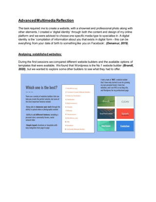
- 1. AdvancedMultimedia Reflection The task required me to create a website, with a showreel and professional photo along with other elements. I created a ‘digital identity’ through both the content and design of my online platform and we were advised to choose one specific media type to specialise in. A digital identity is the ‘compilation of information about you that exists in digital form - this can be everything from your date of birth to something like you on Facebook’. (Denamur, 2019). Analysing established websites: During the first sessions we compared different website builders and the available options of templates that were available. We found that Wordpress is the No.1 website builder (Brandl, 2020), but we wanted to explore some other builders to see what they had to offer.
- 2. Recreating a website: We decided to recreate the ‘Mind.org.uk’ website via Wix. To see the website, click here What did I need to learn? Blogs: A blog shows that you are actively engaging with your profession, but are also able to showcase views and opinions on things unrelated. This is something I wanted to include on my website, as I could regularly update information on this to let my visitors know what’s happening in my life. Looking at published ‘Landing’ Pages/’About Me’ Pages: Landing Page: Anna Pantelia shows a variety of work that she has completed and I thought that this would be a good aspect to try and include with my own website.
- 3. Blog: Regularly updated with the work she is completing, places that she has visited and inspirations for her own work. Exhibitions: She features all of the magazines and publications where her work was shown. I don’t like how all of her work has been centered in the middle of the page, and this is something that I will try and avoid when creating my own portfolio. It is very difficult to read each of the news stories until you’ve clicked on them and you can’t exit them without going back in your browser. In addition to this, Martin Schoeller also had an interesting layout with his website. Titles: They are laid out in a simple column to the left hand side of the screen, with his images being showcased in a grid format or through using a slideshow. ‘About Me’ page: Showcases him in his best form, which includes why he got into photography along with other skills, interests and hobbies that he has. Portrait: I decided that I would like to create a black and white portrait image.
- 5. Differences between Photoshop designs and Created website on Wordpress: Simplicity: One of the main weaknesses around putting my blog together was thinking about how to be simplistic with the content I include, but for it to showcase the best version of myself. Titles: From comparing my initial design to the final layout of my website, I would have preferred the titles to be along either the left or right hand side rather than at the top of the page but after speaking to some of my friends and sharing my link around social media, the majority of people said that the titles at the top would make them more confident in being able to view the site. Colour Scheme: I think another aspect of the site I could have potentially improved, is maybe the colour scheme. I decided to use white as this is a simple colour and it let’s colourful images speak for themselves, but it might have been nice to include a slight tint of blue which would have linked well with the logo I created. Creating the Logo: When creating the logo, I wanted a simple design which would make it clear who I am. I decided to go against using my full name as I am more commonly known on social media by my online
- 6. persona ‘IsThatBrandon’. After several attempts of creating a logo, I came up with a style that I really liked. I used Adobe Photoshop and experimented with some shape tools to create the imagery on my logo, and used the gradient to fill the background. I didn’t have any inspiration for creating the logo, other than my favourite colour is blue. Short biography (& tone of voice): I found ‘Mr Bingo’ who is a professional artist, and the tone of voice and layout throughout his whole website, inspired me to create something similar to his. On his ‘About Me’ page he has a short FAQ about himself where he is able to showcase his personality and is brutally honest with his answers. I decided to include 5 questions, reducing in size one at a time…(How would you introduce yourself in FIVE words, Describe yourself in FOUR words etc). I feel that having changed my biography text, it will attract more people to my website as I am showcasing my true personality. Portraits: I was inspired mainly by Annie Leibovitz and David Bailey and I wanted to recreate their style of portrait photography, which showed more than just a face. I came up with a mood board of website styles from a variety of different photographers and creators, so that I could try and include different concepts from each of them when creating my own site. In terms of the tone of the image, the image is split into a mixture of light and dark tones.
- 8. I discovered David Tabagari who’s images matched the beat of the music, and he also varied how many images were on the screen at the same time. The only problem I faced when watching his showreel is that there was such a wide variety of photography work, that I wouldn’t be able to easily identify what he specialises in. Another showreel inspiration was Mark Duffy who includes images he has taken of himself and manipulated in one way or another. The interesting aspect of his showreel is that he duplicates the images making it appear in the background. From having attempted this myself, I know that you just need to align the image in the right place and then apply the Gaussian Blur effect for this to happen. Screenshots from my created showreel:
- 9. My showreel ended up being just over a minute long which is more than enough time to showcase some of my best work. I decided to include some images that were featured on my website, along with others that haven’t been seen before. This was something I have seen in a lot of other photography portfolios enabling creatives to show a variety of work they have completed. I decided to use an upbeat song to accompany the visuals so that people stayed engaged the whole time. Creating the blog: For the blog, I made sure to post at least once a week to ensure that I was actively engaged as a photographer, and that I was using inspirations, films and other photographers/models as ways for me to write about my thoughts and opinions on various topics linking to photography, but also away from photography to show that my interests branch out. Galleries: I also added a variety of galleries to showcase my work throughout the portfolio, with a link to my created showreel at the top of that page. I was inspired by a variety of portfolios that included images in threes known as triptychs. ‘As the viewer looks from one panel to the next, they have to come to terms as to how the art speaks to them and how they can digest three different artworks in one composition’ (Garrison, 2014).
- 10. Exhibitions: In addition to this I included an exhibitions page where I shared two videos I had created back in A Levels, analysing my photography work (which is something I aimed to do with this module in the form of blog posts). ‘Contact Me’ Page: Lastly, I made sure to include a ‘Contact Me’ page so that people could message me directly through the website (and my social media links were there just in case they preferred that option). On the page, I had a picture of myself as the background and when the user scrolls, the image of my face appears.
- 11. I believe that I have learnt a lot about how to brand myself online, and that I need to make sure my personality flows throughout the whole site. I will ensure to update my website regularly, whether that’s thinking about a new logo style, updating the photography work that I have on the website or creating written blog posts updating people on the recent projects I have been working on. Learning how to create detailed designs of a website before creating it, has taught me that I am able to analyse each individual element and create the website exactly how I want it. It has also shown me that if there is something I am unable to create with a particular template, there are website builders where a different aspect or feature will be available, which would actually improve the aesthetic of the website. To conclude, I feel that the portfolio I have created is a simple outline for the work I am able to create, and is an easy platform for other creatives to see my work online with the share of a URL link. Over the weeks, there were a variety of handy workshops which spoke in detail about specific concepts such as colour, thinking about your target audience, logo design and how you want to sell yourselves to the public. Bibliography: Brandl,R., 2020. ‘The 14 Best Website Builders 2020:Each Tried and Tested’. Website Tool Tester. [Accessed 3rd May 2020]: https://www.websitetooltester.com/en/best-website-builder/ Denamur,L., 2019. ‘What is a Digital identity?’. Jumio.[Accessed 3rd May 2020]: https://www.jumio.com/what-is-a- digital-identity/ Garrison,M., 2014.‘3 Reasons Why Triptych Art Is Successful’.Lori McNee. [Accessed 6th May 2020]: https://www.finearttips.com/2014/01/3-reasons-why-triptych-art-is-successful/ Nayanathara,2016. ‘What is an interactive website and how does it benefitthe user?’. ZYXWARE Technologies. [Accessed 2nd May 2020]: https://www.zyxware.com/articles/4860/what-is-an-interactive-website-and-how-does-it- benefit-the-user