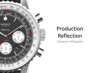
SlideShare a Scribd company logo
1 of 37
Cameron Whapples
Production
Reflection
Process
Process
I started by taking one of the images of a dive watch from my pre-production. This was the Omega Seamaster. I began to block
out the basic pieces such as the face, the lugs and the strap. I used the Shape Tool alongside the Lasso in order to create these.
The face and the strap were enough, just a circles and rectangles. The Lasso Tool was used for the lugs which were an irregular
shape. I selected an area with the tool and filled it with a similar grey tone as the tone as the other pieces. These were kept
different colours so I could easily differentiate between them, furthermore every piece was on a separate layer.
Using an online template I added the details on the face such as the digits and the bezel markers. The main digits were created
using the Shape Tool with the exception of the ‘12’. Which started as two squares and were whittled down and joined into a
triangle. The smaller markers for the individual minutes were created using the Brush Tool once the template had been overlaid.
The dots on the bezel were arranged by eye around the black circle with bigger ones at the major points.
I created the minute hand in a very similar way to the ‘12’ marker; by using the Shape Tool and erasing areas that were not
needed to create the pointed shape. I then positioned a small black dot in the centre of the face which would act as a marker for
the rest of the hands.
Process
Process
The rest of the hands were added to the face along with the brand and the watch specifics. I entered the movement of the
watch and its underwater capabilities, copying them from the Seamaster. I then started to add the shading that would transform
the entire image.
I began with the face. I selected the layers that held the watch’s hands and altered the Blending Options of them. I added a Drop
Shadow to them all, coming from a light source that would be in the top right of the image. I then did the same for the digits
though made the shadow’s distance much smaller as they would be not so prominent. I manually added the shadow the hands
of the watch using the Burn and Dodge tools to darken and lighten chosen areas. This created the same effect. To finish I added a
Stroke around all of the digits. This really brought out the detail with this.
I then moved to the bezel on the watch. Around each of the dots I added the same Stroke so that they appeared to be sticking
out from the surface. I then added a shine to the dark surface. Being completely black I could not use the Dodge and Burn Tools
so I instead used the Brush Tool to paint a white streak that follow the curvature. Then using the Smudge Tool I smoothed out
the flow of the paint so that it better fit the circular shape of the bezel. This also spread the streak around and thinned it slightly.
To complete this shine I lowered the opacity to the point at which it was barely visible. It is not a loud feature but a nice addition
that is noticed after a length of viewing. I copied this effect and placed it in another position, having changed the size so that it
was smaller.
I then moved onto the case. Being a much lighter colour I could revert to the shading tools. I darkened the bottom left sector
while creating a shine on the top right, following the lighting arrangement I had started on the watch face. Near the quarter-to
and quarter-past position I created a shine through the centre of the watch. This added to the texture of the watch’s case and
made it seem much more metallic. I repeated this nearby, although it is harder to see.
I then moved to the lugs. I copied the way in which the light moved over these parts from the source image. The light was
difficult to interpret without it. The effect was what I was looking for. I used the Lass Tool to select the top and the side
individually and I shaded them using the Dodge and Burn Tools separately.
Process
As I wanted the watch to appear similar to the one that would feature in the TV advert I decided to ignore the Omega and place
a different strap on it. I found an image of a NATO strap on a different watch. This design had the three stripes of colour which
was similar to my own. I began by experimenting with a way of copying the texture.
I first created a striped pattern of light grey and dark grey. They were in thin strips and were multiple strips wide. I created a
square of these and then copied the design. I darkened one patch of stripes further so that it was much darker. I placed the
lighter on top of the darker and selected the Eraser Tool. I selected the lighter layer and began roughly erasing the top patch so
that the darker patch showed through. The effect was exactly what I was looking for.
I then merged the layer together and slanted the whole image to the left. This made the square a rhombus and the lines appear
like the nylon texture I was trying to replicate. I copied this and darkened it so that I had a black patch of nylon and a grey. I used
the Selection Tool to cut out a rectangular piece of the texture from both. I placed them side by side, as shown in the image, and
the texture was perfect.
Process
Process
I arranged the nylon textures so that they created the striped effect of the NATO strap. I then merged these layers so that I could
begin to shade it. I created the heaviest shadows in the areas where the case met the strap so that it appeared as though the
material was disappearing underneath it as it should. I then did some light shading in other areas so that it looked more realistic.
At a later date, once the second watch had been finished I used its crown for this watch.
I am very pleased with the result of this watch as it looks realistic enough to be used in an advertisement. The production
experiments were extremely useful in providing me with this method of creating the product. Up close there are details that
reveal the stages behind the work but once it is in a advertisement setting these will not be noticeable.
Process
Process
As this watch was so much more complicated than the diving watch I needed to use a source image of an aviation as a guide. I
started in the same way as I did before by creating multiple circular shapes using the Shape Tool in Photoshop. Just as I had done
before every shape was made in a separate layer so that they could be individually edited at a later date. I blocked out the basic
faces of the watch, starting from the outside and working my way in. I then used the Lasso Tool to create the shapes of the lugs
and the top and bottom half of the strap. I made one of each and duplicated them so that they were exactly the same. The lugs
were made on two levels as one would be for the top and the other the slanted side of the lug. These can be seen as the light grey
and dark grey areas. I then created the thin rings on the inside using the Shape Tool but by only selecting the outline.
To create the chiselled bezel that be seen on the source image I began with a normal circle that was coloured grey. I then made a
much smaller circle and duplicated it multiple times. I positioned them around the perimeter of the bezel circle and then merged
the layers so that they became one. I selected this layer and a dotted line surrounded the entire rings of circles. With it still
selected I rasterized the circular bezel layer and pressed ‘Delete’ on the keyword. The multiple circles acted as a template and
removed that shape from the bezel layer. To remove the pointed edges I repeated the same process, this time with a circle that
was slightly bigger. This removed the spiked edges from around the bezel and resembled the one from the source image.
I moved onto the digits and the hands. I created a new layer to act as a template for the digits. By holding ‘Shift’ on the keyboard
with the Brush Tool I was able to draw a straight line between two points. I did this from the centre of the watch outwards for
every line on the face. I erased the bits I did not need. I then used the Shape Tool to create rectangles for the main digit markers
for every five minutes. I then added the digits around the tachymeter in their according positions.
I made the hands by using the Shape Tool and Lasso Tool to erase sections from rectangular shapes. To create the pin hole I
resized the brush and coloured matched the palette. I then clicked to place a dot at the end of the rectangular strip. I used the
Lasso Tool to shape the ends and give them a point.
Process
I was at the final stages of the watch. Everything that needed to be on the product was on it but I still had some work to do. The
first thing was that I changed the font of the digits on the tachymeter. This was originally a different font to the one on the source
image and so I changed it so that it was more similar. It instantly became more authentic. This new font was wider and much
shorter in height. It made it much more low profile and so it fit better than the font prior which was taller and more rounded.
After this everything was complete. I had branded the watch with the name I had chosen, Underwing. All I needed to was to
render the metal and put a finish on the strap.
I started by selecting the Dodge and Burn Tool and gradually shading the areas so that they resembled the source image. I thought
it better to copy the way in which in the light bounced around the product instead of inventing it, this would make it much more
authentic and realistic. This took time as they had to be done individually. The shading of the lugs was greatly improved by the
separation of the top and the side into different layers. Everything was done so that it resembled the source. I am most pleased
with the tachymeter buttons and the crown. These were the most difficult to accomplish but I believe that the result was very
successful.
With the rendering complete I moved to the strap. I found an image of a leather texture online and overlaid it onto the strap
template. I selected the Darken overlay option and then began shading it. I noticed that the lightest areas were those around the
indents and near the lugs. The darkest area was a an upside down Y-shape in the centre. I copied this and shaded it appropriately.
The watch was complete and the results are exactly what I wanted. The watch looked like an aviation watch which was the main
concern. The rendering was as good as if not better than on the first. This would fit perfectly onto the print adverts that I would
be producing next.
Process
Concept 1 A
Process
Concept 1 B
Process
Concept 1 C
Concept 1
A – This first concept is that looks artistic but is not a good demonstration of my research or advertisement composition. The
black and white background is something that would be reminiscent of a watch advert, however it makes the whole advert very
dull and very hard to look at. The only colour being the red of the plane does mean that it matches with the watch, as both are
sets of colour are surrounded by a very stale colour palette. This dark colour scheme does mean that the logo and the product
stand out ion the right side of the page. Being very bright shade of grey and white, they are a respite in the almost colourless
advert.
A positive aspect of this advert is the composition of the text in the footer. I very much like the brand and model being displayed
above the paragraph of information. This is an appealing part of the advertisement but not a redeeming feature.
B – There are no changes to the way in which the advert has been composed in this version, however the colour scheme has been
changed drastically. Gone is the black and white background image. With the colour restored the image looks much better than it
did previously. The footer has also undergone a change in its properties, the opacity has been lowered to allow some of the colour
to come through. This lightens the whole image massively, however the look is not what I would call finalised.
Although the footer is less intense on the eyes it now resembles a credit roll that would be seen in a television show. What with
the amount of text, the resemblance is striking. This change in opacity also takes its toll on the once successful brand name and
model name that titled the paragraph. This has lost its effect as the contrast had been reduced.
C – This version is a merge between the first and the second as it incorporates the black and white image (except the plane) with
the less intense footer. Although this is much better than the first version of this advert it is still not right. The coloured footer
does not make any sense without first viewing the previous concepts, which is not a good sign for a standalone image. It is more
balanced because of this, the eye is no longer solely attracted to the right side of the page where all the colour lies in the first, nor
anything but the product in the most recent. It is a good combination. The emphasis on the model name has also regained some
of its former glory as it now contrasts slightly better as there is little colour above it.
The few positives of this advert do not outweigh the negatives unfortunately. The image becomes too daft what with the
arrangement of colour. Being in the footer and not the majority of the photograph does not for the advert but detract from it.
Process
Concept 2
Concept 2
This concept of the print advert is entirely different from the first, not just in visuals but in the way that it is advertising the
product. Although this is not a finished version as production of this was ended very shortly it still does show the basic outline of
the advert. This advertisement opts for a majorly different strategy as it uses rhetorical questions to entice the customer, rather
than traditional messages of power and individuality
This advert is similar to the Rolex adverts that would depict a diver, for example, deep underwater and the slogan would read ‘If
you were here you’d wear a Rolex’. Although the language is not exactly alike it is on the same track, a semi-instructive message
that lures customers.
My advert still relates to the flight aspect of the watch as it shows the instruments found inside an aircraft. The presentation is
much more quirky then it should be. This sort of advert does not fit the theme of the brand nor does it represent it in the way that
I want it to. To discontinue this design concept was the right decision.
Process
Concept 3
Concept 3
This version of the print advert has had a massive change from the previous and in fact the first designs, although it may appear to
be back to normal. The biggest change is the composition of the photograph. The colour is back in the image which makes all the
difference. This brings in a lighter look to the whole advert and keeps it bright and attractive. The colours are not too much and
are controlled with the use of the filter effect. Instead of being the original image it now resembles an oil painting due to an effect
that has been placed upon it. This is both visually appealing as it is not at first visible but it is also relevant to the message in the
slogan. This is a new features that resides in the area that once held nothing. It breaks up the previous bleak top half of the page
and keeps it busy and alive.
‘Flight is not a science. It an art’ is a message that relates to both the view on luxury watchmaking and the approach that early
pilots took on flying from the location in which the photograph was taken. This also nicely fits with the filter on the image.
One of the biggest changes was to the footer. This now includes a quote from one of the Wirght brothers, keeping with the
aviation theme. There also has been a reduction in the amount of text located in that area. This keeps the advert’s intensity down
as the customer is not bombarded with a mountain of information. Below this sits the web address for the company. The footers
properties was one of the most successful decisions as it combines the positive aspects of the previous designs. The opacity has
been raised from what it was before but now fully so that it allows the photograph behind it to be seen ever so slightly. This keeps
the footer dark so that the text contrasts but also breaks up the monotony of the darkness.
The product and the logo have stayed in exactly the same place as before. Their position is one that has been dictated by the
research I made. Very few things will make these elements move.
Process
Concept 4 A
Process
Concept 4 B
Process
Concept 4 C (Final)
Concept 4
A – The most noticeable difference between this version and the previous the reduction of the amount of text. It has been
changed once again and this time nearly removed entirely. With the three sentences the advert looks much less cluttered. It
describes the heritage behind the watch and a brief description of how it became a famous and historical timepiece. I also
introduced a header. This sits at the top at what I consider the perfect size, not too small but not intrusive into the photograph. It
breaks the edge of the image up and keeps it looking tidy. I also added the brand name to the image in a style which is
reminiscent of Omega. The low opacity of the text makes it barely visible which is the style I was trying to achieve.
Smaller details that have been changed include the resizing of the reference number of the model. This makes it much easier to
see and therefore gives the advert another level of authenticity. The logo has also been changed so that there is no white
background and the name and slogan has been removed from it. This has increased the quality by tenfold as it no longer looks out
of place among the rest of the details.
B – The next version of the advert has not changed drastically but this is a clear indicator that I am becoming happy with this final
concept. The most noticeable change is the wording and position of the slogan at the top of the page. The previous wording was
impactful and drove the message across but I felt that was the incorrect approach. The punctuation and the use of the two
sentences meant that it appeared as though it was forceful. Having the slogan as one sentence is much more elegant and flows
much better. This did mean that the word ‘art’ looked out of place being red. As this was to match the plane and the watch it was
suitable at the end of the sentence but this no longer worked. Instead I made it much bolder than the rest of the text so that it
could stand out in this way.
The original sentences both ended above the centre of the watch which would draw the eye to the product immediately after
reading the text. This time I positioned the sentence so that it ended in line with the crown of the watch. This kept the text to the
right of the screen and had the same effect. I also nudged the ‘Raymoth’ behind the watch to the left so that it had more of a
border between the edge of the page.
C – I was now content with this version of the advert. The composition of the advert and the colours used all matched my plans. I
moved the web address slightly to the left and used a white to divide the footer and the image. It was now complete.
Process
Concept 1
Concept 1
This first concept is one that was secured through my pre-production. I had a clear idea of what I was going to create. The position
of the watch was determined through my research as I knew it had to be placed in the centre of the page where the eye would
travel to first. This was assisted by features of the page such as the background. Placing it towards the bottom allowed for the text
to sit comfortably above it while not being the focus of attention. The background image is one that I felt was constructive to the
rest of the advert. The deep blue contrasts with the bright white and draws the eye to that specific point. This is only aided by the
use of the lens flare that rest on the top right corner of the watch’s case.
The font choice was a good decision as it matches the theme of the advert, especially the content of the text. This was not so
good, however. I felt that the message was too generic and too unoriginal. The content did not impress, like it should. It just
seemed like any other watch advert. The use of such few words was something that affected the presentation, as I had to
counteract this by spreading the characters and words apart so that they filled the area. I also wanted to highlight the word ‘new’
but this made it impossible to do in an appealing way.
Despite this I think the composition was perfect. The ‘certified dive watch’ specifications were positioned correctly in the bottom
left, with the logo upon a black card directly opposite. This kept all the details to the bottom of the page so that they could be
read once the reader was enticed. The overall design was very neat.
Process
Concept 2 A
Process
Concept 2 B
Process
Concept 2 C
Process
Concept 2 D (Final)
Concept 2
A – Though there are few changes with the presentation from the previous version, the most important is the wording of the
slogan. This was influenced by the key words I had collected in my pre-production. This new slogan of ‘challenging, enduring,
exploring, unrelenting’ meant so much more and was different from other adverts. I worked alongside the research I had made
and provoked the target audience. It was also in line with the sides of the watch which made the whole advert tall and elegant.
I also worked a fade into the card beneath the logo. This meant that it transitioned into the background better but also now
resembled features I had discovered while researching.
B – Although I had improved the slogan in the previous concept the spacing was still terrible. With this edit I changed the spacing
of the individual words so that they did not appear so haphazardly placed. This also gave the sentence below, ‘describe the ocean’
much more room and therefore much more impact upon the reader.
C – The only change I made with this version is the wording of the phrase that I had just given more impact to my prior
improvements. I had debated whether to alter this or not but the conclusion was that the current wording avoided any confusion
that my occur. ‘Describe the ocean’ may be seen as a command rather than an explanation for the four words above it. Although
the chances are slim of this occurring, I feel that there could be some incoherence with the previous sentence, so I changed it and
added an ‘all’ at the start.
D – This last edit was again very small but I felt that this delivered the finishing touches that would complete this advert. As my
planning was so efficient and the design so simple on paper, this took a lot less time and versions to complete than the other,
however I believe that it is just as good. The change I made was to the slogan and its ordering. Before the words seemed to be in a
peculiar order, the smaller and longer words sandwiching the larger and shorter words. My final change ordered the words so that
they descended in size. This meant that this became another feature that drew the eye to the product in the centre.
Rev counter
As one of the shots in my shot list was of a rev counter I needed to find a way of filming one. Practically this would be hard and
potentially dangerous to do. To avoid this I devised a way of creating it within Photoshop. I found an image online. This was dark
enough to show too many of the details on the dashboard so I started to copy it.
The design was basic, but I soon struggled with details such as the seatbelt light and the reflections of light around the dial. I
achieved both of these with a number of tools. For the seatbelt symbol I used the Lasso and Brush tools to create the basic shape.
I colour picked from the original image using the Eye-Drop Tool. Once I had this orange colour I used the Dodge and Burn tools to
shade it appropriately. This made it appear as though it was a light that was glowing.
For the reflections of light I used the Brush again to paint white curves around the edge. I then used the Smudge and Blur tools to
obscure the edges as to make it look as though light was passing through it.
To animate this I used the Frame Animation Toolbar in Photoshop to move the needle (which was done on a separate layer). A
problem occurred very quickly in that the needle would not move as it should in the individual frames. Photoshop would only
allow the image to move on an axis, not a rotation. To make it bounce around the revs I had to duplicate the layer and move this.
This resulted in over 150 individual layers.
The end result was exactly what I needed. The rev counter spun around the dial and even reached the limit which was something
that I would not have been able to do practically. This fit perfectly into the advert as part of the demonstration of power.
Multiple edits + shots
From the initial ideas to the final edit, the television advert went through multiple versions and changes to achieve the final
product. The first plans of the advert depicted cars and planes racing down roads and through skies in time with macro shots of a
watch. This was to emphasise the imagery of power that many of the adverts that I had researched displayed. This changed once
editing began as the shots that I had managed to get were not quite right for the advert.
The tone of the advert was something that I wanted to get right and the shots of cars and planes and other images were not easily
applicable. This may have been down to the shooting of these different things but I think that it was a case of the shots not
matching in an appealing way.
The watch shots also looked very good on their own. The way in which the light chased around the surface of the metal was very
aesthetically pleasing. These were images of elegance and beauty, not speed and power. The research that I performed showed
that these went hand in hand but only at the point of editing did I realise that I had misjudged these things. The ‘Breitling for
Bentley’ adverts used both products to represent each other but these were not showcases of speed, they were of precision and
prestige between the two brands. The editing made me realise that these images were determined by the approach that the
brand took. It may work for Breitling to show fighter planes chasing each other while the pilots wear their watches but it would
not work for the advert I was creating.
Many different versions of the advert were saved but the one that I chose as my final was one that only included the watch. This
was much more basic than I had first imagined but I believed it to be the best choice for my brand. The narration was gentle and
the meaning was related to the watch in a number of different ways. The advert was better off just showing the watch on its own.
The images I had captured were powerful enough to be shown on their own.
I did one of the shots to visualise one of the lines in the narration. At the word ‘elements’ the watch is shown with a shot of trees
in the wind overlaid. This was done so that it would appear that the image was being projected onto the watch. I brought the shot
above the watch clip in the timeline and chose the Lighten option which gave it its effect. Out of all the shots, including the rev
counter I had made, this was the only one that made it in. I do not think that this was a waste, however, and stand by my
statement that this was the best version of the advert.
Music
The music was something that I needed to be perfect as it would provide the advert with the correct tone. I used GarageBand to
create the score, using a USB keyboard. I started with four chords that gave me a somber yet powerful sound. I wanted them to be
melancholy at first but end with a high to lift the mood in an inspiring way.
The first version used strings to draw in the listener. These were deep and powerful. The tone was quite dark to begin with but
this was the point. The tone would be ambiguous until the main chorus started. These string also helped to relate the narration to
the advert. The warps of the sound help give it a mysterious sound.
The piano comes in with the four basic chords along with a chiming of a bell. This is to drastically change the emotion of the music
which would then help to inspire the audience along with the voiceover. The bells also note the clock theme, sounding similar to a
church bell. This section contrasts greatly against the first part of the track which is dark and uninviting.
The drum is introduced along with a complicated sounding tune from the piano. This gives the advert the modern feel while
emphasising the feeling of aspiration. This is only helped by the introduction of the strings, this time in a higher octave. This floats
around different keys until it reaches a higher note to elate the spirits of the listener. The score finishes with the four chords on
their own.
Despite being a successful soundtrack it was too long for the duration of the television advert. The sound was exactly along the
lines of what I needed but it was not short enough and I feared that it would be butchered if I was to shorten it. I decided to
rewrite it entirely.
Using the same four chords this was much shorter than the first but I felt that it delivered more of an impactful emotion than the
first ever did. Instead of using the strings at the beginning I had the piano performing a solo. Some orchestral strings are used to
give the notes a deeper, throatier sound to them. The drumming was also changed so that it was less intense and the piano
melody was less complicated. This still followed four chords.
The reason behind the success of this shorter track was the use of one of GarageBand’s features. I was able to import the finished
advert into the program and view it while the music played. This meant I could sync the notes perfectly to what was happening on
screen.

More Related Content

Similar to Production Reflection

6. fmp production reflection
6. fmp production reflection6. fmp production reflection
6. fmp production reflection
Jamescooperabel1
 
2.2 [pro forma] experimental photography planning
2.2 [pro forma] experimental photography planning 2.2 [pro forma] experimental photography planning
2.2 [pro forma] experimental photography planning
Jamie Mellors
 
3. production experiments
3. production experiments3. production experiments
3. production experiments
Amelia France
 
Construction of media
Construction of mediaConstruction of media
Construction of media
ezreen_b
 
Music mag con photoshop
Music mag con photoshopMusic mag con photoshop
Music mag con photoshop
Charlene
 
Ha2 production log_template_141014
Ha2 production log_template_141014Ha2 production log_template_141014
Ha2 production log_template_141014
amybrockbank
 
Music magazine front page photo man
Music magazine front page photo manMusic magazine front page photo man
Music magazine front page photo man
HGASMedia
 
6. fmp production reflection
6. fmp production reflection6. fmp production reflection
6. fmp production reflection
JackGarner9
 
Front cover magazine process
Front cover magazine processFront cover magazine process
Front cover magazine process
shannoncammish
 

Similar to Production Reflection (20)

Production Experiments
Production ExperimentsProduction Experiments
Production Experiments
 
6. fmp production reflection
6. fmp production reflection6. fmp production reflection
6. fmp production reflection
 
Fmp production reflection
Fmp production reflectionFmp production reflection
Fmp production reflection
 
6. production reflection(1)
6. production reflection(1)6. production reflection(1)
6. production reflection(1)
 
Production Experiments
Production ExperimentsProduction Experiments
Production Experiments
 
2.2 [pro forma] experimental photography planning
2.2 [pro forma] experimental photography planning 2.2 [pro forma] experimental photography planning
2.2 [pro forma] experimental photography planning
 
Final poster creation
Final poster creationFinal poster creation
Final poster creation
 
Fmp2 production reflection
Fmp2 production reflectionFmp2 production reflection
Fmp2 production reflection
 
Fmp2 production reflectionss
Fmp2 production reflectionssFmp2 production reflectionss
Fmp2 production reflectionss
 
Fmp2 production reflection
Fmp2 production reflectionFmp2 production reflection
Fmp2 production reflection
 
3. production experiments
3. production experiments3. production experiments
3. production experiments
 
Construction on front cover
Construction on front coverConstruction on front cover
Construction on front cover
 
Construction of media
Construction of mediaConstruction of media
Construction of media
 
Fmp2 production reflection
Fmp2 production reflectionFmp2 production reflection
Fmp2 production reflection
 
Music mag con photoshop
Music mag con photoshopMusic mag con photoshop
Music mag con photoshop
 
Ha2 production log_template_141014
Ha2 production log_template_141014Ha2 production log_template_141014
Ha2 production log_template_141014
 
Making my digipak - Hell on Heels
Making my digipak - Hell on HeelsMaking my digipak - Hell on Heels
Making my digipak - Hell on Heels
 
Music magazine front page photo man
Music magazine front page photo manMusic magazine front page photo man
Music magazine front page photo man
 
6. fmp production reflection
6. fmp production reflection6. fmp production reflection
6. fmp production reflection
 
Front cover magazine process
Front cover magazine processFront cover magazine process
Front cover magazine process
 

More from Cameron Whapples (20)

3. evaluation
3. evaluation3. evaluation
3. evaluation
 
Evaluation new (1)
Evaluation new (1)Evaluation new (1)
Evaluation new (1)
 
Production planning
Production planningProduction planning
Production planning
 
Research (3)
Research (3)Research (3)
Research (3)
 
Ual ucas pro forma 1- (1)
Ual ucas pro forma 1- (1)Ual ucas pro forma 1- (1)
Ual ucas pro forma 1- (1)
 
Evaluation new
Evaluation newEvaluation new
Evaluation new
 
Presentation
PresentationPresentation
Presentation
 
Production planning
Production planningProduction planning
Production planning
 
My project
My projectMy project
My project
 
Presentation
PresentationPresentation
Presentation
 
Peer feedback
Peer feedbackPeer feedback
Peer feedback
 
Production diary
Production diary Production diary
Production diary
 
Evaluation
EvaluationEvaluation
Evaluation
 
Fmp proposal
Fmp proposalFmp proposal
Fmp proposal
 
Fmp pre proposal
Fmp pre proposalFmp pre proposal
Fmp pre proposal
 
Production planning
Production planningProduction planning
Production planning
 
Problem solving
Problem solvingProblem solving
Problem solving
 
Fmp pre proposal
Fmp pre proposalFmp pre proposal
Fmp pre proposal
 
Context research
Context researchContext research
Context research
 
Research
ResearchResearch
Research
 

Recently uploaded

Seal of Good Local Governance (SGLG) 2024Final.pptx
Seal of Good Local Governance (SGLG) 2024Final.pptxSeal of Good Local Governance (SGLG) 2024Final.pptx
Seal of Good Local Governance (SGLG) 2024Final.pptx
negromaestrong
 
1029-Danh muc Sach Giao Khoa khoi 6.pdf
1029-Danh muc Sach Giao Khoa khoi  6.pdf1029-Danh muc Sach Giao Khoa khoi  6.pdf
1029-Danh muc Sach Giao Khoa khoi 6.pdf
QucHHunhnh
 
Activity 01 - Artificial Culture (1).pdf
Activity 01 - Artificial Culture (1).pdfActivity 01 - Artificial Culture (1).pdf
Activity 01 - Artificial Culture (1).pdf
ciinovamais
 
Russian Escort Service in Delhi 11k Hotel Foreigner Russian Call Girls in Delhi
Russian Escort Service in Delhi 11k Hotel Foreigner Russian Call Girls in DelhiRussian Escort Service in Delhi 11k Hotel Foreigner Russian Call Girls in Delhi
Russian Escort Service in Delhi 11k Hotel Foreigner Russian Call Girls in Delhi
kauryashika82
 

Recently uploaded (20)

Measures of Dispersion and Variability: Range, QD, AD and SD
Measures of Dispersion and Variability: Range, QD, AD and SDMeasures of Dispersion and Variability: Range, QD, AD and SD
Measures of Dispersion and Variability: Range, QD, AD and SD
 
Class 11th Physics NEET formula sheet pdf
Class 11th Physics NEET formula sheet pdfClass 11th Physics NEET formula sheet pdf
Class 11th Physics NEET formula sheet pdf
 
This PowerPoint helps students to consider the concept of infinity.
This PowerPoint helps students to consider the concept of infinity.This PowerPoint helps students to consider the concept of infinity.
This PowerPoint helps students to consider the concept of infinity.
 
Seal of Good Local Governance (SGLG) 2024Final.pptx
Seal of Good Local Governance (SGLG) 2024Final.pptxSeal of Good Local Governance (SGLG) 2024Final.pptx
Seal of Good Local Governance (SGLG) 2024Final.pptx
 
INDIA QUIZ 2024 RLAC DELHI UNIVERSITY.pptx
INDIA QUIZ 2024 RLAC DELHI UNIVERSITY.pptxINDIA QUIZ 2024 RLAC DELHI UNIVERSITY.pptx
INDIA QUIZ 2024 RLAC DELHI UNIVERSITY.pptx
 
Energy Resources. ( B. Pharmacy, 1st Year, Sem-II) Natural Resources
Energy Resources. ( B. Pharmacy, 1st Year, Sem-II) Natural ResourcesEnergy Resources. ( B. Pharmacy, 1st Year, Sem-II) Natural Resources
Energy Resources. ( B. Pharmacy, 1st Year, Sem-II) Natural Resources
 
Presentation by Andreas Schleicher Tackling the School Absenteeism Crisis 30 ...
Presentation by Andreas Schleicher Tackling the School Absenteeism Crisis 30 ...Presentation by Andreas Schleicher Tackling the School Absenteeism Crisis 30 ...
Presentation by Andreas Schleicher Tackling the School Absenteeism Crisis 30 ...
 
Introduction to Nonprofit Accounting: The Basics
Introduction to Nonprofit Accounting: The BasicsIntroduction to Nonprofit Accounting: The Basics
Introduction to Nonprofit Accounting: The Basics
 
Advanced Views - Calendar View in Odoo 17
Advanced Views - Calendar View in Odoo 17Advanced Views - Calendar View in Odoo 17
Advanced Views - Calendar View in Odoo 17
 
1029-Danh muc Sach Giao Khoa khoi 6.pdf
1029-Danh muc Sach Giao Khoa khoi  6.pdf1029-Danh muc Sach Giao Khoa khoi  6.pdf
1029-Danh muc Sach Giao Khoa khoi 6.pdf
 
Nutritional Needs Presentation - HLTH 104
Nutritional Needs Presentation - HLTH 104Nutritional Needs Presentation - HLTH 104
Nutritional Needs Presentation - HLTH 104
 
Activity 01 - Artificial Culture (1).pdf
Activity 01 - Artificial Culture (1).pdfActivity 01 - Artificial Culture (1).pdf
Activity 01 - Artificial Culture (1).pdf
 
2024-NATIONAL-LEARNING-CAMP-AND-OTHER.pptx
2024-NATIONAL-LEARNING-CAMP-AND-OTHER.pptx2024-NATIONAL-LEARNING-CAMP-AND-OTHER.pptx
2024-NATIONAL-LEARNING-CAMP-AND-OTHER.pptx
 
Role Of Transgenic Animal In Target Validation-1.pptx
Role Of Transgenic Animal In Target Validation-1.pptxRole Of Transgenic Animal In Target Validation-1.pptx
Role Of Transgenic Animal In Target Validation-1.pptx
 
Mixin Classes in Odoo 17 How to Extend Models Using Mixin Classes
Mixin Classes in Odoo 17  How to Extend Models Using Mixin ClassesMixin Classes in Odoo 17  How to Extend Models Using Mixin Classes
Mixin Classes in Odoo 17 How to Extend Models Using Mixin Classes
 
Unit-V; Pricing (Pharma Marketing Management).pptx
Unit-V; Pricing (Pharma Marketing Management).pptxUnit-V; Pricing (Pharma Marketing Management).pptx
Unit-V; Pricing (Pharma Marketing Management).pptx
 
Unit-IV- Pharma. Marketing Channels.pptx
Unit-IV- Pharma. Marketing Channels.pptxUnit-IV- Pharma. Marketing Channels.pptx
Unit-IV- Pharma. Marketing Channels.pptx
 
Grant Readiness 101 TechSoup and Remy Consulting
Grant Readiness 101 TechSoup and Remy ConsultingGrant Readiness 101 TechSoup and Remy Consulting
Grant Readiness 101 TechSoup and Remy Consulting
 
Micro-Scholarship, What it is, How can it help me.pdf
Micro-Scholarship, What it is, How can it help me.pdfMicro-Scholarship, What it is, How can it help me.pdf
Micro-Scholarship, What it is, How can it help me.pdf
 
Russian Escort Service in Delhi 11k Hotel Foreigner Russian Call Girls in Delhi
Russian Escort Service in Delhi 11k Hotel Foreigner Russian Call Girls in DelhiRussian Escort Service in Delhi 11k Hotel Foreigner Russian Call Girls in Delhi
Russian Escort Service in Delhi 11k Hotel Foreigner Russian Call Girls in Delhi
 

Production Reflection

  • 3. Process I started by taking one of the images of a dive watch from my pre-production. This was the Omega Seamaster. I began to block out the basic pieces such as the face, the lugs and the strap. I used the Shape Tool alongside the Lasso in order to create these. The face and the strap were enough, just a circles and rectangles. The Lasso Tool was used for the lugs which were an irregular shape. I selected an area with the tool and filled it with a similar grey tone as the tone as the other pieces. These were kept different colours so I could easily differentiate between them, furthermore every piece was on a separate layer. Using an online template I added the details on the face such as the digits and the bezel markers. The main digits were created using the Shape Tool with the exception of the ‘12’. Which started as two squares and were whittled down and joined into a triangle. The smaller markers for the individual minutes were created using the Brush Tool once the template had been overlaid. The dots on the bezel were arranged by eye around the black circle with bigger ones at the major points. I created the minute hand in a very similar way to the ‘12’ marker; by using the Shape Tool and erasing areas that were not needed to create the pointed shape. I then positioned a small black dot in the centre of the face which would act as a marker for the rest of the hands.
  • 5. Process The rest of the hands were added to the face along with the brand and the watch specifics. I entered the movement of the watch and its underwater capabilities, copying them from the Seamaster. I then started to add the shading that would transform the entire image. I began with the face. I selected the layers that held the watch’s hands and altered the Blending Options of them. I added a Drop Shadow to them all, coming from a light source that would be in the top right of the image. I then did the same for the digits though made the shadow’s distance much smaller as they would be not so prominent. I manually added the shadow the hands of the watch using the Burn and Dodge tools to darken and lighten chosen areas. This created the same effect. To finish I added a Stroke around all of the digits. This really brought out the detail with this. I then moved to the bezel on the watch. Around each of the dots I added the same Stroke so that they appeared to be sticking out from the surface. I then added a shine to the dark surface. Being completely black I could not use the Dodge and Burn Tools so I instead used the Brush Tool to paint a white streak that follow the curvature. Then using the Smudge Tool I smoothed out the flow of the paint so that it better fit the circular shape of the bezel. This also spread the streak around and thinned it slightly. To complete this shine I lowered the opacity to the point at which it was barely visible. It is not a loud feature but a nice addition that is noticed after a length of viewing. I copied this effect and placed it in another position, having changed the size so that it was smaller. I then moved onto the case. Being a much lighter colour I could revert to the shading tools. I darkened the bottom left sector while creating a shine on the top right, following the lighting arrangement I had started on the watch face. Near the quarter-to and quarter-past position I created a shine through the centre of the watch. This added to the texture of the watch’s case and made it seem much more metallic. I repeated this nearby, although it is harder to see. I then moved to the lugs. I copied the way in which the light moved over these parts from the source image. The light was difficult to interpret without it. The effect was what I was looking for. I used the Lass Tool to select the top and the side individually and I shaded them using the Dodge and Burn Tools separately.
  • 6. Process As I wanted the watch to appear similar to the one that would feature in the TV advert I decided to ignore the Omega and place a different strap on it. I found an image of a NATO strap on a different watch. This design had the three stripes of colour which was similar to my own. I began by experimenting with a way of copying the texture. I first created a striped pattern of light grey and dark grey. They were in thin strips and were multiple strips wide. I created a square of these and then copied the design. I darkened one patch of stripes further so that it was much darker. I placed the lighter on top of the darker and selected the Eraser Tool. I selected the lighter layer and began roughly erasing the top patch so that the darker patch showed through. The effect was exactly what I was looking for. I then merged the layer together and slanted the whole image to the left. This made the square a rhombus and the lines appear like the nylon texture I was trying to replicate. I copied this and darkened it so that I had a black patch of nylon and a grey. I used the Selection Tool to cut out a rectangular piece of the texture from both. I placed them side by side, as shown in the image, and the texture was perfect.
  • 8. Process I arranged the nylon textures so that they created the striped effect of the NATO strap. I then merged these layers so that I could begin to shade it. I created the heaviest shadows in the areas where the case met the strap so that it appeared as though the material was disappearing underneath it as it should. I then did some light shading in other areas so that it looked more realistic. At a later date, once the second watch had been finished I used its crown for this watch. I am very pleased with the result of this watch as it looks realistic enough to be used in an advertisement. The production experiments were extremely useful in providing me with this method of creating the product. Up close there are details that reveal the stages behind the work but once it is in a advertisement setting these will not be noticeable.
  • 9.
  • 11. Process As this watch was so much more complicated than the diving watch I needed to use a source image of an aviation as a guide. I started in the same way as I did before by creating multiple circular shapes using the Shape Tool in Photoshop. Just as I had done before every shape was made in a separate layer so that they could be individually edited at a later date. I blocked out the basic faces of the watch, starting from the outside and working my way in. I then used the Lasso Tool to create the shapes of the lugs and the top and bottom half of the strap. I made one of each and duplicated them so that they were exactly the same. The lugs were made on two levels as one would be for the top and the other the slanted side of the lug. These can be seen as the light grey and dark grey areas. I then created the thin rings on the inside using the Shape Tool but by only selecting the outline. To create the chiselled bezel that be seen on the source image I began with a normal circle that was coloured grey. I then made a much smaller circle and duplicated it multiple times. I positioned them around the perimeter of the bezel circle and then merged the layers so that they became one. I selected this layer and a dotted line surrounded the entire rings of circles. With it still selected I rasterized the circular bezel layer and pressed ‘Delete’ on the keyword. The multiple circles acted as a template and removed that shape from the bezel layer. To remove the pointed edges I repeated the same process, this time with a circle that was slightly bigger. This removed the spiked edges from around the bezel and resembled the one from the source image. I moved onto the digits and the hands. I created a new layer to act as a template for the digits. By holding ‘Shift’ on the keyboard with the Brush Tool I was able to draw a straight line between two points. I did this from the centre of the watch outwards for every line on the face. I erased the bits I did not need. I then used the Shape Tool to create rectangles for the main digit markers for every five minutes. I then added the digits around the tachymeter in their according positions. I made the hands by using the Shape Tool and Lasso Tool to erase sections from rectangular shapes. To create the pin hole I resized the brush and coloured matched the palette. I then clicked to place a dot at the end of the rectangular strip. I used the Lasso Tool to shape the ends and give them a point.
  • 12.
  • 13.
  • 14. Process I was at the final stages of the watch. Everything that needed to be on the product was on it but I still had some work to do. The first thing was that I changed the font of the digits on the tachymeter. This was originally a different font to the one on the source image and so I changed it so that it was more similar. It instantly became more authentic. This new font was wider and much shorter in height. It made it much more low profile and so it fit better than the font prior which was taller and more rounded. After this everything was complete. I had branded the watch with the name I had chosen, Underwing. All I needed to was to render the metal and put a finish on the strap. I started by selecting the Dodge and Burn Tool and gradually shading the areas so that they resembled the source image. I thought it better to copy the way in which in the light bounced around the product instead of inventing it, this would make it much more authentic and realistic. This took time as they had to be done individually. The shading of the lugs was greatly improved by the separation of the top and the side into different layers. Everything was done so that it resembled the source. I am most pleased with the tachymeter buttons and the crown. These were the most difficult to accomplish but I believe that the result was very successful. With the rendering complete I moved to the strap. I found an image of a leather texture online and overlaid it onto the strap template. I selected the Darken overlay option and then began shading it. I noticed that the lightest areas were those around the indents and near the lugs. The darkest area was a an upside down Y-shape in the centre. I copied this and shaded it appropriately. The watch was complete and the results are exactly what I wanted. The watch looked like an aviation watch which was the main concern. The rendering was as good as if not better than on the first. This would fit perfectly onto the print adverts that I would be producing next.
  • 19. Concept 1 A – This first concept is that looks artistic but is not a good demonstration of my research or advertisement composition. The black and white background is something that would be reminiscent of a watch advert, however it makes the whole advert very dull and very hard to look at. The only colour being the red of the plane does mean that it matches with the watch, as both are sets of colour are surrounded by a very stale colour palette. This dark colour scheme does mean that the logo and the product stand out ion the right side of the page. Being very bright shade of grey and white, they are a respite in the almost colourless advert. A positive aspect of this advert is the composition of the text in the footer. I very much like the brand and model being displayed above the paragraph of information. This is an appealing part of the advertisement but not a redeeming feature. B – There are no changes to the way in which the advert has been composed in this version, however the colour scheme has been changed drastically. Gone is the black and white background image. With the colour restored the image looks much better than it did previously. The footer has also undergone a change in its properties, the opacity has been lowered to allow some of the colour to come through. This lightens the whole image massively, however the look is not what I would call finalised. Although the footer is less intense on the eyes it now resembles a credit roll that would be seen in a television show. What with the amount of text, the resemblance is striking. This change in opacity also takes its toll on the once successful brand name and model name that titled the paragraph. This has lost its effect as the contrast had been reduced. C – This version is a merge between the first and the second as it incorporates the black and white image (except the plane) with the less intense footer. Although this is much better than the first version of this advert it is still not right. The coloured footer does not make any sense without first viewing the previous concepts, which is not a good sign for a standalone image. It is more balanced because of this, the eye is no longer solely attracted to the right side of the page where all the colour lies in the first, nor anything but the product in the most recent. It is a good combination. The emphasis on the model name has also regained some of its former glory as it now contrasts slightly better as there is little colour above it. The few positives of this advert do not outweigh the negatives unfortunately. The image becomes too daft what with the arrangement of colour. Being in the footer and not the majority of the photograph does not for the advert but detract from it.
  • 21. Concept 2 This concept of the print advert is entirely different from the first, not just in visuals but in the way that it is advertising the product. Although this is not a finished version as production of this was ended very shortly it still does show the basic outline of the advert. This advertisement opts for a majorly different strategy as it uses rhetorical questions to entice the customer, rather than traditional messages of power and individuality This advert is similar to the Rolex adverts that would depict a diver, for example, deep underwater and the slogan would read ‘If you were here you’d wear a Rolex’. Although the language is not exactly alike it is on the same track, a semi-instructive message that lures customers. My advert still relates to the flight aspect of the watch as it shows the instruments found inside an aircraft. The presentation is much more quirky then it should be. This sort of advert does not fit the theme of the brand nor does it represent it in the way that I want it to. To discontinue this design concept was the right decision.
  • 23. Concept 3 This version of the print advert has had a massive change from the previous and in fact the first designs, although it may appear to be back to normal. The biggest change is the composition of the photograph. The colour is back in the image which makes all the difference. This brings in a lighter look to the whole advert and keeps it bright and attractive. The colours are not too much and are controlled with the use of the filter effect. Instead of being the original image it now resembles an oil painting due to an effect that has been placed upon it. This is both visually appealing as it is not at first visible but it is also relevant to the message in the slogan. This is a new features that resides in the area that once held nothing. It breaks up the previous bleak top half of the page and keeps it busy and alive. ‘Flight is not a science. It an art’ is a message that relates to both the view on luxury watchmaking and the approach that early pilots took on flying from the location in which the photograph was taken. This also nicely fits with the filter on the image. One of the biggest changes was to the footer. This now includes a quote from one of the Wirght brothers, keeping with the aviation theme. There also has been a reduction in the amount of text located in that area. This keeps the advert’s intensity down as the customer is not bombarded with a mountain of information. Below this sits the web address for the company. The footers properties was one of the most successful decisions as it combines the positive aspects of the previous designs. The opacity has been raised from what it was before but now fully so that it allows the photograph behind it to be seen ever so slightly. This keeps the footer dark so that the text contrasts but also breaks up the monotony of the darkness. The product and the logo have stayed in exactly the same place as before. Their position is one that has been dictated by the research I made. Very few things will make these elements move.
  • 27. Concept 4 A – The most noticeable difference between this version and the previous the reduction of the amount of text. It has been changed once again and this time nearly removed entirely. With the three sentences the advert looks much less cluttered. It describes the heritage behind the watch and a brief description of how it became a famous and historical timepiece. I also introduced a header. This sits at the top at what I consider the perfect size, not too small but not intrusive into the photograph. It breaks the edge of the image up and keeps it looking tidy. I also added the brand name to the image in a style which is reminiscent of Omega. The low opacity of the text makes it barely visible which is the style I was trying to achieve. Smaller details that have been changed include the resizing of the reference number of the model. This makes it much easier to see and therefore gives the advert another level of authenticity. The logo has also been changed so that there is no white background and the name and slogan has been removed from it. This has increased the quality by tenfold as it no longer looks out of place among the rest of the details. B – The next version of the advert has not changed drastically but this is a clear indicator that I am becoming happy with this final concept. The most noticeable change is the wording and position of the slogan at the top of the page. The previous wording was impactful and drove the message across but I felt that was the incorrect approach. The punctuation and the use of the two sentences meant that it appeared as though it was forceful. Having the slogan as one sentence is much more elegant and flows much better. This did mean that the word ‘art’ looked out of place being red. As this was to match the plane and the watch it was suitable at the end of the sentence but this no longer worked. Instead I made it much bolder than the rest of the text so that it could stand out in this way. The original sentences both ended above the centre of the watch which would draw the eye to the product immediately after reading the text. This time I positioned the sentence so that it ended in line with the crown of the watch. This kept the text to the right of the screen and had the same effect. I also nudged the ‘Raymoth’ behind the watch to the left so that it had more of a border between the edge of the page. C – I was now content with this version of the advert. The composition of the advert and the colours used all matched my plans. I moved the web address slightly to the left and used a white to divide the footer and the image. It was now complete.
  • 29. Concept 1 This first concept is one that was secured through my pre-production. I had a clear idea of what I was going to create. The position of the watch was determined through my research as I knew it had to be placed in the centre of the page where the eye would travel to first. This was assisted by features of the page such as the background. Placing it towards the bottom allowed for the text to sit comfortably above it while not being the focus of attention. The background image is one that I felt was constructive to the rest of the advert. The deep blue contrasts with the bright white and draws the eye to that specific point. This is only aided by the use of the lens flare that rest on the top right corner of the watch’s case. The font choice was a good decision as it matches the theme of the advert, especially the content of the text. This was not so good, however. I felt that the message was too generic and too unoriginal. The content did not impress, like it should. It just seemed like any other watch advert. The use of such few words was something that affected the presentation, as I had to counteract this by spreading the characters and words apart so that they filled the area. I also wanted to highlight the word ‘new’ but this made it impossible to do in an appealing way. Despite this I think the composition was perfect. The ‘certified dive watch’ specifications were positioned correctly in the bottom left, with the logo upon a black card directly opposite. This kept all the details to the bottom of the page so that they could be read once the reader was enticed. The overall design was very neat.
  • 34. Concept 2 A – Though there are few changes with the presentation from the previous version, the most important is the wording of the slogan. This was influenced by the key words I had collected in my pre-production. This new slogan of ‘challenging, enduring, exploring, unrelenting’ meant so much more and was different from other adverts. I worked alongside the research I had made and provoked the target audience. It was also in line with the sides of the watch which made the whole advert tall and elegant. I also worked a fade into the card beneath the logo. This meant that it transitioned into the background better but also now resembled features I had discovered while researching. B – Although I had improved the slogan in the previous concept the spacing was still terrible. With this edit I changed the spacing of the individual words so that they did not appear so haphazardly placed. This also gave the sentence below, ‘describe the ocean’ much more room and therefore much more impact upon the reader. C – The only change I made with this version is the wording of the phrase that I had just given more impact to my prior improvements. I had debated whether to alter this or not but the conclusion was that the current wording avoided any confusion that my occur. ‘Describe the ocean’ may be seen as a command rather than an explanation for the four words above it. Although the chances are slim of this occurring, I feel that there could be some incoherence with the previous sentence, so I changed it and added an ‘all’ at the start. D – This last edit was again very small but I felt that this delivered the finishing touches that would complete this advert. As my planning was so efficient and the design so simple on paper, this took a lot less time and versions to complete than the other, however I believe that it is just as good. The change I made was to the slogan and its ordering. Before the words seemed to be in a peculiar order, the smaller and longer words sandwiching the larger and shorter words. My final change ordered the words so that they descended in size. This meant that this became another feature that drew the eye to the product in the centre.
  • 35. Rev counter As one of the shots in my shot list was of a rev counter I needed to find a way of filming one. Practically this would be hard and potentially dangerous to do. To avoid this I devised a way of creating it within Photoshop. I found an image online. This was dark enough to show too many of the details on the dashboard so I started to copy it. The design was basic, but I soon struggled with details such as the seatbelt light and the reflections of light around the dial. I achieved both of these with a number of tools. For the seatbelt symbol I used the Lasso and Brush tools to create the basic shape. I colour picked from the original image using the Eye-Drop Tool. Once I had this orange colour I used the Dodge and Burn tools to shade it appropriately. This made it appear as though it was a light that was glowing. For the reflections of light I used the Brush again to paint white curves around the edge. I then used the Smudge and Blur tools to obscure the edges as to make it look as though light was passing through it. To animate this I used the Frame Animation Toolbar in Photoshop to move the needle (which was done on a separate layer). A problem occurred very quickly in that the needle would not move as it should in the individual frames. Photoshop would only allow the image to move on an axis, not a rotation. To make it bounce around the revs I had to duplicate the layer and move this. This resulted in over 150 individual layers. The end result was exactly what I needed. The rev counter spun around the dial and even reached the limit which was something that I would not have been able to do practically. This fit perfectly into the advert as part of the demonstration of power.
  • 36. Multiple edits + shots From the initial ideas to the final edit, the television advert went through multiple versions and changes to achieve the final product. The first plans of the advert depicted cars and planes racing down roads and through skies in time with macro shots of a watch. This was to emphasise the imagery of power that many of the adverts that I had researched displayed. This changed once editing began as the shots that I had managed to get were not quite right for the advert. The tone of the advert was something that I wanted to get right and the shots of cars and planes and other images were not easily applicable. This may have been down to the shooting of these different things but I think that it was a case of the shots not matching in an appealing way. The watch shots also looked very good on their own. The way in which the light chased around the surface of the metal was very aesthetically pleasing. These were images of elegance and beauty, not speed and power. The research that I performed showed that these went hand in hand but only at the point of editing did I realise that I had misjudged these things. The ‘Breitling for Bentley’ adverts used both products to represent each other but these were not showcases of speed, they were of precision and prestige between the two brands. The editing made me realise that these images were determined by the approach that the brand took. It may work for Breitling to show fighter planes chasing each other while the pilots wear their watches but it would not work for the advert I was creating. Many different versions of the advert were saved but the one that I chose as my final was one that only included the watch. This was much more basic than I had first imagined but I believed it to be the best choice for my brand. The narration was gentle and the meaning was related to the watch in a number of different ways. The advert was better off just showing the watch on its own. The images I had captured were powerful enough to be shown on their own. I did one of the shots to visualise one of the lines in the narration. At the word ‘elements’ the watch is shown with a shot of trees in the wind overlaid. This was done so that it would appear that the image was being projected onto the watch. I brought the shot above the watch clip in the timeline and chose the Lighten option which gave it its effect. Out of all the shots, including the rev counter I had made, this was the only one that made it in. I do not think that this was a waste, however, and stand by my statement that this was the best version of the advert.
  • 37. Music The music was something that I needed to be perfect as it would provide the advert with the correct tone. I used GarageBand to create the score, using a USB keyboard. I started with four chords that gave me a somber yet powerful sound. I wanted them to be melancholy at first but end with a high to lift the mood in an inspiring way. The first version used strings to draw in the listener. These were deep and powerful. The tone was quite dark to begin with but this was the point. The tone would be ambiguous until the main chorus started. These string also helped to relate the narration to the advert. The warps of the sound help give it a mysterious sound. The piano comes in with the four basic chords along with a chiming of a bell. This is to drastically change the emotion of the music which would then help to inspire the audience along with the voiceover. The bells also note the clock theme, sounding similar to a church bell. This section contrasts greatly against the first part of the track which is dark and uninviting. The drum is introduced along with a complicated sounding tune from the piano. This gives the advert the modern feel while emphasising the feeling of aspiration. This is only helped by the introduction of the strings, this time in a higher octave. This floats around different keys until it reaches a higher note to elate the spirits of the listener. The score finishes with the four chords on their own. Despite being a successful soundtrack it was too long for the duration of the television advert. The sound was exactly along the lines of what I needed but it was not short enough and I feared that it would be butchered if I was to shorten it. I decided to rewrite it entirely. Using the same four chords this was much shorter than the first but I felt that it delivered more of an impactful emotion than the first ever did. Instead of using the strings at the beginning I had the piano performing a solo. Some orchestral strings are used to give the notes a deeper, throatier sound to them. The drumming was also changed so that it was less intense and the piano melody was less complicated. This still followed four chords. The reason behind the success of this shorter track was the use of one of GarageBand’s features. I was able to import the finished advert into the program and view it while the music played. This meant I could sync the notes perfectly to what was happening on screen.

Editor's Notes

  1. Discuss the tools and processes used in your production. Log your thoughts and feelings about your work.
  2. Discuss the tools and processes used in your production. Log your thoughts and feelings about your work.
  3. Discuss the tools and processes used in your production. Log your thoughts and feelings about your work.
  4. Discuss the tools and processes used in your production. Log your thoughts and feelings about your work.
  5. Discuss the tools and processes used in your production. Log your thoughts and feelings about your work.
  6. Discuss the tools and processes used in your production. Log your thoughts and feelings about your work.
  7. Discuss the tools and processes used in your production. Log your thoughts and feelings about your work.
  8. Discuss the tools and processes used in your production. Log your thoughts and feelings about your work.
  9. Discuss the tools and processes used in your production. Log your thoughts and feelings about your work.
  10. Discuss the tools and processes used in your production. Log your thoughts and feelings about your work.
  11. Discuss the tools and processes used in your production. Log your thoughts and feelings about your work.
  12. Discuss the tools and processes used in your production. Log your thoughts and feelings about your work.
  13. Discuss the tools and processes used in your production. Log your thoughts and feelings about your work.
  14. Discuss the tools and processes used in your production. Log your thoughts and feelings about your work.
  15. Discuss the tools and processes used in your production. Log your thoughts and feelings about your work.
  16. Discuss the tools and processes used in your production. Log your thoughts and feelings about your work.
  17. Discuss the tools and processes used in your production. Log your thoughts and feelings about your work.
  18. jkljkljkltools and processes used in your production. Log your thoughts and feelings about your work.
  19. Discuss the tools and processes used in your production. Log your thoughts and feelings about your work.
  20. Discuss the tools and processes used in your production. Log your thoughts and feelings about your work.
  21. Discuss the tools and processes used in your production. Log your thoughts and feelings about your work.
  22. Discuss the tools and processes used in your production. Log your thoughts and feelings about your work.
  23. Discuss the tools and processes used in your production. Log your thoughts and feelings about your work.
  24. Discuss the tools and processes used in your production. Log your thoughts and feelings about your work.