
Recommended
More Related Content
What's hot
What's hot (19)
Similar to Response to my digipak and advert
Similar to Response to my digipak and advert (20)
Recently uploaded
Recently uploaded (20)
Response to my digipak and advert
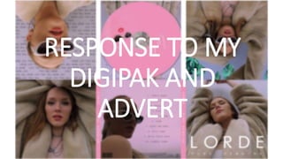
- 1. RESPONSE TO MY DIGIPAK AND ADVERT
- 2. I asked my focus group a few questions about my ancillary texts: • What did you think about my digipak? The main response that I received was that it really correlated with the video in colour and style, which I am very happy about, as it proves that it is received like a real life media product and seems professional and authentic.
- 3. I also was happy to hear that it ‘showed the artists style well’, which is really important, as it means that people who see the digipak on the shelf will know exactly what she is about and the kind of style of her music, just from these panels. This means that the target audience are more likely to invest in the product, as they will be drawn to the certain style that is portrayed. They also thought that my ‘use of colour’ was nice, as it popped and conveyed that feminine feel, but not in a stereotypically ‘girly’ way
- 4. What kind of image did it put forward for the artist? Was it the same as in the video? I was also happy to hear that the ‘star image’ that is normally seen in pop ancillary texts and what I wanted to convey had come across, as they said that they thought that the poses were ‘strong’, ‘expressive’ and ‘powerful’. This also shows that the way in which we were trying to show how the artist is strong and empowered, rather than girly and passive, which is normally the representation in the music industry of women, also came across in my digipak and advert. Finlay commented that the 'plain background was effective’ in the digipak and advert, as it looked professional and authentic, so matched the video in this way. They commented that there was a ‘consistent theme’ throughout the media products, showing how it came across as a real media product.
- 5. What did you not like about my ancillary texts? They did not have anything to say regarding disliking parts of it, with Neave mentioning that she liked all of it, as she thought that it really complimented the video. I worked hard to do this, using similar colour schemes and outfits, along with including the artist with a leading role in both, to create continuality and draw attention to her. Someone has also commented that they didn’t like the name of the album, but this was something that I could not control. However, in future work, If I was to create my own titles, I would make sure to create a name that was punchy and effective, appealing to the widest range of my target audience possible.
- 6. Other comments Beth, a 22 year old girl said that she “really liked the addition of the digital drawings, especially on the CD, as it looks really edgy and creative. I like that it actually looks like the artist, rather than just a random person. I really like the signature as well because it goes really nicely with the drawing as they look like it’s in the same pen, as if the artist has drawn a self portrait and then signed it.” I did this to promote the artist, but in a creative way, so audiences can still recognise the artist on the CD, but it isn’t just another image.
- 7. What would I improve in the future, stemming from these comments? In future, I will make sure to think as much about mis en scene e.g backgrounds, just as much as the content, as I feel that this is something that I have done that has really payed of in my media products. I will also make sure that I pay close attention to detail, as this is what makes products look really professional and authentic. I will also think about the titles and names, as it has to appeal to a target audience and even though I kept the name of the actual album in this project, I know that a bad title can put consumers off of a product, making them possibly not want to invest in it.