
Recommended
More Related Content
What's hot
What's hot (20)
Viewers also liked
Viewers also liked (19)
Similar to Week 10 analysis
Similar to Week 10 analysis (20)
Recently uploaded
Recently uploaded (20)
Week 10 analysis
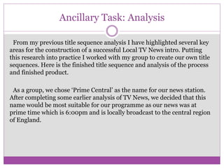
- 1. Ancillary Task: Analysis From my previous title sequence analysis I have highlighted several key areas for the construction of a successful Local TV News intro. Putting this research into practice I worked with my group to create our own title sequences. Here is the finished title sequence and analysis of the process and finished product. As a group, we chose ‘Prime Central’ as the name for our news station. After completing some earlier analysis of TV News, we decided that this name would be most suitable for our programme as our news was at prime time which is 6:00pm and is locally broadcast to the central region of England.
- 2. Next we created our logo together which was based on our news programme name. Through the use of semiotics, companies use their logos to remind audiences of their services, products and the brand they represent. TV News, also uses this technique to remind their views who they are. When making the logo it was important to make sure the colours and text used all linked in with the colours of the name. Below are screenshots of the production process of our logo. We began with the first image of England, then changed the colours so the Central area was in a different colour to the rest of England, we did this to show where our news was aimed at. Next we included the letters PC which stands for Prime Central and finally, we put a globe inside the C which is animated during our title sequence as this image is normally associated with the news.
- 3. During our audience theory researched, we studied the ‘John Hartley Classification’. This taught us that it is important to appeal to our audience demographic through these 7 socially grouped categories: ▪ Self- the ambitions and interests of the audience ▪ Gender ▪ Age ▪ Class- different social classes ▪ Ethnicity ▪ Family ▪ Nation One of the ways we appealed to our audience was through the use of still and moving images.
- 4. Using this work, we constructed out TV sequence in a programme called Video Studio Pro x8 which is a video editing programme. We edited together our logos and footage from our filming day by trimming the footage, adding transitions, effects and texts based on our groups storyboard. The transitions we used were fades, cuts and wipes, we used these because they were quick and professional and made our programme look real. The effects and transitions we used on our logo and images were a God Ray on the map of the UK to highlight the area where our news is targeted, an animated globe which was put inside the C and we used a vignette on the PC to make it look more subtle and professional, the reason we chose this because it gave a professional, simplistic look to our logo and made it more memorable. The length of our title sequence is 20 seconds, this is because we wanted to put many pictures of Birmingham in but we didn’t want to make it too long.
- 5. After this, we added music to our title sequence. We chose this music because it seemed to follow the conventions of existing TV News programmes. The music that we chose fits our brand of news programme as it can grab the attention of the audience even if they are in another room which is a contrast to morning news intros which are softer and quite lengthy. This relates to semiotics as we are using non-verbal communication to grab the attention of the audience through the use of symbols and music.
- 6. Once our title sequences were completed we asked an audience panel to review our intro and give feed back.
- 7. Based on this feedback we were given, we amended our title sequences. I feel I have made a successful title sequence because it conforms to the codes and conventions of existing TV News programmes. In preparation for the main task I will use both our groups logo, the music style and colours blue and purple on my top and bottom strips and in the actors clothing to carry through the continuity.