
Recommended
More Related Content
What's hot
What's hot (20)
Similar to Week 10 analysis pp
Similar to Week 10 analysis pp (20)
More from Robert White
Recently uploaded
Recently uploaded (20)
Week 10 analysis pp
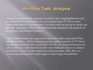
- 1. Ancillary Task: Analysis From my previous title sequence analysis I have highlighted several key areas for the construction of a successful Local TV News intro. Putting this research into practice I worked with my group to create our own title sequences. Here is the finished title sequence and analysis of the process and finished product. News Station name: As a group we chose the following name West Midlands News. After completing some earlier analysis of TV News we decided that this title would best fit with our research because we are located in a sixth form from the west midlands and we wanted a name that viewers in the midlands could associate with. Also we wanted something that could target a wide range of audiences.
- 2. As a group we then created a Logo based on our name to use within the title sequence and on our final news programme.Through the use of semiotics companies use their logos to remind their audience of their services, products and brand. TV news also uses this technique to remind the viewer who they are.
- 3. • Through my research into audience theory we studied ‘The Hartley Classification’ and knew that is was important to appeal to our audience demographic through these 7 socially grouped categories: • 1 Self – ambitions or interests of the audience • 2 Gender • 3 Age Group • 4 Class – different social classes e.g. working, upper etc. • 5 Ethnicity • 6 Family • 7 Nation One of the ways we did this was through our use of still and moving images that consisted of landmarks and highly popular aspects of the West Midlands such as the BullRing and Birmingham Library. The photos taken are highly well known in the West Midlands, so when audience view the news programme, they will affiliate themselves with the landmarks and feel apart of the situation or that the story being told is close to home.
- 4. 4. Using this work we constructed our TV title sequence in a programme called Video Studio Pro x8 which is a video editing programme. We edited together our Logos and footage from our filming day. Trimming footage, adding transitions, effects and text based on our groups storyboard. The transitions we used were crossfades.The reason we chose these transition was because we wanted to sustain continuity throughout my intro I also chose this as it was a straight forward transition which demonstrated professionalism, in comparison to some of the other options which were less suitable. The effects and transitions we used on our logos and images were the moving circle effect as I wanted to add a visiual element to my logo, the way these circles appear is relevent to my programme as it emulates the way the clock strikes in town centre. Also they remind the viewer of the symbolic shapes of Birmingham Library and acts as a semi-conscious way of communicating with the viewers and helps them associate with the area. The length of our title sequence is 20 seconds due to my research stating those was the average length of each intro, the intro needs to be long enough to attract viewers attention and alert them to the news but not too long so they lose interest. We also added text to appeal to the viewer to make them aware of where our programme reaches out to in terms of geographic as we included the names of all areas in the west midlands in the title sequence. The order of Logo, still and moving image has been constructed this was because I wanted to add movement and wanted to show a different range of people and dynamic view of the market capturing people of different ages and genders all of whom wanted to appeal to as our target audience.
- 5. 5. We then added Music to our title sequences. We chose this music because I felt it was highly suitable and serious and reasonably dramatic. Also it mirrors the clock style sound and the intriguing sound of the ticking. My brand being of a serious and high caliber, this fits in sufficiently. In terms of the theory we have chosen a sound that has appealerad to a wide rang of demographics rather than a specific and limited audience.
- 6. As a result me and Hasan merged our footage together, taking my logo graphic and hasan’s middle section, we also changed one of the pieces of movibng footsage to include a visual representation of our demographic to appeal to the target audience.
- 7. Based on this feedback we amended our title sequences and combined mine and Hasan's work. I feel I have made a successful title sequence because I have applied the codes and conventions of TV news. I have related the local TV news to the relevant geographic location and appealed to the seven points in the Hartley classification. I have also taken on board audience feedback and amended my work accordingly. In preparation for the main task I will use both our groups logo, the music style and the colors Gold and Black. On my top and bottom strips and in the actors clothing to carry through the continuity.