
Recommended
More Related Content
What's hot
What's hot (20)
Viewers also liked
Viewers also liked (20)
Similar to Evaluation question 1
Similar to Evaluation question 1 (20)
Recently uploaded
Recently uploaded (20)
Evaluation question 1
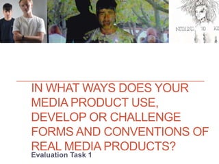
- 1. IN WHAT WAYS DOES YOUR MEDIA PRODUCT USE, DEVELOP OR CHALLENGE FORMS AND CONVENTIONS OF REAL MEDIA PRODUCTS? Evaluation Task 1
- 2. What are conventions? Conventions within the music industry are popular trends which have become traditional characteristics of music genres. These characteristics are recognised by popular culture hence they and help audiences instantly recognise the genre of certain products. When producing media products, multiple forms of media obey these conventions, to attract the appropriate audiences. In the case of music video conventions are establishes through characteristics such as set design, lighting, camera work, performance, costume/make up/hair and editing.
- 4. Set design Our music video, possessed indie rock conventions in terms of our set design. Comparing our video to The Kooks ‘Down’ and The Artic Monkeys ‘When the Sun Goes Down’, both videos habitats involved residency. Our video had strong similarities with ‘When the Sun Goes Down’ as the video displays youthful subcultures and makeshift living spaces relating to the youthful audience instead of alienating them through alienation by displaying wealth and luxury unlike other genres such as rap and pop. However our set design pushes this convention further by juxtaposing ‘When the Sun Goes Down’ by displaying a rural community instead of an urban setting which is commonly the focal point of many idolising videos The Kooks – ‘Down’ The Arctic Monkeys- ‘When The Sun Goes Down’
- 5. Lighting The Kooks – ‘Down’ The Arctic Monkeys- ‘When The Sun Goes Down’ Our use of brightly coloured projections pushes the ‘Down’ music video’s use of diffracted lighting. Our varying projected settings make the video a colourful spectacle making the video more energetic and youthful, the ‘Down’ music video’s use of lighting has a similar effect however the shots are distorted to some extent loosing a focal point of the shots. Our brightly lit projections are juxtoposed by the night time setting alluding to how such young people thrive in the night time, relating to ‘When The Sun Goes Down’.
- 6. Camera work The handheld shots that we took in the woods section of our music video were emblematic of those in ‘When The Sun Goes Down’, which depicted a fast pace urban setting. In the case of our music video we utilised said shots to expose the ease of the bands friendship, allowing the audience to see the band on a more personal level, yet the fast paced nature alludes to a youthful and energetic feeling. We also use a panning shot in woods not only to showcase the surroundings but also for the band to appear more inclusive but yet intimate, inviting the audience into the rural sub culture that they had created. Similarly in ‘Down’ in a few instances the shot pans from setting to setting making the shots more fluid and the setting more intimate. The ‘Down’ video also shoots each member of the band equal amounts uniting and equalising the band, we did this however in the studio section of the video we did have more of an emphasis on our lead singer stressing his star image as we were presenting a debut band. The Kooks – ‘Down’ The Arctic Monkeys- ‘When The Sun Goes Down’
- 7. Performance The Arctic Monkeys- ‘When The Sun Goes Down’ The Kooks – ‘Down’ ‘When The Sun Goes Down’ music video includes no performance element but instead all narrative whereas ‘Down’ was performance for the most part, meaning there wasn’t a clear convention to use. Yet we resultedly decided to use a mixture of the two, in the case of our performance element narrative was still artistically displayed through the projections over the band, allowing us in the woods segment to stress and expose the bands friendship through interesting handheld shots.
- 8. Costume/hair/ makeup The Arctic Monkeys- ‘When The Sun Goes Down’ The Kooks – ‘Down’ . Our costume had a large urban influence, following the popularity amongst young people. This can also be seen in ‘When The Sun Goes Down’ however through hair and make up we embraced a more natural look by braiding their hair and applying face paint reminiscent of foliage. Similarly to ‘Down’ we kept our band in the same neutral colour scheme uniting the artists, however we dressed our lead singer in a large purple fur coat embracing the indie rock genre whilst emphasising his ‘star image’.
- 9. Digipack Cover The Arctic Monkeys– ‘Whatever People Say I Am, That's What I'm The Kooks – ‘Listen’
- 10. Front Cover As demonstrated both The Kooks and The Arctic Monkey’s album covers take a minimalistic approach to their album artwork. The Kooks cover displays a central illustration as the focus of their cover opposed to including imagery of the band, by doing this they avoid idolising the band by presenting a more meaningful and artistic media product. We followed this convention by having a large illustration as the focal point of the artwork which included connotations of our music video such as the foliage, creating continuity within our products. Unlike The Kooks, the illustration presented an image of our lead singer, we found it important to stress his star image to the audience as we are presenting a debut artist. Similarly to The Arctic Monkey’s album cover, we approached the artwork in black and white, simplifying the image to present a more naive illustration emphasising the band name and star image. Relating to both of the other examples, the font of the writing was large and bold, so could be easily read to inform potential audiences.
- 11. Back Cover The Kooks and The Arctic Monkey’s back cover display some obvious conventions such as a bar code, legal information and the album contents. All three conventi9ons we included in our back cover, authenticating our album cover.
- 12. Artist Website
- 13. Homepage Both The Kooks and The Arctic Monkeys had a strong emphasis on their imagery, The Kooks in particular draws in audiences through their eye- catching artwork which relates to their digipack, firmly establishing their ‘brand. Unlike the other two bands, which both had large formed fan bases we choose to avoid using the album artwork and instead use studio photographs to familiarise audiences with the band, exhibiting their young and youthful faces to the teenage female target audience. Though, similarly to The Arctic Monkeys, we choose to create a monochrome theme to subtly link to our digipack artwork creating the ‘look’ of their ‘star image’. Moreover, our lead singer is the most prominent in the photograph linking back to our album artwork.
- 14. Touring The Arctic Monkeys The Kooks Both The Kooks and The Arctic Monkeys’ websites included the dates of gigs and tours, making this a firm convention of artists websites. We included this feature in our website too, including direct links to where tickets could be purchased, as well as social media links to further endorse fans to the artists ‘brand’. Moreover this use of links enhances the spreadability of awareness, ultimately increasing ticket sales.
- 15. Typography Studying both The Kooks and The Arctic Monkeys’ websites, the convention of using clear bod typography is very clear. Using this convention we generated three varying bold fonts, all monochrome, making the website more visually interesting. It was important for the typography to be loud and legible, to emphasis the ‘brand’ and other critical information such as tour dates.
- 16. Branding Links In conjunction with both The Kooks and The Arctic Monkeys’ websites, we included links in the top bar of our homepage, including itunes, social media links and music, allowing fans to easily navigate throughout the website. Similarly to The Kooks website, we wanted to emphasise the social media links, further endorsing the fan base into the ‘world’ of the band and familarising themselves with the band regularly on a personal level as the content would come direct from the band. Moreover, this is particularly useful considering the teenage targeted demographic as they will have been thoroughly endorsed in online technologies.
- 17. Pictures Both The Kooks and The Arctic Monkeys’ websites included picture galleries on their websites which mostly consisted of images from photo shoots. Pushing this convention, we included a range of images ranging from photo shoots and behind the scenes, providing exclusive content for the fan base. Moreover this range of intimate and professional images takes on qualities of image sharing social media such as Instagram, enticing the youthful audience which has the demand for vast online content. Though, the primary role of the website is to promote the band and ultimately sales so we took similar action as The Kooks and The Arctic Monkeys by making the ticket and album promotion more dominant in the website (ie links in the homepage).