
Recommended
More Related Content
What's hot
What's hot (20)
Viewers also liked
Viewers also liked (18)
Similar to Contents page powerpoint
Similar to Contents page powerpoint (20)
Recently uploaded
Recently uploaded (20)
Contents page powerpoint
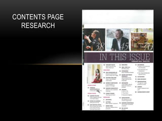
- 2. LANGUAGE The language within the contents page is formal, due to the older audience and is quite advanced eg. Enigma to suit them. The contents is there to guide the reader to the article they want. This contents page uses light purple and pinks to highlight the sub-headings and is bold compared to the rest of the text. Under each sub-heading there is black smaller font to give a small amount of information about the article. Purple and black font
- 3. • The number and title are in the same purple font, purple is used as it symbolizes passion and is the same colour as the border above the text. There is also pink headings with the same black straplines for the main titles like :cover story, opera focus and regulars. There is no text wrapping used in the contents page and uses columns instead.
- 4. REPRESENTATION • The images are there to represent the genre of the magazine. This contents page has 4 images to advertise 4 different classical artists to attract people into reading there article. Three of the four images are located at the top of the page in a row all in the same size and there is then one underneath the border.
- 5. • All the images are studio shots, two close/mid shots and the other two long shots. None of the artists are making eye contact towards the camera which challenges the convention of a music magazine.
- 6. • However, the bright colour’s and different backgrounds are intriguing. All the images have a one similar colour background so the artist stands out and they all look like they have an interaction with a music area and instrument in the image. The images use iconography to represent the music type the magazine is focused on. One example is the violin, which will a recognizable for the audience. They’re all dressed smartly and formal to suit the magazine language and genre.
- 7. TITLE • The title challenges the convention of a contents page as it is located about a quarter down the page in a banner. The banner is the same purple as the text used further down the page and also the shade doesn't’ clash with any of the images used.
- 8. • The text is in white to make it bold and stand out and is a house style for the magazine. The same white font and purple is followed on from the front cover and the publisher has used this colour and font as its classy, a formal style is used to fit the genre and audience.
- 9. • The pug is located on the contents page in the banner, in the same white font. This actually breaks a convention as usually you would find the date and issue number on the front cover. This magazine puts the pugs on the contents as the publisher wants to keep the front cover not crowded or layered. The key elements are put on the front cover and the rest of the information is inside.
- 10. LINKS TO THE FRONT COVER The contents page is on page 3 and doesn't’t have much link to the front page except similar colours which follow through the whole magazine.