
Recommended
More Related Content
What's hot
What's hot (20)
Similar to Contents textual analysis
Similar to Contents textual analysis (20)
Recently uploaded
Recently uploaded (20)
Contents textual analysis
- 1. Textual Analysis- Contents page
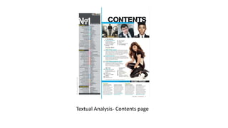
- 2. Masthead • For the masthead they have chosen to keep the title simple by just using the word ‘contents’. This would have been done to ensure that the target audience can easily know what the page is about and, considering, the nature of the topic, where they can find everything in the magazine. The font that they have chosen closely resembles the style of writing that comes from using a stencil. This could have been done to ensure that the title stands out. This is especially effective because the same font is used in all other main titles on the page, this ensures that the reader can differentiate between the topics on the page. They have used black font against a white background to ensure that it stands out. The gaps in the letters because of the font show this even more because it allows you to see the background through the text.
- 3. Images • In this particular contents page they have chosen to use four pictures. Three are located at the very top of the page, just under the masthead. The colour scheme of all of the pictures is the same, black white and grey. The images are all used to advertise who the main artists are in that issue of the magazine. My using images on the contents page this allows the target audience to quickly see who is in the magazine without having to read through the whole page. This could be very beneficial because the contents page usually contains a lot of text that people may not want to read all of. The images all have the page number that the person is featured on in the bottom corner, again, allowing the target audience to quickly find the page. The black and white colour scheme ensure that the pictures are eye catching because they lye on a white background. The larger of the four images in in the middle of the page on the right and this features a woman bending down. The woman's hair is curled and blowing away from her face, this paired with the smile on her face connotes an idea of fun and being carefree, these are all themes in pop music and would attract the target audience.
- 4. Numbers and text • Throughout this page there is a lot of numbers and text, this is because the idea of this page is to give the target audience a small idea of what is going to be featured in the magazine. Due to this, some of the article titles are paired with cover lines. these articles also have a blue title that has been capitalised in order to make them stand out. On the left of each article title there is the page number. This is essential on the contents page as it allows the reader to find the article in the magazine. The articles are written in chronological order and are split into four themes, ‘upfront’, ‘features’, ‘music’ and ‘in every issue’. This could have been done make it easier for the target audience to find what they are looking for in the magazine. The theme 'in every issue' could be considered very important because it would allow regular readers on the magazine to find the same articles that they always read. This theme could also be used to develop a fan base. The features section would also be an important theme because it would be where all of the new articles about the latest artists would be.
- 5. Colour • In this contents page Billboard magazine has chosen to stuck with their classic simple colour scheme that they normally use and that is part of their brand. They have mainly only used black, whit and grey. They have chosen to have the background as being white. This ensures that the reader can easily read the text, which is the most important part of any contents page. They have used a bright blue stripe down the left hand side of the page and at the top a and the bottom of the page the split up the page. This bright blue is conventional of the pop genre as it is bright and playful. They have also used this blue colour for some of the more important headlines. Apart from this they have used black for the text on the page as this stands out from the white background. O the left of the page they have a mostly grey stripe witch has the current music charts which shows the conventions of the topic of their magazine. They have has this in grey so they is stands out from the otherwise mostly white page.
- 6. Layout • Conventionally for a pop music magazine contents page they have chosen to have the title ‘contents’ at the top and they have made it the largest piece of text on this contents page to ensure that it is eye catching and the target audience will know where to find everything that will be featured in that edition of the magazine. Directly underneath this title they have chosen to have three similar sized pictures of the people that have articles about them in the magazine. They then follow this with the majority of their text. The the right that have what is the largest, and mostly likely the most important image on the page. The image of a woman crouching down is integrated into the page so that the text easily flows around her. this would conventionally indicate that this image would be the most interesting to the target audience. At the very bottom of the page they have a section on other places to find them like ‘online’. This would be in order to make it easier for their target audience to find them and make them more accessible and therefore more popular. To the right of the page they have featured the music charts at the time that this edition of the magazine was published. This would be another thing that would be interesting to their target audience. At the top of this they have included a small version of their masthead in order to further advertise their brand.