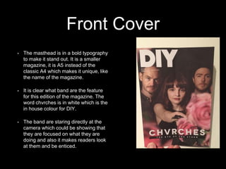
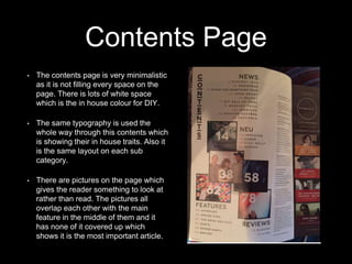
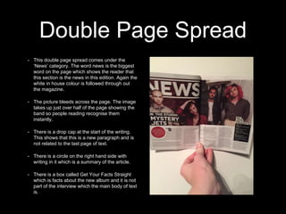
Music Magazine
Analysis 3 - DIY
By Joe Reeves
Front Cover
• The masthead is in a bold typography
to make it stand out. It is a smaller
magazine, it is A5 instead of the
classic A4 which makes it unique, like
the name of the magazine.
• It is clear what band are the feature
for this edition of the magazine. The
word chvrches is in white which is the
in house colour for DIY.
• The band are staring directly at the
camera which could be showing that
they are focused on what they are
doing and also it makes readers look
at them and be enticed.
Contents Page
• The contents page is very minimalistic
as it is not filling every space on the
page. There is lots of white space
which is the in house colour for DIY.
• The same typography is used the
whole way through this contents which
is showing their in house traits. Also it
is the same layout on each sub
category.
• There are pictures on the page which
gives the reader something to look at
rather than read. The pictures all
overlap each other with the main
feature in the middle of them and it
has none of it covered up which
shows it is the most important article.
Double Page Spread
• This double page spread comes under the
‘News’ category. The word news is the biggest
word on the page which shows the reader that
this section is the news in this edition. Again the
white in house colour is followed through out
the magazine.
• The picture bleeds across the page. The image
takes up just over half of the page showing the
band so people reading recognise them
instantly.
• There is a drop cap at the start of the writing.
This shows that this is a new paragraph and is
not related to the last page of text.
• There is a circle on the right hand side with
writing in it which is a summary of the article.
• There is a box called Get Your Facts Straight
which is facts about the new album and it is not
part of the interview which the main body of text
is.

Diy magazine

  • 1.
    Music Magazine Analysis 3- DIY By Joe Reeves
  • 2.
    Front Cover • Themasthead is in a bold typography to make it stand out. It is a smaller magazine, it is A5 instead of the classic A4 which makes it unique, like the name of the magazine. • It is clear what band are the feature for this edition of the magazine. The word chvrches is in white which is the in house colour for DIY. • The band are staring directly at the camera which could be showing that they are focused on what they are doing and also it makes readers look at them and be enticed.
  • 3.
    Contents Page • Thecontents page is very minimalistic as it is not filling every space on the page. There is lots of white space which is the in house colour for DIY. • The same typography is used the whole way through this contents which is showing their in house traits. Also it is the same layout on each sub category. • There are pictures on the page which gives the reader something to look at rather than read. The pictures all overlap each other with the main feature in the middle of them and it has none of it covered up which shows it is the most important article.
  • 4.
    Double Page Spread •This double page spread comes under the ‘News’ category. The word news is the biggest word on the page which shows the reader that this section is the news in this edition. Again the white in house colour is followed through out the magazine. • The picture bleeds across the page. The image takes up just over half of the page showing the band so people reading recognise them instantly. • There is a drop cap at the start of the writing. This shows that this is a new paragraph and is not related to the last page of text. • There is a circle on the right hand side with writing in it which is a summary of the article. • There is a box called Get Your Facts Straight which is facts about the new album and it is not part of the interview which the main body of text is.