
Recommended
More Related Content
What's hot
What's hot (20)
Viewers also liked
Viewers also liked (20)
Similar to Analysis of a classical magazine
Similar to Analysis of a classical magazine (20)
More from shahana18
More from shahana18 (18)
Recently uploaded
Recently uploaded (20)
Analysis of a classical magazine
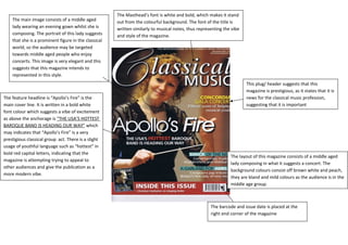
- 1. The Masthead’s font is white and bold, which makes it stand out from the colourful background. The font of the title is written similarly to musical notes, thus representing the vibe and style of the magazine. The layout of this magazine consists of a middle aged lady composing in what it suggests a concert. The background colours consist off brown white and peach, they are bland and mild colours as the audience is in the middle age group. The main image consists of a middle aged lady wearing an evening gown whilst she is composing. The portrait of this lady suggests that she is a prominent figure in the classical world, so the audience may be targeted towards middle aged people who enjoy concerts. This image is very elegant and this suggests that this magazine intends to represented in this style. The feature headline is “Apollo’s Fire” is the main cover line. It is written in a bold white font colour which suggests a vibe of excitement as above the anchorage is “THE USA’S HOTTEST BAROQUE BAND IS HEADING OUR WAY” which may indicates that “Apollo’s Fire” is a very prestigious classical group act. There is a slight usage of youthful language such as “hottest” in bold red capital letters, indicating that the magazine is attempting trying to appeal to other audiences and give the publication as a more modern vibe. This plug/ header suggests that this magazine is prestigious, as it states that it is news for the classical music profession, suggesting that it is important The barcode and issue date is placed at the right end corner of the magazine
- 2. Images: The images are located as a banner that takes half of the page, so it is not in proportional but it is more distinctive and noticeable, so it makes the contents page more enticing and attractive. Layout: The layout is consisted with a banner of three pictures, whilst underneath it titles the contents page, alongside with a plug coordinated in the middle of the glossary. Plug: The magazine advertise a CD album of classic hits. This is related to the magazine as they are advertising of a similar musical genre. Also the title “50 GREATEST RECORDINGS” suggests that the magazine is associated with good music. Contents: Each feature headline is stated in red whilst underneath is the black. There is a monthly section and a features section. The actual contents page however, doesn’t really stand out compared to the collage of pictures. This is due to the small and faint font of the content. Masthead: The headline is consisted with a formal font tilted with serifs included, portraying an elegant image. However it isn’t as noticeable as the picture board, the font and colour should be changed in order for the feature headline is more bold.
- 3. Quotation: This quote included text that seems controversial or notice so it would immediately entice the audience to notice the text and read on. This extract stands out vividly in its white big font against the contrast of the black background; it is also placed in an unconventional way, it is placed as if it was a masthead, as to capture the attention of the readers. Another quotation is placed in the main image. Main Image: The image is coordinated in a whole page, whilst the text is placed at the other side of the page. The image features a well-known violinist in the classical music genre. The model is dressed relatively smartly and in the background of the picture, it features a few violins, representing his craft. The model is dressed formally as to the standard, to what the magazine intends to represent from the publication. Masthead: The Masthead is much smaller than the quotation; it is more similar to a feature headline. However we are aware of the headline, which states the musician’s name. The text is placed in rectangular orange box, consisted with a white text in front. Text: The background colour to the text is black, whilst the context is white. As similar to the quotation, this makes the context more visually noticeable and attractive.