
Recommended
More Related Content
What's hot
What's hot (20)
Viewers also liked
Viewers also liked (10)
Similar to Q Magazine Textual Analysis
Similar to Q Magazine Textual Analysis (20)
Recently uploaded
Recently uploaded (20)
Q Magazine Textual Analysis
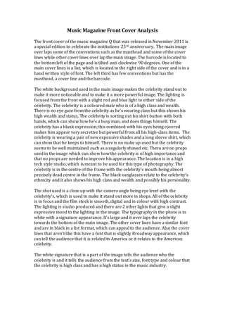
- 1. Music Magazine Front Cover Analysis The front cover of the music magazine Q that was released in November 2011 is a special edition to celebrate the institutions 25th anniversary. The main image over laps some of the conventions such as the masthead and some of the cover lines while other cover lines over lap the main image. The barcode is located to the bottom left of the page and is tilted anti clockwise 90 degrees. One of the main cover lines is a list, which is located to the right side of the cover and is in a hand written style of font. The left third has few conventions but has the masthead, a cover line and the barcode. The white background used in the main image makes the celebrity stand out to make it more noticeable and to make it a more powerful image. The lighting is focused from the front with a slight red and blue light to either side of the celebrity. The celebrity is a coloured male who is of a high class and wealth. There is no eye gaze from the celebrity as he’s wearing class but this shows his high wealth and status. The celebrity is sorting out his shirt button with both hands, which can show how he’s a busy man, and does things himself. The celebrity has a blank expression; this combined with his eyes being covered makes him appear very secretive but powerful from all his high-class items. The celebrity is wearing a pair of new expensive shades and a long sleeve shirt, which can show that he keeps to himself. There is no make up used but the celebrity seems to be well maintained such as a regularly shaved etc. There are no props used in the image which can show how the celebrity is of high importance and that no props are needed to improve his appearance. The location is in a high tech style studio, which is meant to be used for this type of photography. The celebrity is in the centre of the frame with the celebrity’s mouth being almost precisely dead centre in the frame. The black sunglasses relate to the celebrity’s ethnicity and it also shows his high class and wealth and possibly his personality. The shot used is a close up with the camera angle being eye level with the celebrity’s, which is used to make it stand out more in shops. All of the ce lebrity is in focus and the film stock is smooth, digital and in colour with high contrast. The lighting is studio produced and there are 2 other lights that give a slight expressive mood to the lighting in the image. The typography in the photo is in white with a signature appearance. It’s large and it over laps the celebrity towards the bottom of the main image. The other cover lines have a similar font and are in black in a list format, which can appeal to the audience. Also the cover lines that aren’t like this have a font that is slightly Broadway appearance, which can tell the audience that it is related to America or it relates to the American celebrity. The white signature that is a part of the image tells the audience who the celebrity is and it tells the audience from the text’s size, font type and colour that the celebrity is high class and has a high status in the music industry.