CALL ON ➥8923113531 🔝Call Girls Hazratganj Lucknow best sexual service Online
Album cover
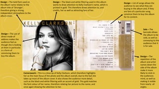
1. Camerawork – This is a close up of Kelly Clarkson, which therefore highlights
her as the main focus of the photo and the album overall, due to the fact she
takes up most of the album cover. It also shows the audience more detail,
such as the black and white filtering with an accent of gold. This gold matches
the font colour of her name, therefore relating her picture to the name, and
once again drawing the attention to her.
Design – The black and white filtering used in this album
works to draw attention to Kelly Clarkson’s name, which is
printed in gold. This therefore draws attention to, and
credits, her as well as attracting fans of her.
Design – The use of
direct mode of
address makes the
audience feel as
though she is looking
at them in particular,
in a form of
convincing them to
buy the album.
Design – The bold font used on
the album name relates to the
album title of ‘Stronger’,
therefore giving a strong,
independent atmosphere to the
album cover.
Design – List of songs allows the
audience to see what they are
buying in the album and, if they
are fans of a particular song,
convince them to buy the album
for its content.
Sale – The
barcode allows
the album to be
sold, as well as
conveying to the
audience that it
is for sale.
Design – The
repetition of the
album and artist
names down the
side of the album
make it more
likely to stick in
the audiences
mind, as well as
making it visible
from nearly all
angles.