
Recommended
More Related Content
What's hot
What's hot (14)
Viewers also liked
Viewers also liked (13)
Similar to Contents Page 'Top Of The Pops'.
Similar to Contents Page 'Top Of The Pops'. (20)
Recently uploaded
Recently uploaded (20)
Contents Page 'Top Of The Pops'.
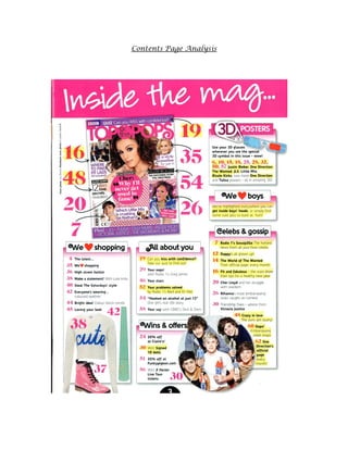
- 2. At the top of the magazine the reader is presented with a large pink text box containing the words, 'Inside the mag...' this shows the reader clearly that this is the contents page. The use of ellipsis on the title also builds anticipation and excitement. The fact it is in a bubblegum pink adds to the fun and eye catching presentation. It also creates a feminine and girly look and feel to the contents page. The text is written in a script font, giving it a handwritten effect again adding to a soft feminine look yet, the text is still able to stand out as it is written in white which contrasts with the brightness of the pink. The pink and white colouring makes the text bold and stand out to grab attention. The fact it has shortened the word magazine to 'mag' gives a chatty approach which the young TA would appeal to as it gives a more friendly approach and it is also language a teenaged audience would be familiar with. The use of ellipsis gives the impression of lots of information, creating for all the gossip which the magazine includes. Underneath this, is an image of the magazines front cover. This is a convention of contents pages to include the front cover as it allows easy access, as the reader would want to find something on the front cover (which has lured them into buying it) quickly. It is also to show an image of the front cover to create a symbiotic link between the front cover and contents page. It clearly points to each section of the front cover with an arrow and a large page number so the reader can find the particular section easily. Each of the numbers are pink and bold to grab attention. The fact they are pink again, links to the feminine feel as pink is stereotypically a 'feminine colour'. Also, the numbers seem to have a 'handwritten' feel to them as many of the numbers have a curved effect to them and the ends of the letters have a 'flick' on the end of them. The arrows used to point to the sections of the front cover also has a handwritten effect as if someone has drawn them, this makes it appear more soft, subtle and fun. The hand-drawn look of the arrow adds a personal touch as well, as if a friend is showing the way around the magazine.
- 3. Surrounding the front cover image are six boxes, all sub titled with a different title. The six boxes have a drop shadow effect, creating a ‘3D’ feel that enables them to grab attention. This is common on music magazine contents pages as it makes it more organized and again much more accessible. Each sub title is written in the same font and colour, they are all written in the familiar font which is used to on the masthead of the magazine 'Top Of The Pops' as each letter 'S' has a curled look to make it stand out and look fun and different. The fac the font is written in the same as the mast head creates another symbiotic link, this is important as it creates a continuity throughout the magazine.Other words in the sub titles are curved and curled to give a handwritten effect, this is used throughout the magazine and creates a girly feel which would appeal to the teenage girl TA. In two of the boxes, the word love has been replaced with a red heart shape, this takes away the text to make a more visual look and to make it look exciting and interesting compared to all text. The heart shape is also extremely feminine and would be adored by the TA. The top right box labelled '3D posters' is different to the other five as it is written in a plain white display font unlike the others which have a script effect. This is so it stands out compared to the others, this is because the information inside the box is not related to a specific page of the magazine like the other boxes. It is for the reader to read and understand. It explains how some of the posters the magazine includes are 3D, therefore the reader can use their 3D glasses to see them. The text effect on the word ‘3D’ makes it look 3D. The effect of seeing the posters in 3D is a fun and practical way to get involved with the magazine, almost like the magazine is coming to life. The use of 3D would appeal to a younger target audience as they would be interested in the latest gadgets and technology as it is a fun way to get involved and it is something new and interesting. From this, they are able to see their artists come to life also, like they are closer to them. This creates entertainment for the reader as this is something fun and different which many other music magazines may not include. This fun feature of the magazine would increase popularity of their young teen audience as they would be intrigued by anything new and exciting! This would also link to the entertainment factor out of the five benefits by Blumler and Katz. The first box is titled 'We heart shopping'. By saying ‘we love...’ on the sub-heads so often, it emphasizes the importance of these things in the minds of the magazine and the reader and also shows the shared interest between the mag and its reader. As ‘We Love Shopping’ sub-headline comes first, notes the importance of fashion in the eyes of the magazine and its audiences and indicating that, in this magazine, music is not the chief priority.The magazine’s passion for these things could urge the audience to love them more, as the audience respects the opinion of the magazine and how it rates things will be likely to rate how they rate things. This would appeal to the TA as it is stereotypically stated that lots of young girls and women would be interesting in shopping and clothes, therefore, it is important that a fun, young and girly music magazine features a fashion section. The fashion section indicates that this is different to the usual music magazine’s aimed at men.This would attract those interested in
- 4. fashion and increase the magazines sales. It is also a convention for pop music magazines to feature a fashion section. One of the features of this section is ‘steal The Saturdays style’. The use of the word ‘steal’ is important, as it suggests that the Saturday’s style secrets are there for the taking. It includes headlines such as 'High street Hotlist' which would appeal to young females as the TA would enjoy going shopping with groups of friends in their spare time. Also the alliteration gives a chatty and catchy feel. Another headline is 'Steal the saturdays style' the fact the magazine includes a section of how to dress like a popular pop band many young girls look up to is important as they would look up to them as role models and would want to be like them, this is also typical for a pop magazine to include as it would increase sales. Finally, the fact there is a section named 'Loving your look' shows how the magazine includes style tips from readers of the magazine is important as it shows how it cares about its readers. The TA would love this as it would make them want to read this magazine more as they feel part of a big group of other girls who read the magazine. At the bottom of this box contains images of clothes and makeup to take away the pure text which is included to make it appear more visual and interesting to look at, next to the images is the page number which is a common in music magazines as some may not want to read the contents page, they might be more interested in the images, again linking to easy access. Next to this is a box titled 'All about you'. The fact there is a section dedicated all to the reader makes it appear more personal and interesting for the reader. It contains a quiz which gives the magazine an interaction section where the reader can get involved, this links to Blumler and Katz five benefits, this one being the social interaction element. It links to social interaction as it gives a chance for the reader to get involved with the magazine, the magazine being the interviewer. The real life story would interest and educate the reader which again links to the education and information benefit made by Blumler and Katz. The 'Wins & Offers' section gives the reader a chance to get involved, it creates a sense of fun, excitement and intrigue. This is also an example of Blumler and Katz five benefits, this one being entertainment. All of the information inside the box links to the interests of the TA, young teens would enjoy the shop 'Claires' therefore the 20% off voucher would appeal to them and make them want to get involved with the competition to win this, which would increase sales. The Claire’s vouchers also indicate the age, monetary status and interests of TA. The TA would also be fans of the huge boy pop band One Direction so the chance to win their dolls signed by the band themselves would create big excitement and interest. The chance to win competitions in music magazines is common, as the competitions included tend to be linked to the interests of those who enjoy this particular genre of music, in this case the signed dolls by One Direction is typical to see in a pop music magazine as it suits the style of music the magazine is based on. Next to the box is an image of One Direction holding their dolls, this creates a symbiotic link to the text, and would appeal to the One Direction fans. On the contents page the band are referred to as '1D' this is a shortened version of the bands name, which is commonly used by their fans, therefore this gives the fans a chance to all come
- 5. together and would attract them to buy the magazine. In the image, One Direction appear their typical cheeky selves. They are all casually dressed to show they’re relaxed and chilled personality. Yet, as they wear colours such as blues, oranges and whites it reminds us of their fun and bubbly characteristics. The direct address, alongside their cheesy grins makes the magazine seem inviting and welcoming to the reader. Also, the group are positioned into a close bundle with one another, highlighting their friendship and bond with each other, like the bond the magazine has with it’s target audience. Finally, the 'Celebs & Gossip' section is common for pop magazines as they tend to be filled throughout with up to date gossip from their favourite celebrity stars. Young girls also tend to enjoy lots of gossip, this is common as loyal members of 'Top Of The Pops' magazine would keep buying the magazine to keep up with the latest gossip. The fact it has shortened the word celebrity again, adds to the chatty and friendly feel the TA can understand and find interesting. The mode of address throughout this contents page is very chatty and is written in a friendly tone which a young audience would appeal to. The words used are words a girly teen audience would use when speaking with friends and when interacting with them through social networking or texting. Abbreviations such as 'OMG' and words such as 'oops' 'celebs' and 'snaps' are just some of the chatty words used throughout the magazine, this gives it a fun and informal tone. It also contains lots of direct address using words like 'your' and 'you' make it appear more personal and friendly as if it is speaking directly to the reader. Even the images included, each celebrity is looking into the camera to make it appear that they are looking at them which would draw the reader into reading more. Overall, the colours used on the contents page are pinks and yellows. These are feminine, bubbly colours which link with the brand identity of the magazine. It also connotes the idea of Summer and flowers, which again is another touch of femininity and decoration. The colours are not overpowering or demanding, highlighting that although the magazine aims to approach the idea of fun and jam-packed gossip, it is also sensitive and calming like a friend. This is shown through the contents sitting on a plain white background, this is also so the text can be seen and read properly, giving the contents page a professional approach. Each of the text boxes have been decorated delicately with colour, they have been given a dip-dye effect of the top of each box being a dark pink fading into white. This creates elegance and a girly feel, which the TA would appeal to. It also shows how the magazine takes pride in appearance and making sure there magazine is presentable, linking to their target audience as they too would take pride in their femininity and appearance. Certain words and numbers have been highlighted in yellow, giving it a scrapbook effect, linking to their friendly personal feel it gives to its target audience. It also shows how the use of colour can draw the reader to that particular element of the magazine. The use of colour throughout the contents page allows it to look presentable and professional, giving a sense of continuity and care.
- 6. Not only is the use of colour from the text, but also through the use of images. By inserting images onto the contents page, it adds a sense of freshness and vibrancy as it is not always just the same colours running throughout. This links to the brand identity of the magazine, as not only does it aim to provide juicy gossip and fashion tips,it also provides elements of involvement and fun with their target audience.
- 7. Not only is the use of colour from the text, but also through the use of images. By inserting images onto the contents page, it adds a sense of freshness and vibrancy as it is not always just the same colours running throughout. This links to the brand identity of the magazine, as not only does it aim to provide juicy gossip and fashion tips,it also provides elements of involvement and fun with their target audience.