
Recommended
More Related Content
What's hot
What's hot (19)
Viewers also liked
Viewers also liked (18)
Recently uploaded
Recently uploaded (20)
Colour Ideas
- 1. Colour Ideas
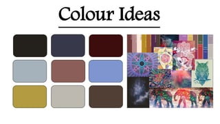
- 2. The following colours/images are the colours I am aiming to use within my magazine and photo shoot. Popular magazines tend to use a minimal amount of colours to make the magazines seem neat and organised, due to this readers will be more interested in reading through the magazine. I have a range of colours, bright to dark, this is because indie has two different styles. Bright and bold or dark and minimal. Both styles still relate to the idea of individualism. The colour black can be used in the title, and/or as a border. This way the magazine will stand out against the others. The other colours I am hoping to use within my photo shoot for example a blue denim shirt for a dark blue colour.