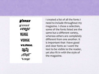
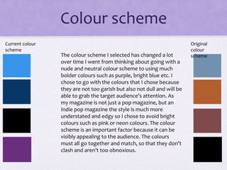
The document discusses font, color scheme, and house style choices for a magazine. It describes selecting a variety of fonts that are clear but fit the magazine's style. The color scheme evolved from neutral to bolder colors like purple and blue to attract attention without being garish. The house style aims to be edgy yet incorporate color in a way that represents the indie pop genre and strengthens the magazine's brand identity.