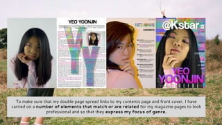
1. To make sure that my double page spread links to my contents page and front cover, I have
carried on a number of elements that match or are related for my magazine pages to look
professional and so that they express my focus of genre.
2. COLOUR SCHEME: First of all, I ensured that the colours that I used in all pages of my magazine were the same to know exactly
what I need to include on each page. The colours I chose were black, white, pink and my multicoloured glitch background. These
were selected to express originally (black and white) as well as for professionalism. The pink and glitch background were chosen to
express my music genre, Kpop, with vibrant colours and technologic effect that my target audience linked with Kpop.
3. FONTS: I made sure to use the same fonts on every page, but also change the size and
colour to combine and create more links with my pages.