3. The colour scheme used through my magazine is: red, black and white reason why I chose these colours is because they contrast well together and because these colours are think and bold they also stand out well.
4. The colour white stands out rather well seeing as the background of my image is rather dark and faded.
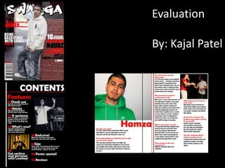
5. The colour red of my colour scheme stands for passion, which connects with the image because he is passionate about the music he creates.
6. The image would give the audience an idea of what type of person he is and what music he creates from his dress sense, he’s wearing branded clothing and common clothes which normal teenage boys would be wearing.
7.
8. I had used this name for my magazine is because it can relate to the type of audience I have aimed for which is mid-teens.
9. The title is also is in a graffiti style which shows that the artist is also a street type of person but also not a typical “hood” kind of boy.
10.
11. Double page spread Denotation: White background through the double page and on the first page there is a large image of my artist which takes up at least half the page and through the other page there is single red line which follows along the left hand side to make it intact with my colour scheme. The questions are in a red colour and answers from the artist are in black, to also be in with the colour scheme and for it to stand out from the white background. The reasons why I chose this: I chose this because of the contents page having a black background I though I’ll go opposite and have a white background for the double page spread I also carefully chose where to place my images because I also had to fit in the interview. Language: The language is quite a mix because the questions are formal but the answers that my chosen artist have given me and I have quoted also has a mix of slang. Font: I have also used the same font from the contents page which is ‘Berlin Sans FB Demi’ at a simple size of 18pt
12.
13. The magazine uses some informal and formal language. T
14. The language used creates a positive representation of the artist as well as the hip hop culture.
19. Bauer specialises in magazine, radio and TVI chose Bauer production to distribute my magazine seeing as they specialise in different varieties of different media and entertainment such as: magazines, TV and radio. They have cross media ownership that allows them to do cross media promotion through the three different media which help to attract more readers. Cross media also helps to create a brand identity, this will allow my magazine to be recognised by a wide range of people. Some of the magazine Bauer distribute are: Q, Uncut and NME.
20.
21. Neutral colour represents a younger audience so I've used complementary colours to even it out to suite the different age groups.
22.
23.
24. So me of my ideas were inspired from a particular magazine mainly on the front cover such as the background colour, having the main picture over lapping some of the title and also having big bold red title to grab the readers attention.
25. There were less articles included on the front cover and no barcode or issue number on it, I made sure on my final product I included article names on the cover.
26. The plane white background on my preliminary task seemed very plain and not catchy whereas on my final product I have a background that related to the theme of my magazine which is music
27. The title of my preliminary task wasn’t eye catching enough but on the other hand my magazine title “swagger” is a kind of name that can relate to my audience and is a word that is commonly used among them
![In what ways does your media product use, develop or challenge forms and conventions of real media project? ,[object Object]](data:image/gif;base64,R0lGODlhAQABAIAAAAAAAP///yH5BAEAAAAALAAAAAABAAEAAAIBRAA7)