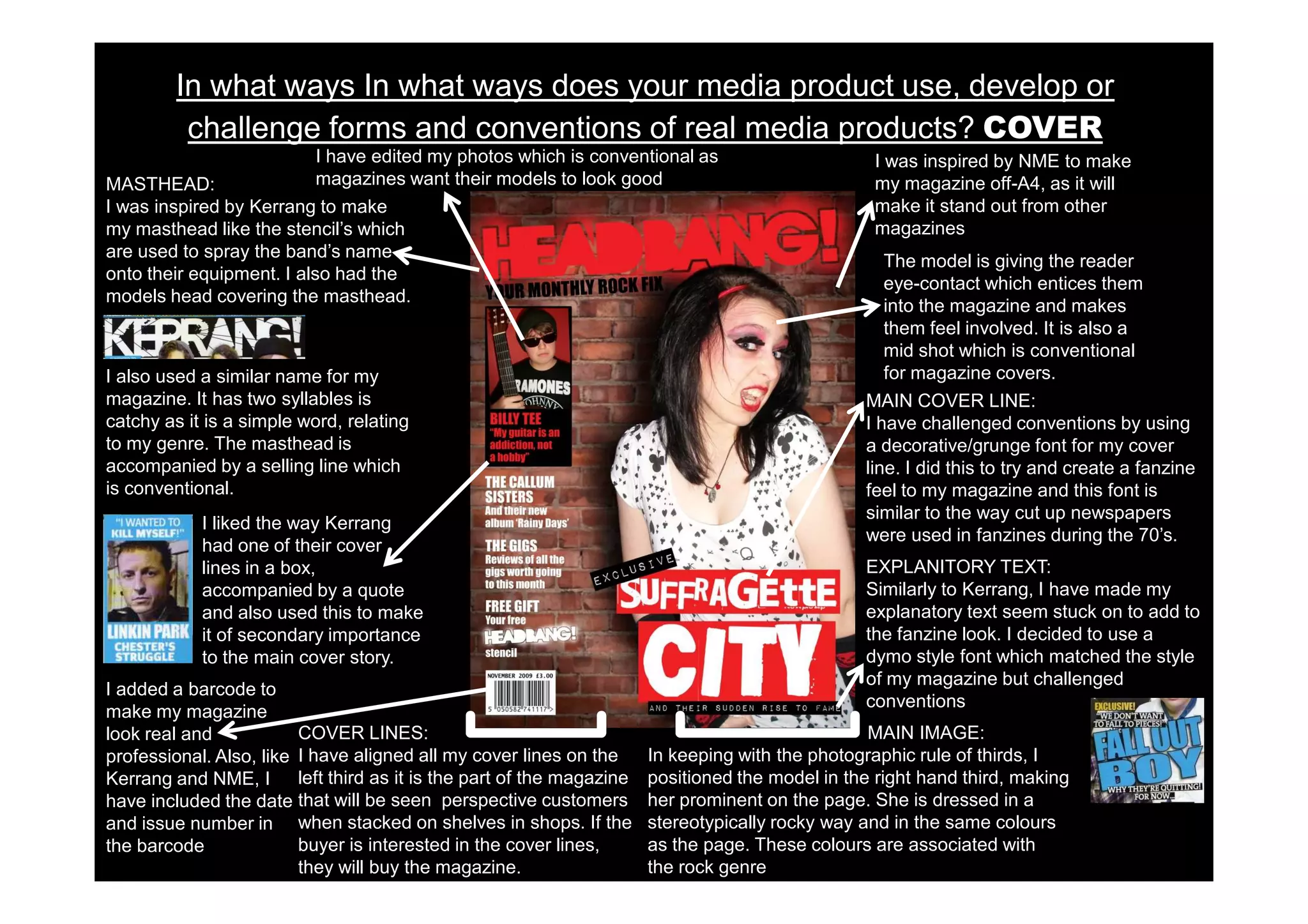
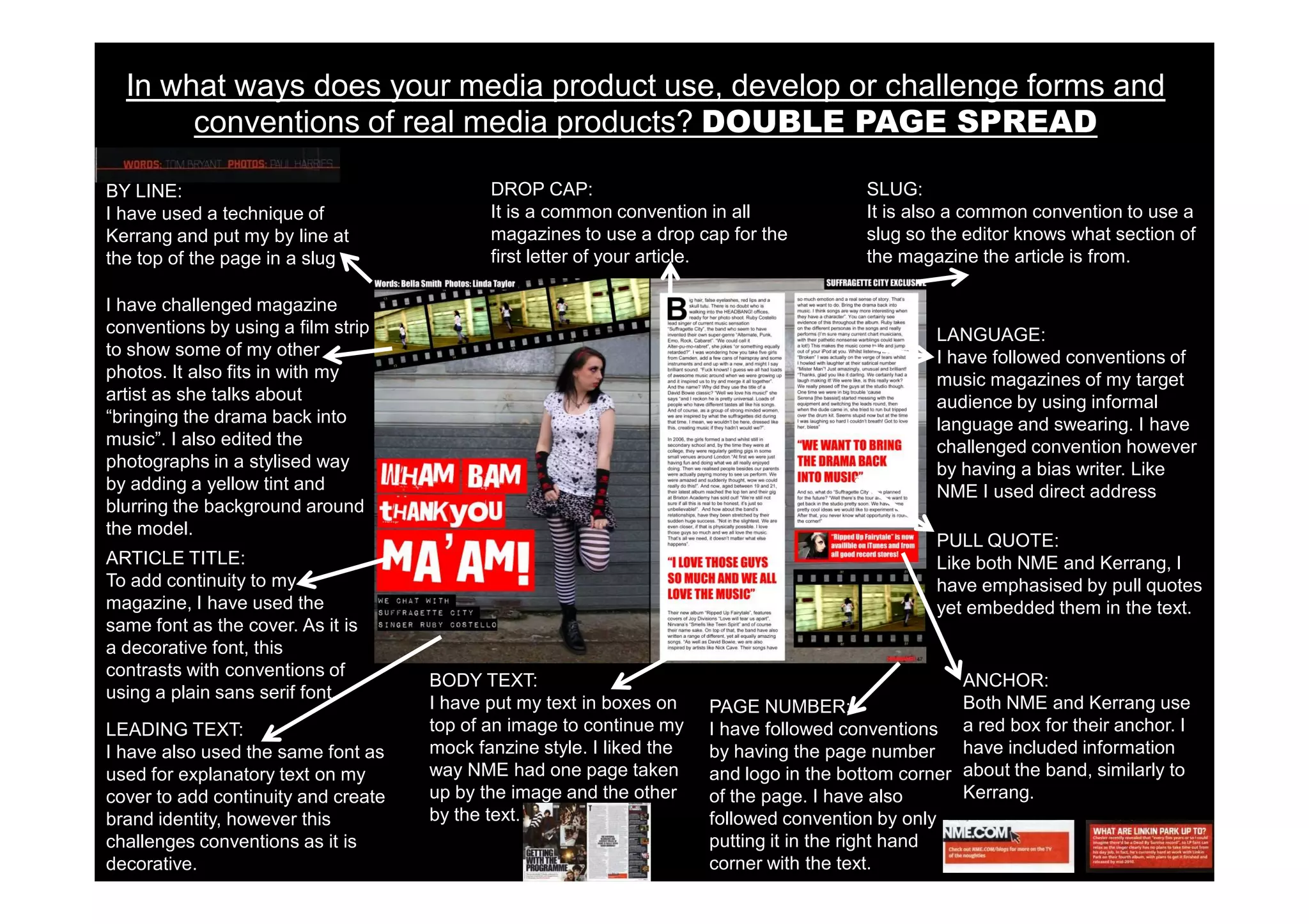
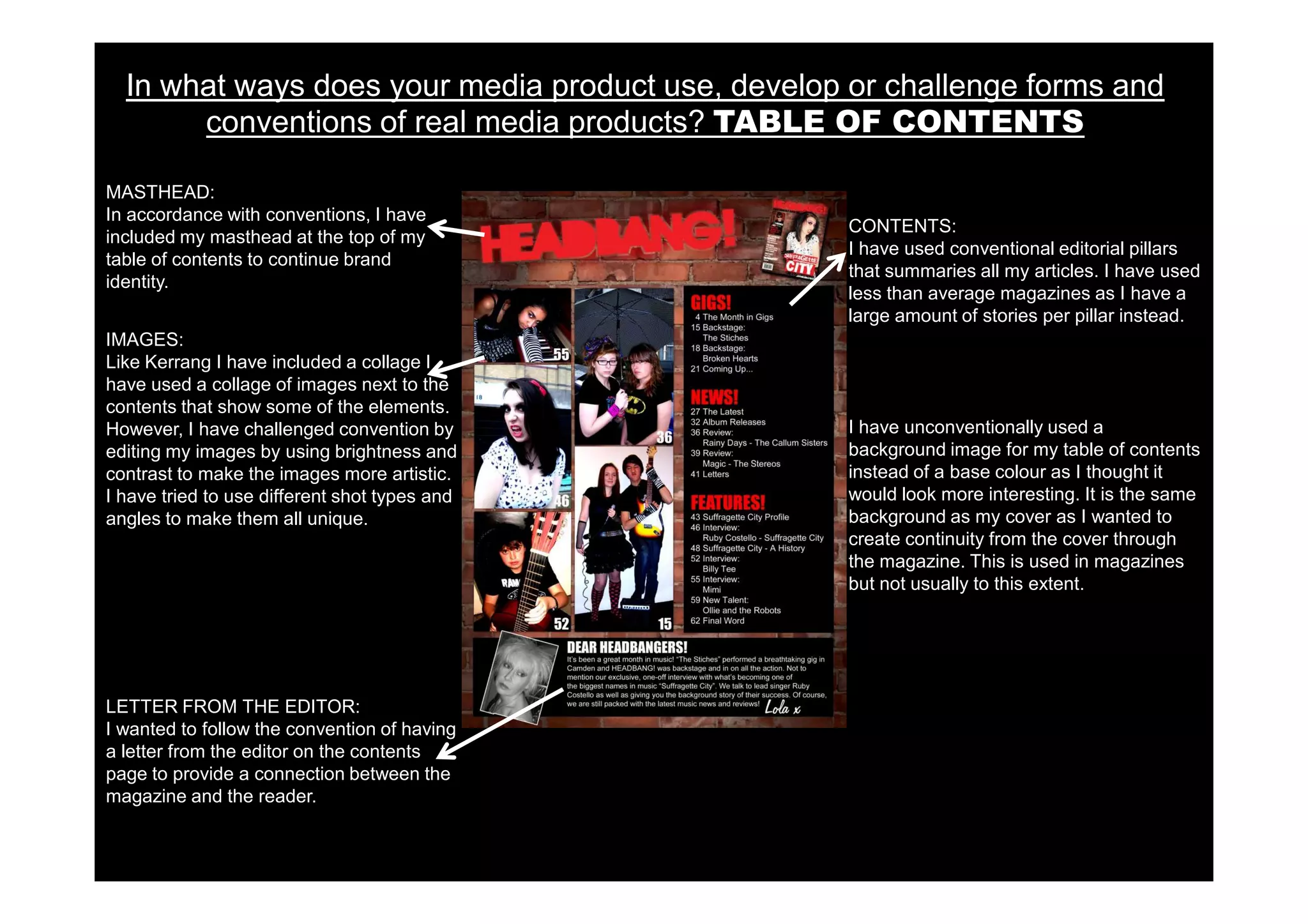
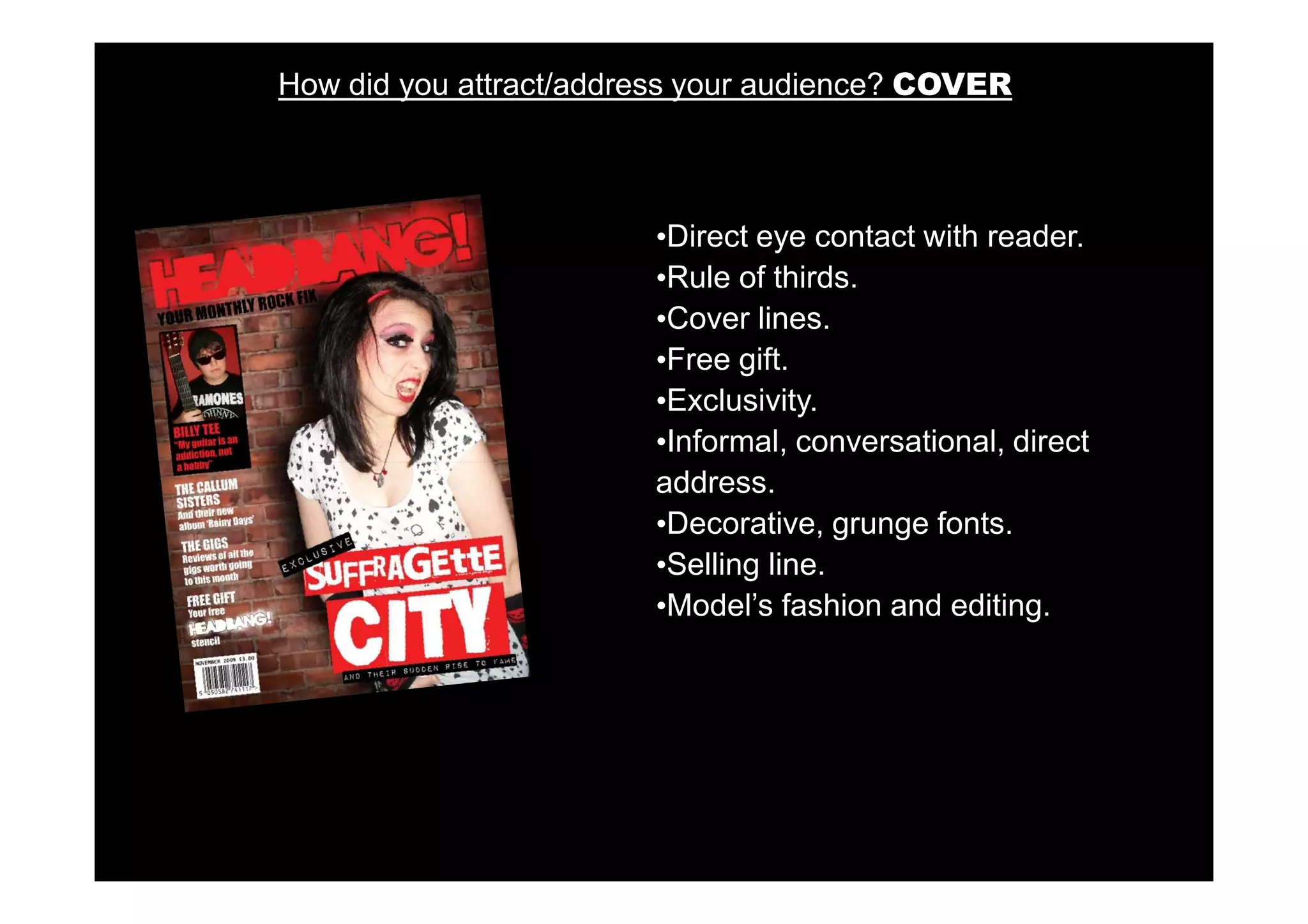
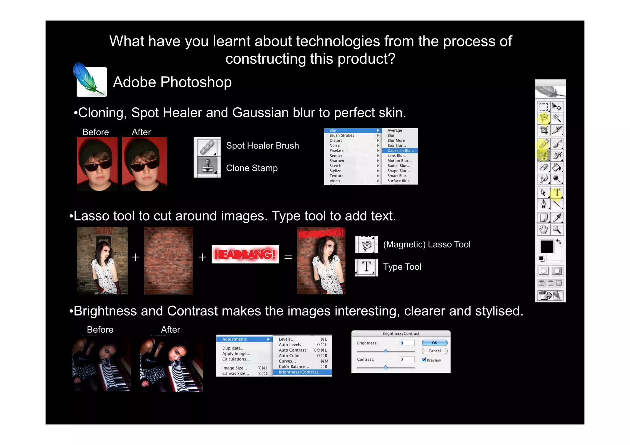
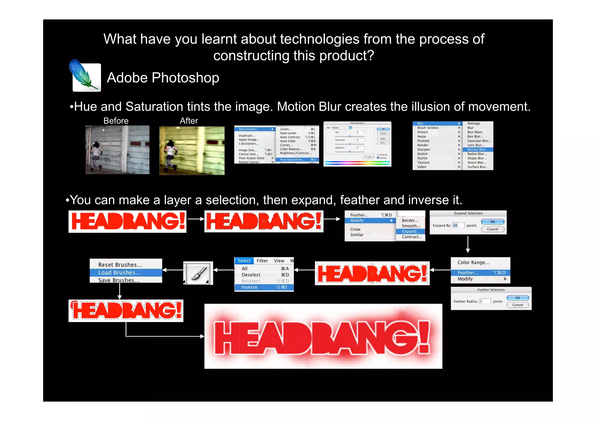
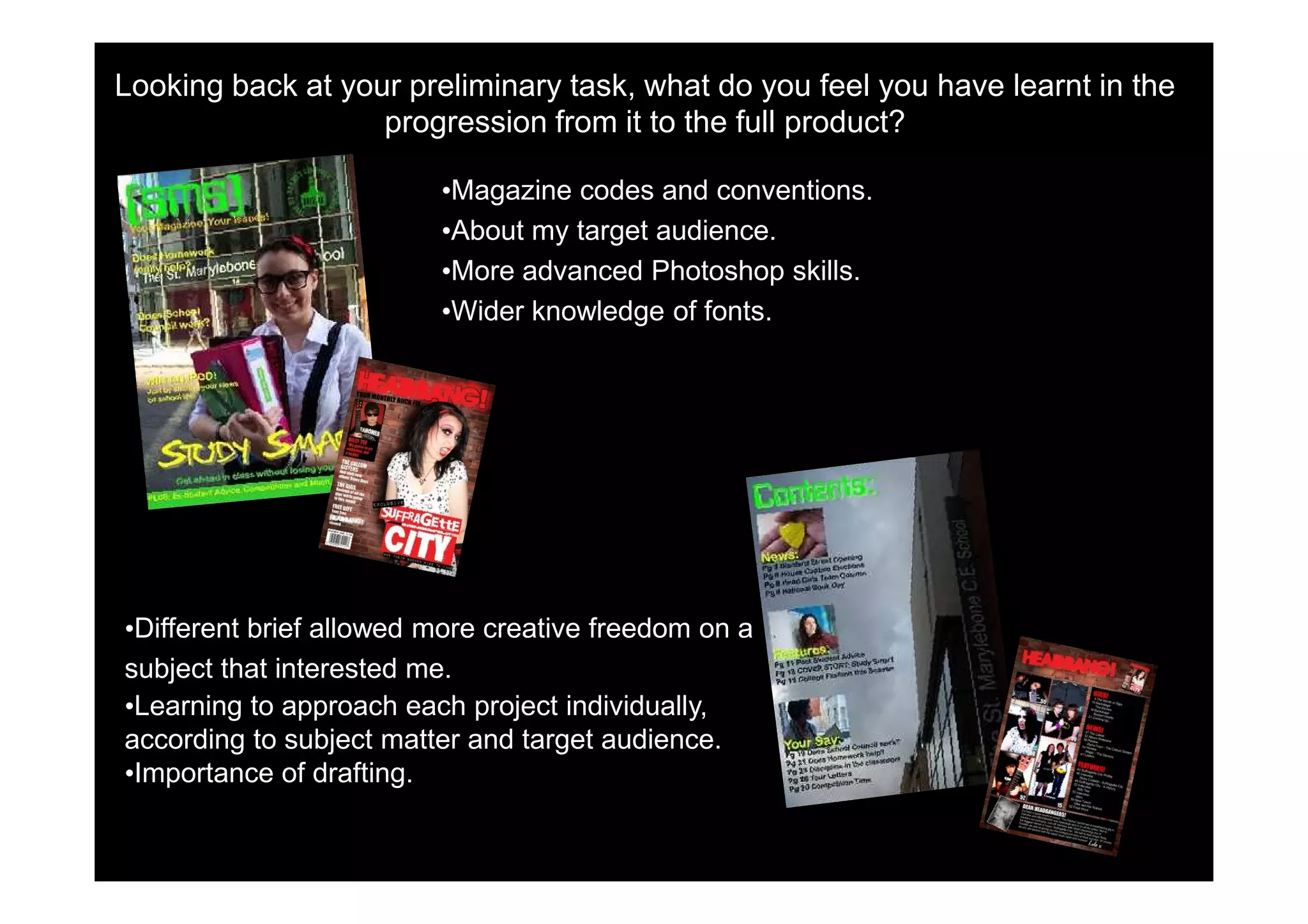
Frankie-Rose Taylor
In what ways In what ways does your media product use, develop or
          challenge forms and conventions of real media products? COVER
                           I have edited my photos which is conventional as                         I was inspired by NME to make
MASTHEAD:                  magazines want their models to look good                                 my magazine off-A4, as it will
I was inspired by Kerrang to make                                                                   make it stand out from other
my masthead like the stencil’s which                                                                magazines
are used to spray the band’s name
                                                                                                     The model is giving the reader
onto their equipment. I also had the
                                                                                                     eye-contact which entices them
models head covering the masthead.
                                                                                                     into the magazine and makes
                                                                                                     them feel involved. It is also a
                                                                                                     mid shot which is conventional
I also used a similar name for my                                                                    for magazine covers.
magazine. It has two syllables is                                                                 MAIN COVER LINE:
catchy as it is a simple word, relating                                                           I have challenged conventions by using
to my genre. The masthead is                                                                      a decorative/grunge font for my cover
accompanied by a selling line which                                                               line. I did this to try and create a fanzine
is conventional.                                                                                  feel to my magazine and this font is
                                                                                                  similar to the way cut up newspapers
            I liked the way Kerrang
                                                                                                  were used in fanzines during the 70’s.
            had one of their cover
            lines in a box,                                                                       EXPLANITORY TEXT:
            accompanied by a quote                                                                Similarly to Kerrang, I have made my
            and also used this to make                                                            explanatory text seem stuck on to add to
            it of secondary importance                                                            the fanzine look. I decided to use a
            to the main cover story.                                                              dymo style font which matched the style
                                                                                                  of my magazine but challenged
I added a barcode to
                                                                                                  conventions
make my magazine
look real and            COVER LINES:                                                              MAIN IMAGE:
professional. Also, like I have aligned all my cover lines on the       In keeping with the photographic rule of thirds, I
Kerrang and NME, I       left third as it is the part of the magazine   positioned the model in the right hand third, making
have included the date that will be seen perspective customers          her prominent on the page. She is dressed in a
and issue number in when stacked on shelves in shops. If the            stereotypically rocky way and in the same colours
the barcode              buyer is interested in the cover lines,        as the page. These colours are associated with
                         they will buy the magazine.                    the rock genre
In what ways does your media product use, develop or challenge forms and
       conventions of real media products? DOUBLE PAGE SPREAD

BY LINE:                                    DROP CAP:                                    SLUG:
I have used a technique of                  It is a common convention in all             It is also a common convention to use a
Kerrang and put my by line at               magazines to use a drop cap for the          slug so the editor knows what section of
the top of the page in a slug               first letter of your article.                the magazine the article is from.

I have challenged magazine
conventions by using a film strip                                                                 LANGUAGE:
to show some of my other                                                                          I have followed conventions of
photos. It also fits in with my                                                                   music magazines of my target
artist as she talks about                                                                         audience by using informal
“bringing the drama back into                                                                     language and swearing. I have
music”. I also edited the                                                                         challenged convention however
photographs in a stylised way                                                                     by having a bias writer. Like
by adding a yellow tint and                                                                       NME I used direct address
blurring the background around
the model.
                                                                                                  PULL QUOTE:
ARTICLE TITLE:                                                                                    Like both NME and Kerrang, I
To add continuity to my                                                                           have emphasised by pull quotes
magazine, I have used the                                                                         yet embedded them in the text.
same font as the cover. As it is
a decorative font, this
contrasts with conventions of
                                     BODY TEXT:                                                      ANCHOR:
using a plain sans serif font.
                                     I have put my text in boxes on    PAGE NUMBER:                  Both NME and Kerrang use
LEADING TEXT:                        top of an image to continue my    I have followed conventions a red box for their anchor. I
I have also used the same font as    mock fanzine style. I liked the   by having the page number have included information
used for explanatory text on my      way NME had one page taken        and logo in the bottom corner about the band, similarly to
cover to add continuity and create   up by the image and the other     of the page. I have also      Kerrang.
brand identity, however this         by the text.                      followed convention by only
challenges conventions as it is                                        putting it in the right hand
decorative.                                                            corner with the text.
In what ways does your media product use, develop or challenge forms and
       conventions of real media products? TABLE OF CONTENTS

MASTHEAD:
In accordance with conventions, I have
                                                    CONTENTS:
included my masthead at the top of my
                                                    I have used conventional editorial pillars
table of contents to continue brand
                                                    that summaries all my articles. I have used
identity.
                                                    less than average magazines as I have a
                                                    large amount of stories per pillar instead.
IMAGES:
Like Kerrang I have included a collage I
have used a collage of images next to the
contents that show some of the elements.
However, I have challenged convention by            I have unconventionally used a
editing my images by using brightness and           background image for my table of contents
contrast to make the images more artistic.          instead of a base colour as I thought it
I have tried to use different shot types and        would look more interesting. It is the same
angles to make them all unique.                     background as my cover as I wanted to
                                                    create continuity from the cover through
                                                    the magazine. This is used in magazines
                                                    but not usually to this extent.


LETTER FROM THE EDITOR:
I wanted to follow the convention of having
a letter from the editor on the contents
page to provide a connection between the
magazine and the reader.
How does your media product represent particular social groups?
                                         My target audience was:
                                         Young adults aged 15-25
                                         D-B social grading
                                         Both male and female
                                         Interested in rock music
•Language: Colloquialisms, uncensored, informal and conversational.

•Images: Models look well dressed, make-up, in clothes of that style. Similar
age to readers, photoshopped, male and female

•Colour: Red, black and white are associated with the rock genre. Red
connotations of danger. Neutral colours.

•Content: Articles they are interested in, not to much writing, information
they want to know.

•Font: Rebellious connotations, decorative.
What kind of media institution might distribute your media product and why?
 I need a publisher that:
 • Produces other music magazines but not of the same genre.
 •Appeals to young people.
 •Has a diverse selection of magazines


Independent Publisher: HEADBANG! Publishing

•Relates to my fanzine research and punk ethos.
•Purely focused on one magazine.                                    Publishing

•Has complete control.
Who would be the audience for your media product?
                                           My target audience was:
                                           Young people aged 15-25
                                           D-B social grading
                                           Both male and female
                                           Interested in rock music

•Young people are most associated with current rock music and culture.
•Upper classes are stereotyped as having a more classical taste in music.
•Rock is not as gender defined as other music (eg. Pop)
•The main thing uniting my target audience is an interest in rock music and my
magazine would appeal to any fans who are in my age range.
How did you attract/address your audience? COVER


                        •Direct eye contact with reader.
                        •Rule of thirds.
                        •Cover lines.
                        •Free gift.
                        •Exclusivity.
                        •Informal, conversational, direct
                        address.
                        •Decorative, grunge fonts.
                        •Selling line.
                        •Model’s fashion and editing.
How did you attract/address your audience? DOUBLE PAGE SPREAD


                                   •Following codes and conventions.
                                   •More images than text.
                                   •Colloquial, uncensored, direct
                                   address and conversational
                                   language.
                                   •Colour scheme.
                                   •Interesting information.
How did you attract/address your audience? TABLE OF CONTENTS


                              •Interesting articles.
                              •Short names.
                              •Connotations of rebellion.
                              •Contact between editor and reader.
                              •Edited images.
                              •Images and models used.
What have you learnt about technologies from the process of
                           constructing this product?
           Adobe Photoshop

•Cloning, Spot Healer and Gaussian blur to perfect skin.
  Before      After
                                  Spot Healer Brush

                                  Clone Stamp


•Lasso tool to cut around images. Type tool to add text.

                                                      (Magnetic) Lasso Tool
              +               +                 =
                                                      Type Tool


•Brightness and Contrast makes the images interesting, clearer and stylised.
   Before             After
What have you learnt about technologies from the process of
                      constructing this product?
       Adobe Photoshop

•Hue and Saturation tints the image. Motion Blur creates the illusion of movement.
      Before        After


•You can make a layer a selection, then expand, feather and inverse it.
What have you learnt about technologies from the process of
                      constructing this product?


I created a blog to store my work and learnt how to operate it.


                         •Edit blog layout.
                         •Post work as jpegs.
                         •Embed other media using HTML codes.
                         •Follow other peoples blogs.
What have you learnt about technologies from the process of
                     constructing this product?
       Microsoft Excel
I used Excel to record data and make graphs from my questionnaire.

              •I created functions to calculate totals in my data.


               •If you select some of your data then you can create a graph.
What have you learnt about technologies from the process of
                     constructing this product?


Slideshare allows you to embed presentations and pdf documents on my blog.

•You select and upload the file.


•Then copy and paste the HTML into a blog post.
What have you learnt about technologies and obesity from the process of
                      constructing this product?


Animoto creates videos from photographs and music you upload that can be
embed in my blog.


            Issuu creates a virtual magazine from a template you create in
            Microsoft Publisher.
Looking back at your preliminary task, what do you feel you have learnt in the
                   progression from it to the full product?

                         •Magazine codes and conventions.
                         •About my target audience.
                         •More advanced Photoshop skills.
                         •Wider knowledge of fonts.


•Different brief allowed more creative freedom on a
subject that interested me.
•Learning to approach each project individually,
according to subject matter and target audience.
•Importance of drafting.

Evaluation

  • 1.
  • 2.
    In what waysIn what ways does your media product use, develop or challenge forms and conventions of real media products? COVER I have edited my photos which is conventional as I was inspired by NME to make MASTHEAD: magazines want their models to look good my magazine off-A4, as it will I was inspired by Kerrang to make make it stand out from other my masthead like the stencil’s which magazines are used to spray the band’s name The model is giving the reader onto their equipment. I also had the eye-contact which entices them models head covering the masthead. into the magazine and makes them feel involved. It is also a mid shot which is conventional I also used a similar name for my for magazine covers. magazine. It has two syllables is MAIN COVER LINE: catchy as it is a simple word, relating I have challenged conventions by using to my genre. The masthead is a decorative/grunge font for my cover accompanied by a selling line which line. I did this to try and create a fanzine is conventional. feel to my magazine and this font is similar to the way cut up newspapers I liked the way Kerrang were used in fanzines during the 70’s. had one of their cover lines in a box, EXPLANITORY TEXT: accompanied by a quote Similarly to Kerrang, I have made my and also used this to make explanatory text seem stuck on to add to it of secondary importance the fanzine look. I decided to use a to the main cover story. dymo style font which matched the style of my magazine but challenged I added a barcode to conventions make my magazine look real and COVER LINES: MAIN IMAGE: professional. Also, like I have aligned all my cover lines on the In keeping with the photographic rule of thirds, I Kerrang and NME, I left third as it is the part of the magazine positioned the model in the right hand third, making have included the date that will be seen perspective customers her prominent on the page. She is dressed in a and issue number in when stacked on shelves in shops. If the stereotypically rocky way and in the same colours the barcode buyer is interested in the cover lines, as the page. These colours are associated with they will buy the magazine. the rock genre
  • 3.
    In what waysdoes your media product use, develop or challenge forms and conventions of real media products? DOUBLE PAGE SPREAD BY LINE: DROP CAP: SLUG: I have used a technique of It is a common convention in all It is also a common convention to use a Kerrang and put my by line at magazines to use a drop cap for the slug so the editor knows what section of the top of the page in a slug first letter of your article. the magazine the article is from. I have challenged magazine conventions by using a film strip LANGUAGE: to show some of my other I have followed conventions of photos. It also fits in with my music magazines of my target artist as she talks about audience by using informal “bringing the drama back into language and swearing. I have music”. I also edited the challenged convention however photographs in a stylised way by having a bias writer. Like by adding a yellow tint and NME I used direct address blurring the background around the model. PULL QUOTE: ARTICLE TITLE: Like both NME and Kerrang, I To add continuity to my have emphasised by pull quotes magazine, I have used the yet embedded them in the text. same font as the cover. As it is a decorative font, this contrasts with conventions of BODY TEXT: ANCHOR: using a plain sans serif font. I have put my text in boxes on PAGE NUMBER: Both NME and Kerrang use LEADING TEXT: top of an image to continue my I have followed conventions a red box for their anchor. I I have also used the same font as mock fanzine style. I liked the by having the page number have included information used for explanatory text on my way NME had one page taken and logo in the bottom corner about the band, similarly to cover to add continuity and create up by the image and the other of the page. I have also Kerrang. brand identity, however this by the text. followed convention by only challenges conventions as it is putting it in the right hand decorative. corner with the text.
  • 4.
    In what waysdoes your media product use, develop or challenge forms and conventions of real media products? TABLE OF CONTENTS MASTHEAD: In accordance with conventions, I have CONTENTS: included my masthead at the top of my I have used conventional editorial pillars table of contents to continue brand that summaries all my articles. I have used identity. less than average magazines as I have a large amount of stories per pillar instead. IMAGES: Like Kerrang I have included a collage I have used a collage of images next to the contents that show some of the elements. However, I have challenged convention by I have unconventionally used a editing my images by using brightness and background image for my table of contents contrast to make the images more artistic. instead of a base colour as I thought it I have tried to use different shot types and would look more interesting. It is the same angles to make them all unique. background as my cover as I wanted to create continuity from the cover through the magazine. This is used in magazines but not usually to this extent. LETTER FROM THE EDITOR: I wanted to follow the convention of having a letter from the editor on the contents page to provide a connection between the magazine and the reader.
  • 5.
    How does yourmedia product represent particular social groups? My target audience was: Young adults aged 15-25 D-B social grading Both male and female Interested in rock music •Language: Colloquialisms, uncensored, informal and conversational. •Images: Models look well dressed, make-up, in clothes of that style. Similar age to readers, photoshopped, male and female •Colour: Red, black and white are associated with the rock genre. Red connotations of danger. Neutral colours. •Content: Articles they are interested in, not to much writing, information they want to know. •Font: Rebellious connotations, decorative.
  • 6.
    What kind ofmedia institution might distribute your media product and why? I need a publisher that: • Produces other music magazines but not of the same genre. •Appeals to young people. •Has a diverse selection of magazines Independent Publisher: HEADBANG! Publishing •Relates to my fanzine research and punk ethos. •Purely focused on one magazine. Publishing •Has complete control.
  • 7.
    Who would bethe audience for your media product? My target audience was: Young people aged 15-25 D-B social grading Both male and female Interested in rock music •Young people are most associated with current rock music and culture. •Upper classes are stereotyped as having a more classical taste in music. •Rock is not as gender defined as other music (eg. Pop) •The main thing uniting my target audience is an interest in rock music and my magazine would appeal to any fans who are in my age range.
  • 8.
    How did youattract/address your audience? COVER •Direct eye contact with reader. •Rule of thirds. •Cover lines. •Free gift. •Exclusivity. •Informal, conversational, direct address. •Decorative, grunge fonts. •Selling line. •Model’s fashion and editing.
  • 9.
    How did youattract/address your audience? DOUBLE PAGE SPREAD •Following codes and conventions. •More images than text. •Colloquial, uncensored, direct address and conversational language. •Colour scheme. •Interesting information.
  • 10.
    How did youattract/address your audience? TABLE OF CONTENTS •Interesting articles. •Short names. •Connotations of rebellion. •Contact between editor and reader. •Edited images. •Images and models used.
  • 11.
    What have youlearnt about technologies from the process of constructing this product? Adobe Photoshop •Cloning, Spot Healer and Gaussian blur to perfect skin. Before After Spot Healer Brush Clone Stamp •Lasso tool to cut around images. Type tool to add text. (Magnetic) Lasso Tool + + = Type Tool •Brightness and Contrast makes the images interesting, clearer and stylised. Before After
  • 12.
    What have youlearnt about technologies from the process of constructing this product? Adobe Photoshop •Hue and Saturation tints the image. Motion Blur creates the illusion of movement. Before After •You can make a layer a selection, then expand, feather and inverse it.
  • 13.
    What have youlearnt about technologies from the process of constructing this product? I created a blog to store my work and learnt how to operate it. •Edit blog layout. •Post work as jpegs. •Embed other media using HTML codes. •Follow other peoples blogs.
  • 14.
    What have youlearnt about technologies from the process of constructing this product? Microsoft Excel I used Excel to record data and make graphs from my questionnaire. •I created functions to calculate totals in my data. •If you select some of your data then you can create a graph.
  • 15.
    What have youlearnt about technologies from the process of constructing this product? Slideshare allows you to embed presentations and pdf documents on my blog. •You select and upload the file. •Then copy and paste the HTML into a blog post.
  • 16.
    What have youlearnt about technologies and obesity from the process of constructing this product? Animoto creates videos from photographs and music you upload that can be embed in my blog. Issuu creates a virtual magazine from a template you create in Microsoft Publisher.
  • 17.
    Looking back atyour preliminary task, what do you feel you have learnt in the progression from it to the full product? •Magazine codes and conventions. •About my target audience. •More advanced Photoshop skills. •Wider knowledge of fonts. •Different brief allowed more creative freedom on a subject that interested me. •Learning to approach each project individually, according to subject matter and target audience. •Importance of drafting.