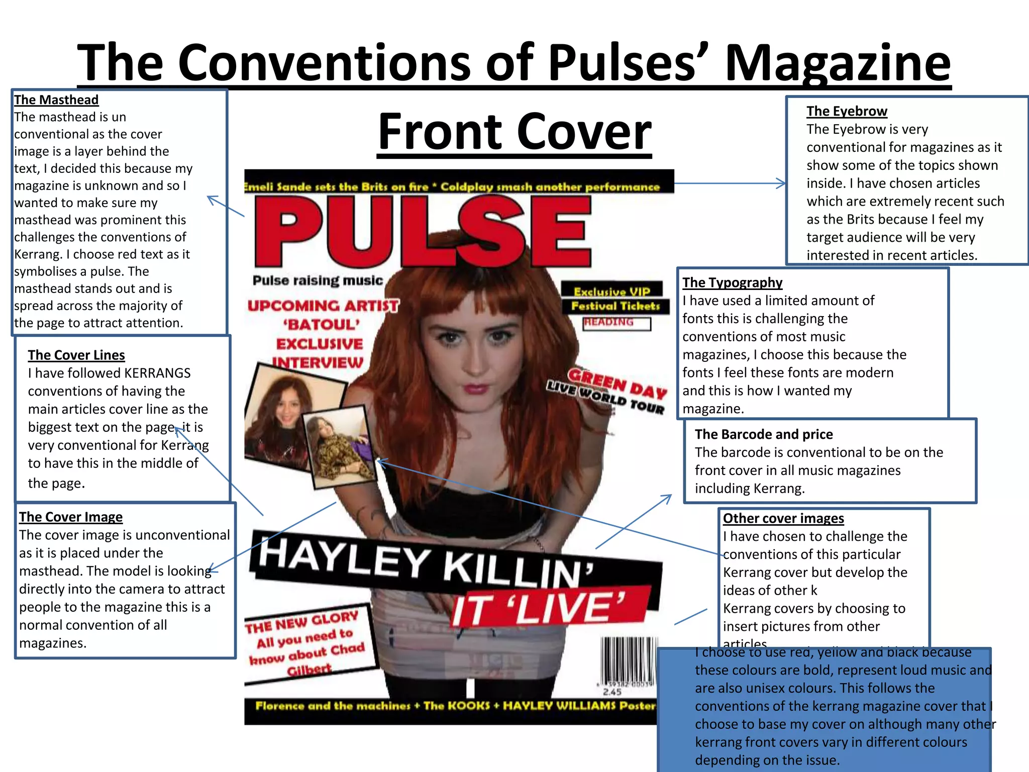
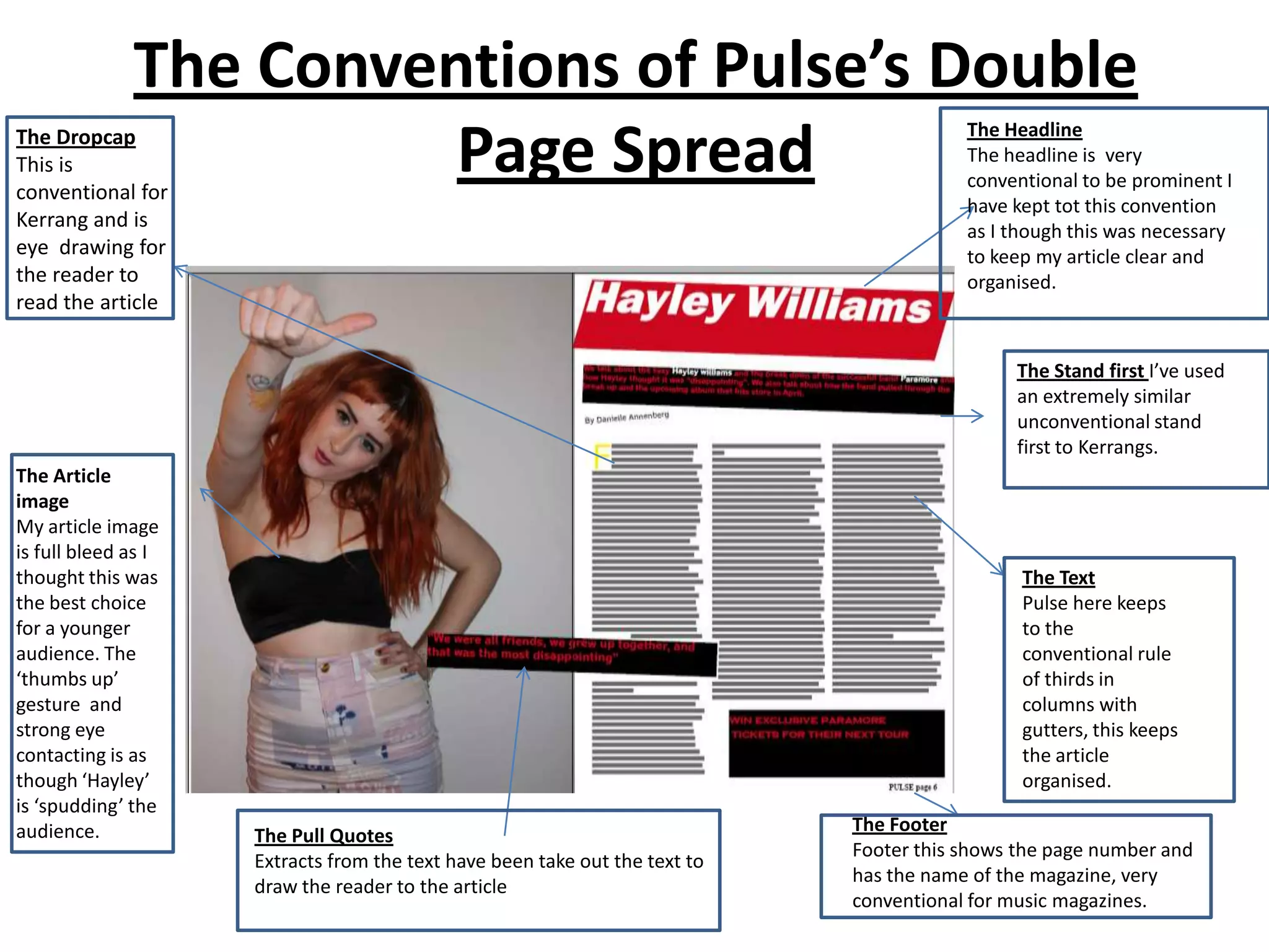
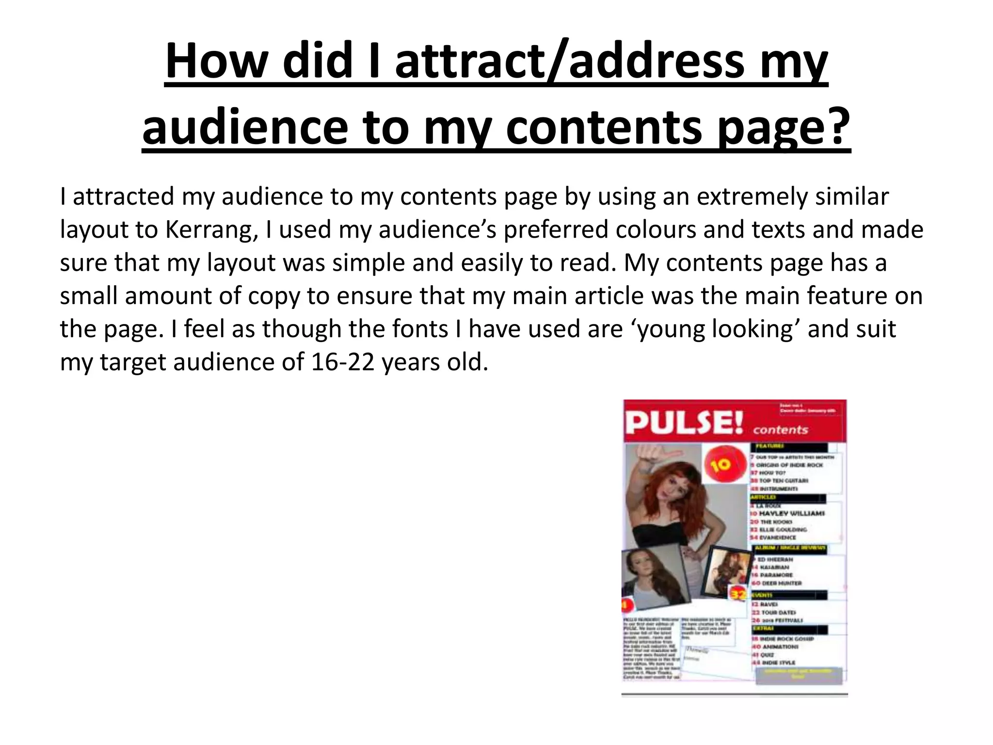
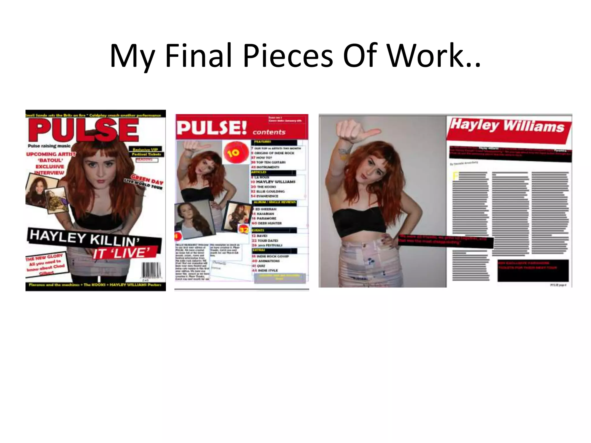
The document summarizes the conventions of music magazine front covers and how the student's mock magazine cover for "Pulse" both develops and challenges those conventions in comparison to the magazine "Kerrang".
Key points:
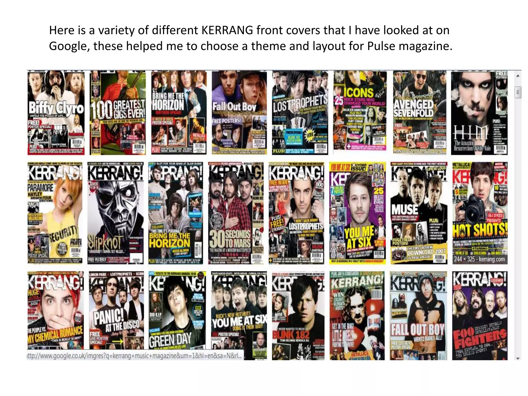
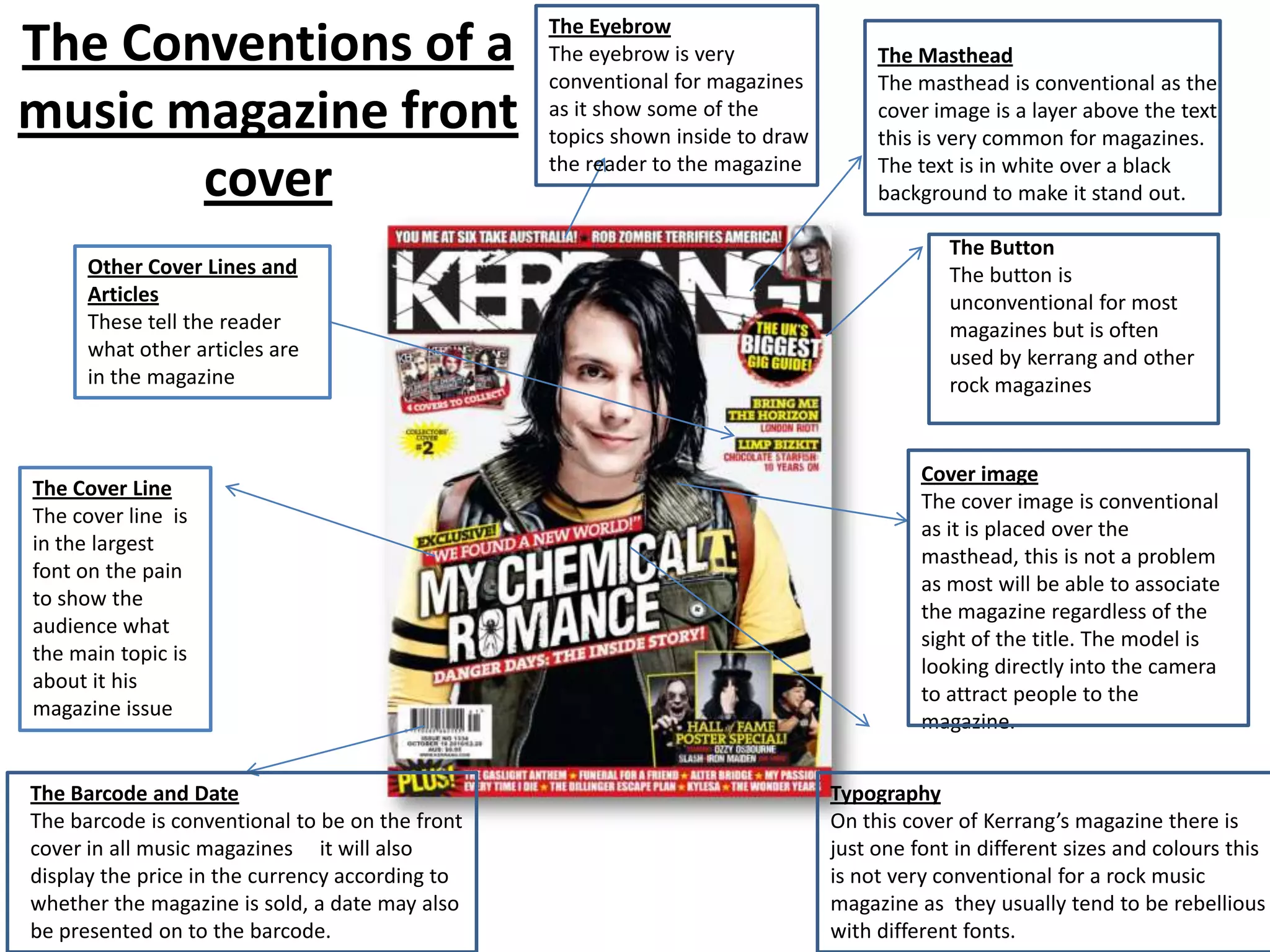
- Kerrang conventions include the masthead, eyebrow, cover lines, images, and barcode/date.
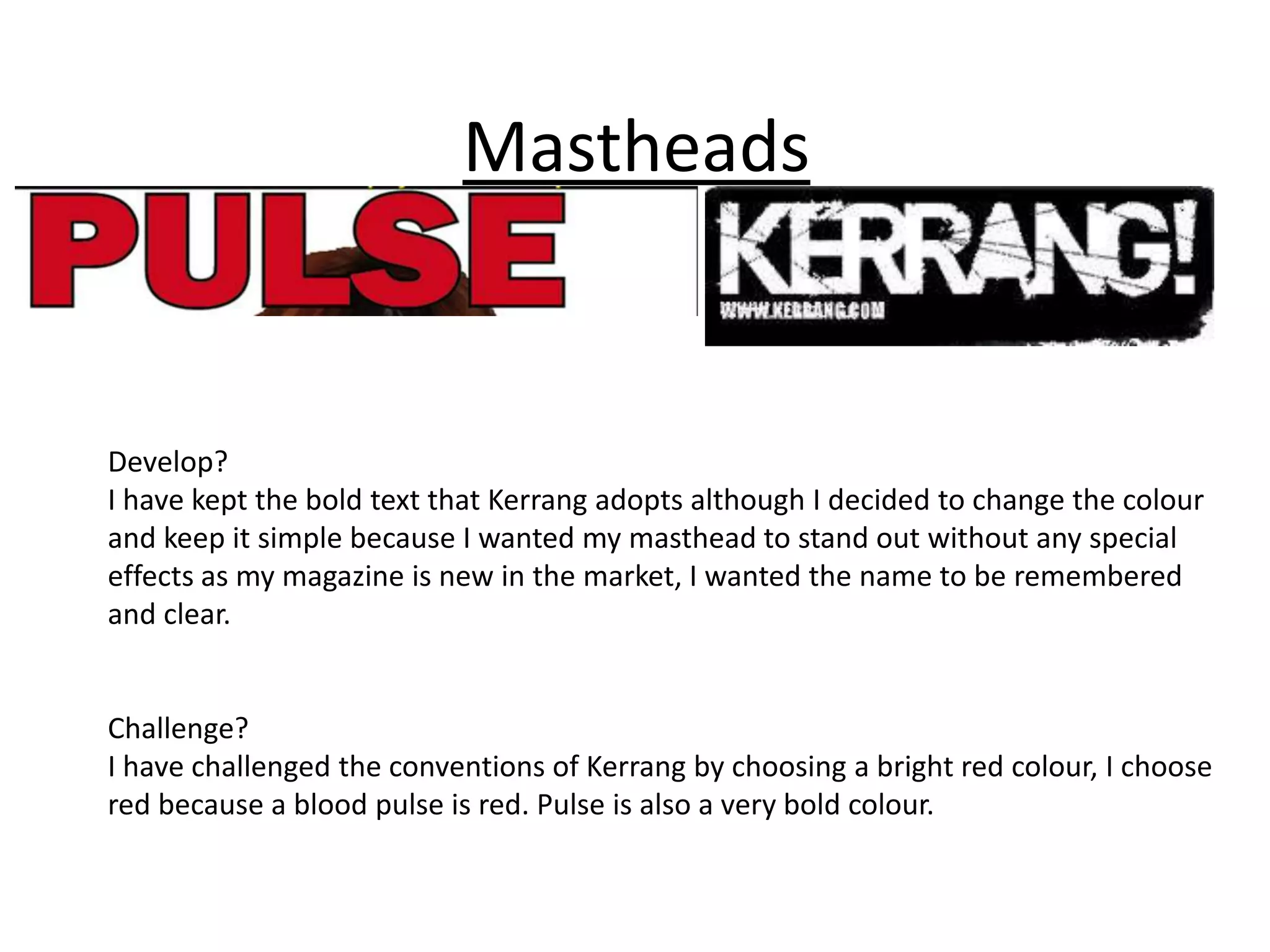
- Pulse's masthead challenges conventions by being red and prominent above the cover image.
- Pulse follows conventions for the eyebrow, cover lines, and barcode/date.
- Pulse challenges conventions with its limited fonts and placement of cover image under masthead.
- Both magazines develop conventions through color schemes and layout similarities to Kerrang covers.
Future would be a suitable publisher for Pulse magazine as they are a large, established magazine and internet publisher focused on music and gaming. Future has experience successfully publishing similar rock magazines like Classic Rock, Metal Hammer, and Revolver. Their wide reach across multiple countries through both print and digital platforms would help promote and distribute Pulse magazine to its target indie rock audience.
This document summarizes the front cover, contents page, and double page article layout of a music magazine called "Amp Volume".
[1] The front cover uses conventions like mastheads, strip lines, cover lines with images, barcodes, and advertisements to attract audiences.
[2] The contents page lists article headings in bright colors and includes a subscription box. Most magazines include cover images and editor summaries.
[3] Double page articles typically feature large central quotes and images that portray lifestyles and target audiences. Conventions like white text on black backgrounds are used.
The document summarizes the key conventions and codes used in music magazines that the author incorporated into their own music magazine project. Some of the main conventions included mastheads, cover lines, quotes from artists, large cover images, contents pages with headings and listings of articles, double page interviews with photos and introductory comments, and consistent color schemes and fonts throughout. The author analyzed real music magazines to incorporate standard elements like mastheads, barcodes, and subscription boxes to make their magazine seem professional and realistic.
This document summarizes how the media product uses, develops, and challenges conventions of real media products. Specifically:
- The magazine cover follows conventions such as having the masthead across the top, a main image, and issue details. However, the background image is more complex than typical.
- The contents page lists articles under regular and feature headings, uses images to break up text, and has the issue details. It also includes a subscription prompt.
- The double-page article spread uses techniques like a short eye-catching title, bold drop quotes, and multiple columns of text.
Frankie-Rose Taylor discusses how her media product challenges and develops conventions of real magazines. She edited photos on the cover to make the model look good. The masthead was inspired by Kerrang magazine. Fonts and designs were chosen to create a fanzine feel. Images on the double page spread were styled with a yellow tint and blurring. The table of contents included a background image for visual interest. Overall, the goal was to challenge conventions while maintaining connections to real magazines through codes and formats.
The document analyzes conventions used in pop magazines. It summarizes the key conventions seen across front covers, contents pages, and double page spreads. Conventions include placement of mastheads, coverlines, images, and other elements. Font styles and use of color are also conventional across genres. Overall layout and design elements follow typical structures to effectively guide the reader's eyes and convey necessary information in clear, accessible ways.
The document analyzes the conventions used in magazine layout and design. It finds that:
1) The route of the eye and rule of thirds are used conventionally to guide readers through mastheads, images, and cover lines.
2) Bold fonts, bright colors, and clear hierarchies are conventional for pop magazines to attract readers.
3) Common elements like mastheads, cover lines, images, and fonts are arranged conventionally to maximize comprehension and engagement.
The document discusses how the author's music magazine product uses and develops conventions of real music magazines. Some conventions that the author incorporates include placing the artist on the cover as the main focus, including a barcode, masthead matching the cover artist's color, cover lines, issue number and date, contents page with artist image and page numbers, double page interview spread in question and answer format, and basing the house style and colors on the cover artist. The author analyzes examples from NME magazine to inspire conventions used in their own magazine design.
This document analyzes the design of a magazine cover. It discusses several design elements including the masthead, main image, model credit, main cover line, and various coverlines. It notes that the largest coverlines on the left side are more likely to be read. The direct address of the main image and retro theme are meant to appeal to the target audience of music fans. Color, typefaces, photography lighting and house style create an informal yet consistent look to attract readers.
This document analyzes the design of a magazine cover. It discusses several design elements including the masthead, main image, model credit, main cover line, and coverlines. The analysis explains how these elements are used to attract the target audience of music fans. For example, the main cover line "Changed my life" in a bold font is intended to encourage readers. The variety of artists listed in the coverlines would appeal to different fans within the target genre of music. Overall, the cover uses photographic style and fonts associated with rock music to target its audience.
This double page spread from NME magazine profiles UK rapper Dizzee Rascal. The main image shows Dizzee Rascal graffiti tagging a wall while looking over his shoulder, suggesting a rebellious tone. Additional images and a graffiti background further reinforce this theme. The article begins with a large dropped capital Y, maintaining a professional design. A second spread profiles singer Florence Welch of Florence and the Machine during a US tour. Florence is pictured sitting on a table in front of an American flag, indicating the location. Her sophisticated look matches the magazine's font and color scheme. Both spreads utilize images, backgrounds, fonts, and designs to set a tone that matches the subject and keeps the reader engaged.
The media product uses and develops some conventions of real magazines while also challenging others. It uses conventional elements like a masthead, cover lines, and issue date, but challenges conventions with elements like a gradient background, non-text masthead incorporation, and large overlapping subtitles. Overall, it aims to target an indie audience with its mixture of conventional and unconventional design choices.
This document analyzes the design elements of the Kerrang! rock magazine front cover and contents page. The front cover uses black, white, red, and yellow colors that create a rock atmosphere. It features a full-page image of a Foo Fighters band member in a red shirt. Variations in font size are used to emphasize different elements. The contents page includes artist images and issue details, maintaining the color scheme and fonts for consistency. Images on the double-page article spread are captioned and arranged at angles to make the page visually interesting while following conventions of magazine design.
The document provides an analysis of the front pages of two music magazines - NME and Mojo.
[1] It examines the layout conventions used on both magazines' mastheads, headlines, images, pull quotes, and other design elements. [2] Key details like the magazines' target audiences, genres of music covered, and fonts and colors used are discussed. [3] The analysis provides a breakdown of how different elements on the pages are designed to catch readers' eyes and convey important information in a clear manner.
This document discusses how the media product uses conventions of real music magazines. It summarizes:
1) The front cover uses images from a photo shoot and a plain background, following conventions. Coverlines are relevant to the genre and use buzzwords like "Exclusive."
2) The contents page uses bold category headlines, images that anchor to coverlines, and sublines that provide extra information without revealing all.
3) The double page spread uses a title that bleeds across pages to link them, follows conventions by using a band's own font for their name, and includes a collage of images on one page like real magazines.
Magazine cover analysis_worksheet rolling stonekruane95
The document analyzes the design of a magazine cover. It summarizes various elements of the design including the masthead font, main image featuring a model, model credit, main cover line, placement of elements according to the Guttenburg design principle, colors used, typefaces, photography lighting, coverlines of different sizes featuring various artists, and the overall informal yet professional house style. The design aims to attract fans of indie and rock music genres through prominent coverage of the band Arctic Monkeys and a retro-themed image of a model associated with that genre.
The document discusses how the group's media products for a horror film trailer effectively combine through consistent style and representative elements. The magazine cover, poster, and trailer all feature the same main character Radiya and use a color scheme of black, white, and red. Intertitles in the trailer match the font and colors of the other products. Close-ups of Radiya's face in different media help familiarize the audience with her without revealing too much of the plot. The teaser trailer establishes key elements of the story in a suspenseful way that matches the mysterious atmosphere of the poster and magazine cover.
The document analyzes the layout and design features of a magazine contents page from NME magazine from September 2009 with the Dizzee Rascal cover. It discusses elements such as the masthead, main image, color theme, headings in red, editors' introduction, and information about subscribing to future editions. The analysis looks at how these elements are typically positioned on contents pages and how they are used to attract readers' attention and highlight important information.
Analysing contents pages prep for blog pptasmediac12
The document analyzes the layout and design features of the contents page from the September 2009 edition of NME magazine. Key elements included are the masthead to identify the publication, a main image to draw attention and support the text, use of color themes throughout, individual section headings, and information about subscribing to future issues. The layout utilizes columns, boxes, and graphic elements like shapes around headings to structure the text and make important elements stand out.
The document describes the layout and design elements of various magazine covers and pages. Some of the key points summarized:
- The NME magazine cover has a scrapbook layout with many images and text cut in various sizes to look like a collage. Bright colors are used.
- Q magazine uses a dark color scheme with Matt Bellamy's image smashing their logo. They target an older audience with in-depth artist profiles.
- Kerrang magazine has a messy punk-inspired layout with many photos. They use contests and previews of revealing photos to attract younger readers.
- Mojo focuses more on information with a 50/50 text to image ratio. Their sophisticated black, white,
This document provides an analysis of the front cover, contents page, and a double page spread from two different music magazines - Kerrang! and Q Magazine.
For the Kerrang! cover analysis, key elements like the masthead, main image, additional information, and house colors are described. The contents page analysis notes the use of images and their relevance to articles. For the double page spread, the layout of text in columns and use of images is examined.
The Q Magazine analyses also describe the masthead, main cover line, house style and colors. The contents page layout lists main features and uses simple fonts. The double page spread again uses red to highlight parts and contains band images and a question/
This magazine cover features analysis discusses key elements of magazine design. In 3 sentences:
The cover summarizes that magazine covers typically include prominent mastheads, cover lines advertising main features, colorful schemes and images to attract readers, and additional text and graphics highlighting articles, artists, and advertisements. Common elements like barcodes and issue details are kept small and out of the way. Overall magazine covers aim to entice readers through eye-catching designs that preview exciting content and artists.
This document analyzes the layout and design elements of a double-page spread (DPS) from an alternative music magazine. It summarizes that DPS's typically feature a large central image, bold headers and drop caps to attract the reader's attention, and use informal language and quotations to appeal to the target audience. Evaluation of the DPS finds that full-page images and unique typographic designs are most effective at drawing in readers.
Music magazine double page spread comparisonBeth Wilcock
This double page magazine spread features a photo of an artistic band. The large photo takes up most of the space, drawing the reader's eye. It is styled to match the band's genre and image. Pull quotes are used to tease interesting quotes from the article and entice readers to learn more. Sophisticated fonts, layouts, and language target a specific audience for this band.
The document discusses how the student used conventions from existing magazines like Kerrang! and Metal Hammer to structure their own music magazine. They studied the front covers, contents pages, and double-page spreads of these magazines to inform the layout and design of their magazine. The student provides examples of how they implemented conventions like placement of the title, artist images and plugs while also developing their own style with unique elements like font color and placement of elements. They learned new skills using technologies like cameras, image editing software, and layout programs.
Evaluation -1. In what ways does your media product use forms and conventions...CharleyO16
1. The document describes the forms and conventions used in a mock music magazine, including elements like the masthead, coverlines, contents page, articles, and body text.
2. Standard features are used, such as the masthead at the top, barcode, issue details, images, headlines, bylines, standfirsts, columns of text, and page numbers.
3. Design elements like the color scheme, font sizes, and positioning of images and text also follow conventions of real music magazines.
The document analyzes a magazine cover, contents page, and article from Kerrang magazine from December 2005.
The 3 sentence summary is:
The magazine cover features a striking masthead in the Kerrang style and a photo of Foo Fighters' lead singer to target rock fans. The contents page uses similar fonts and colors and images instead of words to emphasize the music focus. The article is image-driven with a two column layout to keep a magazine format while making it easier to read about a concert tour.
This summary provides an overview of the conventions used in Kerrang magazine based on the document:
The masthead of Kerrang magazine is in bold capital letters that stand out from the background. Kickers are used along the sides and edges of the magazine to promote articles inside. Box outs are also used to highlight certain pieces of content. Images are prominently featured on the cover and in articles to attract readers. The magazine utilizes a consistent color scheme and house style throughout to create a recognizable brand.
The document provides an analysis of how the student's media magazine product uses conventions of real magazines to be successful. It examines the use of the rule of thirds in layout, the Gutenberg diagram to place key information, and how the front cover follows magazine conventions through positioning of images and title. The student also represents the niche audience of punk/grunge music fans aged 16-25 through the chosen model, clothing, and negative tagline. To attract this audience, the model is styled to look like the music genre through her leather jacket, t-shirt, and dismissive attitude.
My indie rock magazine front cover follows conventions like featuring a large dominant image to catch readers' eyes, includes the magazine name in a large font, and lists the issue number and date as well as quotes and cover lines representing stories inside.
This document summarizes how the student's media product uses and develops conventions of real media products.
The student's magazine masthead goes across the top of the page like professional magazines. Section headers are in different colors than articles for easy browsing. The contents page lists articles under regular and feature sections. Images are used throughout to break up text and draw the eye. The double page spread uses columns, a unique title font, and drop quotes to highlight sections from interviews. Overall, the student follows conventions like branding, layout, and visual design elements seen in real magazines.
The masthead of Kerrang magazine is in bold capital letters that stand out from the background. Kickers are used along the top and bottom of the magazine to promote articles inside. Box outs are also used to highlight extras and promote content. Images are featured to showcase the artists written about. Consistent formatting and stylistic elements like varying text sizes and colors are applied throughout to clearly structure the content and guide readers through the magazine.
The document summarizes the key design conventions used in the contents pages of two music magazines - NME and Vibe. Some of the conventions highlighted include: using bold colors and fonts to make headings stand out; including article page numbers and titles; separating sections with lines or spacing; and featuring images of artists to match article topics and attract readers. Both magazines aim to catch the eye, clearly present content information, and appeal to target audiences through their contents page designs.
NME magazine uses a simple yet bold masthead in red at the top of the magazine to catch readers' eyes. The main image on the front cover takes up the whole page to be the focal point, and frequently features exclusives for a unique selling point. Inside, the largest text is used for headlines to stand out, while smaller text and box outs provide additional details on stories and features.
The double page spread features a large main image of singer Usher smoking a cigar which suggests a relaxed attitude reflective of the genre of music covered in Vibe magazine. The interview questions are bolded for clarity. While the image page lacks a color scheme, keeping the text page simple with just black text implies the content is interesting without additional design elements.
The document analyzes Kerrang magazine as a case study for a rock magazine the author wants to produce. Some key points:
- Kerrang focuses on rock music and targets a teenage audience, publishing weekly since 1981.
- The magazine has conventions like a simple layout, masthead on the cover, and sections divided by genre.
- Features include cover stars, editor's notes, and ads to convince readers to buy.
- The author wants to take inspiration from Kerrang's accessible photo shoots, vibrant colors, and busy yet simple covers that appeal to their target audience.
The document summarizes two rock music magazines that could serve as examples for the magazine the document author plans to create.
Rocksound magazine is described as a monthly UK-based rock/metal magazine that features interviews and news of underground bands. Kerrang! magazine is a weekly UK publication that focuses on rock music and has been the best-selling rock magazine in the UK.
The document author notes design elements they want to incorporate from each magazine, including Rocksound's unstructured cover layout and Kerrang!'s use of a double-page band spread with sepia-toned photographs.
The document contains an audience member's questions and the media creator's responses about their magazine product.
The creator explains how their magazine both follows and challenges conventions of real music magazines in terms of design elements like the masthead, cover lines, and use of color. They also discuss how the magazine represents teenagers and young adults, and how a company like Prometheus Global Media might distribute it due to their experience with similar magazines. The target audience is identified as teenagers and young adults interested in music, and methods for attracting this audience included featuring a young model and using bright colors and an easy-to-navigate layout.
The document summarizes and compares the front covers and contents pages of two music magazines, NME and Vibe. Some key conventions highlighted include bold mastheads, featured artist banners, and prominent page numbers to help readers navigate. Color schemes and images are used to attract different audiences. Contents pages list article headlines clearly and draw attention through formatting like bold text. Overall the document analyzes design elements and their purpose in engaging readers.
The technologies used to create the magazine were a professional camera, InDesign, Photoshop, WordPress and PowerPoint. While the student was inexperienced with these programs, working on the preliminary task helped prepare them to take better photos and design magazine layouts. Comparing the final magazine to the preliminary work shows improvement in photography skills and creating a more professional design. However, editing skills could still be improved, such as making background effects look more realistic. Overall, the student gained valuable experience designing a magazine even as a beginner using these technologies.
The document discusses the conventions of magazine covers and how the author's mock magazine cover both uses and challenges conventions. It summarizes that the author's cover uses conventions like including a masthead and dateline but challenges conventions by having a main image of a model looking vulnerable rather than with a powerful stare, to attract the intended audience. The author also developed conventions by making the film title larger than the "film preview text" to make the title more prominent.
The document discusses the layout and design elements of magazine covers. Key elements include the logo, masthead, skyline, cover lines, barcode, price, and main image. The logo and masthead identify the magazine brand for readers. Cover lines are used to promote stories inside and attract audiences. Imagery and text are tailored to the target genre and audience. Pricing and barcode information is placed strategically to not interfere with the overall design.
1. The document summarizes how the media product uses conventions of real music magazines. Key conventions included are a barcode, date, cost, layout with a large central image, headlines, and plugs/advertisements.
2. Forms such as mastheads, contents pages, and double page spreads are modeled after magazines like 'Metal Hammer' and 'Kerrang'. Colors, fonts, and positioning of images and text are designed to look professional.
3. Challenges include putting text around an image spanning two pages and using slanted text for impact, while keeping the design simple and easy to read like real music magazines.
Annotations of my magazine showing conventions teague8200
The document summarizes the conventions used in the magazine layout. Some of the key conventions included are:
- Using a masthead, coverlines, price/barcode, contents page, editor's letter, images with captions, page numbers, and subscription offers which are typical of magazine format and help guide the reader.
- Choosing fonts, colors, sizing and positioning for elements like the masthead, coverlines, contents title to make them visually stand out.
- Including promotional elements like free gift offers and quotes on the cover and contents which aim to increase sales and engagement.
- Featuring images and articles on the double page spread and within the body copy that fit conventions of the
The layout and design of the magazine cover aims to attract readers through bold headlines and images. Notable features include a shattered masterhead suggesting a rock magazine, prominent placement of the lead singer to generate interest, and use of gold and white to convey luxury. Taglines about music celebrities aim to intrigue readers into learning more. Overall, the cover is designed to quickly inform readers of the main stories and attract potential buyers through visual elements and provocative text.
Similar to Pulse evaluation completed 27032013 (20)
2. Question 1
In what ways does your media product use,
develop or challenge the conventions of a real
media product?
3. Here is a variety of different KERRANG front covers that I have looked at on
Google, these helped me to choose a theme and layout for Pulse magazine.
4. The Eyebrow
The Conventions of a The eyebrow is very
conventional for magazines
The Masthead
The masthead is conventional as the
music magazine front as it show some of the
topics shown inside to draw
cover image is a layer above the text
this is very common for magazines.
cover the reader to the magazine The text is in white over a black
background to make it stand out.
The Button
Other Cover Lines and The button is
Articles unconventional for most
These tell the reader magazines but is often
what other articles are used by kerrang and other
in the magazine rock magazines
Cover image
The Cover Line
The cover image is conventional
The cover line is
as it is placed over the
in the largest
masthead, this is not a problem
font on the pain
as most will be able to associate
to show the
the magazine regardless of the
audience what
sight of the title. The model is
the main topic is
looking directly into the camera
about it his
to attract people to the
magazine issue
magazine.
The Barcode and Date Typography
The barcode is conventional to be on the front On this cover of Kerrang’s magazine there is
cover in all music magazines it will also just one font in different sizes and colours this
display the price in the currency according to is not very conventional for a rock music
whether the magazine is sold, a date may also magazine as they usually tend to be rebellious
be presented on to the barcode. with different fonts.
5. The Conventions of Pulses’ Magazine
The Masthead
The Eyebrow
The masthead is un
Front Cover
conventional as the cover
image is a layer behind the
text, I decided this because my
The Eyebrow is very
conventional for magazines as it
show some of the topics shown
magazine is unknown and so I inside. I have chosen articles
wanted to make sure my which are extremely recent such
masthead was prominent this as the Brits because I feel my
challenges the conventions of target audience will be very
Kerrang. I choose red text as it interested in recent articles.
symbolises a pulse. The
masthead stands out and is The Typography
spread across the majority of I have used a limited amount of
the page to attract attention. fonts this is challenging the
conventions of most music
The Cover Lines magazines, I choose this because the
I have followed KERRANGS fonts I feel these fonts are modern
conventions of having the and this is how I wanted my
main articles cover line as the magazine.
biggest text on the page, it is The Barcode and price
very conventional for Kerrang The barcode is conventional to be on the
to have this in the middle of front cover in all music magazines
the page. including Kerrang.
The Cover Image Other cover images
The cover image is unconventional I have chosen to challenge the
as it is placed under the conventions of this particular
masthead. The model is looking Kerrang cover but develop the
directly into the camera to attract ideas of other k
people to the magazine this is a Kerrang covers by choosing to
normal convention of all insert pictures from other
magazines. articles.
I choose to use red, yellow and black because
these colours are bold, represent loud music and
are also unisex colours. This follows the
conventions of the kerrang magazine cover that I
choose to base my cover on although many other
kerrang front covers vary in different colours
depending on the issue.
6. Analysis of Kerrang and Pulse’ Front Cover and
how the develop and challenge conventions
Kerrang’s and Pulse’s front cover consists of various
different conventions. Kerrang’s magazine front covers
tend to slightly vary in design although all of their
magazines have the same look to them this develops the
conventions of a indie magazine. The magazine that I
looked at has an eyebrow and ears which is then followed
by a masthead that is wide enough to fill out the width
space on top of the page this follows the conventions of a
Kerrang magazines and most indie rock magazines. Its
central image lays on top of the masthead, the main
colour themes are black and red. Pulse and Kerrang have
many similarities in their front covers although I feel for
that Pulse’s stands out more due to the bolder colours.
7. Mastheads
Develop?
I have kept the bold text that Kerrang adopts although I decided to change the colour
and keep it simple because I wanted my masthead to stand out without any special
effects as my magazine is new in the market, I wanted the name to be remembered
and clear.
Challenge?
I have challenged the conventions of Kerrang by choosing a bright red colour, I choose
red because a blood pulse is red. Pulse is also a very bold colour.
8. The Conventions of Kerrang’s Double
The Stand first
The stand first is
Page Spread The Headline
The headline is very
conventional to be
conventional to be prominent in an article, this
in a bold or capital informs the reader what the
font, it is an article is about. It is very
introduction to conventional for the
the article. headline to be on the right
facing page.
Text
Kerrang keeps to the
conventional rule of thirds in
The Article Image columns with gutters, with the
The article image is
start of each paragraph starting
usually big and takes
in bold keeping the article
up a whole page so it
does not bore the organised.
reader, it is full bleed
this is especially in
magazines that are
based on a younger Pull Quotes
target audience. Extracts from the text
have been taken out of
the article to draw the
reader to read it.
9. The Conventions of Pulse’s Double
Page Spread
The Dropcap The Headline
This is The headline is very
conventional to be prominent I
conventional for
have kept tot this convention
Kerrang and is as I though this was necessary
eye drawing for to keep my article clear and
the reader to organised.
read the article
The Stand first I’ve used
an extremely similar
unconventional stand
first to Kerrangs.
The Article
image
My article image
is full bleed as I
thought this was The Text
the best choice Pulse here keeps
for a younger to the
audience. The conventional rule
‘thumbs up’ of thirds in
gesture and columns with
strong eye gutters, this keeps
contacting is as the article
though ‘Hayley’ organised.
is ‘spudding’ the
audience. The Footer
The Pull Quotes
Footer this shows the page number and
Extracts from the text have been take out the text to
has the name of the magazine, very
draw the reader to the article
conventional for music magazines.
10. Kerrang’s and Pulse’s Double Page
Spread Analysis
Both Pulse and Kerrang’s double page spread tends to
follow the conventions of most music magazines; the stand-
first, headline and article image all follow the conventions.
The double page spreads follows the rule of thirds and is
pleasing to the eye. The double page spread I looked at had
a full size image on the right side and text on the left so this
is the convention I followed.
11. Conventions of a magazine Contents
page
The Front cover masthead as been carried through to the
contents page to keep the same theme throughout the
Kerrang uses
sections to
separate the
magazine, this will lead to the reader creating an immediate
different
connection with the magazine.
pages and
make it easy
for the reader
Kerrang have to be able to
inserted an eye direct
catching themselves to
photograph which the pages they
is very relevant for
this genre of
wish to
magazine. specifically
read.
Here Kerrang
have inserted a
advertising
subscription
box for readers
to choose if
they wish to
reguarly buy
the magazine.
Here, Kerrang have made an interaction with the
audience and an introduction to this issue.
12. Conventions of Pulse magazines
Contents Page
I followed Music magazines
conventions by adding the issue
number and cover date to make it
Headline clear for the readers to know
I used a large which issue they are reading and if
header as I they’ve missed any.
wanted to
reinforce the
name of my new Sections
magazine, Following the
following the conventions of kerrang
conventions of I choose to divide my
Kerrang magazine into different
magazine. headers to ensure it is
easy for my readers to
navigate through the
magazine.
Other Images
I decided to
insert other Main image
article images I kept the main image my main article
as I decided to keep the ‘Hayley Williams’ theme
that it would throughout my magazine.
attract my
audience to my
magazine more
Here I have added an introduction
to my magazine I though this was
crucial for a new magazine, to have
some connection with readers
13. Conventions of Kerrangs and Pulse’s
contents page
I made my contents page similar to Kerrang's as I
felt the layout was relaxed, young, easy to read and
easily to use as a navigator it was a very
conventional type of contents page as it followed
the conventions of a clear layout picture and other
pictures for different articles.. A picture on the left
with the content on the right hand side is
conventional in most magazines. I decided to use
circle shapes to make the main articles page
number stand out. This again is conventional for
contents pages.
15. Who is my target audience?
My target audience is aimed at people within
the age of 16-25 years old with an interest in
indie and rock music. My product is aimed at
both genders and all cultures and ethnicities. My
target audience is of a C2-C3 class although with
indie rock this can vary as many fans can be of a
lower class with others being a rebellious rich
upper class due to the type of fashion and
expense in raves such as cable and fabric.
16. What does Representation mean?
Representation is a way of sharing certain ideas through media products such as music magazines as they deliver certain messages to their
targeted audience.
Mise en scene is an expression used to describe the design aspects of production, which essentially tells a story, this could be through
props, lighting, backing, costume etc..
I designed my model Ellie to look like Hayley Williams even going to the extent where I decided to dye her hair.
Clothing
Pose
Here is my model, I
I got my model to
have dressed her in
pose in a way that I
clothes similar to
thought was
Hayley Williams.
appropriate for an
This will attract my
indie rock magazine.
target audience of
Simple and not
16-22 both men
forced. ’Hayley’
and women.
poses with a
thumbs up to her
fans as though she
is ‘spudding’ them.
17. Photograph Representation
As my target audience is based on a younger age
I had to choose a model who looked in this age
range and posed suitably for this requirement
even though my model also had to represent a
indie rock artist in this case, Hayley Williams. My
model, Ellie represented Hayley by her
messy/red rock hairstyle and standout clothes
range I feel that my model looked similar to
Hayley and represented her well.
18. Through-out my magazine I have tried to
Text
use a variety of different texts without
making my magazine look too
complicated.. I made this decision as this From her flawless pale complexion and sexy red
is how a 16-22 year olds rock magazine hair, Hayley is definitely an eye catching, young lady. The
should look. A magazine with a variety of talented Hayley Nichole Williams is the soul and longest
fonts gives the magazine a reigning member of the indie rock band, Paramore.
rebellious, rock look which is exactly how Christmas baby, born on December 27th 1988 she is just 24
I wanted my magazine to look. Another years old. Hailing from Meridan, Mississippi the American
reason why I choose a variety of fonts is beauty lived there until 2002, when at 13, Hayley moved to
because the results of my questionnaires Tennessee due to the divorce of her parents.
revealed that boys liked a magazine Surprisingly, the outrageous confident vocal artist claims
messy rather than neat Although my that she was bullied as a teen and was very timid whilst
magazine is for both genders and the growing up. She certainly isn’t timid now!
females respondents argued that they
preferred a neat magazine, my magazine
is more likely to be predominently
male, as there are more male rock fans
than female. I choose to use informal
text because of my target audience, I feel
that being at the age of a student my Here is an extract from my double
audience will be bored of reading formal
information and when reading a rock page spread this shows the type of
magazine they will want some rebellious language I used through my
and simple text.
magazine
19. Design
I choose to use colours that I thought would suit
my target audience. The colours are predominantly
red black and yellow, this suits both genders and
are unisex colours which also again follow the
conventions of Kerrang magazine and is then
favourable for both males and females. I choose
not to include a cover mount as I feel due to
technology today, CD’s are out of date and I want
my magazine to be current, additionally to this
when doing my market research I revealed that a
cover mount was not necessary for a magazine and
only a small percentage overall said a cover mount
would attract them to a magazine. Due to the large
rise in social networking sites like Facebook,
Instagram and photo editors like photoshop etc..
There has been a huge interest in photos therefore
I have chosen to base my magazine on a ratio
50:50 for copy and text.
21. Future Publisher
Future creates high-quality multi-media products which reaches audiences’ online, on
mobile and in print. Future is a magazine and internet publisher which was founded in
1985. Future publishes magazines to the United Kingdom, America and Australia. In
2006, future was the sixth-largest in the United Kingdom. It publishes more than 150
magazines in fields such as video games, technology, automotive, sport, music and
creative. Future is the biggest guitar and music making publisher in the UK. Magazines that
Future publish are; Classic Rock, Metal Hammer, Total guitar and Rhythm. Classic
Rock, Metal Hammer and Revolver are still largely expanding. Future is the UK’s number
one licensor of magazine contents. Future publishes over 100 special editions every year
generating newsstand revenues of over £4.5 million with a huge amount of high-quality
content to choose.
Based on this research I decided to choose Future as the publisher for my magazine. Future
publishes various magazines of different fields including the music field. Future has proven
to be successful in its publishing of magazines in particular music magazines and publishes
over a range of countries and so is a good publisher too look into for publishing my indie
rock magazine. The fact that Future publishes Classic rock could be seen as a positive as it
is clear that future is successful in producing similar magazines on rock although the
similarity would not affect sales as there is still a dramatic difference between classic and
indie rock.
22. Introducing one of Futures magazines..
The Official Xbox magazine is clearly aimed at
Xbox lovers. Future is an amazing publisher for
a magazine with a specific genre as it knows
how to market specialist magazines.
23. Where could your media product be
sold?
My magazine would most likely be stored in retailers
such as Tesco, Morrisons, Sainsburys etc… WHSmith is
a large news and book store and would be perfect to
sell my magazine because there are many other
magazines which are sold there. My magazine is a
music magazine so would be ideal to be sold in stores
like HMV.
24. How much is PULSE and why?
I have priced my magazine at the small retail price of £2.45 due to the
class and age group of my magazine. I have also decided that my
magazine will be printed on to glossy paper , because this gives a
magazine a much more superior feel to it as well as making it look
more professional. I have decided that my magazine would be sold
internationally but mainly to America as I feel that this America had a
keen interest in indie music similarly to the UK audience.
My magazine only contains 66 pages and so compared to Uncut who
uses matt paper and contains 132 pages it is affordable. I therefore
have ensured that to cover production costs a large number of
advertisement pages are inserted into my magazine. This will enable
me to be able to make a profit regardless of the cheaper price.
Advertising will be about 45% on my magazine.
26. Target audience
My target audience for Pulse is males and females
aged 16-25 years old. I found through looking at my
research that the shots for the cover images of
Kerrang are generally half shots/ three quarter body
shots, therefore I decided to take shots of my
model according to this requirement. The models
on the front cover of Kerrang generally have a
‘messy’ look to them, although posed they tend not
to have the ‘studio look’, although being a magazine
which had an audience of men and women it is
predominantly male so I decided my model dressed
in a ‘feminine rocky way’.
27. How did I attract/address my
audience to my front cover?
I used unisex colours to attract males and females, bold colours
help my magazine to stand out and a woman on the front cover
also makes the magazine attractive to women as well as
attractive to men. This makes it easier for women to relate to the
cover. I have tried to make it clear on the cover that there is
women articles as well as men articles.
28. How did I attract/address my
audience to my double page spread?
I attracted my magazine through my layout and design. My double page
spread has a full bleed image because my target audience will be more
attracted to copy than they would text this is supported by my market
research. I kept text formative but short (around 800 words) because I feel
that readers like to read minimal amounts of information when in the age
range of 16-25. I used words like ‘fav’ and commented on the article for
example ‘she definitely gets our vote’ when talking about Hayley being voted
the sexiest woman, this keeps the article ‘young and modern’.
29. How did I attract/address my
audience to my contents page?
I attracted my audience to my contents page by using an extremely similar
layout to Kerrang, I used my audience’s preferred colours and texts and made
sure that my layout was simple and easily to read. My contents page has a
small amount of copy to ensure that my main article was the main feature on
the page. I feel as though the fonts I have used are ‘young looking’ and suit
my target audience of 16-22 years old.
31. Who are my audience?
My target audience are likely to dress in an ‘indie’ way. I believe that their favourite shop would be Topshop
this is because of the indie fashion that Topshop sell. I also believe this as when asking people who liked the
look of my music magazine where they shopped they indeed said Topshop. Most Paramore/ Hayley Williams
fans are great indie fans.
What career will my audience have?
As my target audience is based at 16-25 years old this means that it is more than likely that they will be
students and in education whether that being college or university. Therefore there is great opportunities for
adverts on education; eg; UCAS adverts. If not in education the audience may be interested in a music career so
this gives an opportunity for instrument adverts.
32. What would my target audience look
like?
As you can see my audience has a
look of ‘freewill’ and have a very
distinct fashion, this fashion is the
craze of most teenagers now which
is why I think an indie magazine is
so appropriate at the time of its
peak.
33. FABRIC ‘Ravers’ CABLE
According to Kerrang their readers are the heaviest
music consumers purchasing over 6 albums per
month on average(53% more than the national
average) and 8 times more likely to spend over
£200 a year on albums. This is why I have heavily
researched Kerrang magazine because of their great
success.Due to Kerrang having such a great success
rate I decided that I would base a large proportion
of my magazine on them, although create an indie
rock genre for my magazine as this is far more
modern and the audience for this music is growing
due to the rise In ‘raving’ rather than ‘clubbing’.
34. These are the questions I used to
analyse my magazine
Front cover-
1. Who do you think the target audience is for this magazine?
2. What do you like about my front cover?
3. What stands out to you about the cover, would you choose this magazine yourself?
4. What genre would you say this magazine was?
5. What would you say could be improved on my front cover, do you think it works?
Contents page-
6. What do you think about the layout of my Contents page?
7. Do you think it is keeping with the style of the front cover?
8. Would you find this easily to navigate around?
9. What do you dislike about the contents page and if so how would you change this?
Double page spread-
10. Does this article appeal to you, if so what attracts you to it?
11. Do you think this carries on theme of the front cover and contents page?
12. What do you dislike about the double page spread and what would you change
Overall-
13. What do you think of the product overall?
35. Audience feedback
In order to find out about my target audiences
views on my magazine I decided to do a voice
recording on my phone as an audio note to
record the answers for my questions. This will
then help me to find out whether my magazine
is specific to my target audience and whether I
could think about some changes.
36. Question 6
What have you learnt about technologies from
the process of constructing this product?
37. The technology that I used throughout
the production
• Word press
• Adobe Photoshop Cs5
• Adobe InDesign
• SLR Camera
• Social networking sites – Facebook, Twitter
38. Using Wordpress
Word press is a free blog production website which enables you to create a blog on
the internet. This was the first time that I had ever created my own blog so I had to
look at existing blogs to understand what my blog should look like. Once I had
understood how to make a post and create categories the additional work was easy.
Creating the categories was a challenge at first because I had to ensure that I had
subheadings within headings. I struggled with displaying files onto my blog so they are
displayed on the posts without having to click onto the link, some would not display
but some did.
39. Adobe InDesign
InDesign is the next tool that I used to produce my product. This
is where I created my masthead, front cover, contents and
double page spread. InDesign was hard for me to use at first as I
struggled with the different tools that InDesign possess but my
preliminary task meant that I had background knowledge and
this helped me dramatically and saved me a lot of time in the
long run.
40. Adobe Photoshop
Adobe Photoshop is widely used within the media industry and in the
production of magazines etc… Photoshop is used to edit photographs, I
used this tool to edit all the photos that I had taken for my magazine-
‘Pulse’. I found this document the hardest to use. During the editorial
of my photographs I needed to crop out the background of my
photos, this proved to be tricky because of the similarity between my
model and the background. Cropping around my models hair also
proved to be an extremely hard task. For my double page spread the
hair was so hard to cut around that I decided to leave the
background, this was not an easy decision because the picture that I
had taken displayed a shadow. I hard to therefore blend the colour of
the background and fill the shadow in this colour. This proved to be a
very difficult task but I feel the finished product is better this way than
cutting around the hair which left the photograph looking messy.
41. SLR Camera
I used an SLR Camera and tripod which I rented
from college to take my shots. I found the
camera easy to use and did not struggle with
taking the photos. I had to make sure the
camera was in focus and that I was not chopping
any part of the picture out.
42. The Internet - Social Networking Sites
And Google
Lastly I used social networking sites to contact models for my
photo-shoot. I also used Facebook and twitter to look at friends
photos to see who had a similar appearance to my artist, Hayley
Williams. Once I had chosen who I wanted to be my model I then
had to contact them through my mobile phone both calling and
texting to arrange a time and date to take photos. I regularly
used Google in the production of my media magazine because it
helped me to research into my artist and also helped me to look
at previously taken photographs of my model, Hayley Williams.
43. Question 7
Looking back at your preliminary task what do
you feel you have learnt in the progression from
it to the full product?
44. My Progression
I have learnt, developed and progressed my skills by using a variety of
different design programmes.
At the start of my coursework I had never used Adobe Photoshop nor had I
used Adobe InDesign, My knowledge using computer documents and design
programme was very limited and was only what I had left behind before GCSE
level. I only had experience in using programmes such as
word, PowerPoint, excel etc.. I feel from my preliminary task I have made a
huge improvement. My first attempt at a magazine was extremely simplistic
and I designed both my front cover and contents page in a very amateur way.
I am now extremely happy with my product and feel I have created and
designed it to the best of my ability. My front cover and contents page in my
preliminary task has one layer and the design and layout has no specific
structure whereas now my magazines front cover and content page has
various layers and a good structure.
45. What have I learnt about publishers?
IPC
Media is one of if not the largest publisher in the
UK. Their print copies reaches almost 75% of all
women and 42% of all men in the UK. The main
audience that IPC focus on are clearly women
usually working to upperclass.. IPC is part of a
international corporation.
47. The Media’s Manipulation On The
Public
I feel now that I have a decent amount of knowledge of how to use
Photoshop which came with practice and persistence, I have now
realised how easy it is to change the appearance of a photograph. The
media uses software like Photoshop to edit pictures to potray ‘a look’
to the public. The pictures that we see in magazines etc.. are highly
edited and do not look like this in reality. Representation throughout
the media gives an impression that we should all look a certain way
when in fact no one looks the way media manipulates photos.