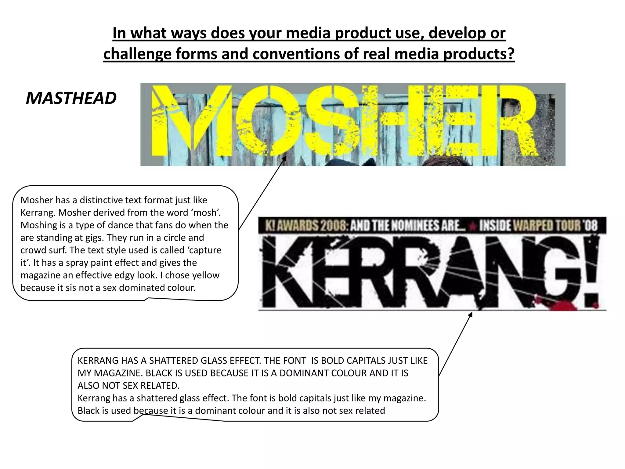
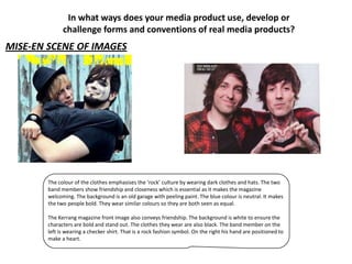
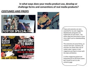
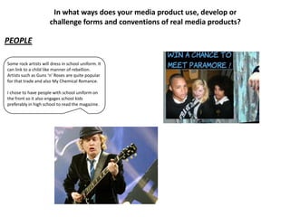
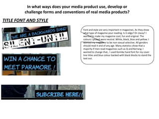
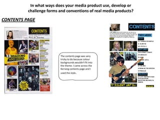
My media product uses and develops forms and conventions of real rock music magazines in several ways:
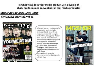
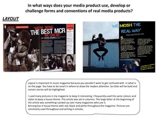
1) The layout, with bold titles, frequent images, and consistent colors, resembles magazines like Kerrang.
2) Elements like guitars, skateboards, and black clothing on the cover visually represent rock music culture.
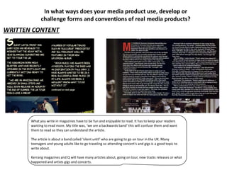
3) Written content about bands and concerts would interest the target audience of teenagers and rock fans.
4) The magazine aims to be inclusive of all gender and age groups, challenging the convention of primarily male readerships in similar magazines.