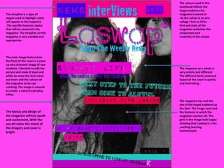
1. The colours used in the masthead reflects the target audience the magazine is aimed at .As the school is an arts college I feel as if the font and style of the magazine symbolise the uniqueness and creativity of the school. The strapline is a type of slogan used to highlight what will appear in the magazine .The specific features, topics that will be covered in the magazine. The strapline on this magazine is very suitable and appropriate . The main image featured on the front of the cover is a close up very dramatic image of two students. I decided to edit the picture and make it black and white to make the font stand out more and the colours of the magazine to be eye catching. The image is smooth to create a natural everyday effect. The magazine as a whole is very artistic and different. The different fonts used and layout of the cover is quirky and interesting . The magazine has met the aim of the target audience as the font. The image used and the features in which the magazine consists off. The girls in the image look happy showing that Laswap is a fun ,exciting learning environment. The layout and design of the magazine reflects youth and excitement, With the use of colour the mood of the imagery and cover is bright.