
Recommended
More Related Content
What's hot
What's hot (18)
Similar to Pilamary task research
Similar to Pilamary task research (20)
More from Danielle_Chaddock
More from Danielle_Chaddock (20)
Recently uploaded
Recently uploaded (20)
Pilamary task research
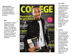
- 1. Target audience: This magazine would be for students who are thinking about or currently at college. It would be for both girls and boys. The image: This image on this magazine shows the type of person you would see studying at college therefore the audience could relate to this person. He looks like a cool character carrying books which the subjects may interest the reader. Mast: The headline on this magazine is partly covered up by the image. The audience however can still work out what the magazine is from the unique theme and shows the confidence that the producer has on their magazine. Colours: The colours used in this magazine are bright unique colours. the use of yellow is effective because yellow has connotations of happiness and isnt related to a girl or boy colour. The yellow contrasts with the black so the mast stands out. the splat on h
- 2. Target audience: this magazine would have a student audience and interest people who are thinking about taking higher education or for parents who are interested in their Childs education. Colour: the colour used on this magazine limits to similar colours. this lack of colour really doesn’t attract the reader to pick the magazine up but keeps a theme which the audience will notice every week. The Picture: the picture on this magazine shows people in a school library. Instantly the audience know it has something to do with education. the models also look happy showing a positive effect on the school. Mast: the mast has two colours to create a unique effect. The school magazine seem to be confident that people will know their magazine by not making the mast all a bold colour.
- 3. Colours: the colours used in this magazine content is not attractive and very plain. The white background may be ideal for making the pictures stand out but it lacks uniqueness . The mast: the mast on this contents uses colours from the pictures and puts them in the mast. Images: the images used in this magazine use various picture angles which makes the pictures more interesting. They are also in full which makes the page look attractive. Target audience : the audience for this contents page would be for students who are interesting in their next steps in life and activities that are taken pout in the pictures.
- 4. Masthead : The mass head uses a clear font and is the top were the audience usually look. Colours : the use of black and white contrast with each other so the masthead and other writing stands out however these two colours are very simplistic and may bore the reader. Image: the image is faded out and is put as the background this is effective by page looks more interesting but it could confuse the reader by the text being unclear to read. Target audience: The target audience for this contents page is for people who are at school or looking to go into six form.