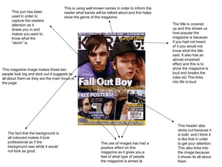
1. This is using well known names in order to inform the
This pun has been reader what bands will be talked about and this helps
used in order to show the genre of the magazine.
capture the readers
attention as it The title is covered
draws you in and up and this shows us
makes you want to how popular the
know what the magazine is because
“storm” is. if you had not heard
of it you would not
know what the title
said. It also has an
almost smashed
effect and this is to
This magazine image makes these two show the magazine is
people look big and stick out it suggests its loud and breaks the
all about them as they are the main focus of rules etc.This links
the page. into life is loud
This header also
sticks out because it
The fact that the background is is bold and I think it
all coloured makes it look is like that in order
professional as if the The use of images has had a to get your attention.
background was white it would positive effect on this This also links into
not look as good. magazine as it gives you a the image because
feel of what type of people it shows its all about
the magazine is aimed at. them.
2. This has been used in order to give the
audience an idea of what's inside in the hope
that people will see it and think I want to know
about that. This is the title
and the fact you
cannot see
some of it
shows how
popular the
magazine is.
This also shows
that the
magazine has
been round for a
This header links into long time as it is
the picture as it is quite a risky
sticks out and shows thing to do.
its all about them.
This is written in
capitals and is also
bold which makes it
draw attention to its
self. This banner has been
used in order to show
what the magazines
contents include. This
is good because it
draws the reader in as
These pictures are the word “special”
good because like This image is big and implies that it is a one
the other magazine the main focus of the off.
it shows who the page and this
magazine is aimed suggests that the
at and gives you an magazine is going to
idea of the genre. be about them.
3. The Title sticks out as
it is bold and in
capitals, this makes it
easy to read. The title
of this is short but this
is good because it
does not take up too This picture is off
much space. centre but is very
effective as it
makes him the
main focus of the
page. He also
takes up a lot of
the page which
This like the title is bold
again shows he is
and written in capitals
the main focus.
and this is to draw
attention to its self and
the picture because
Muse is one of the This links into the genre of
main focuses. In the the magazine as it shows
caption some words what music it Is going to
are written in white in mention and is good
order to show there because it gives you a
importance for example clear message of what
“last” this word has type of people the
been highlighted in magazine is targeted.
order to show that it is
you last chance.
These pictures are used in
order to show what the
magazines going to include
and who are in right now etc.
4. What I learnt on my front cover
analysis…
• I learnt that it is a good idea to have a big picture
taking up a lot of the space as it gives your
magazine a big statement.
• It is also a good idea to include bands relevant
to your genre as it gives the audience an idea of
what you magazine will include.
• The final thing I learnt was that by making your
title stick out people are more likely to read your
magazine, and so it is a good idea to have it in
bold capitals with some sort of effect.