SlideShare a Scribd company logo
1 of 9
Colour Scheme – Colours used on the front cover are red, white and black. This gives the magazine a
 serious look, which appeals to an older target audience. We also associate these colours with rock and roll
 magazines, this gives us an idea of what kind of magazine it is.
Photography – They have                                                         Writing style There isn’t
used a long mid shot. Unlike                                                    much writing on the
most magazine cover                                                             cover, just headlines and
especially the rolling stone                                                    little bits of information
the picture hasn’t been taken                                                   about that story this
in a studio. The pose seem                                                      interest into buying the
natural but the way she has                                                     magazine. It gives them
turned her head and looking                                                     spinets of what is inside.
into the camera suggest that                                                    The information is short
its unnatural. Her red hair fits                                                but interesting. They don’t
in very well with the colour                                                    use any slang but are
scheme of the magazine, it                                                      informative. Reading level
also reflects the kind of                                                       of the magazine is
magazine it could be, as do                                                     medium, this could be
her clothes. They both look                                                     because the magazine is
rock and rollish, especially her                                                appealing to an older
shorts that have been ripped .                                                  target audience, who have
The image stands out, it is in                                                  a higher standard social
the centre of the page with                                                     class so they expect well
the writing to the side, the                                                    written material. Also
name of the magazine is                                                         some of the subjects are
behind her head making her                                                      serious this could be taken
stand out on the page, this                                                     away from them if they
also suggest how important she is.                                              used slang or were easy to
Overall look – The over all look to the magazine is quite rock and roll, this is reflected in the way Rihanna is
dressed and looks, also in the text, layout and colour scheme, it also look serious at the same time. The
magazine has been made to look like this because of their target audience they want it to appeal to them
and live up to their standards.
                                                                                    Fonts - The text is very
Text / picture ratio– More                                                          90’s this is when rolling
of this page is dedicated to                                                        stones changed and
the picture rather than text.                                                       started applying to a
This is expected on magazine                                                        younger audience. It
front covers as the image is                                                        makes you think of older
important as they use it to                                                         generation and when the
attract people to the                                                               magazine first started. It
magazine. The large image                                                           is unique and creates a
suggests that Rihanna is going                                                      contrast between old and
to be the main feature of the                                                       new. The text looks
magazine. There is only one                                                         formal and it reminds
image on the cover , this                                                           you of a newspaper
makes the magazine formal                                                           fonts. This is good as the
and professional. If there was                                                      magazine isn’t just a
another image on the cover                                                          magazine it has
then it would look cheap and                                                        information about what
tacky it could also suggest                                                         is going on in the world
that is a gossip celebrity                                                          and other celebrities.
magazine. The class of the
magazine would also go
down.
Colour Scheme – The colour scheme has followed on from the cover, this often happens as it shows
 continuity and doesn’t confuse the reader and it lets them know that the magazine is for them. It also
 keeps it’s serious. It keeps the magazine simple, this colour scheme will be seen all the way through the
 magazine.
Photography – They have
used mainly pictures from
concerts. Only a few images
look to have been taken in a
studio and posed. Images
from concerts are expect
more in rock genre
magazines. Mid shots have
been used showing the
action. Other pictures used
are close mid shots and
close ups. This gives us an
indication of who is going to
be featured in the magazine.
All photos are in colour this
makes them more relax and
less serious it also suggest
the genre of magazine. In
                                Writing style – There isn’t much text on the page this is because they
                                try to fit as much information about the magazine on a as possible. It
most of the picture people
                                contains headers and small bits of information on that header, to let the
are wearing jackets, some
                                reader know more. They have kept the same reading level as the front
leather this suggests the
                                cover as this is what apples to the reader.
rock genre of the magazine.
Overall look – The contents is very different form the front cover which is odd as they normally continue
the look on. The way it is laid out looks very structured and neat as it did on the cover. This is appropriate to
their target audience. Some of the colours and text is similar.
                                                                                  Text/picture ratio – On
                                                                                  this page pictures take up
                                                                                  more space than the text
                                                                                  dose. This makes the page
                                                                                  look interesting. They have
                                                                                  also put stories or headers
                                                                                  on the image on or under
                                                                                  the image. This breaks the
                                                                                  writing up and shows that
                                                                                  maybe they could be a
                                                                                  important part of the
                                                                                  magazine as we are more
                                                                                  likely to look at the images
                                                                                  than the text. They have
                                                                                  the correct balance
                                                                                  between photos and text
                                                                                  to appeal to their target
                                                                                  audience. If they added
                                                                                  more images then it would
  Fonts – The fonts have been carried on from the front cover. They               become tacky but if they
  have the same old look that you associate with rock and roll. They              added more text it would
  make the magazine look formal making it different other magazine. The           put people off.
  fonts that they use creates their identity and relates well to the
  magazine genre.
Colour scheme – The black and white continue on this page but the red doesn’t. This could be because
 Sean Penn is an actor not a musician. The blue from the pool as replaced the red which makes a
 difference, it also makes the black and white stand out. Blue gives us a sense of clam and could suggest a
 laid back interview.
Photography – They have
used a full length shot of
Sean. A location has been
used to shoot this
image, this makes the image
interesting. Again it shows
that he isn’t a musician, as
they would be more likely to
be in a studio or at a
concert. His pose is natural
and relaxed, making him
look like careless but
important. His clothes are
simple, smart but look rough
at the same time this fits in
well with the whole image.
The image stands out        Writing style – It is like they are telling a fairy tale story. “One afternoon…” Is
because of the turquoise their way of saying once upon a time. The “O” is large just like is would be in
water, which doesn’t fit in books. The width of the text is similar to the width in a book. It is different as in
with the black and          most interviews as the questions they asked would be there written in a bold text
white, used on both         and then the answers underneath but they haven’t done it. This makes the
pages, making it catch your interview more sophisticated, making the reading level higher for its correct
attention.                  target audience.
Overall look – It looks abandoned, lonely, easy, relaxed and careless, this could say something about
the kind of life he lives or kind of person he is. It could also tell us what kind of a interview it is. They have
repeated the colours black and white on both pages and haven’t put any colour on the page with the text
so the focus is on the image. The black lines are also repeated on both pages making it different and
interesting.
                                                                                Text/picture ratio – The
                                                                                image is what takes up most
                                                                                of the page and with the
                                                                                lack of writing on the over
                                                                                side of the page it makes
                                                                                the image stand out even
                                                                                more and is what you focus
                                                                                on. The large image shows
                                                                                that he is the main focus of
                                                                                the interview. Even though
                                                                                the magazines target
                                                                                audience is upper class and
                                                                                older they haven’t written
                                                                                much which they make up
                                                                                for by the way it is written.


       Fonts – The fonts are the ones that have been used all the way through the
       magazine. They have the same rock and roll look that ties in with a newspaper look
       too. The fonts are sophisticated which is appropriate for their target audience.

More Related Content

What's hot

Front cover analysis
Front cover analysisFront cover analysis
Front cover analysisdammyalaka
 
front page analysis
front page analysis front page analysis
front page analysis elliotpack1
 
Kerrang evaluation
Kerrang evaluationKerrang evaluation
Kerrang evaluationsophiex
 
Music magazine evaluation
Music magazine evaluationMusic magazine evaluation
Music magazine evaluationCharlie Walden
 
Question 1
Question 1Question 1
Question 1LilyGRAY
 
Media final evaluation
Media final evaluationMedia final evaluation
Media final evaluationFardowsa
 
Evaluation q1
Evaluation q1Evaluation q1
Evaluation q1Ollie1994
 
G321 foundation portfolio in media – Evaluation
G321 foundation portfolio in media – EvaluationG321 foundation portfolio in media – Evaluation
G321 foundation portfolio in media – Evaluationlouisestorer
 
Question 1
Question 1Question 1
Question 1LilyGRAY
 

What's hot (18)

Magazine research
Magazine researchMagazine research
Magazine research
 
Media mags
Media magsMedia mags
Media mags
 
Question 1!
Question 1!Question 1!
Question 1!
 
Media
MediaMedia
Media
 
Front cover analysis
Front cover analysisFront cover analysis
Front cover analysis
 
front page analysis
front page analysis front page analysis
front page analysis
 
Kerrang evaluation
Kerrang evaluationKerrang evaluation
Kerrang evaluation
 
Q
QQ
Q
 
Textual analysis
Textual analysisTextual analysis
Textual analysis
 
Music magazine evaluation
Music magazine evaluationMusic magazine evaluation
Music magazine evaluation
 
Conventions
ConventionsConventions
Conventions
 
Question 1
Question 1Question 1
Question 1
 
Media final evaluation
Media final evaluationMedia final evaluation
Media final evaluation
 
Evaluation q1
Evaluation q1Evaluation q1
Evaluation q1
 
Number 4
Number 4Number 4
Number 4
 
G321 foundation portfolio in media – Evaluation
G321 foundation portfolio in media – EvaluationG321 foundation portfolio in media – Evaluation
G321 foundation portfolio in media – Evaluation
 
Grime music slide
Grime music slideGrime music slide
Grime music slide
 
Question 1
Question 1Question 1
Question 1
 

Viewers also liked

Viewers also liked (20)

Music Magazine Analysis
Music Magazine AnalysisMusic Magazine Analysis
Music Magazine Analysis
 
Magazine design
Magazine designMagazine design
Magazine design
 
Question 4
Question 4Question 4
Question 4
 
Ud teen tribes_s1_exposition
Ud teen tribes_s1_expositionUd teen tribes_s1_exposition
Ud teen tribes_s1_exposition
 
Question 3
Question 3Question 3
Question 3
 
Question 6
Question 6Question 6
Question 6
 
Question 1
Question 1Question 1
Question 1
 
Question 2
Question 2Question 2
Question 2
 
F latplan
F latplanF latplan
F latplan
 
Online Personal Branding for Developers
Online Personal Branding for DevelopersOnline Personal Branding for Developers
Online Personal Branding for Developers
 
Tutorial visitor
Tutorial visitorTutorial visitor
Tutorial visitor
 
Question 7
Question 7Question 7
Question 7
 
Navidad-Aleksandra Jezierska II F
Navidad-Aleksandra Jezierska II FNavidad-Aleksandra Jezierska II F
Navidad-Aleksandra Jezierska II F
 
Project Manager versus Product Manager.
Project Manager versus Product Manager.Project Manager versus Product Manager.
Project Manager versus Product Manager.
 
Rolling Stone Magazine Analysis
Rolling Stone Magazine Analysis Rolling Stone Magazine Analysis
Rolling Stone Magazine Analysis
 
Questionnaire analysis
Questionnaire analysisQuestionnaire analysis
Questionnaire analysis
 
ISLAS CANARIAS
ISLAS CANARIASISLAS CANARIAS
ISLAS CANARIAS
 
Lean Startup for Project Managers
Lean Startup for Project ManagersLean Startup for Project Managers
Lean Startup for Project Managers
 
Lean Startup for Project Managers
Lean Startup for Project ManagersLean Startup for Project Managers
Lean Startup for Project Managers
 
Powerpoint The Beatles
Powerpoint The BeatlesPowerpoint The Beatles
Powerpoint The Beatles
 

Similar to Rolling stones analysis

Contents page newest
Contents page newestContents page newest
Contents page newestAnitahoxha
 
Front page analysis 1
Front page analysis 1Front page analysis 1
Front page analysis 1nadiaewins
 
Front Page Analysis 1
Front Page Analysis 1Front Page Analysis 1
Front Page Analysis 1nadiaewins
 
Textual analysis
Textual analysisTextual analysis
Textual analysisjoelbmedia
 
Textual analysis
Textual analysisTextual analysis
Textual analysisjoelbmedia
 
Magazine cover analysis_rihanna
Magazine cover analysis_rihannaMagazine cover analysis_rihanna
Magazine cover analysis_rihannaRyanDenner
 
Magazine cover analysis
Magazine cover analysis Magazine cover analysis
Magazine cover analysis emilylivesey
 
Magazine cover analysis worksheet the big cheese
Magazine cover analysis worksheet  the big cheeseMagazine cover analysis worksheet  the big cheese
Magazine cover analysis worksheet the big cheeseadamtimms22
 
Semiotic analysis of a magazine cover
Semiotic analysis of a magazine coverSemiotic analysis of a magazine cover
Semiotic analysis of a magazine coveremjcampbell
 
Analysing contents pages
Analysing contents pagesAnalysing contents pages
Analysing contents pages05knotwelllau
 
contents page analysis
contents page analysiscontents page analysis
contents page analysiselliotpack1
 
Music Magazine Analysis.
Music Magazine Analysis.Music Magazine Analysis.
Music Magazine Analysis.RyaaanWard
 
Front Cover Research
Front Cover ResearchFront Cover Research
Front Cover Researchjessheap
 

Similar to Rolling stones analysis (20)

Task 8
Task 8Task 8
Task 8
 
1st contents page
1st contents page1st contents page
1st contents page
 
Contents page newest
Contents page newestContents page newest
Contents page newest
 
Front page analysis 1
Front page analysis 1Front page analysis 1
Front page analysis 1
 
Front Page Analysis 1
Front Page Analysis 1Front Page Analysis 1
Front Page Analysis 1
 
Analysis of magazine covers
Analysis of magazine coversAnalysis of magazine covers
Analysis of magazine covers
 
Textual analysis
Textual analysisTextual analysis
Textual analysis
 
Textual analysis
Textual analysisTextual analysis
Textual analysis
 
Contents
ContentsContents
Contents
 
NME
NMENME
NME
 
Magazine cover analysis_rihanna
Magazine cover analysis_rihannaMagazine cover analysis_rihanna
Magazine cover analysis_rihanna
 
Contents
ContentsContents
Contents
 
Magazine cover analysis
Magazine cover analysis Magazine cover analysis
Magazine cover analysis
 
Magazine cover analysis worksheet the big cheese
Magazine cover analysis worksheet  the big cheeseMagazine cover analysis worksheet  the big cheese
Magazine cover analysis worksheet the big cheese
 
Nme
NmeNme
Nme
 
Semiotic analysis of a magazine cover
Semiotic analysis of a magazine coverSemiotic analysis of a magazine cover
Semiotic analysis of a magazine cover
 
Analysing contents pages
Analysing contents pagesAnalysing contents pages
Analysing contents pages
 
contents page analysis
contents page analysiscontents page analysis
contents page analysis
 
Music Magazine Analysis.
Music Magazine Analysis.Music Magazine Analysis.
Music Magazine Analysis.
 
Front Cover Research
Front Cover ResearchFront Cover Research
Front Cover Research
 

Recently uploaded

Vertex AI Gemini Prompt Engineering Tips
Vertex AI Gemini Prompt Engineering TipsVertex AI Gemini Prompt Engineering Tips
Vertex AI Gemini Prompt Engineering TipsMiki Katsuragi
 
Science&tech:THE INFORMATION AGE STS.pdf
Science&tech:THE INFORMATION AGE STS.pdfScience&tech:THE INFORMATION AGE STS.pdf
Science&tech:THE INFORMATION AGE STS.pdfjimielynbastida
 
"ML in Production",Oleksandr Bagan
"ML in Production",Oleksandr Bagan"ML in Production",Oleksandr Bagan
"ML in Production",Oleksandr BaganFwdays
 
SIP trunking in Janus @ Kamailio World 2024
SIP trunking in Janus @ Kamailio World 2024SIP trunking in Janus @ Kamailio World 2024
SIP trunking in Janus @ Kamailio World 2024Lorenzo Miniero
 
Gen AI in Business - Global Trends Report 2024.pdf
Gen AI in Business - Global Trends Report 2024.pdfGen AI in Business - Global Trends Report 2024.pdf
Gen AI in Business - Global Trends Report 2024.pdfAddepto
 
Integration and Automation in Practice: CI/CD in Mule Integration and Automat...
Integration and Automation in Practice: CI/CD in Mule Integration and Automat...Integration and Automation in Practice: CI/CD in Mule Integration and Automat...
Integration and Automation in Practice: CI/CD in Mule Integration and Automat...Patryk Bandurski
 
Automating Business Process via MuleSoft Composer | Bangalore MuleSoft Meetup...
Automating Business Process via MuleSoft Composer | Bangalore MuleSoft Meetup...Automating Business Process via MuleSoft Composer | Bangalore MuleSoft Meetup...
Automating Business Process via MuleSoft Composer | Bangalore MuleSoft Meetup...shyamraj55
 
Connect Wave/ connectwave Pitch Deck Presentation
Connect Wave/ connectwave Pitch Deck PresentationConnect Wave/ connectwave Pitch Deck Presentation
Connect Wave/ connectwave Pitch Deck PresentationSlibray Presentation
 
WordPress Websites for Engineers: Elevate Your Brand
WordPress Websites for Engineers: Elevate Your BrandWordPress Websites for Engineers: Elevate Your Brand
WordPress Websites for Engineers: Elevate Your Brandgvaughan
 
Scanning the Internet for External Cloud Exposures via SSL Certs
Scanning the Internet for External Cloud Exposures via SSL CertsScanning the Internet for External Cloud Exposures via SSL Certs
Scanning the Internet for External Cloud Exposures via SSL CertsRizwan Syed
 
Nell’iperspazio con Rocket: il Framework Web di Rust!
Nell’iperspazio con Rocket: il Framework Web di Rust!Nell’iperspazio con Rocket: il Framework Web di Rust!
Nell’iperspazio con Rocket: il Framework Web di Rust!Commit University
 
costume and set research powerpoint presentation
costume and set research powerpoint presentationcostume and set research powerpoint presentation
costume and set research powerpoint presentationphoebematthew05
 
Human Factors of XR: Using Human Factors to Design XR Systems
Human Factors of XR: Using Human Factors to Design XR SystemsHuman Factors of XR: Using Human Factors to Design XR Systems
Human Factors of XR: Using Human Factors to Design XR SystemsMark Billinghurst
 
"Debugging python applications inside k8s environment", Andrii Soldatenko
"Debugging python applications inside k8s environment", Andrii Soldatenko"Debugging python applications inside k8s environment", Andrii Soldatenko
"Debugging python applications inside k8s environment", Andrii SoldatenkoFwdays
 
Understanding the Laravel MVC Architecture
Understanding the Laravel MVC ArchitectureUnderstanding the Laravel MVC Architecture
Understanding the Laravel MVC ArchitecturePixlogix Infotech
 
Artificial intelligence in the post-deep learning era
Artificial intelligence in the post-deep learning eraArtificial intelligence in the post-deep learning era
Artificial intelligence in the post-deep learning eraDeakin University
 
Unblocking The Main Thread Solving ANRs and Frozen Frames
Unblocking The Main Thread Solving ANRs and Frozen FramesUnblocking The Main Thread Solving ANRs and Frozen Frames
Unblocking The Main Thread Solving ANRs and Frozen FramesSinan KOZAK
 
Pigging Solutions in Pet Food Manufacturing
Pigging Solutions in Pet Food ManufacturingPigging Solutions in Pet Food Manufacturing
Pigging Solutions in Pet Food ManufacturingPigging Solutions
 
AI as an Interface for Commercial Buildings
AI as an Interface for Commercial BuildingsAI as an Interface for Commercial Buildings
AI as an Interface for Commercial BuildingsMemoori
 

Recently uploaded (20)

Vertex AI Gemini Prompt Engineering Tips
Vertex AI Gemini Prompt Engineering TipsVertex AI Gemini Prompt Engineering Tips
Vertex AI Gemini Prompt Engineering Tips
 
Science&tech:THE INFORMATION AGE STS.pdf
Science&tech:THE INFORMATION AGE STS.pdfScience&tech:THE INFORMATION AGE STS.pdf
Science&tech:THE INFORMATION AGE STS.pdf
 
"ML in Production",Oleksandr Bagan
"ML in Production",Oleksandr Bagan"ML in Production",Oleksandr Bagan
"ML in Production",Oleksandr Bagan
 
SIP trunking in Janus @ Kamailio World 2024
SIP trunking in Janus @ Kamailio World 2024SIP trunking in Janus @ Kamailio World 2024
SIP trunking in Janus @ Kamailio World 2024
 
Gen AI in Business - Global Trends Report 2024.pdf
Gen AI in Business - Global Trends Report 2024.pdfGen AI in Business - Global Trends Report 2024.pdf
Gen AI in Business - Global Trends Report 2024.pdf
 
Integration and Automation in Practice: CI/CD in Mule Integration and Automat...
Integration and Automation in Practice: CI/CD in Mule Integration and Automat...Integration and Automation in Practice: CI/CD in Mule Integration and Automat...
Integration and Automation in Practice: CI/CD in Mule Integration and Automat...
 
Automating Business Process via MuleSoft Composer | Bangalore MuleSoft Meetup...
Automating Business Process via MuleSoft Composer | Bangalore MuleSoft Meetup...Automating Business Process via MuleSoft Composer | Bangalore MuleSoft Meetup...
Automating Business Process via MuleSoft Composer | Bangalore MuleSoft Meetup...
 
Connect Wave/ connectwave Pitch Deck Presentation
Connect Wave/ connectwave Pitch Deck PresentationConnect Wave/ connectwave Pitch Deck Presentation
Connect Wave/ connectwave Pitch Deck Presentation
 
WordPress Websites for Engineers: Elevate Your Brand
WordPress Websites for Engineers: Elevate Your BrandWordPress Websites for Engineers: Elevate Your Brand
WordPress Websites for Engineers: Elevate Your Brand
 
Scanning the Internet for External Cloud Exposures via SSL Certs
Scanning the Internet for External Cloud Exposures via SSL CertsScanning the Internet for External Cloud Exposures via SSL Certs
Scanning the Internet for External Cloud Exposures via SSL Certs
 
Nell’iperspazio con Rocket: il Framework Web di Rust!
Nell’iperspazio con Rocket: il Framework Web di Rust!Nell’iperspazio con Rocket: il Framework Web di Rust!
Nell’iperspazio con Rocket: il Framework Web di Rust!
 
costume and set research powerpoint presentation
costume and set research powerpoint presentationcostume and set research powerpoint presentation
costume and set research powerpoint presentation
 
Human Factors of XR: Using Human Factors to Design XR Systems
Human Factors of XR: Using Human Factors to Design XR SystemsHuman Factors of XR: Using Human Factors to Design XR Systems
Human Factors of XR: Using Human Factors to Design XR Systems
 
DMCC Future of Trade Web3 - Special Edition
DMCC Future of Trade Web3 - Special EditionDMCC Future of Trade Web3 - Special Edition
DMCC Future of Trade Web3 - Special Edition
 
"Debugging python applications inside k8s environment", Andrii Soldatenko
"Debugging python applications inside k8s environment", Andrii Soldatenko"Debugging python applications inside k8s environment", Andrii Soldatenko
"Debugging python applications inside k8s environment", Andrii Soldatenko
 
Understanding the Laravel MVC Architecture
Understanding the Laravel MVC ArchitectureUnderstanding the Laravel MVC Architecture
Understanding the Laravel MVC Architecture
 
Artificial intelligence in the post-deep learning era
Artificial intelligence in the post-deep learning eraArtificial intelligence in the post-deep learning era
Artificial intelligence in the post-deep learning era
 
Unblocking The Main Thread Solving ANRs and Frozen Frames
Unblocking The Main Thread Solving ANRs and Frozen FramesUnblocking The Main Thread Solving ANRs and Frozen Frames
Unblocking The Main Thread Solving ANRs and Frozen Frames
 
Pigging Solutions in Pet Food Manufacturing
Pigging Solutions in Pet Food ManufacturingPigging Solutions in Pet Food Manufacturing
Pigging Solutions in Pet Food Manufacturing
 
AI as an Interface for Commercial Buildings
AI as an Interface for Commercial BuildingsAI as an Interface for Commercial Buildings
AI as an Interface for Commercial Buildings
 

Rolling stones analysis

  • 1.
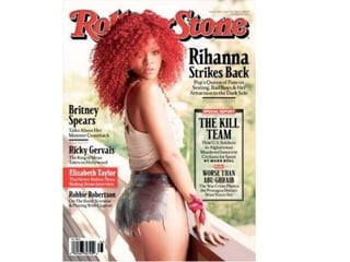
  • 2. Colour Scheme – Colours used on the front cover are red, white and black. This gives the magazine a serious look, which appeals to an older target audience. We also associate these colours with rock and roll magazines, this gives us an idea of what kind of magazine it is. Photography – They have Writing style There isn’t used a long mid shot. Unlike much writing on the most magazine cover cover, just headlines and especially the rolling stone little bits of information the picture hasn’t been taken about that story this in a studio. The pose seem interest into buying the natural but the way she has magazine. It gives them turned her head and looking spinets of what is inside. into the camera suggest that The information is short its unnatural. Her red hair fits but interesting. They don’t in very well with the colour use any slang but are scheme of the magazine, it informative. Reading level also reflects the kind of of the magazine is magazine it could be, as do medium, this could be her clothes. They both look because the magazine is rock and rollish, especially her appealing to an older shorts that have been ripped . target audience, who have The image stands out, it is in a higher standard social the centre of the page with class so they expect well the writing to the side, the written material. Also name of the magazine is some of the subjects are behind her head making her serious this could be taken stand out on the page, this away from them if they also suggest how important she is. used slang or were easy to
  • 3. Overall look – The over all look to the magazine is quite rock and roll, this is reflected in the way Rihanna is dressed and looks, also in the text, layout and colour scheme, it also look serious at the same time. The magazine has been made to look like this because of their target audience they want it to appeal to them and live up to their standards. Fonts - The text is very Text / picture ratio– More 90’s this is when rolling of this page is dedicated to stones changed and the picture rather than text. started applying to a This is expected on magazine younger audience. It front covers as the image is makes you think of older important as they use it to generation and when the attract people to the magazine first started. It magazine. The large image is unique and creates a suggests that Rihanna is going contrast between old and to be the main feature of the new. The text looks magazine. There is only one formal and it reminds image on the cover , this you of a newspaper makes the magazine formal fonts. This is good as the and professional. If there was magazine isn’t just a another image on the cover magazine it has then it would look cheap and information about what tacky it could also suggest is going on in the world that is a gossip celebrity and other celebrities. magazine. The class of the magazine would also go down.
  • 4.
  • 5. Colour Scheme – The colour scheme has followed on from the cover, this often happens as it shows continuity and doesn’t confuse the reader and it lets them know that the magazine is for them. It also keeps it’s serious. It keeps the magazine simple, this colour scheme will be seen all the way through the magazine. Photography – They have used mainly pictures from concerts. Only a few images look to have been taken in a studio and posed. Images from concerts are expect more in rock genre magazines. Mid shots have been used showing the action. Other pictures used are close mid shots and close ups. This gives us an indication of who is going to be featured in the magazine. All photos are in colour this makes them more relax and less serious it also suggest the genre of magazine. In Writing style – There isn’t much text on the page this is because they try to fit as much information about the magazine on a as possible. It most of the picture people contains headers and small bits of information on that header, to let the are wearing jackets, some reader know more. They have kept the same reading level as the front leather this suggests the cover as this is what apples to the reader. rock genre of the magazine.
  • 6. Overall look – The contents is very different form the front cover which is odd as they normally continue the look on. The way it is laid out looks very structured and neat as it did on the cover. This is appropriate to their target audience. Some of the colours and text is similar. Text/picture ratio – On this page pictures take up more space than the text dose. This makes the page look interesting. They have also put stories or headers on the image on or under the image. This breaks the writing up and shows that maybe they could be a important part of the magazine as we are more likely to look at the images than the text. They have the correct balance between photos and text to appeal to their target audience. If they added more images then it would Fonts – The fonts have been carried on from the front cover. They become tacky but if they have the same old look that you associate with rock and roll. They added more text it would make the magazine look formal making it different other magazine. The put people off. fonts that they use creates their identity and relates well to the magazine genre.
  • 7.
  • 8. Colour scheme – The black and white continue on this page but the red doesn’t. This could be because Sean Penn is an actor not a musician. The blue from the pool as replaced the red which makes a difference, it also makes the black and white stand out. Blue gives us a sense of clam and could suggest a laid back interview. Photography – They have used a full length shot of Sean. A location has been used to shoot this image, this makes the image interesting. Again it shows that he isn’t a musician, as they would be more likely to be in a studio or at a concert. His pose is natural and relaxed, making him look like careless but important. His clothes are simple, smart but look rough at the same time this fits in well with the whole image. The image stands out Writing style – It is like they are telling a fairy tale story. “One afternoon…” Is because of the turquoise their way of saying once upon a time. The “O” is large just like is would be in water, which doesn’t fit in books. The width of the text is similar to the width in a book. It is different as in with the black and most interviews as the questions they asked would be there written in a bold text white, used on both and then the answers underneath but they haven’t done it. This makes the pages, making it catch your interview more sophisticated, making the reading level higher for its correct attention. target audience.
  • 9. Overall look – It looks abandoned, lonely, easy, relaxed and careless, this could say something about the kind of life he lives or kind of person he is. It could also tell us what kind of a interview it is. They have repeated the colours black and white on both pages and haven’t put any colour on the page with the text so the focus is on the image. The black lines are also repeated on both pages making it different and interesting. Text/picture ratio – The image is what takes up most of the page and with the lack of writing on the over side of the page it makes the image stand out even more and is what you focus on. The large image shows that he is the main focus of the interview. Even though the magazines target audience is upper class and older they haven’t written much which they make up for by the way it is written. Fonts – The fonts are the ones that have been used all the way through the magazine. They have the same rock and roll look that ties in with a newspaper look too. The fonts are sophisticated which is appropriate for their target audience.