SlideShare a Scribd company logo
1 of 3
The masthead is place at                                                                                             Eye catching sub-heading stories making it
the top left making it                                                                                               more interesting for the readers as they
easier for the reader to                                                                                             might see artist they listen to regularly
see so they instantly know                                                                                           making them want to buy the music
what magazine it is. The                                                                                             magazine so they can find out more
colours that are used are                                                                                            information.
red making it stand out
connoting the importance                                                                                                  The colour theme red, black, white is
of the music magazine.                                                                                                    suitable for a a rock magazine. They
The design of the                                                                                                         also used these colour to contract the
masthead is shape and                                                                                                     important information and making
simple so its recognized                                                                                                  other information stand out more
straight away and it shows                                                                                                than others for example, the names
that the music magazine                                                                                                   of the artist is white on black making
is well known.                                                                                                            it stand out more. And the masthead
                 The plug looks the same                                                                                  in red also standing out showing the
                 as the tile creating that                                                                                importance of it.
                 same effect and doesn’t                                                                                  Central image is most
                 give out a lot of                                                                                        important feature which is
                 information as most of                                                                                   part of the front cover of the
                 the important                                                                                            music magazine as it’s the
                 information is inside the                                                                                main thing that would attract
                 music magazine.                                                                                          the reader, also a direct mode
                                                                                                                          of address is usually used too.
                                                                                                                          The type of colour black of
  Puff is used making it more eye                                                                                         clothing that they artist are
  catching for the readers for them                                                                                       wearing conveys that they are
  to buy this music magazine.                                                                                             serious and also their facial
                                                                                                                          expressions show that they
                                                                                                                          have serious side to them.
                                                                                                                          The fact that they are back on
  Main cover line appears to be big                                                                                       back this also connotes
  giving out more information about the                                                                                   seriousness as it portrays that
  main image that’s used and a quote is                                                                                   they are both in this together
  used making it more eye catching as                                                                                     and they ‘have each other
  they use the word ‘affair’ making the                                                                                   backs’.
  storyline sound appealing.
                                     Both the artists name are added in front of the music magazine.   Bar code and price is placed small on the bottom
                                     The effect of this is that it may attract the fans which knows    right hand this is because its takes away the force of
                                     these artist but on the other hand, it could also suggest that    the price of the magazine and it would be the last
                                     these artist are not well know so therefore, by adding the        thing on their mind as the other features of the music
                                     names would give an idea to the audience of who they might        magazine would make them buy it.
                                     be. The colours that are used go with the whole theme of the
                                     music magazine.
The masthead is behind the
main image this suggest that                                                                                            Puff is used to attract the readers
they music magazine is well                                                                                             more. By adding thing winning price it
known and doesn’t have to                                                                                               would make the readers want to buy
bee shown fully. The fact that                                                                                          the magazine even more. By placing it
the masthead is used in that                                                                                            at the top makes it more eyes
sort of edgy broken front                                                                                               catching and also the yellow yellow is
connotes the whole rock                                                                                                 bright attracting the reader. The
theme of it                                                                                                             colour yellow connotes happiness the
                                                                                                                        reader could feel as if they could be in
                                                                                                                        luck of winning.
 Other image of a artist which
 seems to be a old artist this                                                                                             The main image of green day is the
 can attract the older readers                                                                                             biggest feature in the music
 to buy the magazine.                                                                                                      magazine. This would attract the
                                                                                                                           reader as they might know him
                                                                                                                           and may be a big fan so therefore
The colour theme white black blue                                                                                          would consider buying the music
and yellow. Black and white connotes                                                                                       magazine. The main image is also
the whole rock theme. And the black                                                                                        the important feature as it givers
dark background makes the other                                                                                            an idea of the main story line and
information stand out making them                                                                                          it would also show that he’s the
seem important such as, the masthead                                                                                       main forces of the story line. The
and the main story.                                                                                                        body position of the artist seems
                                                                                                                           to be leaned back conveying the
                                                                                                                           idea of how he’s not a serious
                                                                                                                           person and doesn’t really care. The
           The bar code is small                                                                                           type of clothing he's wearing
           and its surround by                                                                                             seems to simple and formal again
           other information                                                                                               showing the side of him not really
           such are the prices                                                                                             caring about his appearance. He's
           that the audience can                                                                                           wearing black, black is a dark
           win and other                                                                                                   serious colour showing the whole
           information this takes                                                                                          rock theme.
           away the focus of the
           price of the music
           magazine.
                    More seal teams are added making the magazine        The main story line appears to big and side of the forces centre. This shows the
                    stand out more for the readers. By including that    importance of the magazine as it the main story that the readers would find
                    they can win for than one thing it would make        inside the music magazine. It also gives a little quote giving idea of what the
                    them feel as if it would be worth buying the music   main story may be about. By making the artist name bigger than the other
                    magazine. Also by adding the images of the           front it shows he's the main important person about this magazine. The front
                    posters it can attract the readers as they might     it seems to be similar to the masthead suggesting that he's just as important as
                    see the band they listen to.                         the masthead.
The music magazine                                                                                                       The main image of the
masthead at the top of                                                                                                   singer Cheryl Cole is big
the music magazine so                                                                                                    and most of the front
the reader can spot what                                                                                                 cover music magazine.
music magazine it is. By                                                                                                 This is done because it
making it in red and white                                                                                               can grab more attention
it stands out more so it                                                                                                 from the readers as
can catch the readers                                                                                                    Cheryl Cole is a well
attention more. Also by                                                                                                  know artist meaning that
making it a one letter title                                                                                             Cheryl Coles fan would
this would be easy for the                                                                                               buy this music magazine
readers to remember it                                                                                                   as the main story is
and recognize it when                                                                                                    about her. Also by
they see it else where.                                                                                                  making it big and close
                                                                                                                         up it would stand out
                                                                                                                         more making her look
The issue date is under the                                                                                              more sexual attracting
masthead with the price. This                                                                                            male audience.
could suggest that by adding                                                                                             The type of hair
the price at the top, no                                                                                                 style that Cheryl
matter what the price is the                                                                                             Cole is styled with
readers would still buy this                                                                                             makes her look
music magazine because it’s                                                                                              more sexual and
a well known one. More                                                                                                   also it makes her
over, including the date at                                                                                              look like a rock star
the top would show the                                                                                                   which this music
readers that this music                                                                                                  magazine is going
magazine is updated with                                                                                                 for.
new stories.
                                                                                                                         The type of make-up that
The cover line stories are                                                                                               Cheryl is wearing for
placed at the side so the                                                                                                example the black eye
readers can see straight                                                                                                 liner connotes the rough
away what other story                                                                                                    look which goes with the
lines the music magazine                                                                                                 whole rock theme.
talks about. The colours
that used also match with
the whole music magazine
                                                                                                                         The red lip stick and her
                                                                                                                         tongue placed in that
                                                                                                                         position is seen as being
                                                                                                                         a sexual look which is
    The main story line in big writing making it stand out more from the rest this suggest that it would                 used to attract the male
    Be easier for the readers to realise that it’s the main story line and also by making Cheryl name in bold it would   audience..
    Attract the audience as shes well known. By adding the ‘Rock’ to it makes it go with the whole rock theme.

More Related Content

What's hot

Evalutiaon for music magazine
Evalutiaon for music magazineEvalutiaon for music magazine
Evalutiaon for music magazineCharlene
 
Analysis of nme magazine
Analysis of nme magazineAnalysis of nme magazine
Analysis of nme magazineasmediaf12
 
Existing products magazine
Existing products magazineExisting products magazine
Existing products magazinejosh-haigh
 
Media final evaluation
Media final evaluationMedia final evaluation
Media final evaluationFardowsa
 
Magazine analysis
Magazine analysisMagazine analysis
Magazine analysisDa_Bhoy
 
Analysis of cover magazines
Analysis of cover magazinesAnalysis of cover magazines
Analysis of cover magazinessuhayl786
 
Kerrang! Magazine
Kerrang! MagazineKerrang! Magazine
Kerrang! Magazineharrywbfmv
 
Presentation of magazine design
Presentation of magazine designPresentation of magazine design
Presentation of magazine designashleighkingmedia
 

What's hot (16)

Evalutiaon for music magazine
Evalutiaon for music magazineEvalutiaon for music magazine
Evalutiaon for music magazine
 
Analysis of nme magazine
Analysis of nme magazineAnalysis of nme magazine
Analysis of nme magazine
 
Existing products magazine
Existing products magazineExisting products magazine
Existing products magazine
 
Contents Page Analysis
Contents Page Analysis Contents Page Analysis
Contents Page Analysis
 
Media final evaluation
Media final evaluationMedia final evaluation
Media final evaluation
 
Contents Page Analysis
Contents Page Analysis Contents Page Analysis
Contents Page Analysis
 
Magazine analysis
Magazine analysisMagazine analysis
Magazine analysis
 
Media
MediaMedia
Media
 
Kerang analysis1
Kerang analysis1Kerang analysis1
Kerang analysis1
 
Contents Page Analysis
Contents Page Analysis Contents Page Analysis
Contents Page Analysis
 
Analysis of cover magazines
Analysis of cover magazinesAnalysis of cover magazines
Analysis of cover magazines
 
Cover magazine
Cover magazineCover magazine
Cover magazine
 
Kerrang! Magazine
Kerrang! MagazineKerrang! Magazine
Kerrang! Magazine
 
Media
MediaMedia
Media
 
Evaluation 1
Evaluation 1Evaluation 1
Evaluation 1
 
Presentation of magazine design
Presentation of magazine designPresentation of magazine design
Presentation of magazine design
 

Similar to Rock Mag Cover Design Pops

Analysis powerpoint
Analysis powerpointAnalysis powerpoint
Analysis powerpointSam_jp
 
Front cover analyses
Front cover analysesFront cover analyses
Front cover analysesMirianay
 
Double Page Spread Analysis
Double Page Spread AnalysisDouble Page Spread Analysis
Double Page Spread Analysisjohanna-asmedia
 
Magazine cover analysis_rihanna
Magazine cover analysis_rihannaMagazine cover analysis_rihanna
Magazine cover analysis_rihannaRyanDenner
 
Analysis of nme magazine
Analysis of nme magazineAnalysis of nme magazine
Analysis of nme magazineasmediaf12
 
Evaluation-Q5
Evaluation-Q5Evaluation-Q5
Evaluation-Q5giran_11
 
Music magazine double spread pages
Music magazine double spread pagesMusic magazine double spread pages
Music magazine double spread pagesAnitahoxha
 
Magazine analysis
Magazine analysisMagazine analysis
Magazine analysisitb6mdu
 
Magazine contents page2
Magazine contents page2Magazine contents page2
Magazine contents page2UmaiyaKhawaja
 
Analysing contents pages prep for blog ppt
Analysing  contents pages prep for blog pptAnalysing  contents pages prep for blog ppt
Analysing contents pages prep for blog pptasmediag12
 
Music magazine front cover analysis[1]
Music magazine front cover analysis[1]Music magazine front cover analysis[1]
Music magazine front cover analysis[1]lukelong5
 
Contents page analysis for blog
Contents page analysis for blogContents page analysis for blog
Contents page analysis for blogdaniellajohnston
 
Contents page analysis for blog
Contents page analysis for blogContents page analysis for blog
Contents page analysis for blogdaniellajohnston
 
Double page spread analysis
Double page spread analysisDouble page spread analysis
Double page spread analysismwalker33
 
Research into music magazines front cover analysis
Research into music magazines  front cover analysisResearch into music magazines  front cover analysis
Research into music magazines front cover analysis05bealeros
 
Rock sounds content page
Rock sounds content pageRock sounds content page
Rock sounds content pagetarunkapp
 

Similar to Rock Mag Cover Design Pops (20)

Cover magazine
Cover magazineCover magazine
Cover magazine
 
Analysis powerpoint
Analysis powerpointAnalysis powerpoint
Analysis powerpoint
 
Front cover analyses
Front cover analysesFront cover analyses
Front cover analyses
 
Double Page Spread Analysis
Double Page Spread AnalysisDouble Page Spread Analysis
Double Page Spread Analysis
 
Magazine cover analysis_rihanna
Magazine cover analysis_rihannaMagazine cover analysis_rihanna
Magazine cover analysis_rihanna
 
Analysis of nme magazine
Analysis of nme magazineAnalysis of nme magazine
Analysis of nme magazine
 
Nme magazine powerpoint
Nme magazine powerpointNme magazine powerpoint
Nme magazine powerpoint
 
Evaluation-Q5
Evaluation-Q5Evaluation-Q5
Evaluation-Q5
 
Music magazine double spread pages
Music magazine double spread pagesMusic magazine double spread pages
Music magazine double spread pages
 
Magazine analysis
Magazine analysisMagazine analysis
Magazine analysis
 
Magazine contents page2
Magazine contents page2Magazine contents page2
Magazine contents page2
 
Analysing contents pages prep for blog ppt
Analysing  contents pages prep for blog pptAnalysing  contents pages prep for blog ppt
Analysing contents pages prep for blog ppt
 
Music magazine front cover analysis[1]
Music magazine front cover analysis[1]Music magazine front cover analysis[1]
Music magazine front cover analysis[1]
 
Contents Page Analysis
Contents Page Analysis Contents Page Analysis
Contents Page Analysis
 
Contents Page Analysis
Contents Page Analysis Contents Page Analysis
Contents Page Analysis
 
Contents page analysis for blog
Contents page analysis for blogContents page analysis for blog
Contents page analysis for blog
 
Contents page analysis for blog
Contents page analysis for blogContents page analysis for blog
Contents page analysis for blog
 
Double page spread analysis
Double page spread analysisDouble page spread analysis
Double page spread analysis
 
Research into music magazines front cover analysis
Research into music magazines  front cover analysisResearch into music magazines  front cover analysis
Research into music magazines front cover analysis
 
Rock sounds content page
Rock sounds content pageRock sounds content page
Rock sounds content page
 

More from Anitahoxha

Advertisement drafts
Advertisement draftsAdvertisement drafts
Advertisement draftsAnitahoxha
 
Analysis of cd design
Analysis of cd designAnalysis of cd design
Analysis of cd designAnitahoxha
 
Cd back cover deisgn
Cd back cover deisgnCd back cover deisgn
Cd back cover deisgnAnitahoxha
 
Feeback on questionnaire
Feeback on questionnaireFeeback on questionnaire
Feeback on questionnaireAnitahoxha
 
Feeback on questionnaire
Feeback on questionnaireFeeback on questionnaire
Feeback on questionnaireAnitahoxha
 
Music video ideas
Music video ideasMusic video ideas
Music video ideasAnitahoxha
 
Britney spears analysis
Britney spears analysisBritney spears analysis
Britney spears analysisAnitahoxha
 
A2 cd magazine advertisement
A2 cd magazine advertisementA2 cd magazine advertisement
A2 cd magazine advertisementAnitahoxha
 
Evaluation question 7
Evaluation  question 7Evaluation  question 7
Evaluation question 7Anitahoxha
 
Photos used and not used.
Photos used and not used.Photos used and not used.
Photos used and not used.Anitahoxha
 
Target aduience research
Target aduience researchTarget aduience research
Target aduience researchAnitahoxha
 
Typography for masthead
Typography for mastheadTypography for masthead
Typography for mastheadAnitahoxha
 
Audience profile new
Audience profile newAudience profile new
Audience profile newAnitahoxha
 
Research and surveys
Research and surveysResearch and surveys
Research and surveysAnitahoxha
 
Production schedule
Production scheduleProduction schedule
Production scheduleAnitahoxha
 
Double page spread analysis
Double page spread analysisDouble page spread analysis
Double page spread analysisAnitahoxha
 

More from Anitahoxha (20)

Advertisement drafts
Advertisement draftsAdvertisement drafts
Advertisement drafts
 
Analysis of cd design
Analysis of cd designAnalysis of cd design
Analysis of cd design
 
Cd back cover deisgn
Cd back cover deisgnCd back cover deisgn
Cd back cover deisgn
 
Feeback on questionnaire
Feeback on questionnaireFeeback on questionnaire
Feeback on questionnaire
 
Feeback on questionnaire
Feeback on questionnaireFeeback on questionnaire
Feeback on questionnaire
 
Music video ideas
Music video ideasMusic video ideas
Music video ideas
 
postmodern
postmodernpostmodern
postmodern
 
Britney spears analysis
Britney spears analysisBritney spears analysis
Britney spears analysis
 
Album covers
Album coversAlbum covers
Album covers
 
A2 cd magazine advertisement
A2 cd magazine advertisementA2 cd magazine advertisement
A2 cd magazine advertisement
 
Evaluation question 7
Evaluation  question 7Evaluation  question 7
Evaluation question 7
 
Q4
Q4Q4
Q4
 
Context page
Context pageContext page
Context page
 
Photos used and not used.
Photos used and not used.Photos used and not used.
Photos used and not used.
 
Target aduience research
Target aduience researchTarget aduience research
Target aduience research
 
Typography for masthead
Typography for mastheadTypography for masthead
Typography for masthead
 
Audience profile new
Audience profile newAudience profile new
Audience profile new
 
Research and surveys
Research and surveysResearch and surveys
Research and surveys
 
Production schedule
Production scheduleProduction schedule
Production schedule
 
Double page spread analysis
Double page spread analysisDouble page spread analysis
Double page spread analysis
 

Rock Mag Cover Design Pops

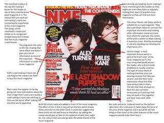
  • 1. The masthead is place at Eye catching sub-heading stories making it the top left making it more interesting for the readers as they easier for the reader to might see artist they listen to regularly see so they instantly know making them want to buy the music what magazine it is. The magazine so they can find out more colours that are used are information. red making it stand out connoting the importance The colour theme red, black, white is of the music magazine. suitable for a a rock magazine. They The design of the also used these colour to contract the masthead is shape and important information and making simple so its recognized other information stand out more straight away and it shows than others for example, the names that the music magazine of the artist is white on black making is well known. it stand out more. And the masthead The plug looks the same in red also standing out showing the as the tile creating that importance of it. same effect and doesn’t Central image is most give out a lot of important feature which is information as most of part of the front cover of the the important music magazine as it’s the information is inside the main thing that would attract music magazine. the reader, also a direct mode of address is usually used too. The type of colour black of Puff is used making it more eye clothing that they artist are catching for the readers for them wearing conveys that they are to buy this music magazine. serious and also their facial expressions show that they have serious side to them. The fact that they are back on Main cover line appears to be big back this also connotes giving out more information about the seriousness as it portrays that main image that’s used and a quote is they are both in this together used making it more eye catching as and they ‘have each other they use the word ‘affair’ making the backs’. storyline sound appealing. Both the artists name are added in front of the music magazine. Bar code and price is placed small on the bottom The effect of this is that it may attract the fans which knows right hand this is because its takes away the force of these artist but on the other hand, it could also suggest that the price of the magazine and it would be the last these artist are not well know so therefore, by adding the thing on their mind as the other features of the music names would give an idea to the audience of who they might magazine would make them buy it. be. The colours that are used go with the whole theme of the music magazine.
  • 2. The masthead is behind the main image this suggest that Puff is used to attract the readers they music magazine is well more. By adding thing winning price it known and doesn’t have to would make the readers want to buy bee shown fully. The fact that the magazine even more. By placing it the masthead is used in that at the top makes it more eyes sort of edgy broken front catching and also the yellow yellow is connotes the whole rock bright attracting the reader. The theme of it colour yellow connotes happiness the reader could feel as if they could be in luck of winning. Other image of a artist which seems to be a old artist this The main image of green day is the can attract the older readers biggest feature in the music to buy the magazine. magazine. This would attract the reader as they might know him and may be a big fan so therefore The colour theme white black blue would consider buying the music and yellow. Black and white connotes magazine. The main image is also the whole rock theme. And the black the important feature as it givers dark background makes the other an idea of the main story line and information stand out making them it would also show that he’s the seem important such as, the masthead main forces of the story line. The and the main story. body position of the artist seems to be leaned back conveying the idea of how he’s not a serious person and doesn’t really care. The The bar code is small type of clothing he's wearing and its surround by seems to simple and formal again other information showing the side of him not really such are the prices caring about his appearance. He's that the audience can wearing black, black is a dark win and other serious colour showing the whole information this takes rock theme. away the focus of the price of the music magazine. More seal teams are added making the magazine The main story line appears to big and side of the forces centre. This shows the stand out more for the readers. By including that importance of the magazine as it the main story that the readers would find they can win for than one thing it would make inside the music magazine. It also gives a little quote giving idea of what the them feel as if it would be worth buying the music main story may be about. By making the artist name bigger than the other magazine. Also by adding the images of the front it shows he's the main important person about this magazine. The front posters it can attract the readers as they might it seems to be similar to the masthead suggesting that he's just as important as see the band they listen to. the masthead.
  • 3. The music magazine The main image of the masthead at the top of singer Cheryl Cole is big the music magazine so and most of the front the reader can spot what cover music magazine. music magazine it is. By This is done because it making it in red and white can grab more attention it stands out more so it from the readers as can catch the readers Cheryl Cole is a well attention more. Also by know artist meaning that making it a one letter title Cheryl Coles fan would this would be easy for the buy this music magazine readers to remember it as the main story is and recognize it when about her. Also by they see it else where. making it big and close up it would stand out more making her look The issue date is under the more sexual attracting masthead with the price. This male audience. could suggest that by adding The type of hair the price at the top, no style that Cheryl matter what the price is the Cole is styled with readers would still buy this makes her look music magazine because it’s more sexual and a well known one. More also it makes her over, including the date at look like a rock star the top would show the which this music readers that this music magazine is going magazine is updated with for. new stories. The type of make-up that The cover line stories are Cheryl is wearing for placed at the side so the example the black eye readers can see straight liner connotes the rough away what other story look which goes with the lines the music magazine whole rock theme. talks about. The colours that used also match with the whole music magazine The red lip stick and her tongue placed in that position is seen as being a sexual look which is The main story line in big writing making it stand out more from the rest this suggest that it would used to attract the male Be easier for the readers to realise that it’s the main story line and also by making Cheryl name in bold it would audience.. Attract the audience as shes well known. By adding the ‘Rock’ to it makes it go with the whole rock theme.