2. In what ways does your
media product
use, develop or
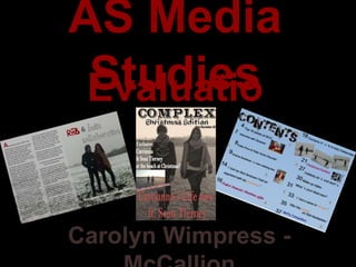
challenge forms and
conventions of real
media products?
3. My magazine is a Christmas
Edition. I took my pictures I made the title bold so it would
when it was snowing because I stand out compared to other
thought the scenery was very magazines so it would attract more
eye-catching. This would readers.
relate to Christmas because it
generally snows around
Christmas time , in the winter. My main image is a long
This made my artist look shot, with the 2 subjects walking
popular because on seasonal towards the camera and looking
holidays, interviews are straight a head. This set up is
normally only done with common for a magazine because
popular and successful artists. it’ simple and looks better. This
is because you want some focus
on the taglines and headline, as
well as, the subjects in the
picture and it would look messy
I choose to make my heading if your main image was a
red because I wanted it to collection of more than one
stand out because it ‘s the image and would drive reader
main story of my magazine. away because it would be
Also, because people will difficult to see the featured
know that it links to the main stories and they wouldn’t stand
image because the image out and attract readers that
and the heading is the first would be interested in the
things people will see when stories.
they at it. I challenged the form of R’n’B magazines
because I made the artists action really simple.
Although, normally R’n’B artists are wearing
revealing clothes and are posing a lot.
4. The colour of my font
challenges the conventions
of a contents page because I
have changed the colours of
certain words to make them
stand out more, I did this to
make my contents page
more interesting and easier
for people to see everything I challenged the conventions
easier so they don’t have to of this media product by
read the whole contents making my contents on a
page to find something they double page. This layout
want to read. This is because made it easier to fit
they just see key words that everything on and it allowed
tell them what the page is me to make the text quite
about. Also, I changed the random and stylish with the
colours of some titles of page numbers in different
pages because they were a positions . I also could fit
one time article that is linked more pictures on it so they
to the edition of the give the target audience
magazine which is a more that will instantly tell
‘Christmas Edition’. them what the pages are
about so they can go straight
to that page.
5. I put the first letter as a drop cap My title is in 2 different fonts because I think it’s
because many articles put them in effective that I made the difference of the 2 genres
and it made my double page spread obvious to the audience, which would allow them to
look professional because you see it understand the pull quote more because it doesn’t tell
in actual magazines. you what genres she’s mixed.
I used the conventional
column layout for my
article because it made
it much neater to look at
and easier to read. This
is used in other double
page spreads for the
same reasons.
I choose this as my pull quote because it
I put a transparent text box on my image showed how interesting my artist is because
so I could put my article on it because it by saying she want to mix R’n’B and Indie
allow the audience to read it properly music is unique because not many people
because if it wasn’t on a text box it have done it before. This would make people
would be quite difficult to read if the want to read the article because they would
background was the image. want to know how she has mixed the two and
she stand out a as a result of her doing
something new .
6. How does your media
product represent
particular social
groups?
7. The ‘Christmas Edition’ shows
that the magazine represents a
social group of people that like
Christmas because the by
having a Christmas Edition
proves that the magazine will
have sales which means that
the target audience will enjoy
reading a Christmas styled
magazine.
The cover line ‘The relationship
they’ve always denied’, shows
that I targeted my audience at
teenagers and young adults
(mainly females) because they are
the people that are generally
interested in celebrity gossip
about their relationships and they
will talk about it with their
friends. This represents the social
group as they care about the
famous people that they like’s
lives and they see it as a way of
socialising with other people
8. The main image shows that the double page represents a teenage and young adult social group
because the artist are young and the people that tend to mostly listen to them are teenagers and
young adults. The image represents this age group to be different to the stereotype because young
artists are usually represented to be seductive and flirtatious, but they are fully covered and they are
smiling, I did this because I wanted my artist to look down to earth.
The pull quote shows that the social groups that
would read this is listeners of R’n’B music and Indie
music. This is because they will want to read about
this because it’s what they are interested in and they
can relate to it.
9. By having a page about
‘Christmas Fashion’ shows
that the social group that is
being represented in the
contents is
females, preferably
teenagers and young adults
because they are interested
the most in fashion and
what they look like.
‘Perfect Romantic
Christmas Gifts’ also
represents a female
adult social group
because women are
mostly the ones looking
for romance and this
shows that women are
The ‘McFly Competition’ page shows that the social group is
sensitive.
teenager (mainly females) because they are the age that are
fans of McFly becaue they have been around during their
childhood. Even though they are not the genre of the
magazine, this would increase the amount of people wanting
to read the magazine because it is targeted at lots of different
people.
10. What kind of media
institution might
distribute your media
product and why?
11. There were many different institutions that could distribute my music magazine, but after researching all of
them I found that this one was the most appropriate.
‘With more than 60 iconic media brands, IPC
creates content for multiple platforms, across
print, online, mobile, tablets and events. We
engage with 26 million UK adults - almost two
thirds of UK women and over 40% of UK men.
Our award winning portfolio of websites
reaches over 25 million global users every
month.’
I chose this institution because it is very experienced with magazines and publishing, so I think they could
distribute my magazine very well because they’ve done it enough to know how to make it successful.
Also, because my magazine is a different genre to the ones they normally distribute so my magazine wouldn’t
be in competition with many other magazines. Finally, by choosing a popular company, will give my magazine a
higher chance of consumers being interested in my magazine.
12. Who would be the
audience for your
media product?
13. This magazine is a ‘Christmas
Edition’, which shows that the target
audience is people who enjoy
Christmas because the magazine
would be Christmas themed as a
result. This would mean people that
like celebrating during the seasonal
holidays.
This shows that the artists are happy
because they are smiling, which also
shows that the audience of the
magazine are going to be people that
The cover line shows that the enjoy Christmas.
magazine is gossip about my
artists. This shows that the
audience would be people
that enjoy reading about
famous people’s lives. This is
generally teenagers and
young adults because they
look up to some celebrities
and they can socialise with
their friend about it because
lot of young people
(preferably women) look at
famous young women for
fashion and style.
14. By having an article about my artists mixing the 2 genres – R’n’B
and Indie, show that the audience would be people that listen
to either R’n’B or Indie music or both because they would be
interested in the artists or if they like both genres they will be
interested to find out how the 2 have been mixed together.
My artists are smiling in
the picture and looking
at the camera, which
shows that the picture
is quite welcoming for a
reader and that the I think the pull quote suggests an audience of
article is going to be ambitious people because the quote is saying that
interesting, so the she’s had an achievement she’s wanted to fulfil.
audience would be Ambitious people will be attracted the reading the
anyone who doesn’t like article after they see the pull quote becaue they will
any artificial artists and see it as aspiration and they can relate to it.
gossip.
15. The photo shoot with the pictures of my artists show that the
audience would be teenagers because they are playing in the snow
and throwing snow balls, which is more likely to than adult do to
this because teenagers don’t mind getting cold and they think
playing in the snow is fun because they can do snow fights or make
snowmen.
The audience would be
female teenagers and
young adults because
they would be the ones
that would be
interested in fashion
The audience would be and wearing stylish
female teenagers and clothes.
young adults because it
is more likely for
women to look for
Christmas Gift ideas in
magazines, especially
romantic ones and
women are
stereotypically more
romantic and sensitive
than men.
17. The ‘Christmas Edition’ is
a way that I attracted the
audience because when
people see it they will
think the magazine will be
I attracted my
interesting and festive.
audience by using
the word
‘Exclusive’ in front
of my cover
line, which makes
people think that it
is important news
and it is urgent to
read.
I attracted an audience by having a
bold sub-heading so it would stand
out and be one of the first things
people read on the front cover, so
people that are interested in
celebrities gossip will want to read
the magazine.
18. My main image attracted an
audience because by the
artists in the picture
smiling, it creates a
welcoming atmosphere so
people will want to read the
article and think that it will
take them out of their own
lives for a while and read
something that will give them
release because they know
it’s going to be something
nice to read because it’s
obviously not depressing
because the people in the
picture are happy.
The pull quote attracts an audience because the people that
are interested in music or like R’n’B or Indie music are going
to want to read the article when they read what the artist
said about mixing the 2 genres, which is very unusual and not
a common thing to do.
19. The photos would attract a
teenage audience because
the artists are messing about
in the snow, which would
The text being different attract them because
colours attracted an teenagers tend to think that
audience because it draws that is fun and they don’t
people’s eyes to what it mind getting cold by staying
says, only the key words out in the snow for a long
were a different colour time.
which makes people think
that them pages are
important and are the best
pages in the magazine.
20. What have you learnt
about technologies
from the process of
constructing this
product?
21. I have learnt that you
I’ve learnt that you have to shouldn’t put any text
put all the cover lines right over lots of the subjects
at the edge so you can see body because they won’t
the main image properly. be fully
This also makes the front visible, however, it’s fine
cover look neat and tidy to cover someone a little
and nearly all magazines lay if they are not the main
out their front covers like person in the image that
that. the magazine is focusing
on.
I also learnt that it is better to put the main
image in the centre of the front cover
because then it will stand out straight
away and attract people to magazine if
they recognise the people.
22. I learnt that you should I also learned that you
put a transparent text should get a picture
box for the article when with the subjects on
you’ve got a picture one side so you can
covering the whole use the whole picture
page. So it’s easy to with the article in front
read because the of one side, this is
background isn’t effective because it
covering any of the looks
words. professional, neat and
tidy.
I’ve learnt that you should put a
pull quote on an article because
it makes it more interesting and
it gives people a preview of what
to expect when they read the
article.
23. I learnt that the title looks I learn to slant my photos so they
better on the left hand side look more interesting to look at
because on my draft contents because when I put them next to
page, I put it on the right each other straight, it looked
hand side and it didn’t look quite boring.
right and it looked out of
place on that side.
I also learnt that if you put all the text in a
messy style, you need to change the fonts
and colours to make it look more interesting
and make the messy style more obvious and
exaggerated.
24. Looking back at your
preliminary task, what
do you feel you learnt
in the progression
from it to the full
25. Final Front Cover Preliminary Task Front Cover
Comparing my front covers from my Preliminary task and my Final front cover, I think I improved a lot
because my final one looked much more professional and a higher quality than my preliminary one.
This is because all the text on my preliminary one isn’t that visible and it looks like they are just
dotted anywhere and it looks messy. Also, my preliminary looks really bare without much
information, which makes the front cover not interesting at all. My final front cover is better because
I fill much more space with text and the text is in better positioning. Finally, in my Preliminary task
my photo was taken really badly and it made the front cover look really unprofessional.